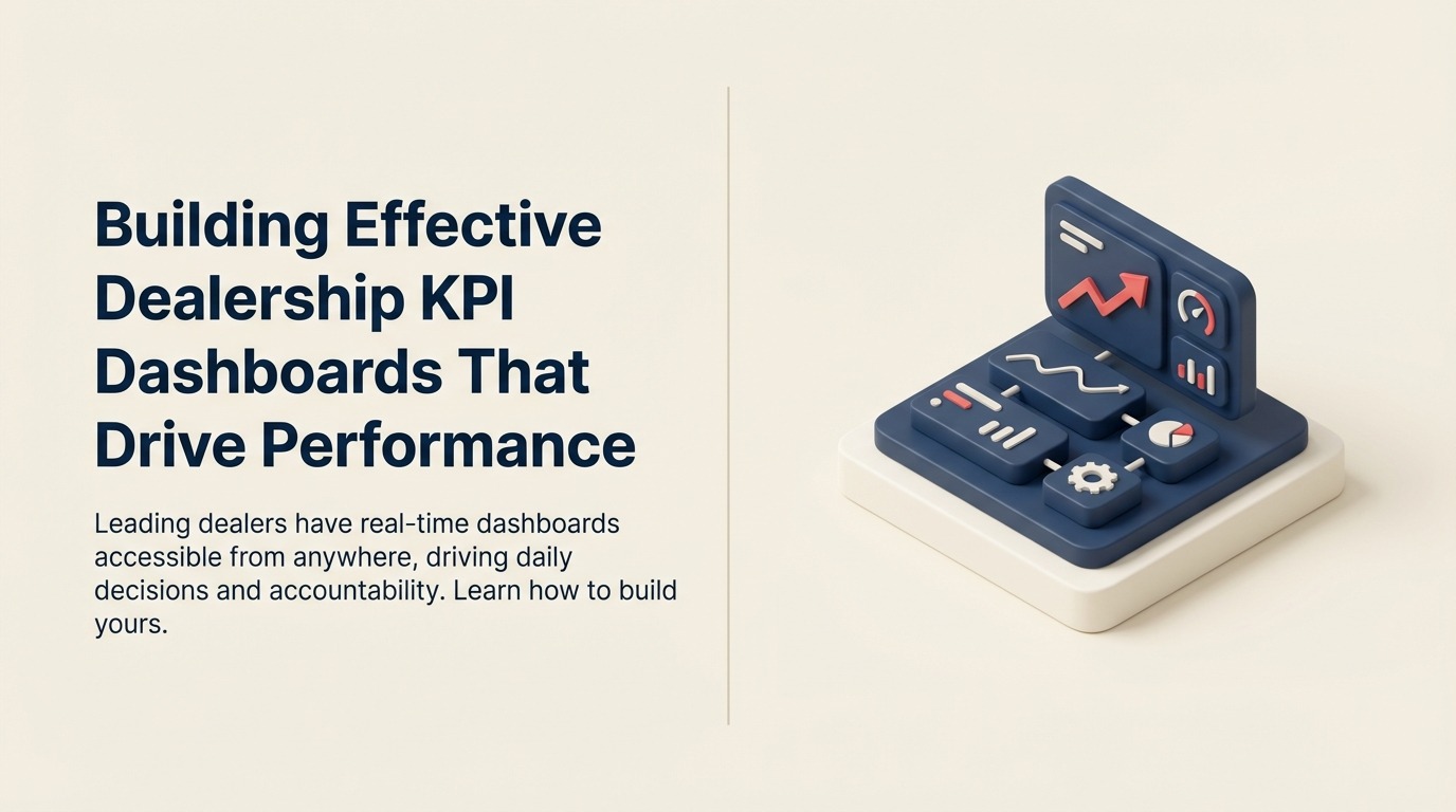
Building Effective Dealership KPI Dashboards That Drive Performance
Turn this article into takeaways for your work.
Each assistant summarizes the article only for you and suggests best practices for your work.
Walk into most dealerships and ask the GM about yesterday's performance. You'll wait 10 minutes while they log into three different systems, pull multiple reports, and piece together an answer. Ask about how individual sales consultants performed, and you'll wait even longer.
Now visit a leading dealership. The GM pulls up their phone, shows you a dashboard with real-time data, and answers your question in 15 seconds. They know exactly where they stand on monthly goals, which salespeople are crushing it, which are struggling, what inventory is selling, and what isn't.
The difference isn't the data. Both dealerships have the same systems and information. The difference is how that data is organized, displayed, and used to drive decisions. Effective KPI dashboards turn raw data into actionable intelligence that changes behavior and improves results.
Dashboard Design Principles
Bad dashboards confuse people. Good dashboards drive action. The difference comes down to design principles.
Focus on actionable metrics, not vanity metrics. Website traffic is a vanity metric, it feels good when it goes up but doesn't tell you what to do. Lead conversion rate is actionable—if it drops, you investigate lead quality, BDC processes, and sales consultant performance. Every metric on your dashboard should trigger clear actions when it moves outside expected ranges.
Real-time or near-real-time data updates make dashboards relevant. A report showing last month's performance is analysis, not a dashboard. Dashboards answer "How are we doing right now?" That requires data refreshing at least daily, preferably hourly for sales activity and continuously for website and marketing metrics. According to McKinsey research, automotive OEMs that closely monitor financial KPIs can achieve up to 20% higher profitability.
Role-based views prevent information overload. Your GM needs different information than your sales manager, who needs different information than individual sales consultants. Don't force everyone to look at the same cluttered screen. Design specific views for each role showing only what they need to know and can act on.
Visual hierarchy and data visualization best practices matter more than most dealers realize. Humans process visual information faster than text or numbers. Use color coding (green for on-target, yellow for caution, red for problem), trend arrows (up, down, flat), and simple charts. Put the most important numbers largest and highest. Remove clutter ruthlessly.
Mobile accessibility enables management from anywhere. Your GMs and managers aren't chained to desks. They need dashboards that work on phones and tablets so they can check performance from home, between appointments, or while walking the lot. If your dashboard only works on a desktop computer, it won't get used consistently.
Executive-Level Dashboard
Dealer principals and GMs need a high-level snapshot that shows overall health and highlights problems.
Daily sales units and gross profit by department (new, used, finance) are the foundation. Show units sold today, month-to-date, and pace to monthly goal. Show gross profit today and month-to-date versus plan. Break it down: new vehicle front-end, used vehicle front-end, FF&I back-end. WhenI back-end. When these numbers are off target, the GM digs deeper or redirects resources.
Service RO count and gross profit track fixed ops performance. Customer pay ROs today, week-to-date, and month-to-date compared to goals. Labor gross and parts gross. Service drives dealership profitability more than sales for most dealers, so this belongs on the executive dashboard.
Parts sales and margin give insight into parts department health. Track sales today and month-to-date, plus margin percentage. Significant margin drops signal pricing problems or mix shifts that need investigation.
Cash position and floor plan expose financial health. Outstanding floor plan balance, aging inventory costs, and available cash show whether the dealership is financially healthy or headed for trouble. This doesn't need to update hourly, but it belongs on the daily executive view.
CSI and SSI scores with monthly trends show customer satisfaction. These don't change daily, but tracking the trend identifies whether your customer experience is improving or declining. Link low scores to specific departments or individuals for targeted improvement.
Year-to-date performance versus budget provides context. Current month's results matter, but you need to see the bigger picture. Are you ahead or behind for the year? Are you making up previous shortfalls or falling further behind? This influences strategy and urgency.
Sales Department Dashboard
Sales managers need detailed funnel metrics and individual performance data to coach effectively and allocate resources.
Daily, weekly, and monthly unit sales by consultant create competitive transparency. Rank consultants by units sold. Show each person's sales today, this week, this month. Make it public within the sales team. Top performers get recognition. Underperformers feel pressure to improve.
Sales funnel metrics, leads, appointments, shows, deliveries, reveal where the process breaks down. Are you getting enough leads? Track inbound lead count by source. Are you setting enough appointments? Track appointment set rate. Are customers showing up? Track show rate. Are you closing shows? Track closing percentage. Each metric points to specific improvement opportunities.
Conversion rates at each stage identify coaching needs. One consultant converts shows at 28%, another at 16%. That 12-point gap represents 3-4 additional sales monthly for the underperformer. The sales manager sees this instantly and schedules coaching focused on closing skills.
Average front-end and back-end gross reveals profit performance. Some consultants sell volume but destroy gross by discounting too aggressively. Others maintain gross but don't sell enough units. The dashboard shows both dimensions, enabling balanced goal-setting.
Lead source performance and ROI guides marketing budget allocation. If third-party leads cost $125 each and convert at 8% while website leads are free and convert at 12%, you should invest more in SEO and website optimization. The dashboard makes this visible to sales managers who can then advocate for smarter marketing spend.
Inventory turn rate and aging by category prevents obsolescence. Which vehicle types are moving? Which are sitting? Sales managers need this visibility to coach consultants on what to push and to inform conversations with the used car manager about repricing or wholesaling.
Individual consultant scorecards consolidate performance into single views. Each salesperson should have a scorecard showing all their metrics: units, gross, conversion rates, activity levels, CSI scores, and ranking versus peers. Review these weekly in one-on-ones.
Service Department Dashboard
Fixed ops managers need visibility into capacity utilization, technician productivity, and customer retention.
Daily RO count by type (customer pay, warranty, and internal) shows service volume trends. Customer pay ROs generate profit. Warranty ROs generate less margin but maintain customer relationships. Internal ROs consume capacity without revenue. Track all three separately.
Labor and parts gross profit measure profitability. Track daily and month-to-date labor gross and parts gross. Compare to goals. When labor gross drops, investigate effective labor rate, hours-per-RO, or discounting. When parts gross drops, investigate pricing or mix.
Technician productivity and efficiency separate high performers from those needing improvement. Track hours flagged versus hours paid for each technician. Top performers flag 9+ hours for 8 hours paid (112%+ efficiency). Underperformers flag 6 hours for 8 paid (75% efficiency). This visibility drives coaching and training.
Shop capacity utilization shows whether you're maximizing resources. If you have 10 technicians working 8-hour days, you have 80 hours of capacity daily. If they flag 85 hours, you're at 106% utilization, which is excellent. If they flag 55 hours, you're at 69%, so your service advisors aren't selling enough work, or your shop layout isn't efficient.
Average RO value and effective labor rate track pricing effectiveness. Your door rate might be $185, but if discounting and efficiency issues bring your effective rate to $152, you're leaving money on the table. Average RO value should trend upward over time as you improve menu selling and technician efficiency.
Customer retention and defection rates predict future revenue. What percentage of customers who bought from you service with you regularly? What percentage serviced with you last year but haven't returned this year? Track retention by vehicle age cohort and by original sales consultant.
Comebacks and first-time fix rate measure quality. If 8% of customers return within 30 days with the same issue, you have quality problems. Track by technician and by service type. Use this data to identify training needs and hold people accountable for rework.
BDC and Marketing Dashboard
BDC managers and marketing directors need lead management and campaign performance metrics.
Inbound lead volume by source shows what's working. Track daily leads from website, phone, email, chat, third-party sites, and walk-ins. Compare to historical averages and seasonal norms. Sudden drops signal technical problems or campaign issues.
Contact rate and speed-to-lead measure BDC responsiveness. What percentage of leads does the BDC successfully contact? How quickly after lead receipt does first contact happen? Industry best practices: 80%+ contact rate, under 5 minutes for speed-to-lead during business hours. Dashboard alerts when performance slips.
Appointment set rate and show rate evaluate BDC effectiveness. Of leads contacted, what percentage convert to appointments? Of appointments set, what percentage show up? If appointment set rate drops, BDC needs coaching on phone skills. If show rate drops, investigate confirmation processes and appointment quality.
Cost per lead and cost per appointment by source inform budget decisions. Google Ads might generate leads for $42 each, while Facebook generates them for $68. But if Facebook leads set appointments at 25% versus Google at 15%, Facebook's cost per appointment might be lower. Track both metrics.
Email campaign performance guides messaging strategy. Track open rates, click rates, and conversion to appointment for each campaign. Industry averages: 20-25% open rate, 3-5% click rate. Campaigns that significantly outperform averages reveal what messaging resonates. Underperformers get retired or revised.
Website traffic and conversion funnel analysis shows digital performance. Monthly unique visitors, inventory VDP views, form submissions, chat initiations, and phone calls from website all belong on the marketing dashboard. Track conversion rate from visitor to lead.
Marketing ROI by channel shows what's worth funding. Calculate revenue generated versus dollars spent for each marketing channel: search, social, display, direct mail, traditional media. Channels with positive ROI get increased investment. Channels with negative ROI get cut or optimized.
F&I Dashboard
F&I managers need product penetration and profit per vehicle data to maximize back-end gross.
Finance penetration rate shows the percentage of deals financed versus cash. Industry average is 75-80%. Higher penetration means more opportunity to sell F&I products and earn reserve. Track by F&I manager and by vehicle type (new vs. used).
PVR (per-vehicle revenue) for F&I products is the critical profitability metric. What's your average back-end gross per vehicle sold including products and reserve? Top dealers hit $1,800-$2,200. Struggling dealers sit at $1,200-$1,400. Track monthly trends and by individual F&I manager.
Product penetration by type reveals where opportunity exists. What percentage of finance customers buy extended warranties? Gap insurance? Maintenance plans? Paint protection? Typical benchmarks: 50-60% warranty, 60-70% GAP, 30-40% maintenance. Low penetration in any category signals training opportunities.
Finance source mix and reserve shows lender relationship optimization. Which lenders are you using? What reserve are you earning? Diversified lender mix prevents dependence on one source. Higher reserve per deal improves profitability. Track both.
Chargeback rate and exposure measures risk. Customers who pay off loans early or default can trigger chargebacks where lenders reclaim reserve paid. Track chargeback rate and outstanding exposure. High rates signal credit quality issues or product fit problems.
Individual F&I manager performance creates accountability. Rank managers by PVR, product penetration rates, deals processed, customer satisfaction, and compliance scores. Publicize rankings to drive performance through competition and recognition.
Building the Dashboard
Knowing what to display is half the challenge. Building it effectively is the other half.
Data source integration determines what's possible. Your dashboard needs to pull from your DMS (sales, service, accounting), CRM (leads, appointments, activities), website analytics (traffic, conversions), and marketing platforms (campaigns, costs, results). Some systems offer APIs for real-time integration. Others require scheduled data exports. Map out your data landscape before selecting dashboard tools.
Platform options range from simple to sophisticated. Power BI and Tableau are enterprise-grade business intelligence platforms that can connect to virtually any data source and create sophisticated visualizations. They're powerful but complex. Dealer-specific tools like DealerSocket Analytics, VinSolutions IQ, and AutoAlert offer pre-built dealership dashboards with less flexibility but faster implementation.
Automated data refresh and scheduling eliminates manual work. Your dashboard should refresh automatically—hourly for sales metrics, daily for service and financial metrics, weekly for satisfaction scores. Nobody should need to manually export, combine, and upload data. If they do, the dashboard won't stay current.
Alert and notification configuration makes dashboards proactive instead of reactive. Set thresholds: if daily units drop below 10, alert the GM. If appointment show rate drops below 55%, alert the BDC manager. If a service advisor's CSI drops below 90%, alert the service manager. Push these alerts via text or email so problems get addressed immediately.
Access controls and permissions ensure people see what they should and nothing they shouldn't. Individual sales consultants should see their own metrics and team averages, not other consultants' detailed performance. Managers should see their department. GMs should see everything. Configure permissions appropriately to prevent data leaks and maintain trust.
Dashboard Cadence and Usage
Building a dashboard means nothing if nobody uses it. Integrate it into daily operations.
Morning dashboard review during 5-minute daily huddles sets the tone. Every morning at 8:00 AM, the sales team reviews yesterday's performance: units sold, gross profit, lead counts, appointments, shows. Celebrate wins. Address shortfalls. Set today's goals. This daily rhythm makes the dashboard the center of operations.
Weekly performance meetings with drill-down analysis dive deeper. The dashboard identifies problems at the surface level. Weekly meetings use the dashboard as a starting point, then drill into details. Why did used vehicle gross drop 15% this week? Let's pull individual deals and analyze them.
Monthly business reviews and trending look at bigger patterns. Compare this month to last month, to the same month last year, to budget. Identify multi-month trends: service retention declining for 3 months, new vehicle gross trending up for 4 months. Use these trends to inform strategy and goal-setting.
Individual coaching sessions based on scorecards turn data into development. When the dashboard shows a sales consultant struggling with closing rate, the manager schedules a one-on-one, reviews specific deals, identifies skill gaps, and role-plays scenarios. Data makes coaching specific and objective instead of general and subjective.
Goal-setting and target tracking create accountability. Dashboards show current performance. Goals show where you need to be. The gap drives action. Set monthly goals for every key metric. Update the dashboard to show progress toward goals. When someone hits or exceeds goals, recognize them publicly. When they miss, understand why and adjust approach.
Common Dashboard Mistakes
Even with good intentions, many dashboards fail. Avoid these pitfalls.
Too many metrics create information overload. A dashboard with 47 different KPIs isn't a dashboard—it's a data dump. People glaze over and ignore it. Limit dashboards to 8-12 key metrics maximum. If something doesn't drive action, remove it.
Delayed data makes dashboards useless. A "dashboard" showing performance from three days ago isn't valuable. Either automate data refresh or accept that you can't dashboard that metric yet. Don't build dashboards on stale data.
Lack of context leaves people guessing. A number without a goal, benchmark, or trend provides no meaning. Is 23 new vehicle sales this week good or bad? It's bad if your goal was 30, good if your average is 18. Always provide context: goals, averages, trends, and comparisons.
Poor data quality undermines trust. If your CRM has duplicate records and your dashboard shows 500 leads when you know you got 350, nobody trusts the dashboard. Fix data quality before building dashboards. One month of bad data can destroy credibility that takes years to rebuild.
Building dashboards without processes for action wastes time. Don't create KPIs unless you have clear processes for responding when metrics move. A dashboard showing service retention at 32% is pointless if nobody owns service retention improvement. Assign ownership and response protocols before building dashboards.
Not training teams on interpretation and use guarantees failure. Don't assume people understand what metrics mean or how they're calculated. Train everyone: what is closing rate? How is gross profit calculated? Why does this metric matter? What actions should you take when it changes? Without training, dashboards remain decorations instead of tools.
Making Dashboards Drive Performance
The best dealerships treat dashboards as mission control for daily operations. Every decision, every goal, every coaching session starts with dashboard data.
They know exactly where they stand at any moment. They see problems early enough to fix them. They identify opportunities fast enough to capture them. And they hold everyone accountable to clear, measurable standards that everyone can see.
Your dealership generates massive amounts of data every day. The question isn't whether the data exists—it's whether you've organized it into dashboards that drive profitable action.
Start with one dashboard. Get it right. Make it part of daily operations. Then build another.
The dealers winning in 2026 aren't necessarily the biggest or the ones with the fanciest facilities. They're the ones who know their numbers, track their progress, and use data to make better decisions every single day.

Senior Implementation Consultant