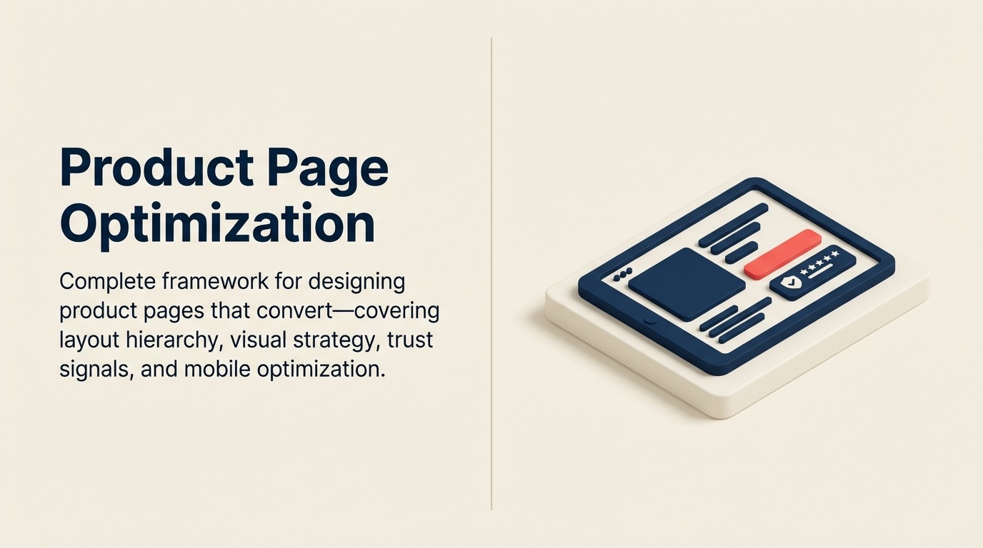
Product Page Optimization: The Complete Framework for Conversion-Focused Pages
Turn this article into takeaways for your work.
Each assistant summarizes the article only for you and suggests best practices for your work.
Your product page is where browsers become buyers. For most e-commerce stores, 40-60% of all conversions happen on product pages. Yet most retailers treat these pages as an afterthought - throwing up a few images, copying supplier descriptions, and calling it done. That's leaving money on the table.
Product page optimization isn't about making pages "look nice." It's about removing friction, building confidence, and giving customers the information they need to buy right now. Every element on the page should serve one purpose: moving visitors closer to adding to cart. This is the foundation of effective conversion rate optimization.
This guide covers the complete product page optimization framework, from above-the-fold hierarchy to technical performance. We'll focus on what actually drives conversions: strategic layout design, visual content that sells, trust signals that overcome objections, and mobile experiences that work.
Why product pages are your highest-converting asset
When someone lands on your product page, they're already interested. They've clicked through from search, ads, category pages, or recommendations. They're not browsing aimlessly, they're evaluating whether your product solves their problem and whether they trust you enough to buy.
The data shows this intent clearly. Product pages typically convert at 2-5% for new visitors and 8-15% for returning customers. That's significantly higher than category pages (0.5-2%) or homepage traffic (0.5-1%). The warmer the traffic, the better product pages perform.
But here's what most retailers miss: conversion rate on product pages varies dramatically based on page quality. Well-optimized product pages can convert at 8-12% even for cold traffic. Poorly optimized pages struggle to hit 1%. The difference isn't the product or the price, it's how effectively the page communicates value and removes barriers to purchase.
Your product page needs to accomplish three jobs simultaneously: showcase the product clearly, build trust and credibility, and make the path to purchase obvious. Miss any of these and conversions drop. Nail all three and you've built a revenue-generating asset that compounds over time.
Above-the-fold hierarchy: the critical first impression
Above-the-fold content, what visitors see before scrolling, determines whether they stay or bounce. You have about 3-5 seconds to prove this page has what they're looking for. That means the most critical information needs to be immediately visible without scrolling.
Primary product image and gallery
Your main product image is the first thing visitors see. It should be large, high-resolution, and show the product clearly against a clean background. Blurry images, small thumbnails, or crowded compositions kill trust immediately.
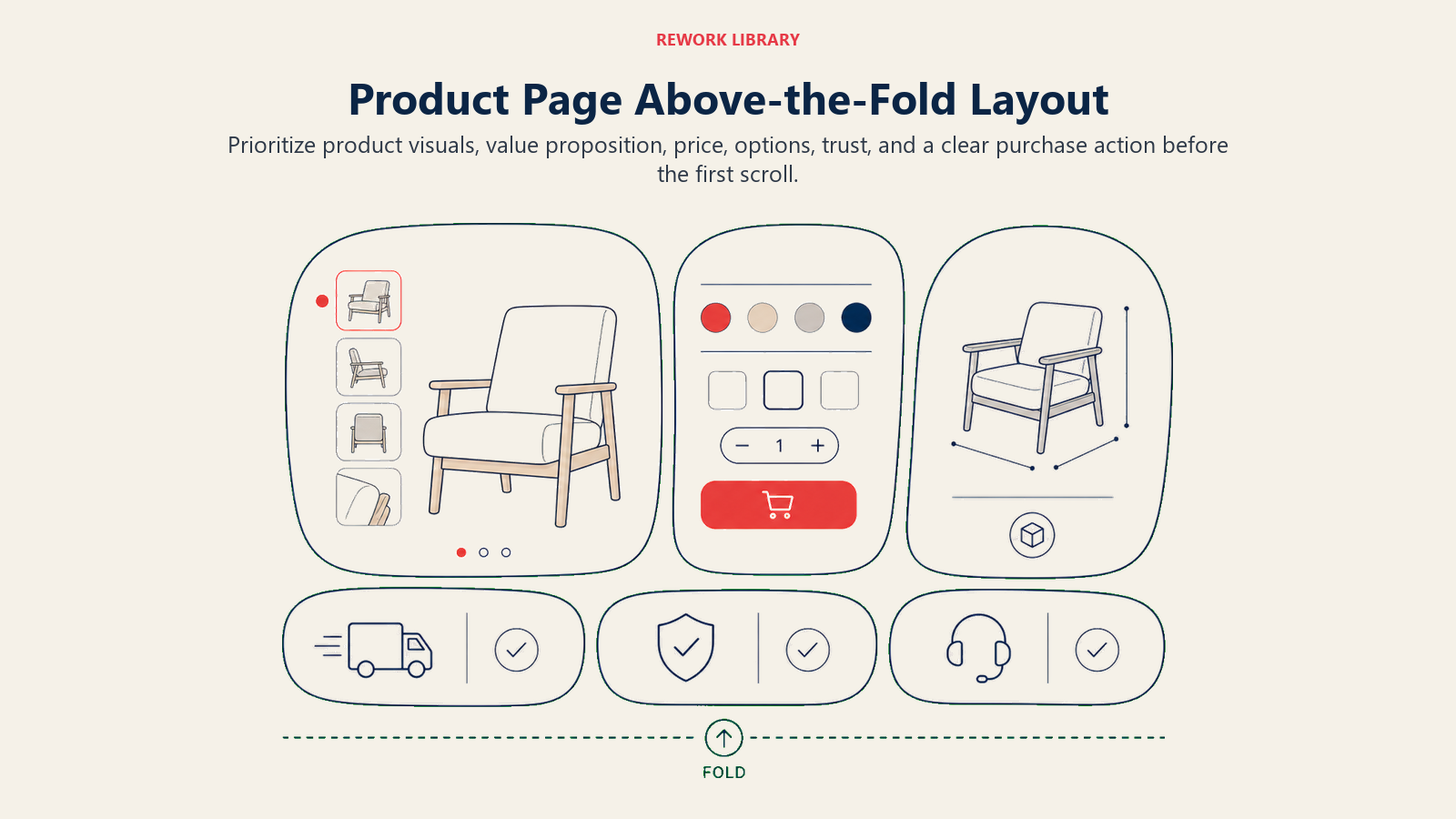
The product gallery should include at least 5-8 images: hero shot on white background, lifestyle images showing the product in use, detail shots of key features, scale reference, multiple angles, and variant images for each color or style option. Make thumbnails large enough to see detail (at least 60x60 pixels) and make sure clicking or tapping any image opens a full-screen view with zoom capability. For guidance on creating compelling visuals, see our guide to product photography and video.
Product title and key differentiators
Your product title needs to be descriptive, not clever. "Wireless Headphones" is too generic. "Sony WH-1000XM5 Wireless Noise-Cancelling Headphones | 30-Hour Battery | Premium Sound" tells visitors exactly what they're looking at and why it matters.
Immediately below the title, highlight 3-5 key differentiators as bullet points or badges: free shipping or fast delivery, extended warranty or guarantee, awards or certifications, unique features or benefits, and limited availability or exclusivity. These differentiators should be visual (icons or badges) and scannable.
Price and availability status
Price needs to be prominent, clear, and immediately visible. If you're running a sale, show both the original price (struck through) and sale price. The savings percentage or dollar amount should be obvious.
Availability status is just as critical. "In Stock - Ships Today" is far more compelling than generic "Add to Cart" messaging. If stock is limited, say so: "Only 3 left in stock." If you're out of stock, show expected restock dates and offer email notifications.
Primary call-to-action placement
Your "Add to Cart" button should be impossible to miss. It should be large enough to tap easily on mobile (minimum 44x44 pixels), high-contrast color that stands out from the page, above the fold on desktop and mobile, labeled clearly, and sticky on mobile so it remains accessible while scrolling.
Secondary CTAs (wishlist, share, compare) should be visually subordinate to the primary action. You want one clear path forward, not multiple competing options that create decision paralysis.
Visual content strategy: images and video as conversion drivers
Product imagery isn't decoration. It's the primary way customers evaluate products online. Poor visual content is one of the fastest ways to tank conversion rates.
High-quality product photography standards
Professional photography pays for itself through higher conversion rates. Minimum standards: at least 1000x1000 pixel resolution (preferably 2000x2000 or higher for zoom), consistent even lighting that shows true colors, clean white or neutral backgrounds for primary images, and accurate color representation.
For apparel and products with texture, include close-up detail shots that show fabric weave, material quality, stitching, or surface finish. These details matter to buyers making decisions without physically touching the product.
Lifestyle and context images
Lifestyle images show the product in use, giving visitors context for size, application, and benefits. A backpack shown on a model hiking tells a completely different story than the same bag on a white background.
Context images should show realistic use cases and environments, provide scale reference with familiar objects or people, demonstrate key features in action, and appeal to your target customer's aspirations. For furniture, show the piece in a styled room. For tools, show them being used. For clothing, show them worn by models who match your customer demographics.
Video demonstrations and product videos
Video content increases conversion rates by 80-90% according to multiple studies. Videos don't need to be professionally produced, authenticity often performs better than polished marketing content.
Effective product videos include unboxing videos showing what's included, feature demonstrations highlighting key functions, size and scale references, before/after comparisons for products that solve visible problems, and usage tutorials. Keep videos short (30-90 seconds) and auto-play muted with captions.
360-degree viewers and zoom functionality
Interactive product viewers let customers control the examination process. 360-degree spin viewers are particularly effective for products where all angles matter, shoes, electronics, furniture, or anything with complex shapes.
Zoom functionality should allow 2-4x magnification without quality loss. The zoom should be intuitive: hover on desktop, pinch on mobile. For apparel, consider adding interactive features like "view on model" toggles or color swatch selectors that update all images.
Product copy architecture: writing descriptions that sell
Product descriptions aren't creative writing exercises. They're sales tools that need to answer customer questions, highlight benefits, and overcome objections, in that order. Learn proven techniques in our guide to product description writing.
Headline and subheading strategy
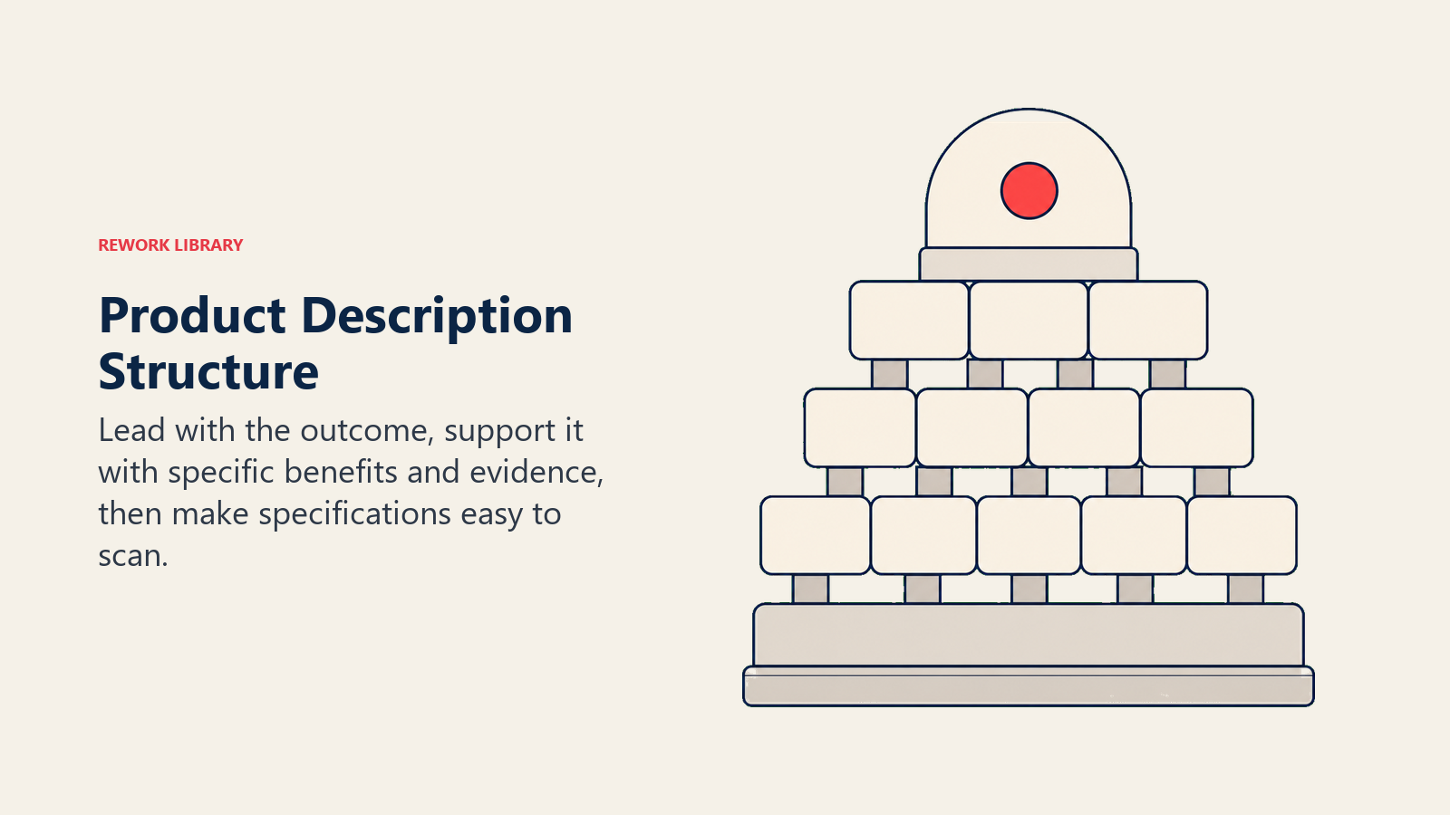
Start with a benefit-driven headline that expands on the product title. If your title is "Wireless Keyboard," your headline might be "Work Comfortably From Anywhere With 3-Month Battery Life."
Subheadings should break the description into scannable sections: key benefits and use cases, specifications and technical details, materials and construction, size and fit information, and care instructions. Most visitors won't read every word, subheadings allow them to jump directly to the information they care about most.
Feature-to-benefit translation
Features describe what a product has. Benefits describe what those features mean for the customer. Listing features without translating them into benefits is a missed opportunity.
Feature: "Stainless steel construction" Benefit: "Stainless steel construction resists rust and looks new for years, even with daily use"
For every feature you list, ask "so what?" and answer with the customer benefit. Focus on outcomes, not specifications.
Specifications and technical details
After covering benefits, provide complete specifications in a structured format. Use tables or definition lists for easy scanning: dimensions, weight, materials, compatibility, warranty, and any other technical details customers need to make a confident purchase decision.
For apparel and footwear, provide detailed sizing information: size charts with measurements, fit guidance (runs small, true to size, runs large), model measurements and size worn in photos, fabric content and care instructions, and stretch characteristics.
Trust signals and social proof: building confidence in the purchase
Customers need reasons to trust you before handing over their credit card. Trust signals and social proof remove this barrier by showing that others have bought successfully and been satisfied.
Customer reviews and ratings
Product reviews are one of the most powerful conversion drivers. Products with reviews convert 270% better than products without reviews, according to Spiegel Research Center. Display reviews prominently near the product title with star ratings, total review count, and recent reviews with verified purchase badges. Include customer photos and videos for authentic social proof.
Encourage reviews through post-purchase email sequences, but don't filter negative reviews, authenticity builds more trust than perfect 5-star ratings. For strategies to collect and leverage reviews effectively, explore our guide on customer reviews and user-generated content.
Trust badges and guarantees
Trust badges signal security, quality, and credibility. Place security certifications (SSL, Norton, McAfee) near the "Add to Cart" button where purchase anxiety is highest. Show sustainability certifications (B Corp, Fair Trade, organic) and industry awards near product images.
Clear warranty and guarantee information removes purchase risk. Display satisfaction guarantees prominently: "Try it risk-free for 30 days" is more compelling than fine-print warranty terms. Show what's covered, how long, and how to make claims. Learn more about implementing effective trust signals and social proof throughout your site.
Mobile experience optimization: ensuring conversions on all devices
Over 60% of e-commerce traffic comes from mobile devices, but mobile conversion rates typically lag behind desktop by 30-50%. The gap isn't because mobile users aren't ready to buy, it's because most product pages aren't optimized for mobile experiences. For comprehensive mobile optimization strategies, see our dedicated guide to mobile commerce optimization.
Touch-friendly design and performance
Mobile users navigate with their thumbs. Buttons and interactive elements need minimum 44x44 pixel touch targets, larger is better for primary actions like "Add to Cart" (aim for 48-60 pixels). Space elements at least 8-10 pixels apart to prevent accidental taps.
Implement lazy loading for images below the fold and optimize file sizes with WebP format (25-35% smaller than JPEG). Users should see the main product image, title, price, and CTA within 2 seconds on 3G connections.
Mobile layout and CTAs
Design for natural vertical flow: main image at top (full-width), product title and price immediately below, sticky Add to Cart button at bottom of screen, additional images in vertical stack, and expandable sections for descriptions and reviews.
Avoid horizontal image carousels that require swiping, they're hard to use and often get skipped. Make your primary CTA sticky at the bottom center of the screen (the "thumb zone") so it remains accessible while scrolling.
Related products and cross-sell: increasing average order value
Related product recommendations turn single-item purchases into multi-item orders. Done well, they increase average order value by 10-30%. Done poorly, they distract from the primary purchase. This is a critical component of your average order value optimization strategy.
Recommended products and bundles
Show 3-6 related products below the main product description. These should be algorithmically selected based on products frequently viewed together, products bought together by previous customers, similar products in the same category, or products from the same collection or brand. Implementing product recommendations effectively requires balancing relevance with business goals.
Bundle suggestions work best when they're logical and save money. "Buy the complete kit and save 15%" is more compelling than showing random products that happen to be in the same category. Display bundle savings clearly: "Buy together for $89 (Save $23)."
Upsell and cross-sell strategy
Upselling works best when the alternative provides clear additional value. Show higher-tier options with obvious benefit improvements: "Upgrade to Pro model with 2x battery life for $30 more."
At the bottom of product pages, show category-based cross-sells: "You might also need..." with complementary categories. If someone's buying a camera, suggest memory cards, cases, and tripods. These work better than random product suggestions because they serve functional needs customers might not have thought of yet. For detailed tactics, review our guide on upsell and cross-sell strategies.
Conversion barriers and objection handling: removing friction
Every objection that isn't addressed is a potential reason to abandon. Anticipate customer concerns and resolve them directly on the product page.
Shipping, returns, and payment transparency
Shipping surprises cause cart abandonment. Show shipping costs and delivery estimates before checkout: "Free shipping on orders over $X" or "Arrives by [date] if ordered in the next [time]." Provide shipping estimator tools if costs vary.
Generous return policies increase conversions by removing purchase risk. Display key points prominently: "Free 30-day returns, no questions asked." Link to full policy details.
Show accepted payment methods with logos (credit cards, PayPal, Apple Pay, Affirm). If you offer buy-now-pay-later, display installment amounts: "Pay in 4 interest-free payments of $X." These elements should also be streamlined in your checkout flow optimization to reduce cart abandonment.
Use honest availability messaging: "In stock - ships today," "Only 3 left at this price," or "Low stock - order soon." Real scarcity creates urgency; fake scarcity damages trust.
Technical performance: speed and functionality requirements
All the optimization in the world doesn't matter if your page loads slowly or doesn't work properly. Technical performance directly impacts conversion rates.
Page speed and Core Web Vitals
Every second of load time reduces conversions by 7%. Target load times under 3 seconds on mobile, under 2 seconds on desktop. Compress images (WebP format, lazy loading), minimize JavaScript, use CDNs, enable browser caching, and defer non-critical scripts.
Google's Core Web Vitals directly impact search rankings. Focus on Largest Contentful Paint (LCP) under 2.5 seconds for main product image loading, First Input Delay (FID) under 100ms for interaction response, and Cumulative Layout Shift (CLS) under 0.1 to prevent elements shifting during load. Use Google Search Console to monitor and address issues. For comprehensive performance optimization techniques, see our guide on site speed and performance.
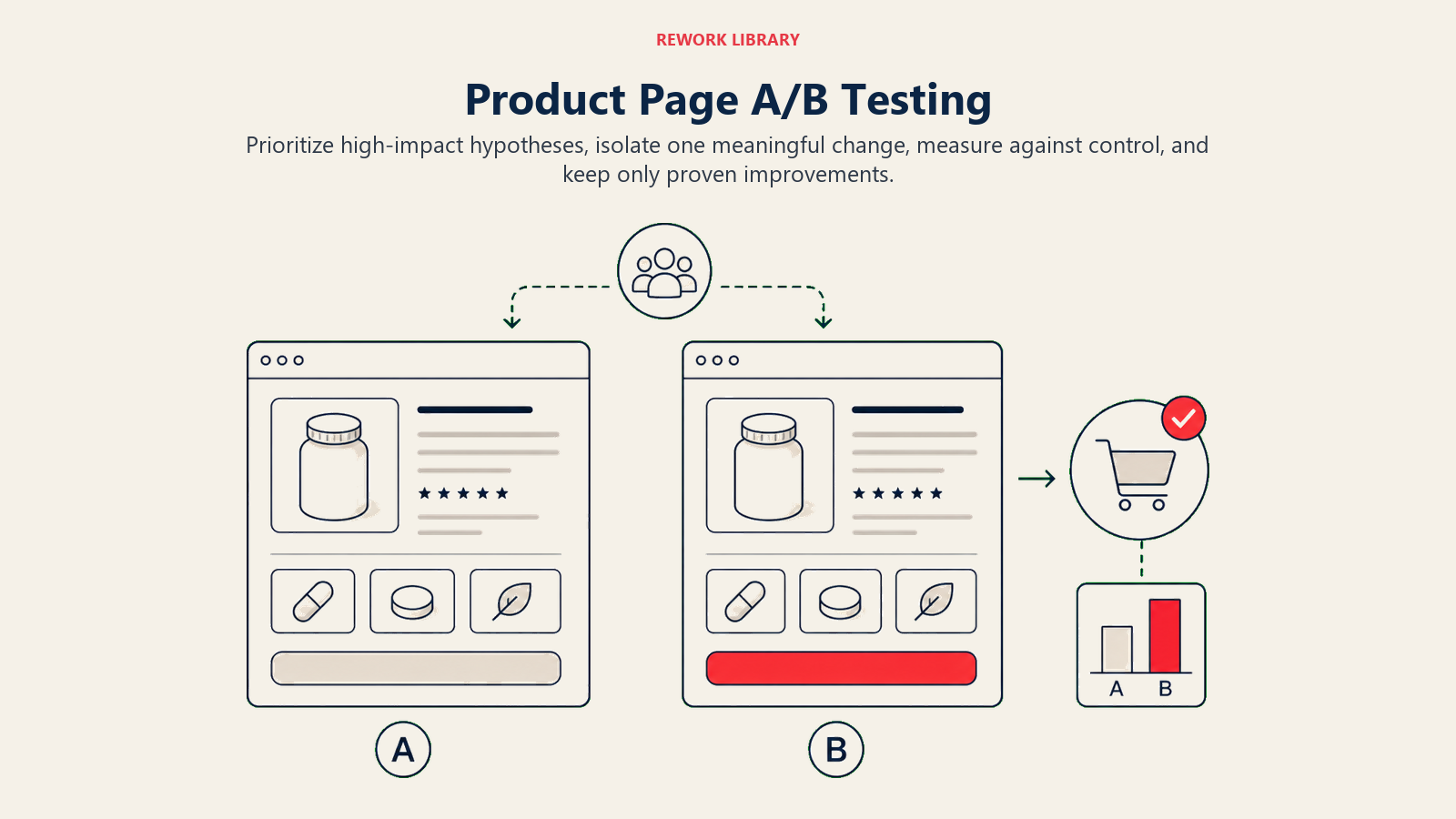
A/B testing framework: systematic optimization approach
Product page optimization is never "done." Continuous testing reveals opportunities to improve conversion rates over time.
High-impact test prioritization
Not all tests are equally valuable. Prioritize based on potential impact and ease of implementation. High-impact tests for product pages:
- Above-the-fold layout: Test image size, CTA position, or information hierarchy
- CTA button design: Test color, size, copy, and placement
- Image variations: Test lifestyle vs product-only images, or video vs static images
- Trust signal placement: Test review positioning, badge locations, or guarantee visibility
- Mobile experience: Test sticky CTAs, image galleries, or form layouts
Start with elements that directly impact the purchase decision. Defer cosmetic changes until you've optimized conversion-critical elements.
Testing best practices
Don't call tests early. Reach at least 95% statistical significance and 100+ conversions per variation before declaring a winner. Ideally, run tests for full business cycles (1-2 weeks minimum) to account for day-of-week and time-of-day variations.
Use proper A/B testing tools (Google Optimize, VWO, Optimizely) that calculate significance automatically. Don't eyeball results or call winners based on small sample sizes. For complete testing methodology and best practices, refer to our A/B testing framework guide.
Analytics and measurement: tracking what matters
You can't optimize what you don't measure. Set up proper analytics to understand how product pages perform and where improvements are needed. For comprehensive tracking implementation, see our guide on analytics and tracking setup.
Key metrics and KPIs
Track these product page metrics:
- Conversion rate: Percentage of visitors who add to cart or purchase
- Add-to-cart rate: Percentage who click "Add to Cart"
- Cart abandonment rate: Percentage who add to cart but don't complete checkout
- Time on page: How long visitors spend evaluating the product
- Bounce rate: Percentage who leave without interacting
- Revenue per visitor: Average order value divided by total visitors
![]()
Compare metrics across product categories, price ranges, and traffic sources to identify patterns.
Exit point analysis and heatmaps
Track where visitors leave your product pages without taking action: exiting after viewing images, after reading descriptions, after selecting variants, or after viewing pricing. High exit rates at specific points indicate problems, unclear information, objections not addressed, or friction in the buying process.
Use heatmap tools (Hotjar, Crazy Egg, Microsoft Clarity) to see how visitors interact with product pages: where they click, how far they scroll, what they hover over, and where they get confused. Heatmaps reveal whether visitors see important elements like reviews, specifications, or CTAs.
Product page optimization is ongoing work, not a one-time project. Start with the fundamentals: clear images, compelling copy, prominent CTAs, and mobile-friendly design. Then test systematically to find what resonates with your specific audience.
The best product pages don't just display products, they answer questions, overcome objections, and guide customers confidently toward purchase. Build pages that serve customers first, and conversions will follow.
For deeper dives into specific optimization strategies, explore our guides on Conversion Rate Optimization (CRO), Product Photography & Video, Product Description Writing, Trust Signals & Social Proof, Mobile Commerce Optimization, Site Speed & Performance, Upsell & Cross-Sell, and A/B Testing Framework.

Senior Operations & Growth Strategist
On this page
- Why product pages are your highest-converting asset
- Above-the-fold hierarchy: the critical first impression
- Primary product image and gallery
- Product title and key differentiators
- Price and availability status
- Primary call-to-action placement
- Visual content strategy: images and video as conversion drivers
- High-quality product photography standards
- Lifestyle and context images
- Video demonstrations and product videos
- 360-degree viewers and zoom functionality
- Product copy architecture: writing descriptions that sell
- Headline and subheading strategy
- Feature-to-benefit translation
- Specifications and technical details
- Trust signals and social proof: building confidence in the purchase
- Customer reviews and ratings
- Trust badges and guarantees
- Mobile experience optimization: ensuring conversions on all devices
- Touch-friendly design and performance
- Mobile layout and CTAs
- Related products and cross-sell: increasing average order value
- Recommended products and bundles
- Upsell and cross-sell strategy
- Conversion barriers and objection handling: removing friction
- Shipping, returns, and payment transparency
- Technical performance: speed and functionality requirements
- Page speed and Core Web Vitals
- A/B testing framework: systematic optimization approach
- High-impact test prioritization
- Testing best practices
- Analytics and measurement: tracking what matters
- Key metrics and KPIs
- Exit point analysis and heatmaps