Mobile Commerce Optimization: UX, Checkout, and Performance

Turn this article into takeaways for your work.
Each assistant summarizes the article only for you and suggests best practices for your work.
Mobile commerce optimization is one of the highest-leverage ecommerce growth tactics because mobile is already 60-70% of traffic yet converts 30-50% below desktop. Closing that gap through mobile-first design, faster checkout, and better page speed can lift mobile conversion 30-60%, adding 15-35% overall revenue without spending more on traffic.
Mobile traffic now makes up 60-70% of e-commerce visits across most industries, yet mobile conversion rates consistently lag desktop by 30-50%. This creates a fundamental business problem: the majority of your traffic converts at significantly lower rates than the minority. The math is brutal. A store with 70% mobile traffic converting at 1.5% and 30% desktop traffic converting at 3% achieves an overall conversion rate of 1.95%. If mobile conversion matched desktop at 3%, overall conversion would jump to 3%, a 54% improvement in conversion rate optimization.
The mobile conversion gap isn't mysterious. Mobile devices present inherent challenges: smaller screens, touch-based input, slower connections, usage in distracting environments. But device limitations don't fully explain the gap. The primary driver is poor mobile optimization. Most e-commerce sites are designed primarily for desktop, then adapted for mobile as an afterthought. The resulting mobile experience feels cramped, difficult to navigate, and frustrating to complete purchases through.
This creates an extraordinary opportunity. While competitors accept the mobile conversion gap as inevitable, stores that commit to genuine mobile optimization see dramatic improvements. Mobile-first design, streamlined mobile checkout, fast load times, and mobile-specific features can increase mobile conversion rates by 30-60%, translating to 15-35% overall revenue growth without any increase in traffic.
The Mobile Commerce Imperative
The shift to mobile-dominant traffic is one of the most significant changes in e-commerce over the past decade, requiring a fundamental rethinking of site design and optimization priorities.
Mobile traffic percentages vary by industry but trend consistently upward. Fashion and beauty see 70-80% mobile traffic, electronics and home goods typically show 60-70%, B2B and high-consideration purchases skew lower at 40-50% but still have substantial mobile presence.
Here's the critical insight: mobile isn't secondary traffic to optimize "when you get around to it." Mobile is your primary traffic source. Optimization priorities should reflect this reality. If 70% of traffic arrives on mobile, 70% of optimization effort should focus on mobile experience.
Yet most stores still prioritize desktop optimization. Design reviews happen on large monitors, testing focuses on desktop flows, performance optimization targets desktop metrics. This desktop-first approach then forces mobile users through experiences designed for different devices, creating unnecessary friction and conversion loss.
The business case for mobile prioritization is straightforward: even modest mobile conversion improvements deliver outsized revenue impact due to traffic volume. Improving desktop conversion by 10% affects 30% of traffic. Improving mobile conversion by 10% affects 70% of traffic, more than double the impact.
Beyond traffic volume, mobile usage patterns differ fundamentally from desktop. Mobile users browse during commutes, while watching TV, during work breaks, moments characterized by limited attention and frequent interruptions. Mobile purchases happen impulsively, driven by immediate needs or desires. Desktop purchases more often involve research, comparison, and deliberate decision-making.
These behavioral differences demand different optimization approaches. Mobile experiences must be faster, simpler, and more focused than desktop equivalents. The "everything accessible" approach that works on desktop creates overwhelming complexity on mobile.
Mobile-First Design Philosophy
Mobile-first design inverts traditional web design by starting with mobile constraints and capabilities, then expanding to larger screens, rather than building for desktop and shrinking to mobile. The fundamental principle: design for the smallest screen first, then progressively enhance for larger screens. This forces prioritization, when screen real estate is severely limited, you must decide what's truly essential. This discipline creates clearer, more focused experiences that benefit all devices.
Mobile-first thinking asks: What does a customer need to accomplish on mobile? How can we enable that with minimum friction? What can we eliminate or defer to reduce cognitive load? These questions lead to streamlined experiences that work beautifully on mobile and remain clean and fast on desktop.
The alternative approach, desktop-first design, starts with expansive layouts leveraging large screens, then struggles to fit everything onto small mobile screens. The result is cramped layouts, tiny text, difficult navigation, and frustrated users.
Practical implementation: Begin design mockups at mobile size (375px width, typical iPhone size). Design complete user flows at this size. Only after mobile design is finalized, expand to tablet (768px) and desktop (1200px+) sizes. During expansion, add features and content that enhance larger-screen experiences without being essential to core functionality.
This sequence ensures mobile users receive fully-designed experiences, not compressed desktop layouts. It also reveals bloat, features that seem essential on desktop often prove unnecessary when mobile prioritization forces critical evaluation.
Responsive Design Fundamentals
Responsive design creates flexible layouts that adapt gracefully across device sizes through fluid grids, flexible images, and CSS media queries. Breakpoints define screen width ranges where layout adjusts to accommodate different devices. Common breakpoint strategy:

- Mobile: 320-767px (phones in portrait and landscape)
- Tablet: 768-1023px (tablets in portrait)
- Desktop: 1024px+ (tablets in landscape and desktop screens)
More sophisticated approaches include additional breakpoints for large phones (414px), small tablets (600px), and large desktops (1440px+). The optimal breakpoint strategy depends on your specific content and audience device distribution (check analytics for actual device sizes).
Typography must remain readable across all screen sizes. Mobile text should never be smaller than 16px for body copy, smaller sizes force pinch-to-zoom, creating immediate friction. Product names, prices, and key information deserve even larger sizes (18-20px) for prominence and accessibility.
Line length (measure) affects readability significantly. Optimal reading occurs at 50-75 characters per line. Mobile's narrow screens naturally create appropriate line lengths, but responsive design must maintain this comfort on wider screens through max-width constraints or multi-column layouts.
Touch targets represent one of the most critical mobile design considerations. Human fingers are significantly less precise than mouse cursors. Apple's Human Interface Guidelines recommend minimum 44x44 pixel touch targets. Google's Material Design suggests 48x48 pixels. Targets smaller than this create frustration and mis-clicks.
Implementation: Buttons, links, form fields, and all interactive elements must meet minimum size requirements. Add adequate spacing between touch targets, tapping the wrong button because elements are too close together infuriates users. Product cards, navigation items, and checkout buttons deserve generous sizing on mobile even if this means fewer items visible simultaneously.
Visual design should provide clear affordance (indication that elements are interactive). On desktop, hover states signal interactivity. Mobile lacks hover, requiring explicit design signaling through button styling, link colors, and obvious clickability.
Mobile Navigation Patterns
Navigation on small screens requires fundamentally different approaches than desktop navigation with extensive horizontal menu bars. Hamburger menus (three horizontal lines triggering slide-out navigation drawers) represent the most common mobile navigation pattern. They hide navigation complexity behind a single icon, preserving screen real estate for content while providing access to full navigation when needed. Effectiveness varies by user familiarity and site structure. For simple site structures with 5-7 main categories, hamburger menus work well. For complex catalogs with hundreds of categories, they create discovery challenges, customers can't see what's available without actively opening navigation. Best practices: Place hamburger icon consistently (typically top-left), label it clearly ("Menu" text alongside icon improves clarity), ensure slide-out panel is easy to close, organize menu items logically with clear hierarchy.

Bottom navigation bars position key navigation elements in thumb-accessible bottom screen area. This particularly suits mobile apps but works for mobile web as well. Bottom navigation provides constant visibility (no hiding like hamburger menus) while keeping interactive elements within easy reach.
Limitation: Bottom navigation works for 3-5 primary destinations only. More items create cramped layouts and small touch targets. Use for main sections (Shop, Search, Cart, Account) while relegating secondary navigation to hamburger or category pages.
Search optimization becomes more critical on mobile where navigation browsing is cumbersome. Prominent search functionality allows customers to bypass hierarchical navigation and jump directly to desired products.
Mobile search considerations: Make search highly visible (top of screen, large touch target), implement autocomplete to reduce typing, show recent searches for quick access, design search results for mobile scanning (larger images, clear titles), enable voice search for hands-free interaction.
Category browsing on mobile benefits from large, scannable category tiles rather than text-heavy dropdown menus. Full-screen category overlays provide generous touch targets and clear hierarchy.
Image-based category navigation works particularly well on mobile, large category images with overlay text create obvious touch targets while providing visual context. This approach leverages mobile's strength (beautiful image display) while avoiding its weakness (difficult text interaction).
Product Page Optimization for Mobile
Product pages represent critical conversion points where mobile product page optimization delivers immediate revenue impact. Image galleries must balance showing products clearly (requiring large images) with practical mobile constraints (screen size, data usage). Mobile users can't see fine product details in small thumbnails, but forcing excessive scrolling to see multiple images creates friction. Swipe-based galleries work intuitively on mobile, horizontal swipes to view additional images feel natural on touch devices. Provide clear indicators showing number of images and current position. Enable pinch-to-zoom for detail viewing without requiring full-screen image modes.

Image optimization: Use responsive images serving appropriate sizes for device screens (no need to send 2400px images to 375px phone screens). Implement lazy loading for images below viewport. Optimize file sizes aggressively, every KB matters on mobile connections.
Specifications and product details require mobile-specific formatting. Dense specification tables readable on desktop become incomprehensible when shrunk to phone screens. Restructure information for vertical scanning, one specification per row, generous line spacing, clear labels.
Accordion/collapsible sections preserve screen real estate while providing access to detailed information. Show key specifications immediately, hide detailed technical specs, shipping information, and care instructions behind expandable sections. This prioritization shows what's most important without overwhelming the screen.
Reviews build trust signals and social proof that influence purchase decisions but can overwhelm mobile layouts if poorly implemented. Show review summary (star rating, review count) prominently near product name and price. Display 2-3 most helpful reviews immediately, with clear access to view all reviews.
Mobile review optimization: Use readable fonts sizes (never below 16px), include reviewer names and verification badges for credibility, show product variant reviewed (critical for items with multiple options), enable filtering by rating to surface relevant reviews quickly.
Star rating taps should show review details, not just highlight the rating. Customer photos in reviews deserve prominent display, visual proof from real customers influences mobile browsers strongly.
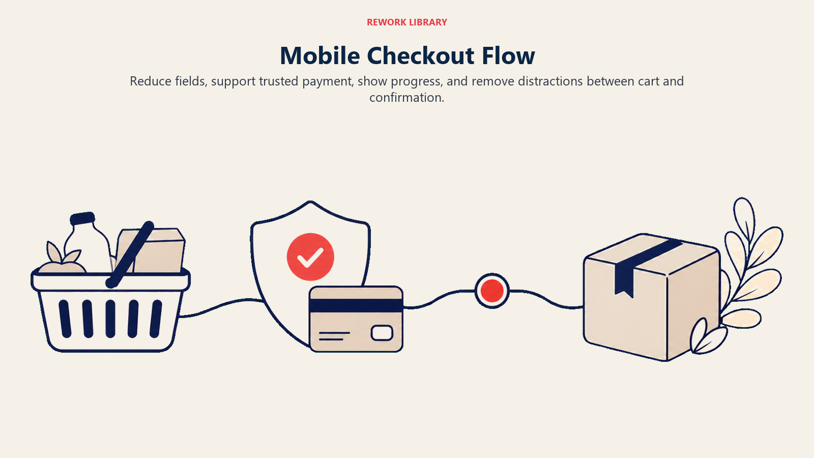
Mobile Checkout Flow
Checkout represents the critical conversion point where mobile friction most directly impacts revenue. Optimizing your checkout flow for mobile deserves intense focus. Streamlining for small screens requires ruthless simplification. Desktop checkout might display order summary, shipping form, and trust signals simultaneously. Mobile must show these elements sequentially, trying to fit everything creates cramped, unusable layouts. Single-column layouts work best on mobile. Forget two-column checkout forms, the narrow screen can't accommodate them comfortably. Stack all form fields vertically with generous spacing. Form field optimization minimizes typing through smart input types, autocomplete, and field reduction. Every field removed improves mobile completion rates.
Use HTML5 input types to trigger appropriate keyboards: type="email" shows keyboard with @ symbol and .com shortcut, type="tel" displays numeric keypad, type="number" shows number keyboard. These small optimizations significantly reduce typing friction.
Enable autofill for all standard fields (name, address, email, phone). This allows customers with saved information to complete checkout with minimal typing. Ensure field names and autocomplete attributes match standard patterns browsers recognize.
Express checkout options provide the biggest mobile conversion improvements. Apple Pay, Google Pay, and PayPal One Touch enable one-click purchasing that bypasses form completion entirely.
Mobile users particularly appreciate express checkout, typing shipping addresses and payment information on phone keyboards is tedious. Express checkout buttons should appear prominently at the top of checkout pages, possibly even on product pages for impulse purchases.
Implementation: Display express checkout buttons before traditional checkout forms. Make them visually distinct and obviously clickable. Show supported payment method logos to communicate available options.
Progress indicators remain important on mobile despite limited screen space. Customers need to know where they are in the process and how many steps remain. Use compact progress indicators, dots or simple step numbers work better than verbose labels on mobile.
Mobile payment methods now include diverse options beyond traditional card entry. Mobile wallets (Apple Pay, Google Pay), BNPL options optimized for mobile (Klarna, Afterpay), and mobile-specific payment services all reduce checkout friction.
The strategic priority: enable as many mobile-optimized payment processing options as practical. Each additional option captures customers who would have abandoned due to payment limitations.
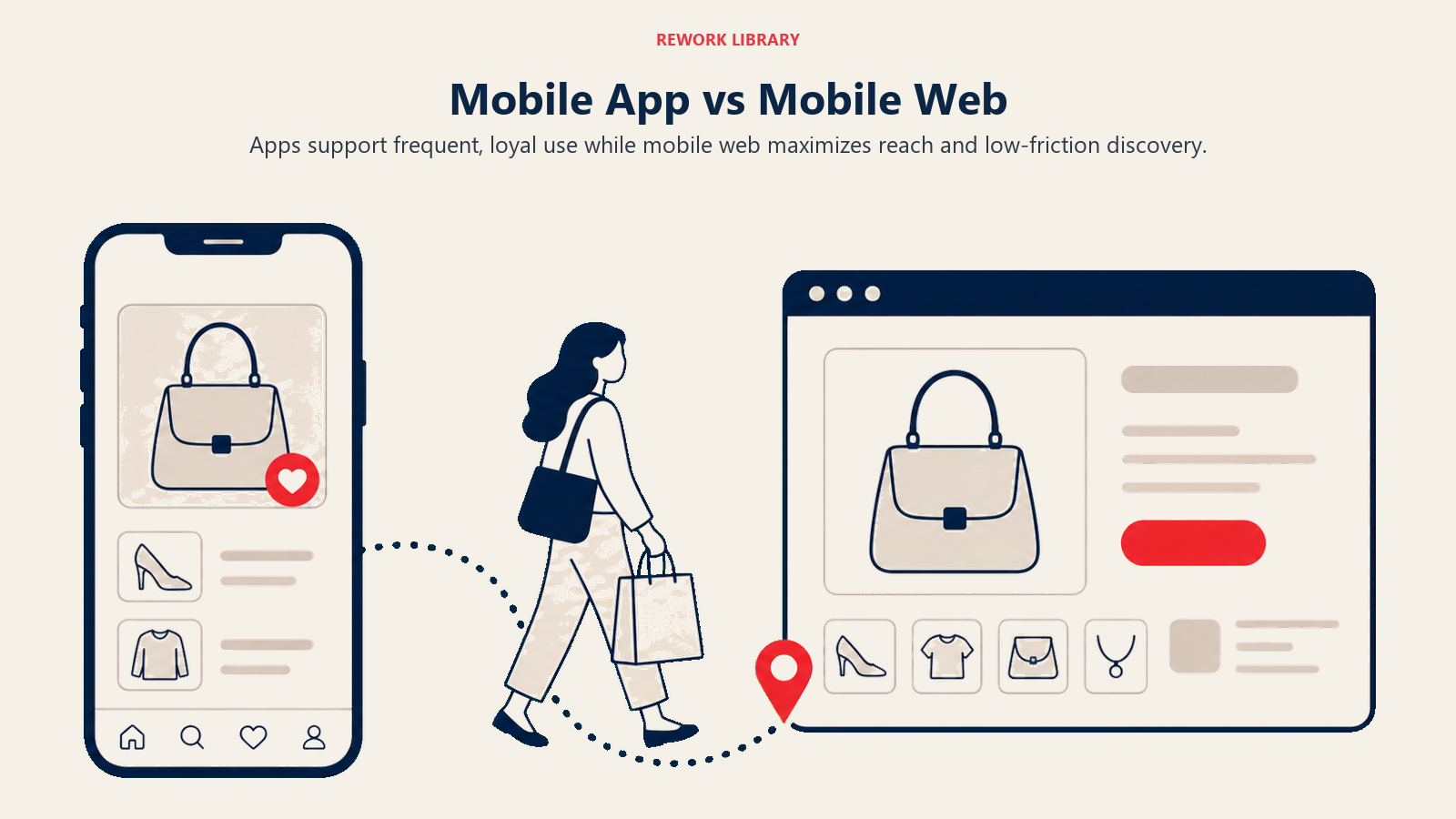
App versus Mobile Web
The app versus mobile web decision significantly impacts development resources and customer experience. Native apps provide superior performance, offline capability, push notifications, home screen presence, and full device feature access (camera, GPS, biometrics). Apps work well for frequent-purchase categories (grocery, fast food), subscription services, and stores where repeat customer engagement justifies development investment. The downsides are substantial: high development costs (building for iOS and Android separately), ongoing maintenance requirements, app store approval processes, user reluctance to download apps for infrequent purchases, and limited reach (customers must download before using). Mobile web offers universal access (no download required), immediate updates (no app store review delays), lower development costs (single codebase for all devices), and better SEO visibility. Mobile web suits most e-commerce operations, particularly those with diverse product catalogs and less frequent purchase patterns.
Progressive Web Apps (PWAs) blur the distinction by providing app-like experiences through mobile web, home screen installation, offline functionality, push notifications. PWAs offer middle-ground advantages without full native app development costs.
Decision framework: Build native apps if you have frequent repeat purchases (multiple times per month), strong brand loyalty that justifies download friction, budget for ongoing app development, and features requiring native capabilities (augmented reality, complex camera integration). Choose mobile web (potentially PWA-enhanced) for most other scenarios. Your e-commerce platform selection should support your mobile strategy.
Many successful e-commerce operations use mobile web as their primary channel while offering apps for engaged customer segments. This hybrid approach captures broad audiences through web while providing enhanced experiences for loyal customers willing to download apps.
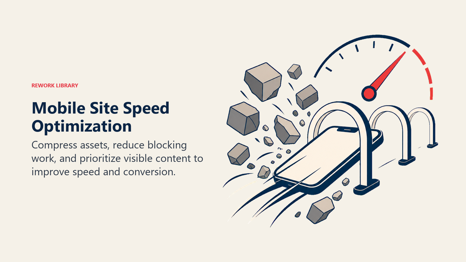
Mobile Site Speed and Performance
Performance dramatically affects mobile conversion, every 100ms delay in load time correlates with measurable conversion rate decline. Site speed and performance optimization is particularly critical for mobile users. Core Web Vitals represent Google's standardized performance metrics affecting both user experience and search rankings. The three Core Web Vitals specifically matter for e-commerce: Largest Contentful Paint (LCP) measures loading performance, specifically when the largest content element becomes visible. Target: under 2.5 seconds. Mobile LCP often lags desktop due to slower connections and less powerful processors. Optimization priorities: Optimize images (usually the largest content element), minimize render-blocking JavaScript and CSS, use CDN for faster content delivery, implement preloading for critical resources.
First Input Delay (FID) / Interaction to Next Paint (INP) measures interactivity, the delay between user interaction (tap) and browser response. Target: under 100ms for FID, under 200ms for INP. Mobile devices with less powerful processors struggle with heavy JavaScript execution.
Optimization priorities: Minimize JavaScript execution, break long tasks into smaller chunks, use web workers for background processing, defer non-critical scripts.
Cumulative Layout Shift (CLS) measures visual stability, how much content unexpectedly shifts during loading. Target: under 0.1. Mobile users particularly notice layout shifts since the entire screen changes.
Optimization priorities: Include size attributes on images and videos, reserve space for dynamic content (ads, embeds), avoid inserting content above existing content except in response to user interaction.
Image optimization delivers the biggest mobile performance impact. Images typically represent 50-70% of page weight, and mobile connections download these bytes slowly.
Modern formats (WebP, AVIF) provide significantly better compression than JPEG/PNG while maintaining visual quality. Serve responsive images appropriate for device screens, don't send 2400px images to 375px phones. Implement lazy loading for images below initial viewport. Use CDN for image delivery with geographic distribution.
Lazy loading defers loading resources until needed, dramatically improving initial page load. Implement lazy loading for below-the-fold images, product recommendation sections, review displays, and related product carousels.
Modern browsers support native lazy loading through loading="lazy" attribute on images. For broader compatibility and more control, JavaScript lazy loading libraries provide sophisticated implementations.
Mobile Search Behavior
Mobile search differs from desktop in usage patterns, input methods, and intent, requiring specific optimization.
Voice search sees higher usage on mobile than desktop, asking questions verbally while multitasking appeals to mobile users. Voice queries tend to be longer and more conversational than typed queries: "blue running shoes for women size 8" (typed) versus "show me women's blue running shoes in size eight" (voice).
Optimize for voice by using natural language in product descriptions and supporting conversational search patterns. Structured data markup helps search engines understand product details for voice response generation.
Local search dominates mobile, searches with local intent ("near me," "open now," city names) occur 3x more frequently on mobile than desktop. This matters even for pure-play e-commerce without physical stores through local inventory displays, store pickup options, and localized content.
Implementation: Support location detection for personalized experiences, highlight local stock availability, feature store pickup options prominently for omnichannel operations, optimize for local SEO through location pages and localized content.
Mobile search intent skews toward immediate needs and quick answers. Mobile searchers want fast results, clear answers, and frictionless paths to conversion. Product pages must load quickly and present key information (price, availability, main features) immediately visible without scrolling.
Mobile-Specific Features
Certain features particularly enhance mobile commerce experiences, justifying implementation priority. One-click checkout reduces checkout to single tap for returning customers with saved information. Amazon's patented One-Click ordering expires in 2017, enabling widespread adoption. Implementation through express checkout options (Apple Pay, Google Pay) or custom solutions with saved customer data.
Saved payment methods enable fast repeat checkout without re-entering card details. Tokenization services securely store payment information while maintaining PCI compliance. Display saved payment methods clearly during checkout with easy selection.
Autofill optimization leverages browser capabilities and platform features for automatic form completion. Proper HTML markup (autocomplete attributes, appropriate input types, standard field names) enables autofill. This transforms checkout from tedious typing to quick verification.
Biometric authentication (fingerprint, face recognition) provides fast, secure login and payment authorization. Apple Pay and Google Pay leverage device biometrics for frictionless payment. Custom implementations can use Web Authentication API for biometric login.
Camera integration enables visual product search, barcode scanning, and augmented reality try-on experiences. These features particularly suit fashion, beauty, and home goods categories where visual decision-making drives purchases.
SMS notifications provide another powerful mobile channel for order updates, shipping notifications, and promotional messages. SMS marketing strategy complements email for time-sensitive mobile communications.
Testing and Optimization
Mobile optimization requires continuous testing and refinement based on actual user behavior and device performance. Mobile analytics track device-specific metrics: mobile conversion rates by device type, mobile bounce rates, mobile page load times, mobile cart abandonment rates, mobile versus desktop AOV. Tracking e-commerce metrics and KPIs reveals mobile-specific opportunities and challenges.
Segment analytics by connection type (WiFi versus cellular) to understand performance impacts. Cellular users on slow connections experience sites differently than WiFi users, potentially requiring connection-adaptive optimization.
Heat mapping and session recording reveal how mobile users actually interact with your site. Where do they tap? How far do they scroll? Where do they abandon? Mobile-specific tools (or mobile segments in general tools like Hotjar, FullStory) show touch interactions, scroll patterns, and frustration signals (rapid taps, page exits).
Common discoveries: important content placed too low (mobile users don't scroll as far as expected), too-small touch targets causing mis-clicks, confusing navigation patterns, unresponsive elements that don't react to taps.
A/B testing on mobile validates optimization hypotheses through controlled experiments. Test variables include mobile navigation patterns, checkout flow variations, product page layouts, image gallery designs, form field requirements.
Mobile-specific consideration: Test mobile and desktop separately rather than assuming desktop winners translate to mobile. User behavior differs sufficiently that optimal experiences often differ across devices.
Mobile conversion benchmarks provide context for performance evaluation. Average mobile conversion rates vary by industry: fashion and beauty 1.5-2%, electronics 1-1.5%, home goods 2-2.5%, specialty products 2-3%.
The mobile/desktop conversion ratio typically ranges from 0.5-0.7 (mobile converts at 50-70% of desktop rate). Ratios above 0.8 suggest strong mobile optimization. Ratios below 0.4 indicate significant mobile friction requiring attention.
Building Your Mobile Optimization Strategy
Mobile optimization isn't optional, it's essential for competitive e-commerce operation. The majority of your traffic arrives on mobile devices, and that percentage increases annually.
Start with performance: Measure current mobile Core Web Vitals, identify primary performance bottlenecks, implement image optimization and lazy loading, achieve sub-3-second load times. Performance improvements deliver immediate conversion benefits.
Address mobile checkout: Implement express checkout options (Apple Pay, Google Pay), reduce form fields to absolute essentials, enable autofill, optimize for mobile keyboards through proper input types. Mobile checkout improvements directly impact revenue.
Then enhance mobile UX: Review mobile navigation patterns, optimize product pages for mobile scanning, implement mobile-first responsive design, add mobile-specific features.
Throughout optimization, measure mobile-specific metrics, test mobile experiences separately from desktop, prioritize mobile improvements proportional to mobile traffic percentage. Focus on maximizing customer lifetime value by creating seamless mobile experiences that encourage repeat purchases. The stores that treat mobile as primary platform rather than secondary adaptation will capture the growing mobile commerce opportunity while competitors struggle with desktop-centric approaches that create unnecessary mobile friction.
Frequently Asked Questions
Why is mobile commerce optimization important for ecommerce growth? Mobile is now 60-70% of ecommerce traffic, but mobile conversion typically runs 30-50% below desktop. Because most of your traffic arrives on mobile, even small mobile conversion gains move overall revenue more than equivalent desktop gains. That makes mobile optimization one of the cheapest ways to grow without buying more traffic.
What is the biggest cause of low mobile conversion? Poor optimization, not device limitations. Most stores design for desktop first, then squeeze the layout onto small screens, creating cramped pages, slow loads, and tedious checkout. Mobile-first design, express checkout, and faster page speed close most of the gap.
What is mobile-first design? Mobile-first design means building the experience for the smallest screen first, then progressively enhancing it for tablet and desktop. Start mockups at 375px width, finalize the core flow, then add features that larger screens can support. This forces you to keep only what is essential.
How fast should a mobile ecommerce page load? Aim for sub-3-second loads and pass Core Web Vitals: Largest Contentful Paint under 2.5 seconds, interaction delay under 200ms, and Cumulative Layout Shift under 0.1. Image optimization and lazy loading deliver the biggest mobile speed gains.
Should I build a native app or optimize mobile web? Mobile web suits most stores: universal reach, no download friction, lower cost, and better SEO. Build a native app only when you have frequent repeat purchases and loyalty that justify the download. A Progressive Web App is a strong middle ground.
Related Resources
- Google Shopping Ads - Drive mobile traffic through optimized shopping campaigns
- Facebook & Instagram Ads - Reach mobile shoppers on social platforms
- Ecommerce Growth Model Overview - How mobile fits the broader growth system
- Conversion Rate Optimization - Lift conversion across mobile and desktop

Senior Operations & Growth Strategist
On this page
- The Mobile Commerce Imperative
- Mobile-First Design Philosophy
- Responsive Design Fundamentals
- Mobile Navigation Patterns
- Product Page Optimization for Mobile
- Mobile Checkout Flow
- App versus Mobile Web
- Mobile Site Speed and Performance
- Mobile Search Behavior
- Mobile-Specific Features
- Testing and Optimization
- Building Your Mobile Optimization Strategy
- Frequently Asked Questions
- Related Resources