E-commerce Growth
Checkout Flow Optimization: Reducing Friction and Increasing Conversions
The checkout process is the final and most critical stage of the e-commerce conversion funnel. After investing in traffic acquisition, product page optimization, and building customer intent, losing customers during checkout is expensive. These are high-intent shoppers who've already decided to buy and added items to their cart. Yet the average checkout abandonment rate hovers around 70%. Businesses lose seven out of ten potential sales at the finish line. Understanding cart abandonment recovery strategies is critical for recapturing these lost opportunities.
The problem isn't that customers suddenly change their minds about wanting the product. Research shows checkout abandonment stems from friction: unexpected costs, complex forms, limited payment options, security concerns, and unclear processes. Each friction point creates an opportunity for doubt to creep in and intent to dissipate.
This creates a massive opportunity. Most stores treat checkout as a technical necessity to configure once and forget. Strategic e-commerce operations recognize checkout optimization as one of the highest-ROI conversion improvements available. Reducing checkout friction by streamlining forms, expanding payment options, and clarifying the process can increase conversion rates by 20-40% without changing anything about products or pricing.
The Checkout Friction Problem
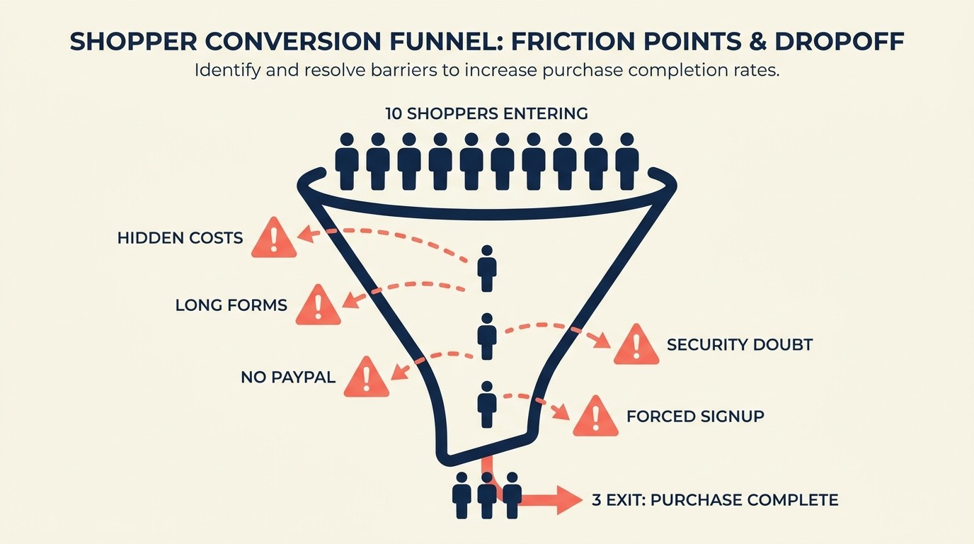
Understanding why customers abandon during checkout is the first step to fixing the problem. The friction points are consistent and measurable.
Unexpected costs are the number one checkout abandonment trigger. Customers add products to cart at one price, then hit shipping fees, taxes, handling charges, or other costs at checkout that weren't clearly communicated earlier. The final price exceeds expectations, creating instant hesitation and often abandonment. A clear shipping strategy and pricing approach helps prevent these surprises.
The psychology is straightforward: customers make buying decisions based on expected total cost. When checkout reveals significantly higher totals than anticipated, it feels like a bait-and-switch even when all charges are legitimate. The trust damage often outweighs the desire for the product.
Checkout complexity and form friction create abandonment through pure exhaustion. Long, complicated forms with excessive required fields transform what should be a simple transaction into a tedious data entry exercise. Each additional field increases cognitive load and provides another opportunity to reconsider the purchase.
Mobile users face compounded friction. Forms that are merely annoying on desktop become genuinely difficult on mobile devices with small screens and touch keyboards. The effort required to complete checkout exceeds the perceived value of the purchase.
Limited payment method options prevent conversions when customers encounter payment limitations. Requiring credit card payment eliminates customers who prefer PayPal, Apple Pay, or Buy Now Pay Later options. The rigid requirement forces customers to either share payment information they're uncomfortable providing or abandon entirely.
Security and trust concerns escalate during checkout when customers prepare to share sensitive financial information. Any element that creates doubt—missing security badges, unfamiliar payment processors, unclear privacy policies—can trigger abandonment. The higher the cart value, the more pronounced these concerns become. Implementing effective trust signals and social proof throughout checkout helps address these anxiety points.
Account creation requirements represent one of the most common and easily preventable friction sources. Forcing customers to create accounts before purchasing adds steps, requires remembering passwords, and creates perception of unnecessary commitment for what might be a one-time purchase.
The cumulative impact of these friction points is substantial. Each element individually might seem minor, but they compound. A customer who's annoyed by unexpected shipping costs, frustrated by excessive form fields, concerned about payment security, and forced to create an unwanted account will abandon. Remove these friction points systematically and conversion rates improve dramatically.
Checkout Flow Fundamentals
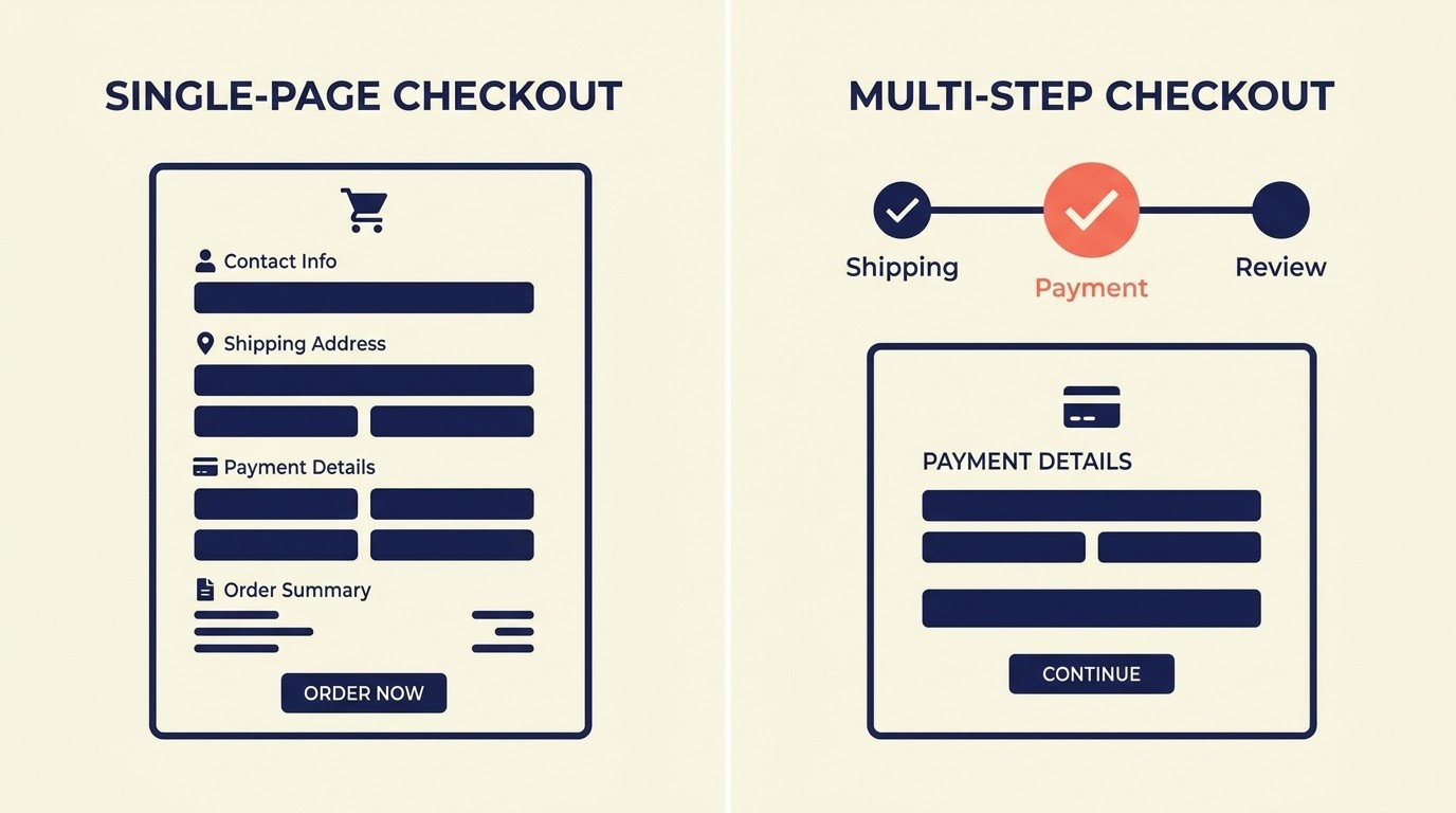
The structural design of checkout flow significantly impacts completion rates. Two primary approaches dominate: single-page checkout versus multi-step checkout.
Single-page checkout displays all checkout elements—shipping address, payment information, order review—on one page. This approach minimizes perceived effort (no additional pages to navigate), provides complete visibility into the process, and allows customers to see all information and edit any element without page transitions.
Single-page checkout works best for simple purchases with minimal customization. It particularly suits mobile users who find page transitions and back-navigation frustrating. The psychological benefit of seeing "everything on one screen" reduces perceived complexity.
The drawback: single-page layouts can appear overwhelming when they include extensive form fields. The visual density of a single page containing 20+ input fields intimidates some customers.
Multi-step checkout breaks the process into distinct stages—typically shipping information, payment details, and order review. Each step displays only relevant fields for that stage, creating visual simplicity and clear progress through a defined process.
Multi-step checkout works well for complex purchases requiring significant information (custom products, multiple shipping addresses, detailed customization). It provides psychological momentum through progress indicators showing movement through steps.
The drawback: additional page loads create more abandonment opportunities, particularly when load times are slow. Each transition gives customers a moment to reconsider or get distracted.
The optimal choice depends on your specific context. Test both approaches with your actual customers rather than assuming one superior to the other universally. Factors that influence which performs better include: average cart complexity, typical customer demographics, mobile vs. desktop traffic ratios, and page load speeds.
Number of steps and page load optimization directly correlate with abandonment rates. Each additional step or page load creates abandonment risk. Minimize steps without sacrificing clarity. Three-step checkout (shipping → payment → review) typically represents the minimum for multi-step approaches. Anything beyond four steps should be questioned.
Page load time matters enormously during checkout. A customer who's decided to buy will wait longer than a casual browser, but patience has limits. Target page load times under 2 seconds for checkout pages, as delays beyond this trigger measurable abandonment increases. Comprehensive site speed and performance optimization becomes especially critical during checkout.
Form field reduction strategies focus on minimizing required information to the absolute essential for order fulfillment. Every non-essential field removed improves completion rates.
Start by auditing current checkout forms. Question every field: Is this information truly required to process and deliver the order? Company name fields, secondary phone numbers, fax numbers—these commonly appear in checkout forms despite being unnecessary for most orders.
Smart defaults reduce effective field counts. Pre-filling country based on IP address, setting standard shipping as default, auto-selecting payment method based on detected card type—these techniques reduce active selections customers must make.
Form Optimization Best Practices

Form design dramatically affects checkout completion rates. Small changes in field structure, validation, and presentation create measurable conversion impacts.
Required versus optional field strategy requires discipline. Mark only genuinely essential fields as required. Make everything else optional. Display optional field labels clearly to set expectations.
Common over-requirement mistakes: requiring phone numbers when email provides sufficient contact capability, requiring secondary address lines that most customers leave blank anyway, requiring company names for consumer purchases.
Counter-intuitive finding: removing "optional" fields entirely often works better than marking them optional. If a field isn't worth requiring, it's usually not worth including. The visual clutter and decision fatigue from optional fields can exceed their value.
Smart field autofill and detection leverages browser capabilities and intelligent processing to reduce manual entry. Enable browser autofill for standard fields (name, address, email, phone). This allows returning customers and users with saved information to complete forms with minimal typing.
Address autocomplete integration with services like Google Places API provides fast, accurate address entry. Customers type partial addresses and select from suggestions rather than manually entering every address component. This reduces entry time, minimizes errors, and improves delivery accuracy.
Payment card detection automatically identifies card type (Visa, Mastercard, Amex) as customers type card numbers. This small feature provides visual confirmation that information is being recognized correctly, reducing anxiety about whether the payment will process.
Validation and error handling requires thoughtful implementation. Poor validation creates frustration and abandonment. Effective validation prevents errors while providing helpful guidance.
Real-time validation provides immediate feedback as customers complete fields. Email address format validation, password strength indicators, ZIP code format checks—these inline validations catch errors immediately when they're easiest to correct.
Error message quality matters as much as error detection. "Invalid input" provides no helpful information. "Email address must include @ symbol" explains exactly what's wrong and how to fix it. Clear, specific error messages reduce frustration and abandonment.
Validation timing affects user experience significantly. Validating while customers are still typing creates annoying interruptions. Validating after field completion (on blur) provides feedback without interrupting typing flow.
Progressive disclosure techniques reveal information and options gradually based on customer selections rather than displaying everything simultaneously. This reduces visual complexity and cognitive load.
Example: Don't display gift wrapping options, custom message fields, and delivery instructions until after the customer selects shipping method. These options aren't relevant until core information is provided.
Conditional fields appear only when relevant. If a customer selects "billing address different from shipping," then billing address fields appear. Otherwise, they remain hidden. This keeps forms visually simple while maintaining necessary flexibility.
Payment Options and Security
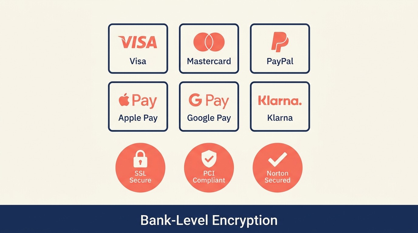
Payment flexibility significantly impacts conversion rates. Customers have strong payment method preferences, and inability to use preferred methods triggers abandonment. A comprehensive payment processing strategy ensures you offer the right mix of payment options.
Multiple payment method support addresses diverse customer preferences. Essential payment options for modern e-commerce include: major credit cards (Visa, Mastercard, American Express, Discover), debit cards, PayPal, digital wallets (Apple Pay, Google Pay), and increasingly, Buy Now Pay Later options (Affirm, Klarna, Afterpay).
Implementation strategy: Start with credit cards and PayPal as baseline. Add digital wallets next—these provide one-click checkout for customers with saved information. Consider BNPL for average order values above $50 where installment payment appeals to customers.
Display available payment methods clearly early in the checkout process. Customers shouldn't discover payment limitations only after completing shipping information. Show payment logos on cart pages and early in checkout to set expectations.
Apple Pay, Google Pay, and PayPal integration provides streamlined checkout for customers with saved payment information. These services store customer shipping and payment details, enabling one-click purchasing that bypasses traditional form completion.
The conversion impact is substantial. Customers using express checkout options convert at significantly higher rates than those completing traditional forms. The reduced friction and saved time create measurably better experiences.
Implementation requires technical integration with payment processors that support these methods. Most modern e-commerce platforms (Shopify, WooCommerce, BigCommerce) include built-in support. Enable these options prominently—dedicated express checkout buttons should appear at the top of checkout flows, not buried in payment method selections.
Buy Now Pay Later (BNPL) options appeal to customers who prefer spreading payments across installments rather than paying full amounts upfront. This particularly impacts higher-value purchases where $200 paid immediately feels more significant than 4 payments of $50.
BNPL services (Klarna, Affirm, Afterpay) handle credit checks, payment collection, and default risk. You receive full payment upfront while customers pay the BNPL provider over time. The cost is BNPL service fees (typically 2-6% of transaction value) and potential lower average order values if customers optimize purchases to installment thresholds.
Strategic implementation: Display BNPL payment amounts on product pages ("or 4 interest-free payments of $49.75"). This converts the abstract consideration of whether installments are available into concrete visualization of affordable payments.
Trust badges and security signals address the heightened security concerns customers experience when entering payment information. Display security badges prominently on checkout pages, particularly near payment form fields.
Effective security signals include: SSL/HTTPS indicators, PCI compliance badges, recognized security service logos (Norton Secured, McAfee Secure), payment processor security logos. Position these directly adjacent to payment fields where customers actively consider security.
Generic "secure checkout" claims carry less weight than specific, recognizable security certifications. Customers recognize Norton and McAfee brands and transfer trust from these established security companies to your checkout process.
PCI compliance indicators demonstrate adherence to Payment Card Industry Data Security Standards. While customers may not understand technical PCI details, the message "PCI DSS Compliant" or "Bank-Level Security" communicates serious security commitment.
Include brief explanatory text when space allows: "Your payment information is encrypted and secured according to banking industry standards." This translates technical compliance into customer-meaningful assurance.
Guest Checkout Strategy
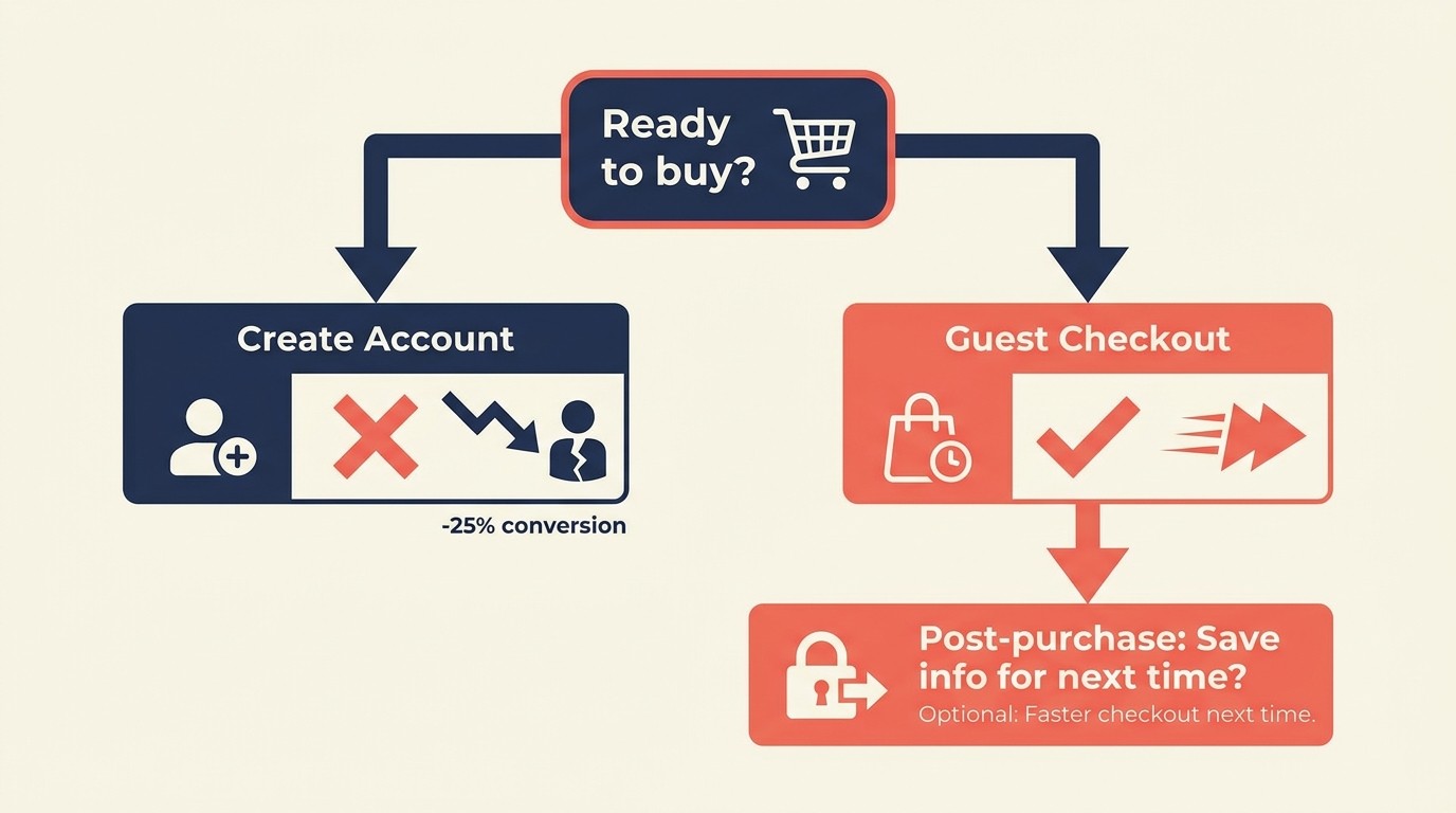
Account creation requirements represent one of the most debated checkout optimization elements. The strategic question: require accounts, encourage accounts, or default to guest checkout?
Guest versus account creation friction creates measurable conversion impact. Studies consistently show that forced account creation reduces checkout completion rates by 15-30%. The friction stems from multiple sources: additional form fields (username, password, password confirmation), concerns about unwanted marketing emails, resistance to "commitment" for potential one-time purchases.
The business case for accounts is legitimate: accounts enable order history access, faster repeat purchases, targeted marketing, and customer lifetime value optimization. But these benefits only materialize if customers complete initial purchases. Abandoned checkouts provide zero lifetime value.
Optimal implementation: default guest checkout with optional account benefits balances conversion optimization with account value. Allow guest checkout as the default path, requiring only information essential for order fulfillment (shipping address, payment, email for confirmation).
Display clear, non-intrusive messaging about account benefits: "Create an account for faster checkout next time," "Save this information for future purchases," or "Track your order easily with an account." Frame account creation as customer benefit rather than site requirement.
Optional account benefits communication requires specificity. Generic "create an account for benefits" messaging carries minimal persuasive power. Specific benefits resonate: "Save your information for 1-click checkout next time," "Get exclusive member discounts," "Track orders and view purchase history easily."
The key: communicate benefits without creating pressure or adding friction to the primary goal of completing the current purchase.
Post-purchase account setup represents an often-overlooked opportunity. Allow guest checkout, then offer account creation after successful purchase: "Your order is confirmed! Create an account now to track shipping and save your information for next time."
This timing leverages post-purchase satisfaction and makes account creation optional rather than required. Customers who just completed successful transactions are more receptive to account creation than those still evaluating whether to buy.
The implementation is technically straightforward: guest checkout captures email and creates a temporary account. Post-purchase flow offers password creation to convert the temporary account to full account. If customers decline, they received order confirmation but can't access account features.
Account recovery options address the common scenario where customers forget they have accounts and attempt guest checkout with previously-used email addresses. Smart systems detect this and offer streamlined sign-in: "Looks like you've shopped with us before! Sign in for faster checkout."
This recognition creates positive experience ("they remember me") while reducing friction through saved information rather than creating it through rigid requirements.
Progress Indicators and Clarity
Checkout transparency reduces anxiety and abandonment by clearly communicating where customers are in the process and what to expect.
Step indicators and progress bars provide visual roadmaps for multi-step checkout. Show all steps, highlight the current step, and indicate completed steps. This creates psychological momentum and reduces uncertainty about how many additional steps remain.
Effective progress indicators include step names (Shipping → Payment → Review) rather than just numbers (Step 1 → Step 2 → Step 3). Names provide context about what information each step requires.
Visual design considerations: Make progress indicators prominent but not intrusive. Position them at the top of checkout pages where they provide orientation without cluttering main content. Use clear visual distinctions between completed, current, and upcoming steps.
Order summary clarity ensures customers understand exactly what they're buying throughout checkout. Persistent order summaries should remain visible as customers complete checkout steps. This includes product images, names, quantities, prices, and totals.
Mobile implementation: Order summaries on mobile often collapse into expandable sections to save screen space. This is acceptable but include clear expandability indicators and ensure the summary opens easily when customers want to review.
Transparent cost breakdown addresses the number one abandonment trigger by clearly displaying all costs before final purchase commitment. Show subtotal, shipping, taxes, fees, discounts, and final total with clear labels for each line item.
The timing of cost revelation matters enormously. Hiding shipping costs until final checkout step feels deceptive even when technically disclosed before purchase. Show shipping costs as early as possible—ideally on cart pages before checkout begins.
For stores with variable shipping (based on address, shipping speed, or weight), display shipping costs immediately after address entry rather than waiting until final review. The earlier costs appear, the less they feel like surprise charges.
Shipping cost visibility upfront prevents the most common unexpected cost abandonment. If shipping is free, prominently display "FREE SHIPPING" early and often. If shipping has costs, show them clearly.
Strategic approaches for variable shipping: Display typical shipping cost ranges on product pages ("Shipping typically $5-$12"), offer shipping calculators before checkout, or default to common addresses for estimation purposes.
Mobile Checkout Optimization

Mobile traffic represents 60-70% of e-commerce visits but converts at lower rates than desktop, largely due to checkout friction that's more pronounced on small screens. Comprehensive mobile commerce optimization addresses these unique challenges.
Touch-friendly form inputs adapt to mobile interaction patterns. Standard form fields designed for mouse precision often frustrate touch users. Optimize for touch by increasing touch target sizes (minimum 44x44 pixels), adding adequate spacing between interactive elements, and using mobile-optimized input controls.
Dropdown menus that work fine on desktop become difficult on mobile. Consider alternative inputs like radio buttons or segmented controls for limited option sets (shipping method selection, for example).
Keyboard optimization leverages HTML5 input types to trigger appropriate mobile keyboards. Use type="email" for email addresses (displays @ and .com keys), type="tel" for phone numbers (displays numeric keypad), type="number" for numeric inputs (displays number keyboard).
These small technical optimizations significantly reduce typing friction. Entering email addresses with easy access to @ symbols and entering phone numbers on numeric keypads instead of full keyboards creates measurably better mobile experiences.
Mobile-specific payment methods like Apple Pay and Google Pay provide significant mobile conversion advantages. One-tap purchasing bypasses form completion entirely, reducing mobile checkout from potentially dozens of interactions to two or three.
Prominence matters: Display express checkout buttons above standard checkout forms. Make them visually distinct and obviously clickable. Test whether showing express options in cart pages before traditional checkout further improves conversion.
Single-hand usability acknowledges how most people hold and use phones. Position interactive elements (buttons, links, form fields) within easy thumb reach for one-handed operation. Avoid placing critical actions in top corners that require hand repositioning to access.
Testing approach: Complete checkout on actual mobile devices (not just desktop browser emulation) while standing, sitting, and holding the phone one-handed. If you struggle to complete checkout comfortably, customers will too.
Address and Shipping Optimization
Shipping information collection represents significant checkout friction. Optimization focuses on accuracy, ease, and clarity.
Address autocomplete dramatically reduces address entry friction. Integration with address validation services (Google Places API, SmartyStreets, Loqate) allows customers to type partial addresses and select from suggested completions. This reduces typing by 60-80% while improving address accuracy.
The accuracy improvement prevents failed deliveries from address errors, reducing customer service contacts and reshipping costs. The ROI from address validation often exceeds the service costs through saved shipping expenses alone.
Address validation catches errors before they cause delivery failures. Real-time validation checks for invalid ZIP codes, mismatched city/state combinations, and formatting errors. Alert customers to potential issues with clear messaging: "This ZIP code doesn't match the city you entered. Please verify your address."
Validation timing: After address entry completion but before advancement to payment. This allows correction while address information is top-of-mind.
Shipping method selection requires clarity about costs, timing, and service level differences. Display shipping options with clear names ("Standard Shipping," "Express 2-Day," "Next-Day"), costs, and delivery timeframes.
Be specific about timing: "Delivery by [actual date]" is clearer than "3-5 business days." Calculate actual delivery dates based on processing time and shipping speed, then display these to customers. "Arrives by Friday, June 23" creates clearer expectations than "Ships in 1-2 business days, arrives in 3-5 business days."
Delivery time transparency manages expectations and reduces post-purchase customer service contacts. Clearly communicate processing time (time before order ships) separate from shipping time (time in transit).
Many stores under-communicate processing time, leading to customer disappointment when orders don't ship immediately. If you need 2 business days to process orders before shipping, say so clearly: "Orders ship within 2 business days. Standard shipping delivers 3-5 business days after shipment."
This transparency prevents customer disappointment and associated negative reviews, returns, and service contacts that arise from unmet expectations.
Testing and Measurement
Checkout optimization requires systematic measurement and testing rather than guesswork. These principles align with broader conversion rate optimization strategies applied throughout your site.
Checkout funnel analytics track customer progression through checkout steps, identifying where abandonment occurs. Set up funnel tracking in Google Analytics or your analytics platform showing: cart page → checkout start → shipping information → payment information → order confirmation.
This visualization reveals exactly where customers drop off. If abandonment spikes at shipping information, focus optimization there. If payment information shows major drop-off, investigate payment friction.
Drop-off point identification requires granular analysis beyond broad step-level tracking. Within each checkout step, track interaction with specific elements: payment method selection, shipping method selection, form field completion, error message encounters.
This micro-level analysis often reveals specific friction sources. You might discover that customers who encounter validation errors abandon at 3x the rate of those who don't, indicating validation friction worth addressing.
A/B testing strategies systematically improve checkout through controlled experiments. Test variables include: single-page vs. multi-step checkout, field requirements, payment method displays, progress indicator designs, security badge placement, button copy variations.
Testing discipline: Test one variable at a time to isolate impact. Run tests to statistical significance (typically thousands of checkout sessions). Measure both checkout completion rate and downstream metrics (average order value, return rates) since some optimizations might improve conversion while encouraging lower-quality purchases.
Conversion rate benchmarks provide context for performance evaluation. Average e-commerce checkout conversion rates (customers who start checkout and complete purchase) range from 25-35%. Rates below 20% indicate significant friction. Rates above 40% suggest well-optimized checkout flows. Understanding e-commerce metrics and KPIs helps contextualize these benchmarks within your overall performance.
Industry and price point affect benchmarks significantly. Higher-value purchases typically show lower checkout conversion rates than lower-value purchases. Use industry-specific benchmarks when available rather than general e-commerce averages.
Common Checkout Mistakes
Understanding what not to do is as valuable as knowing what to do. Common checkout mistakes appear repeatedly across e-commerce sites despite causing measurable harm.
Unnecessary form fields plague checkout forms. Every field beyond absolute essentials reduces completion rates. Audit checkout forms ruthlessly: Is this information required to process and deliver the order? If not, remove it.
Common unnecessary fields: company name (for consumer purchases), fax numbers, secondary phone numbers, extra address lines (most addresses need only one), title/salutation fields (Mr./Mrs./Ms.), marketing preference checkboxes disguised as requirements.
Hidden costs create abandonment and damage brand trust. Surprising customers with unexpected fees at final checkout steps triggers immediate abandonment and creates negative brand perception that affects repeat purchase likelihood.
The solution: Show all costs as early as possible. If shipping costs vary based on address, calculate and display them immediately after address entry. If taxes vary by location, estimate based on IP-derived location or clearly state "plus applicable taxes" on all price displays.
Security concerns arise from inadequate trust signal display during checkout. Customers about to enter payment information need visible reassurance that the transaction is secure. Missing SSL indicators, absence of security badges, unfamiliar payment processors—these trigger abandonment.
Address security concerns proactively: Display recognized security badges, use clear HTTPS indicators, include brief security messaging ("Your information is encrypted and secure"), and feature recognized payment processor logos.
Complex navigation during checkout creates opportunities for distraction and abandonment. Simplified checkout layouts with minimal navigation, no promotional distractions, and clear progress toward completion outperform busy layouts with full site navigation.
Best practice: Use simplified headers during checkout that include only essential elements (company logo, cart icon, support contact). Remove main navigation, promotional banners, and other elements that provide exit opportunities or distractions.
Building Your Checkout Optimization Strategy
Checkout optimization delivers some of the highest ROI of any e-commerce improvement. You're optimizing conversion of customers who've already decided to buy—the highest-intent traffic your site receives.
Start with measurement: Implement comprehensive checkout funnel tracking. Identify where abandonment occurs and quantify the revenue impact. This data-driven approach focuses optimization efforts on highest-impact areas.
Address the fundamentals first: Reduce required form fields to absolute essentials, add guest checkout, display all costs early, implement address autocomplete, expand payment method options. These high-impact changes require minimal investment and deliver immediate results.
Then advance to sophisticated optimizations: A/B test checkout layouts, implement express checkout options, add BNPL payments, optimize for mobile-specific patterns, personalize checkout based on customer segments.
The stores that excel at checkout optimization don't just remove friction—they actively reduce anxiety, provide clarity, and create confidence throughout the final purchase steps. This systematic approach transforms checkout from a necessary transaction into a final positive experience that encourages completion and builds loyalty for future purchases.
Related Resources
Expand your e-commerce optimization knowledge with these complementary guides:
- AOV Optimization Strategy - Increase revenue per transaction through strategic upselling and bundling techniques
- Post-Purchase Email Sequences - Convert one-time buyers into repeat customers with strategic post-purchase communication
- Email Marketing for E-commerce - Build comprehensive email strategies that drive consistent revenue growth

Senior Operations & Growth Strategist
On this page
- The Checkout Friction Problem
- Checkout Flow Fundamentals
- Form Optimization Best Practices
- Payment Options and Security
- Guest Checkout Strategy
- Progress Indicators and Clarity
- Mobile Checkout Optimization
- Address and Shipping Optimization
- Testing and Measurement
- Common Checkout Mistakes
- Building Your Checkout Optimization Strategy
- Related Resources