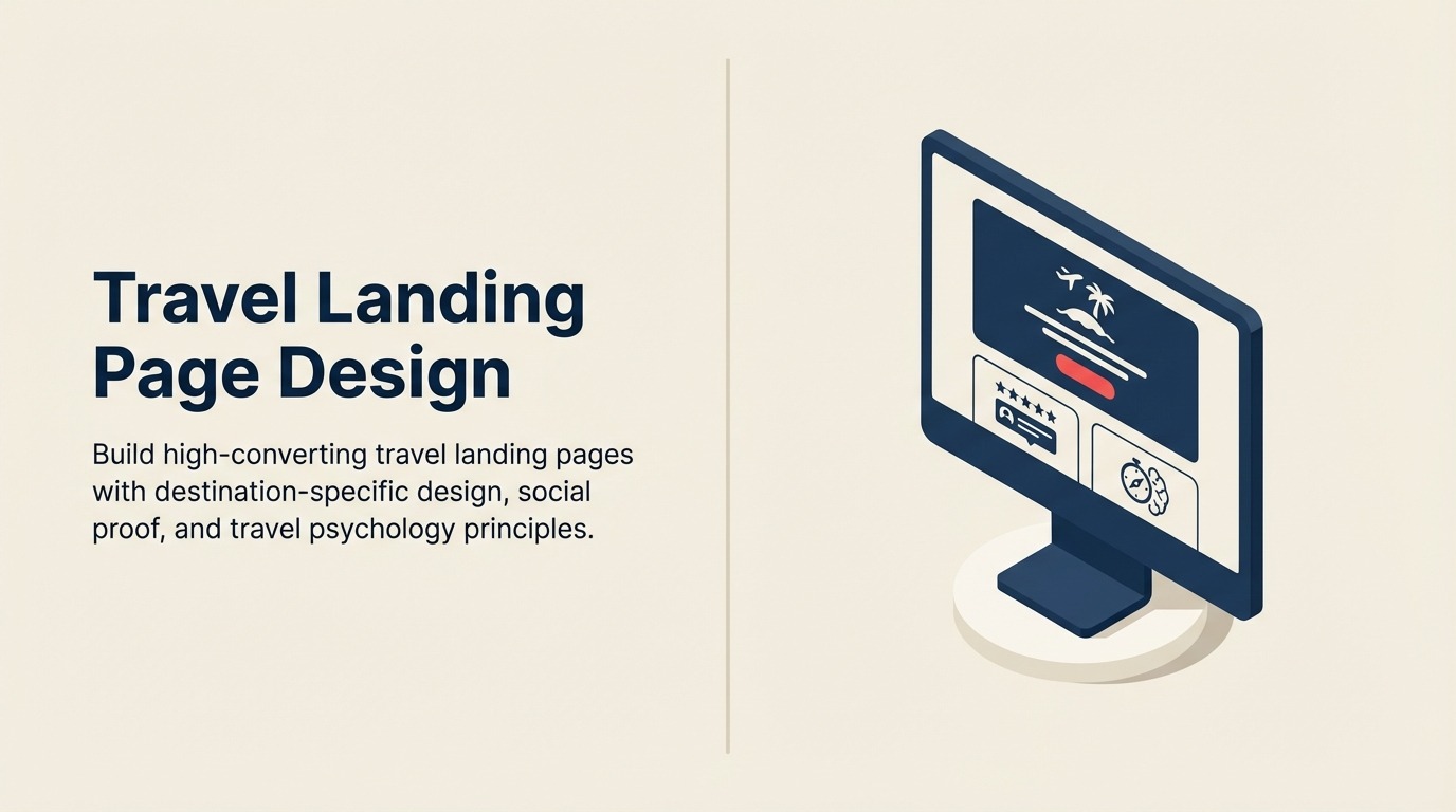
Travel Landing Page Design: High-Converting Campaign Destinations
Turn this article into takeaways for your work.
Each assistant summarizes the article only for you and suggests best practices for your work.
You're paying $4 per click to send travel paid advertising traffic to your homepage. Visitors land, see generic "Welcome to XYZ Travel" messaging unrelated to the Iceland tour ad they clicked, get confused, and bounce within 8 seconds. Your $4 bought nothing.
Landing pages solve this. Instead of sending all paid traffic to your homepage, create dedicated pages that match the exact promise of your ads. Someone clicks an ad for "Iceland Northern Lights Tours - Small Groups" and lands on a page about... Iceland Northern Lights Tours in small groups. Message match drives 40-60% higher website conversion than generic destination pages.
But message match is just the foundation. High-converting travel booking funnel landing pages leverage emotional triggers specific to travel psychology—aspiration, social proof, urgency, and trust-building—through visual storytelling that generic product pages can't match. A well-optimized landing page converts paid traffic at 8-15% compared to 2-4% for homepage traffic.
Landing Page Fundamentals
Five principles separate converting pages from wasted ad spend.
Message match principle means your ad promise and landing page headline should be nearly identical. Ad says "Affordable Peru Tours - $2,299 Including Machu Picchu"? Headline says "Affordable Peru Tours from $2,299 - Machu Picchu Included." This confirmation that they're in the right place reduces bounce rate by 30-40%. Break message match and people leave immediately.
Single travel sales process conversion goal focus eliminates distraction. Your landing page has one job: get visitors to book or inquire. Remove navigation menus, unrelated links, and multiple competing CTAs. Every element should guide toward the primary action. Multiple exit points leak conversions.
Distraction elimination means no homepage link, no "About Us" nav, no blog sidebar. Someone clicking a travel paid advertising ad is in shopping mode, not browsing mode. Keep them focused on the package until they convert or consciously choose to leave. Navigation creates easy exits that reduce conversion.
Visual hierarchy guides eyes through content in deliberate sequence. Headline first, hero image second, primary CTA third, supporting details fourth. Use travel content marketing size, color, and spacing to create this hierarchy. The most important elements (headline, CTA) should be impossible to miss.
Mobile booking optimization acknowledges 60%+ of paid traffic comes from phones. Design for mobile screens first, then enhance for desktop. Buttons sized for thumbs, minimal text entry, images optimized for small screens. If your landing page requires pinch-zooming or has tiny form fields, you're wasting mobile ad spend.
Travel Landing Page Types
Different campaigns need different page structures.
Destination-specific campaigns promote single locations. "Discover Iceland - 8-Day Northern Lights Adventure" with stunning Iceland imagery, Iceland itinerary details, Iceland social proof. These pages convert 12-18% because they match specific destination intent. Use for broad destination campaigns targeting "Iceland tours" searches.
Package and offer promotions highlight specific deals. "Early Bird Special: Save $500 on Japan Cherry Blossom Tours" with clear pricing, savings breakdown, deadline urgency. These convert 15-22% when targeting deal-seekers. Use for limited-time promotions and seasonal campaigns.
Seasonal and event-based pages capture timely demand. "New Year's Eve in Dubai Packages" or "Oktoberfest Munich Tours 2026" with event-specific content and urgency messaging. These convert exceptionally (18-25%) during short windows when demand peaks.
Retargeting and abandonment recovery pages speak to warm audiences. "Still Planning Your Peru Trip? Here's What You Were Looking At" with personalized package reminders. These convert 20-30% because they're reaching people who already showed strong interest.
Lead generation and inquiry pages trade information for contact details. "Download Free Iceland Travel Guide" or "Get Custom Peru Itinerary Quote." These convert 25-40% to leads (not bookings) and work when your sales cycle requires consultation.
Above-the-Fold Elements
The first screen determines whether visitors stay or bounce.
Hero image selection should trigger emotional response. Not generic stock photos—authentic images showing real moments of wonder, joy, or adventure. Someone watching Northern Lights in awe. A family laughing during a cooking class. An adventurer summiting a peak at sunrise. Emotion sells travel.
Headline formula combines destination, benefit, and urgency. "Experience Iceland's Northern Lights - Small-Group Tours with Expert Guides - Limited 2026 Departures." Destination (Iceland/Northern Lights), benefit (small groups, expert guides), urgency (limited departures). Test variations but include all three elements.
Subheadline supporting detail expands on the headline promise. "8-day cultural immersion including Reykjavik, Golden Circle, glacier hiking, and 3 Northern Lights viewing opportunities. Max 12 travelers per group." This provides specifics that confirm the headline promise.
Primary CTA placement should be prominent and early. "Check Availability" or "See Dates & Pricing" button in contrasting color, large enough to be unmissable. Place it both at top (immediate access for ready buyers) and after key sections (for those who need more information first).
Trust signals build credibility immediately. Display review rating, number of trips completed, certifications, and award badges above the fold. "4.9/5 from 847 travelers" with TripAdvisor logo provides instant social proof. Don't hide these—feature them prominently.
Body Content Structure
After the hero section, structure content to build desire and overcome objections.
Package overview and highlights summarize what makes this trip special. Use bullet points with benefit-oriented language: "Hike on a 1,000-year-old glacier with certified guide," "Stay in authentic guesthouses, not tourist hotels," "Included meals feature local Icelandic cuisine." Benefits, not features.
Itinerary teaser shows day-by-day highlights without overwhelming detail. "Day 1: Arrival in Reykjavik and welcome dinner. Day 2: Golden Circle including Geysir and Gullfoss waterfall." Expandable sections let detail-oriented people drill deeper without forcing everyone to scroll through 8 days of minute-by-minute schedules.
What's included/excluded prevents surprise later. Clear lists with icons: green checkmarks for inclusions (accommodations, meals, activities, guides), red Xs for exclusions (international flights, alcohol, tips). Transparency builds trust and reduces checkout abandonment.
Pricing and value proposition should emphasize value, not just cost. "$2,899 per person includes 8 days, all accommodations, 16 meals, guided activities, and ground transportation. Similar tours cost $3,500-4,200." Anchoring against higher prices increases perceived value.
Social proof section features 3-4 detailed testimonials with photos and names. Video testimonials are 3x more persuasive than text. "This Iceland trip exceeded our expectations. Our guide Erik was phenomenal..." - Sarah & Mike Thompson, Toronto. Specificity and authenticity matter more than generic praise.
FAQ anticipation addresses common objections before they become barriers. "What's the cancellation policy?" "What fitness level is required?" "Are solo travelers welcome?" Proactively answer questions that prevent people from booking.
Visual Storytelling
Travel is visual. Your page must showcase experiences, not describe them.
Image selection principles prioritize authenticity over perfection. Real customer photos showing genuine moments outperform professional stock photography by 30-40% in engagement. People trust slightly grainy authentic photos more than overly polished marketing shots.
Video integration dramatically increases conversion. A 90-second tour highlight video showcasing the experience increases booking rates 50-80%. Auto-play muted video as hero element captures attention. Testimonial videos build trust. Destination footage creates desire.
Gallery versus carousel comes down to engagement depth. Galleries showing all images at once let users scan quickly but don't guide attention. Carousels control narrative by sequencing images but require interaction. Test both—carousels often perform better on mobile, galleries on desktop.
User-generated content leverages customer creativity. When past travelers share amazing photos from their trips, ask permission to feature them. "Photo by Sarah M. on our July 2025 Iceland tour" feels more authentic than anonymous marketing imagery. Build a library of customer photos and rotate featured content.
Destination mood creation through color, typography, and imagery should match the travel experience. Luxury tours use elegant, sophisticated design. Adventure tours use bold, energetic layouts. Cultural immersion uses authentic, local-inspired aesthetics. Your design should feel like the destination.
Social Proof and Trust
Travel requires high trust. Your page must radiate credibility.
Customer review placement should be early and prominent. Aggregate score above the fold ("4.8/5 from 1,200+ travelers"), detailed reviews mid-page, and trust-building review highlights throughout. Don't save social proof for the bottom—feature it where objections arise.
Testimonial selection should be specific and relatable. Generic "great trip!" testimonials don't persuade. "We were worried about traveling with teenagers, but the itinerary kept them engaged without feeling rushed. Our guide adapted activities to our family's interests." This speaks to specific concerns and demographics.
Trust badge positioning matters. Security badges and payment icons belong near booking engine optimization CTAs. Industry certifications and memberships go in footer. "As seen in" media logos work in hero section or sidebar. Match badge placement to purpose—security near payment, authority near headline.
Expert endorsements from recognized travel bloggers, photographers, or authors who've toured with you provide third-party validation. "This was the best-organized tour I've experienced in 15 years of customer retention travel journalism." - Jane Smith, Travel + Leisure. Expert credibility transfers to your brand.
Media mentions leverage PR. If National Geographic, CNN Travel, or major publications featured you, show it. "Featured in National Geographic's 2025 Best Adventure Tours" signals trust-building authority that self-promotion can't match.
Call-to-Action Optimization
Every visitor should know exactly what to do next.
Primary CTA copy formulas focus on benefit or next step, not generic commands. "See Dates & Pricing" outperforms "Learn More" by 35%. "Book Your Iceland Adventure" beats "Submit" by 40%. Test variations: "Check Availability," "Reserve Your Spot," "Get Your Free Quote."
Button color and size testing reveals audience preferences. Orange and green buttons typically outperform blue and gray in travel, but test for your audience. Minimum button size on mobile should be 44x44 pixels for easy tapping. Desktop buttons should be prominent without overwhelming other content.
Multiple CTA placement strategy repeats primary action throughout the page. One above fold, one after itinerary, one after testimonials, one at bottom. Visitors scroll at different depths—meet them with CTAs wherever they're ready to convert.
Urgency and scarcity messaging creates deadline pressure when truthful. "Only 4 spots remaining for June departure" or "Early bird pricing ends March 15" drives action. But manufactured scarcity damages trust when discovered. Use real deadlines and real capacity limits.
Low-commitment alternatives offer escape valves for hesitant visitors. Not everyone's ready to book immediately. "Not ready to book? Download our free Iceland planning guide" captures email addresses for nurture campaigns. "Talk to our Iceland specialist" offers human connection for complex questions.
Form Design Best Practices
Lead generation forms need balance between information gathering and conversion optimization.
Field minimization is the highest-leverage improvement. Every field you require reduces conversion 5-8%. For booking forms, collect only information needed to confirm: name, email, phone, payment. Collect passport numbers and emergency contacts post-booking. For lead gen forms, name and email are often sufficient.
Multi-step forms reduce perceived effort. Instead of one page with 15 fields, use three steps with 5 fields each. "Step 1 of 3: Travel Details" feels manageable. "Complete this form" with 15 fields feels overwhelming. Progress bars show advancement and reduce abandonment.
Inquiry versus booking forms serve different purposes. Booking forms need payment info and complete details. Inquiry forms need just enough to start conversation. Match form complexity to conversion goal—don't ask for full itinerary preferences when you just need contact info.
Lead magnet offers justify information requests. "Get our free Iceland packing list" feels valuable enough to trade an email address. "Subscribe to our newsletter" doesn't. Offer specific, immediate value in exchange for contact details.
Privacy and data protection messaging near forms reduces submission anxiety. "We'll never share your information" or "Your data is encrypted and secure" addresses concerns that prevent people from submitting. Small reassurance text increases form completion 8-12%.
Testing and Optimization
Landing pages require continuous improvement through systematic testing.
Headline testing priority makes sense because headlines have outsized impact. Test specific vs broad ("Iceland Northern Lights Tours" vs "Discover Iceland"), benefit-focused vs destination-focused, urgency vs non-urgency. Small headline changes can improve conversion 20-40%.
Image testing methodology compares emotional vs informational imagery. Does a stunning Northern Lights photo outperform a happy group photo? Test authentic customer photos against professional shots. Run tests for 2-4 weeks or until reaching 95% confidence with 100+ conversions per variation.
CTA testing strategies include button copy, color, size, and placement. Test one variable at a time. "Book Now" vs "See Availability," orange vs green buttons, above vs below fold placement. Document all results—learnings compound across campaigns.
Form length experimentation finds your audience's tolerance. Test 3-field forms against 6-field forms. Measure not just conversion rate but also lead quality—sometimes shorter forms convert better but generate lower-quality leads who don't book.
Statistical significance requirements prevent premature conclusions. Wait for 95% confidence and minimum 100 conversions per variation before declaring a winner. Travel's lower conversion rates mean tests run longer than e-commerce—be patient.
Conclusion
Generic pages waste ad spend. Dedicated landing pages matching ad promises and optimized for travel psychology convert 3-5x better while costing nothing extra. Every paid campaign deserves its own landing page—destination campaigns, seasonal promotions, retargeting efforts.
Start with message match and single conversion focus. Add authentic imagery and social proof. Simplify forms and amplify CTAs. Test headlines and images continuously. The compound improvements turn paid advertising from breakeven traffic generation into your most profitable customer acquisition channel.
Related Articles:
