Mobile Booking Optimization: Capture the 65% of Travel Research on Smartphones
Turn this article into takeaways for your work.
Each assistant summarizes the article only for you and suggests best practices for your work.
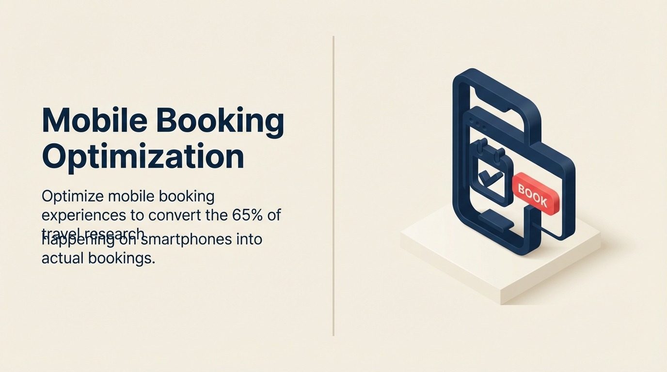
Sixty-five percent of travel lead generation research happens on smartphones. Only 35% of bookings complete on mobile. This gap represents millions in lost revenue—qualified traffic that researches on phones but switches to desktop to book because your website conversion mobile experience is too painful.
The excuse that "travel bookings are too complex for mobile" no longer holds. Airlines book 55% of tickets on mobile. Hotels book 48% of rooms on mobile. Tours and packages lag at 30-35% not because mobile can't work, but because most tour operator sites aren't optimized for mobile booking. Clunky interfaces, tiny form fields, and desktop-centric travel booking funnel flows force users to abandon.
Closing this gap doesn't require reinventing your booking engine optimization. It requires understanding mobile-specific behaviors and constraints, then optimizing for thumbs instead of mice, for vertical scrolling instead of multi-column layouts, and for simplified travel checkout optimization flows instead of comprehensive forms.
Mobile Travel Behavior
Mobile users behave differently than desktop users.
Research versus booking gap shows that people love browsing trips on phones during commutes, lunch breaks, and evenings on the couch. But when it's time to enter payment information and commit $3,000, they switch to desktop where they feel more confident and less rushed. Your job is to make mobile travel sales process booking feel as secure and effortless as desktop.
Device switching patterns reveal multi-device journeys. Forty percent of bookings involve 3+ devices: initial research on phone, deeper comparison on tablet, final booking on desktop. Enable this by syncing sessions across devices—someone who built an itinerary on mobile should find it waiting on desktop via customer data management account login or email link.
Session length differences mean mobile sessions average 2-3 minutes versus 8-12 minutes on desktop. Mobile users are distracted, interrupted, and browsing in stolen moments. Your mobile experience must communicate value quickly and enable progressive booking—save progress and abandonment recovery resume later rather than forcing completion in one session.
Booking value comparison shows mobile bookings average 12% lower value than desktop. Partly this reflects last-minute bookings (often mobile). But it also suggests friction prevents high-value bookings on mobile. Someone planning a $12,000 African safari feels the stakes are too high for phone booking. Reduce that friction through trust-building trust signals and security emphasis.
Use case scenarios differ by device. Last-minute bookings (hotel tonight, flight this week) happen disproportionately on mobile. Business travel bookings often mobile. But leisure planning for trips 6+ months out skews desktop. Understand which scenarios your mobile traffic represents and optimize accordingly.
Mobile-First Design Principles
Design for thumbs, not cursors.
Thumb zone optimization recognizes that people use phones one-handed. The bottom third of screen is easiest to reach with thumb while holding phone. Place primary navigation and CTA buttons in thumb-friendly zones. Avoid forcing users to stretch to top corners to tap critical elements.
Touch target sizing must accommodate imprecise finger taps. Minimum button size is 44x44 pixels per Apple guidelines, 48x48 pixels per Google. Smaller targets lead to mis-taps, frustration, and abandonment. Space buttons apart so users don't accidentally tap adjacent elements.
One-handed navigation assumes users browse while commuting, eating, or multitasking. Hamburger menus work well on mobile despite desktop designers hating them. Bottom navigation bars keep controls accessible. Avoid interactions requiring two hands or phone placement on a flat surface.
Simplified navigation hierarchy collapses desktop's multi-level menus into streamlined mobile flows. Desktop might show Tours > Destinations > Iceland > Northern Lights Tours. Mobile should jump directly to search or featured tours with minimal hierarchy. Every menu level adds friction.
Progressive disclosure shows essential information first, detailed content on demand. Instead of displaying full day-by-day itinerary immediately (requiring endless scrolling), show overview with "Expand for full itinerary" option. Let users control information depth.
Mobile Search Experience
Search is entry point. Make it effortless.
Streamlined search interface asks for minimal initial input. Desktop can accommodate complex search forms. Mobile should start with destination and dates—optionally guest count. Make everything else filterable after showing initial results. Don't force five selections before showing anything.
Smart defaults and memory reduce typing. If returning visitor previously searched Iceland, default to Iceland. If they selected "2 adults" last time, default to that. Remember recent searches and offer one-tap repeat. Auto-complete destination names so users type 3 letters and select rather than typing fully.
Voice search integration leverages mobile strength. "Search for Alaska tours in July for 2 people" is faster spoken than typed on small keyboard. Implement voice input for search fields. Accuracy has improved to where this is reliable and useful.
Location-based suggestions use phone GPS to offer relevant options. If someone in Miami searches "beach vacation," suggest Caribbean and Mexico. If someone in Seattle searches same, suggest Hawaii and California. Geolocation makes suggestions contextually relevant.
Calendar and date picker optimization for touch interaction beats tiny desktop-style calendars. Large, tappable dates. Swipe between months. Visual highlighting of available versus sold-out dates. Pre-select popular date ranges (7 days, 10 days, 14 days) so users can choose rather than manually select start and end dates.
Package Browsing and Selection
Help mobile users evaluate options despite screen constraints.
Card-based layouts work naturally on mobile. Each tour package is a vertical card users scroll through. Swipe horizontally to see package images. Tap to expand details. Cards stack vertically for infinite scrolling that feels native to mobile browsing.
Swipe interactions feel intuitive on touch screens. Swipe through photo galleries. Swipe cards left to dismiss, right to favorite. Swipe to compare two packages side-by-side. These gestures are effortless on phones but impossible with mouse and keyboard.
Image optimization balances quality with loading speed. Serve images sized for mobile screens (750-1000px wide maximum), compressed aggressively, in next-gen formats (WebP, AVIF). Lazy load images below fold. A 3MB hero image that looks fine on desktop kills mobile experience with 8-second load time.
Content prioritization surfaces essential info first. On desktop you might show destination, duration, price, highlights, full itinerary, reviews, and FAQs all above fold across multi-column layout. Mobile must prioritize: destination image, price, key highlights, "Book Now" button. Hide secondary content in expandable sections.
Comparison functionality helps users evaluate options without juggling multiple browser tabs. "Compare" button on tour cards lets users select 2-3 packages, then view them side-by-side in a mobile-optimized comparison view showing key differentiators. This keeps users on your site rather than switching to competitor tabs.
Mobile Booking Flow
Minimize steps and typing to reduce abandonment.
Step reduction strategies collapse multi-page desktop flows into essential mobile screens. Desktop booking might be: 1) Select dates, 2) Choose room type, 3) Add activities, 4) Traveler info, 5) Payment. Mobile should be: 1) Confirm dates and travelers, 2) Traveler info and payment combined. Fewer pages mean fewer abandonment opportunities.
Guest information shortcuts reduce typing pain. Offer Google, Facebook, or Apple login to auto-fill name and email. Accept Apple Pay or Google Pay to auto-fill payment and billing info. Provide keyboard type optimization—email keyboard for email fields, numeric keyboard for phone numbers. These small optimizations significantly reduce friction.
Saved traveler profiles for repeat customers eliminate re-entering information. "Book again as John Smith" pre-fills all fields from last booking. One-tap checkout for returning customers. This creates loyalty incentive—booking again is dramatically easier than switching to competitor requiring full re-entry.
Payment method simplification prioritizes mobile wallets. Apple Pay and Google Pay convert 3x better on mobile than manual card entry. They're faster, more secure, and trusted. Position digital wallet options prominently above manual card entry fields.
Autofill and validation prevent errors without requiring users to fix them. Validate email addresses in real-time ("Did you mean gmail.com instead of gmial.com?"). Autofill city and state from zip code. Check that credit card number is valid format before submission. Catch errors immediately rather than forcing users to resubmit entire form.
Performance Optimization
Slow mobile sites bleed conversions invisibly.
Page load speed targets should be under 3 seconds on 4G mobile networks. Desktop sites might hit 2 seconds on broadband. Mobile on cellular data needs aggressive optimization. Every second beyond 3 seconds drops mobile conversion 15%. Five-second load times lose half your mobile traffic.
Image lazy loading defers loading images below the fold until users scroll to them. Your package page might have 25 images total but only 3 visible initially. Load those 3 immediately, lazy load the other 22. This cuts initial page weight by 70-80%, dramatically improving load time.
Caching strategies store static assets locally on user's device. First page load might take 3 seconds. Subsequent loads take under 1 second because images, CSS, and JavaScript are cached. Implement aggressive caching for unchanged assets to speed up return visits.
Progressive web app considerations give mobile web app-like features without installation friction. Add to homescreen capability, offline content access, push notifications. PWAs combine web's discoverability with app's user experience. For most tour operators, investing in excellent PWA outperforms native app development.
Offline capability lets users browse previously loaded content without connection. If someone viewed 5 tour packages, those remain accessible offline. When connection returns, enable booking. This accommodates spotty cellular service during commutes or travel.
Mobile Payment Experience
Payment is where mobile bookings die.
Digital wallet integration (Apple Pay, Google Pay) should be default option. Position these prominently at top of payment section. One-tap payment with biometric authentication (Face ID, fingerprint) converts dramatically better than typing 16-digit card numbers on tiny keyboards.
Card scanning technology uses phone camera to capture card details rather than manual entry. "Scan card" button opens camera, reads card number and expiration automatically. This feels futuristic and reduces error rates to near zero. Stripe, Braintree, and other processors offer built-in card scanning.
Installment plan mobile flows work if simplified. Desktop might show detailed payment calculator. Mobile should show: "Pay in full ($3,500) or 4 monthly payments ($875)." Toggle between options without complex interfaces. Make installment selection dead simple—monthly payments attract mobile users who are cost-conscious.
Security and trust on small screens requires prominent reassurance. "Secure checkout" messaging near payment fields. Display payment processor logos (Visa, Mastercard, PayPal) prominently. Show padlock icon and "Your information is encrypted" text. Mobile users worry about security more than desktop users—over-communicate protection.
Cross-Device Experience
Enable seamless transitions between devices.
Session continuity means someone who built an itinerary on mobile can resume on desktop. Save incomplete bookings to account (if logged in) or send email link (if not logged in). "Continue on another device" button emails them a link to resume exactly where they left off.
Cart synchronization across devices requires account login. Someone browsing on mobile during lunch can review the same selections on desktop at home. This requires account system, but dramatically improves convenience and conversion for users who prefer researching mobile, booking desktop.
Email handoff to desktop provides escape valve. Prominent "Email me this itinerary" button on mobile sends package details, pricing, and booking link to their email. They can review comprehensively on desktop later without losing information gathered on mobile.
App versus mobile web decision for tour operators typically favors mobile web. Apps require installation friction, app store approval, ongoing maintenance across iOS and Android, and discovery challenges. Excellent mobile web with PWA capabilities serves 95% of use cases without app complexity. Reserve native apps for very high-transaction-volume businesses.
Mobile-Specific Features
Leverage unique mobile capabilities.
Click-to-call priority for mobile users who prefer speaking to typing. Prominent phone number displayed as tappable link throughout site. "Questions? Call us now" button on package pages. Many mobile users researching complex travel inquiry management trips prefer calling—make it effortless.
WhatsApp inquiry option especially for international markets. Europeans, Asians, and Latin Americans expect WhatsApp as contact method. "Chat on WhatsApp" button opens WhatsApp with pre-filled message. This works better than forms for mobile users who want quick customer retention back-and-forth.
Location-based offers use GPS to serve relevant promotions. Someone browsing from New York sees "NYC Departure Dates" prominently. Someone in London sees GBP pricing and UK departure cities. Location awareness makes travel content marketing experiences contextually relevant.
Camera for document upload simplifies data collection. Instead of typing passport numbers, let users photograph their passport. OCR extracts relevant details automatically. For pre-trip document collection, camera upload is dramatically easier than manual entry on small keyboards.
Push notifications for travel pricing strategy price drops keep mobile users engaged. Someone who favorited but didn't book Iceland tour receives notification when price drops or limited-time promotion launches. This requires PWA or native app but drives significant re-engagement and conversion.
Conclusion
Mobile isn't a secondary channel anymore. It's where most travel research happens and where an increasing share of bookings will complete—if you make it effortless. The 65% research to 35% booking gap isn't inherent to mobile. It's the result of desktop-centric design forcing users to switch devices.
Optimize for thumbs, simplify flows, reduce typing, emphasize digital wallets, and communicate security relentlessly. Test on actual phones (not just desktop browser resized), measure mobile-specific conversion rates, and obsess over mobile page speed. These investments close the device gap and capture bookings currently lost to friction.
The operators winning mobile aren't building separate mobile sites or native apps. They're building mobile-first experiences that happen to also work brilliantly on desktop. Start mobile, enhance for desktop. That's the future.
Related Articles: