Lead and Rep Performance Dashboards for D2D Home Services Teams
Turn this article into takeaways for your work.


Each assistant summarizes the article only for you and suggests best practices for your work.
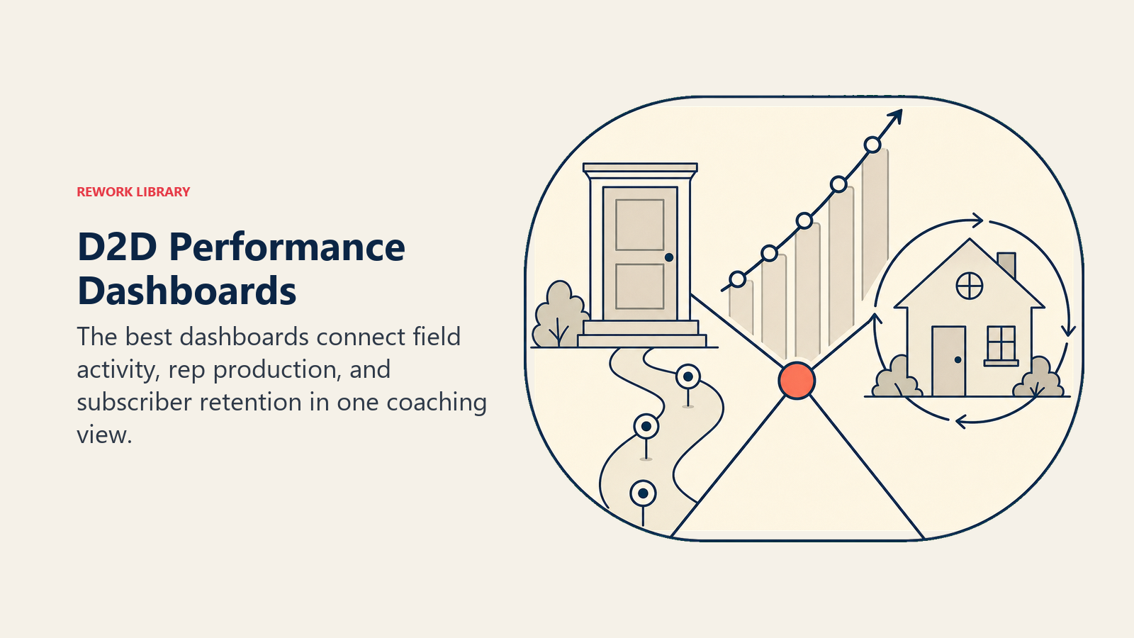
Most D2D sales managers spend their evenings staring at spreadsheets. They're trying to figure out who's actually producing and who's padding their knock counts. It doesn't have to work that way. A well-built performance dashboard shows you, in real time, everything you need to coach your team, reallocate territory, and project where the month is headed.
The difference between a dashboard that gets used and one that collects dust is specificity. Dashboards built for generic sales teams show pipeline stage and deal value. D2D home services dashboards need to show door-level activity, subscription close rates, and subscriber health. Those are different data points requiring different design choices. Harvard Business Review's research on finding the right metrics for your sales team makes the core case: managers inundated with dozens of metrics lose sight of what actually drives sales, while the highest-performing teams pick a short list of leading indicators and act on them daily.
What Does a D2D Performance Dashboard Actually Need to Show?
Generic sales dashboards optimize for pipeline visibility: how many deals are in each stage, what's the projected close value, who needs follow-up. That logic applies fine to enterprise software deals that take months to close.
D2D subscription sales close the same day or not at all. The pipeline is measured in doors knocked, not in deal stages. And the revenue story doesn't end at the signature. It extends through the subscriber lifecycle, because a closed deal that cancels in 60 days is actually a cost, not revenue.
A real D2D performance dashboard has three distinct layers:
Layer 1: Daily field activity. What is each rep doing right now? How many doors knocked today? What's their close rate against their personal average? Are they in the territory they were assigned?
Layer 2: Weekly and monthly production. Which reps are trending toward quota? Who's ahead, who's behind, and by how much? Which territories are producing and which are underperforming?
Layer 3: Subscriber pipeline. Of everyone who signed up in the last 30, 60, and 90 days, how many are still active? Which reps have high early-cancellation rates suggesting they're overselling or qualifying poorly?
The third layer is the one most D2D operations skip, and it's often the most important. A rep who closes 8 agreements a week but loses 4 of them in the first 60 days is less valuable than a rep who closes 5 and keeps all 5. Without subscriber retention data by rep, you can't see this.
Key Facts
- 84% of sales leaders agree that analytics has had less influence on performance than leadership expected, with poor data quality and too many disconnected metrics cited as the top barriers. (Gartner, February 2024, survey of 303 sales leaders)
- Low-turnover field sales teams adopt a CRM or integrated field platform at a rate of 78%, versus 54% of high-turnover teams, and are 2.4x more likely to operate on one to two integrated systems. (SPOTIO State of Field Sales 2026, survey of 452 sales professionals)
- Field sales reps spend just 44% of their time on active selling. The other 56% goes to administrative work, data entry, meetings, and preparation, which means every minute saved on manual reporting is a minute available for doors. (SPOTIO State of Field Sales 2026)
The Daily Activity Dashboard
Your daily activity view should update in near-real-time as reps log outcomes in your canvassing app. Here's what it should display:
Per-rep daily summary:
- Doors knocked (running total)
- Closes logged (count + plan type breakdown)
- Current close rate (closes / doors knocked)
- Last logged activity and timestamp
- Assigned territory vs. actual location flag
Team daily totals:
- Total doors knocked across all active reps
- Total closes with revenue projection
- Team close rate
- Pacing vs. daily target
Alerts:
- Rep inactive for 90+ minutes without logging activity
- Rep working outside assigned territory
- Close submitted with incomplete information
The inactive alert is particularly useful. In a 20-rep team, it's impossible to notice if one rep checked out at 2pm and nobody followed up. The alert creates an automated accountability loop without requiring a manager to monitor locations all day.
Most canvassing apps (SalesRabbit, Spotio, and similar tools) have a built-in daily activity view. The key is making sure your team actually uses it as the primary management tool during field hours, not just as a reporting tool at day's end.
The Weekly Performance View
Weekly performance tracking is where you identify coaching priorities and spot patterns that don't show up in single-day data. A rep can have a great Tuesday and a terrible Thursday. Over a week, the pattern becomes clearer.
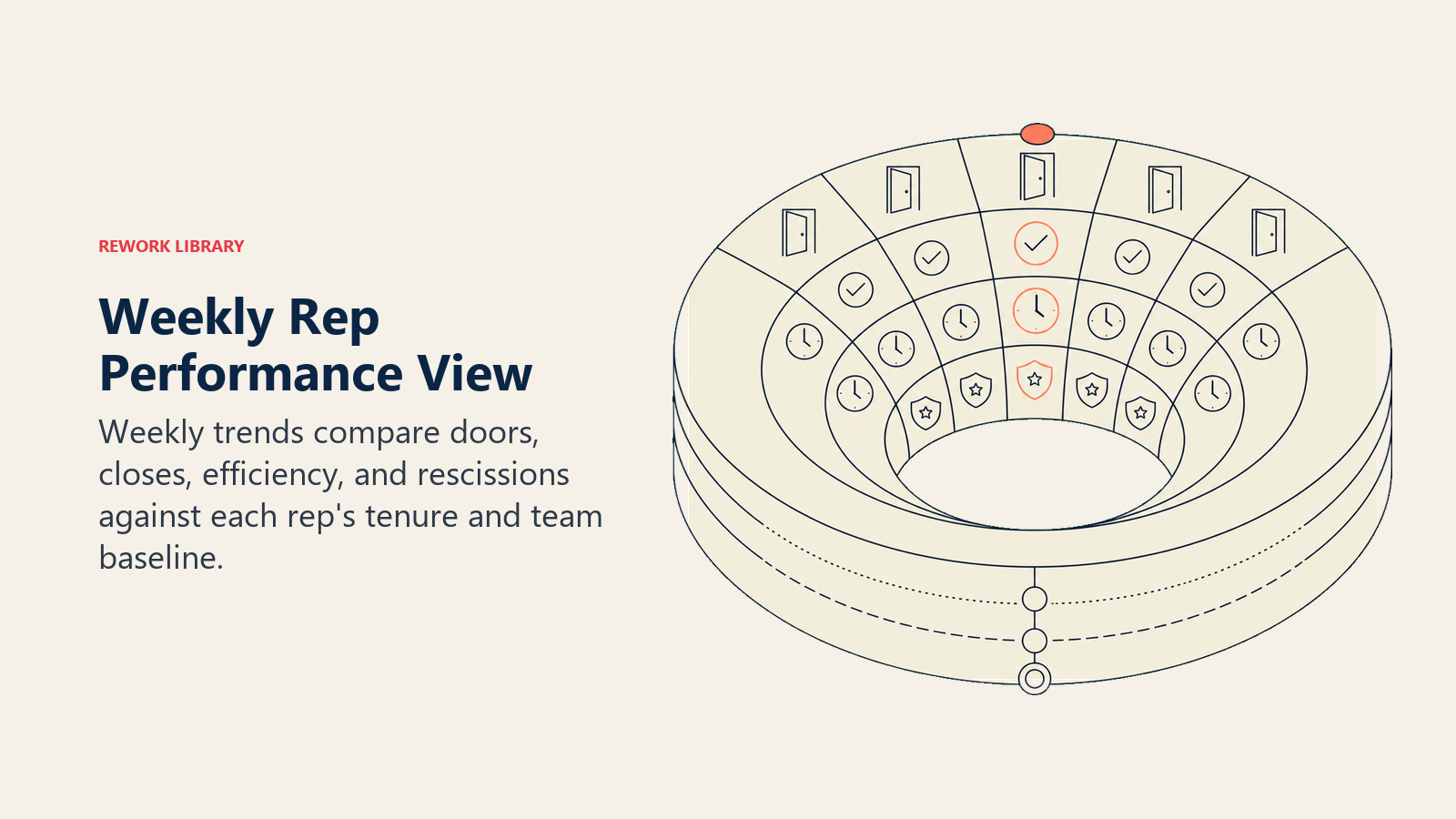
Your weekly view should show, per rep:
| Metric | What it tells you |
|---|---|
| Total doors knocked | Effort and work ethic |
| Total closes | Raw output |
| Close rate (%) | Skill and territory quality |
| Average closes per active hour | Efficiency |
| Rescissions this week | Overselling or qualification issues |
| Current week vs. last week vs. team average | Trend and comparative standing |
The "average closes per active hour" metric is underused but powerful. Two reps can knock the same number of doors in a week but work very different hours to do it. The rep working 6 hours a day and hitting 4 closes is outperforming the rep working 9 hours a day to hit the same number, even if raw close counts look equal.
Lay out weekly performance in a ranked leaderboard that reps can also see. Public visibility into rankings creates healthy competition and lets top performers feel recognized without requiring a manager to explicitly call everyone out.
Benchmark targets by vertical and rep tenure:
| Rep tenure | Doors/week | Target closes/week | Target close rate |
|---|---|---|---|
| Week 1-2 (new) | 200-250 | 3-5 | 1.5-2% |
| Month 1-3 | 250-300 | 6-10 | 2.5-3.5% |
| Month 3+ | 250-350 | 10-15 | 3.5-5% |
| Top performers | 200-300 | 15+ | 5%+ |
Note that top performers often knock fewer doors than average because they're spending more time on the doorstep when they get engagement, not rushing through a neighborhood to inflate their knock count. Close rate is a better leading indicator of skill than raw door volume.
For the connection between qualifying at the door and close rate, see qualifying at the door.
Building the Subscriber Pipeline Dashboard
This is the layer most D2D management teams are missing. Your subscriber pipeline dashboard tracks what happens to a closed deal over time, and it needs to be connected to your CRM or subscription management system, not just your canvassing app.
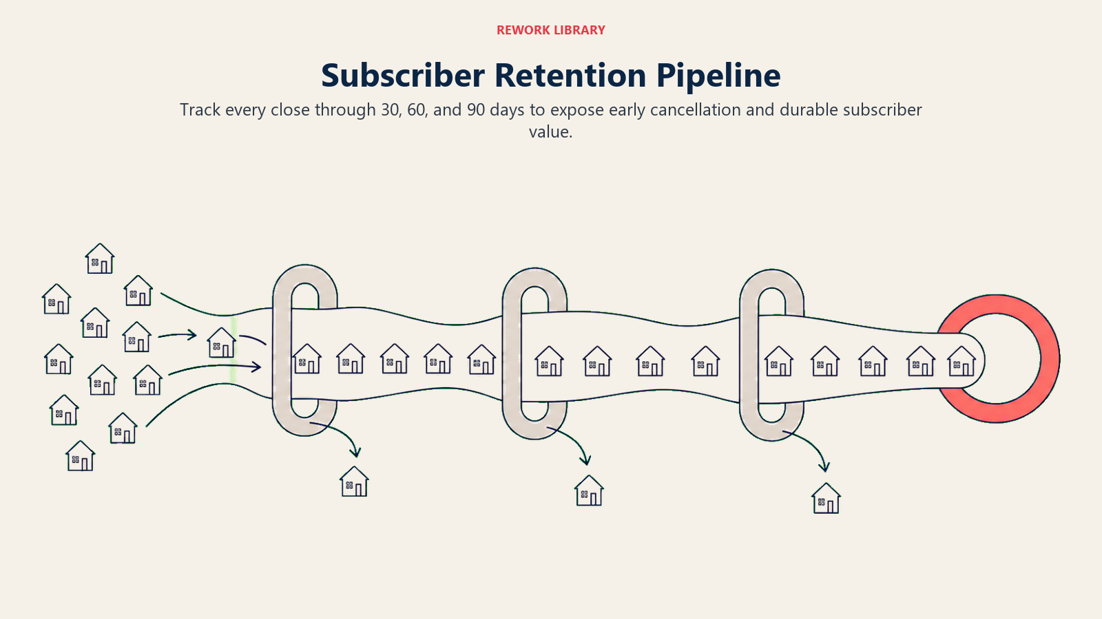
Key metrics for the subscriber pipeline view:
By rep, for the trailing 90 days:
- Total closes
- Agreements still active at day 30
- Agreements still active at day 60
- Agreements still active at day 90
- 90-day retention rate (agreements still active at 90 / total closes)
- Estimated lifetime value per close (based on average subscriber duration)
Team-wide cohort view:
- Monthly cohort retention curves (what % of each month's new subscribers are still active at each milestone)
- Early cancellation rate trend (is it improving or getting worse month over month?)
- Net new subscribers (closes minus cancellations for the period)
The cohort retention curve is the single most valuable visual in a D2D subscriber business. It shows you, for every class of new customers, how many are still paying at each point in their subscription. If your March cohort is showing 55% retention at 90 days and your April cohort is showing 78%, something changed. Maybe you changed your qualifying script. Maybe a new rep joined with strong retention instincts. Find the variable and replicate it.
For context on how to use subscriber pipeline data to predict and prevent churn, see churn prediction and save offers and the broader framework in retention fundamentals.
Rep-Level Performance Cards
Beyond aggregate dashboards, effective D2D management requires rep-level performance cards that tell the full story of each individual contributor. A rep card should include:
Current status: active in field, inactive today, in training, on leave.
Trailing 30-day production: closes, close rate, estimated earnings, rescissions.
Subscriber health: 90-day retention rate for their cohort of subscribers. This is the most important number for evaluating rep quality beyond raw production.
Territory history: which territories has this rep worked, and what were the results in each?
Coaching notes: a log of ride-along observations, script issues, and improvement areas. Visible to managers, not to the rep themselves.
Comparative ranking: where does this rep rank on close rate, volume, and retention rate within their tenure cohort?
The tenure cohort comparison matters because comparing a 2-week rep to a 2-year rep is meaningless. You want to know if a new rep is developing at the expected rate, not whether they've matched a veteran's output.
Rep performance cards are most useful when reviewed weekly in one-on-one coaching sessions. A manager who walks into a coaching conversation without the rep's performance card is guessing at what to discuss. The card structures the conversation around data and removes the subjectivity that makes coaching uncomfortable. For the full coaching rhythm, see coaching, ride-alongs, and D2D culture.
Manager-Level Accountability Dashboards
Your dashboards aren't only for tracking reps. Managers need to be accountable too, and the best D2D organizations run manager performance dashboards alongside rep dashboards.
A manager performance dashboard should include:
- Number of active reps in their team
- Team close rate vs. target
- Team 90-day subscriber retention rate
- Coaching sessions completed in the last 30 days
- Ride-alongs completed
- Average response time to rep field support requests
- Rep retention rate (how many of their reps are still active from 30, 60, 90 days ago)
The rep retention metric is particularly telling. A manager who churns through reps quickly is either hiring poorly, coaching poorly, or running their territory into the ground. That pattern shows up clearly in a manager dashboard and surfaces conversations that would otherwise only happen when a field manager loses their whole team mid-season.
The Three-Layer Dashboard Framework
The Activity-Production-Pipeline Stack: Effective D2D performance dashboards are not a single view. They are three stacked layers that answer three different questions at three different time horizons.
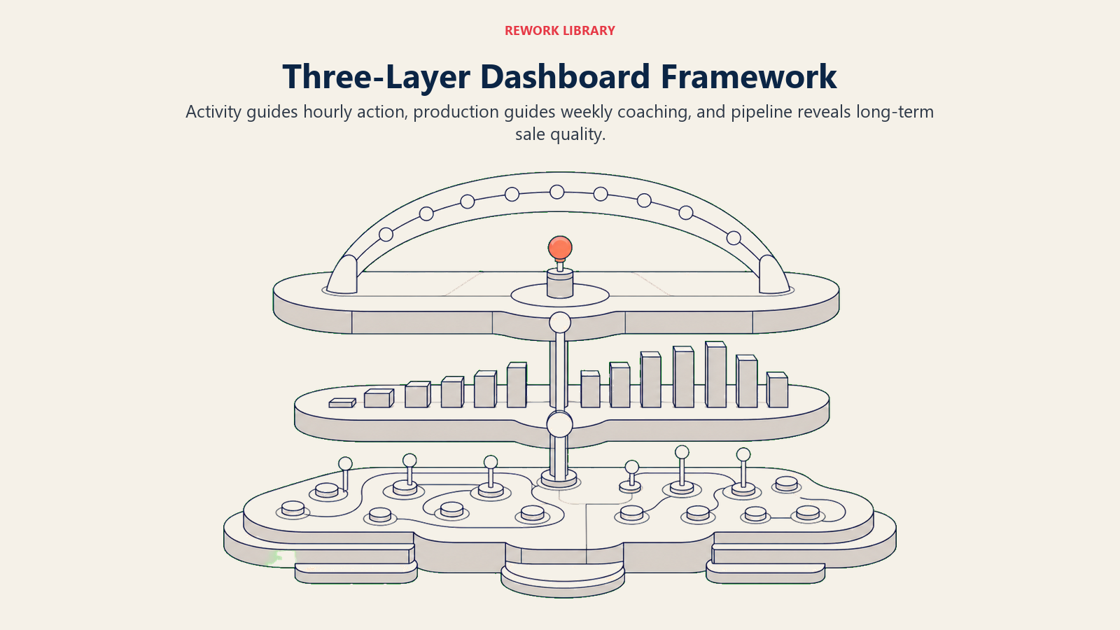
Layer 1 (Activity): What is happening right now? Doors knocked today, current close rate, last logged activity timestamp, rep location vs. assigned territory. Updates in real time. Built for decisions that need to happen within the hour.
Layer 2 (Production): What are the weekly and monthly patterns? Close rate trends, volume vs. quota pace, efficiency per active hour, rescission counts. Refreshes daily. Built for coaching conversations and territory reallocation decisions.
Layer 3 (Pipeline): What is the quality of what we sold? 30, 60, and 90-day cohort retention by rep, estimated lifetime value per close, early cancellation rate trend. Refreshes weekly. Built for the strategic questions: which reps are building a real subscriber base and which are generating churn?
Most D2D teams only use Layer 1 and Layer 2. The teams that build Layer 3 have a material advantage because they can see rep quality before it shows up in comp disputes or subscriber losses. The insight that a rep closing 8 agreements a week but losing 4 in 60 days is less valuable than a rep closing 5 and keeping all 5 only becomes visible at Layer 3.
Quotable Nuggets
"A rep dashboard that takes more than three seconds to read in the field is a dashboard nobody reads. Design for a sweaty phone between doors, not a monitor in a conference room." (Field operations principle documented in D2D platform UX guidelines and operator communities)
"Your manager retention metric tells you as much about the manager as it does about the reps. High manager churn is either a territory problem or a coaching problem. Either way, it shows up first in the dashboard before it shows up in your revenue." (Practitioner observation from D2D field operations communities)
"Dashboards that don't feed directly into territory assignments and coaching priorities are noise. The measure of a good dashboard isn't whether it gets reviewed; it's whether the week after a review looks different from the week before." (Operational principle from D2D field operations communities; aligned with HBR's argument that leading indicators must connect to real-time behavioral adjustment)
Dashboard Design: What to Show and What to Hide
Every dashboard design conversation eventually comes down to: how much information is too much? The answer in D2D is usually "less is more for reps, more is acceptable for managers." That matches the Gartner finding cited earlier: too many disconnected metrics is one of the top reasons analytics fails to change behavior. Fewer, cleaner data points win.
Rep-facing view should show:
- Today's doors and closes
- Their current rank on the team leaderboard
- Their earnings estimate for the week
- Any alerts (territory issue, submission error)
- Yesterday's performance summary
Keep the rep view to one screen. No scrolling. If a rep is in the field and needs to check their numbers, it should take 3 seconds and require no navigation.
Manager-facing view can include:
- Full team daily activity map
- Individual rep performance cards
- Territory heat maps showing close density
- Alert queue (inactive reps, territory conflicts, unusual close patterns)
- Weekly trend charts
Managers have context that reps don't, and they're usually looking at a dashboard from a tablet in a car or an office, not from a phone between doors. More data density is acceptable.
Integrating Dashboards Across Your Tech Stack
The practical challenge with D2D performance dashboards is that the data lives in multiple systems. Canvassing activity is in your canvassing app. Subscriber records and retention data are in your CRM or billing system. If you want a unified dashboard, you need to pull data from both.
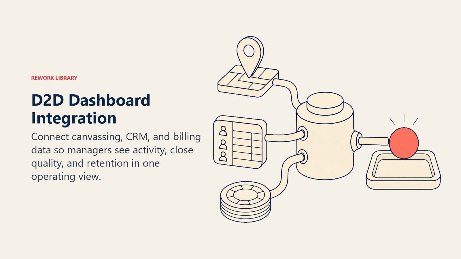
Options, roughly in order of complexity:
Option 1: Use the built-in reporting in your canvassing app and review CRM reports separately. Simple, zero cost, but requires managers to context-switch between tools. Acceptable for teams under 20 reps.
Option 2: Export both systems to a shared Google Sheet or Airtable base that auto-refreshes. Moderate complexity, free or low cost. The sheet becomes your unified view with some manual formula work. Works well for teams of 20-50.
Option 3: Build a connected dashboard in Looker Studio (free) or Tableau. Data pipelines pull from the canvassing app API and CRM API, transform into a unified schema, and populate the dashboard. Updates in near-real-time. Best option for teams over 50 reps or any organization where performance data is reviewed daily by multiple managers.
Option 4: Vertical-specific platforms that bundle canvassing, CRM, and reporting. Some platforms in the D2D space are starting to offer this. The trade-off is less flexibility for more integration simplicity.
For the full picture of the tech stack supporting these dashboards, including canvassing app evaluation and CRM selection, see D2D CRM and canvassing apps. And for how the territory-level data feeds into knock analytics, see territory and knock analytics.
Dashboards only pay off when someone actually reviews them on a schedule and turns what they see into a decision.
Putting It All Together: The Dashboard Review Cadence
Having dashboards isn't the same as using them. The organizations that see the most improvement from performance visibility are the ones that build structured review routines around the data.
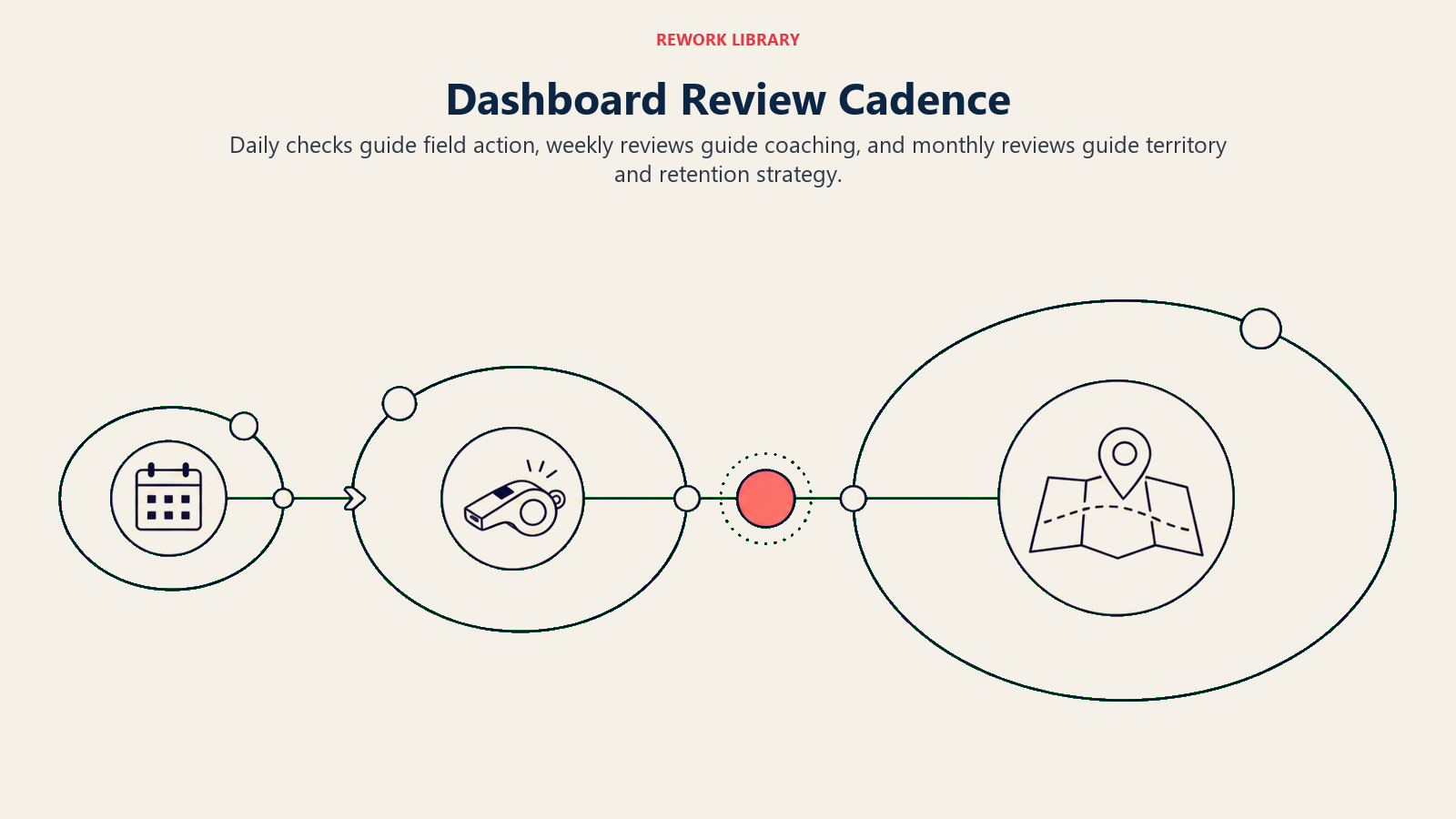
A practical cadence:
Daily (5 minutes, start of field hours): Review real-time activity dashboard. Any reps not showing active? Any territory conflicts? Any unusual patterns from yesterday that need a follow-up today?
Daily (end of day): Review close counts and team pacing against monthly target. Note any reps whose close rate dropped more than 20% from their 7-day average.
Weekly (30 minutes, Monday or Friday): Formal weekly performance review. Update rep performance cards with the week's data. Identify top three coaching priorities for the coming week. Review subscriber retention data for closes from 30, 60, 90 days ago.
Monthly (60 minutes): Cohort retention analysis. Territory performance review. Rep ranking updates. Forward planning for territory reallocation and team structure changes.
The weekly and monthly reviews should feed directly into your territory assignments for the following week and your coaching priorities for the next cycle. Data that doesn't influence decisions is just noise. Connect the dashboard to the action, and you'll find your team improving measurably quarter over quarter.
Learn More

Senior Implementation Consultant
On this page
- What Does a D2D Performance Dashboard Actually Need to Show?
- Key Facts
- The Daily Activity Dashboard
- The Weekly Performance View
- Building the Subscriber Pipeline Dashboard
- Rep-Level Performance Cards
- Manager-Level Accountability Dashboards
- The Three-Layer Dashboard Framework
- Quotable Nuggets
- Dashboard Design: What to Show and What to Hide
- Integrating Dashboards Across Your Tech Stack
- Putting It All Together: The Dashboard Review Cadence
- Learn More