FMCG Sales Dashboards: What Commercial Leaders Actually Need to See Every Day, Week, and Month
Turn this article into takeaways for your work.


Each assistant summarizes the article only for you and suggests best practices for your work.
Here's a scenario that plays out in FMCG commercial operations constantly. A national sales manager opens a dashboard and sees 47 metrics across 6 tabs. Volume, coverage, compliance, distribution, secondary sales, stock aging, promotion uptake, call rates, market share proxies, channel mix. All of it current to this morning. And when someone asks what's causing the volume shortfall in the west region, no one in the room can answer because finding that signal inside the dashboard takes 20 minutes of drilling they haven't done yet.
Most FMCG dashboards are comprehensive. Very few are useful. The difference is whether the dashboard is designed to display data or to support decisions. Those are not the same thing.
A dashboard designed to display data shows everything available. A dashboard designed to support decisions shows the metrics each specific role needs, at the cadence that matches their decision cycle, in a format that makes the action obvious. This article covers how to build the second kind.
Dashboard Design Principles
Before discussing specific dashboard levels, it's worth establishing the design principles that separate useful dashboards from data displays. Bain's survey of consumer products executives found that only half of respondents saw a clear link between corporate strategy and what their field salesforces were actually executing, a disconnect that poorly designed dashboards make worse, not better.

Role specificity. A DSR's (Direct Sales Representative's) daily dashboard and a national commercial director's daily pulse view are different products entirely. Designing a single dashboard for all audiences produces something that's adequate for no one. Role-specific views mean every person in the commercial hierarchy sees the metrics relevant to their decisions and their decisions only.
Actionability as the filter. The test for any metric on an operational dashboard: can the person viewing it take a specific action based on what they see? If not, the metric belongs in a report, not a dashboard. A DSR who sees that their must-sell compliance rate for Dr. Noodles instant noodles in the modern trade channel is 68% against an 85% target can adjust their call approach at the next outlet visit. A DSR who sees a regional map of secondary sales trends can't do anything with that information during their working day.
Exception-first layout. Attention is the scarcest resource in any commercial operation. Dashboard layouts should lead with exceptions (things that are wrong, below target, or trending in the wrong direction) rather than comprehensive displays of everything that's fine. A DSR who opens their app and immediately sees "3 priority outlets not visited this week" and "must-sell compliance for SKU group A is below 80% in 4 outlets" knows where to focus without reading through a table of 30 outlets.
Mobile-first for field roles. Dashboards designed on desktop screens and accessed by DSRs and area managers on smartphones in the field are dashboards that don't get used. McKinsey's research on sales-growth outperformance consistently shows that outperforming sales organizations invest in tools that reduce administrative burden on reps and put decision-relevant data in front of them in the moment they need it, not hours later on a laptop. Mobile-first means the most critical information for a field role fits on a single screen without scrolling, loads in under 3 seconds on 3G connectivity, and is usable one-handed while standing in an outlet. For national and regional roles who review dashboards from offices, desktop layouts can carry more information. For anyone who accesses a dashboard while in the field, mobile-first is non-negotiable. What changes by role is not the principle but the specific metrics and time horizon.
Key Facts: FMCG Sales Dashboards
- A Bain & Company survey of 120 consumer products executives found that 90% ranked sales execution as one of their top five business priorities, yet fewer than half felt their salesforces were operating at full potential, a gap that Bain attributes directly to weak links between strategy and what field tools actually display. (Bain, "Perfecting Sales Execution")
- Top-performing FMCG field teams maintain 95 percent or better beat adherence (planned route visits vs. completed visits), while average-performing teams operate at 75 to 89 percent, a gap that exception-flagged daily dashboards are specifically designed to close before the week ends (benchmark from FieldAssist, an SFA/field sales vendor; FieldAssist FMCG Field Sales Productivity Benchmarks 2026).
- McKinsey research on sales-growth outperformance consistently finds that leading sales organizations invest in tools that reduce administrative burden on reps and surface decision-relevant data in the moment it is needed, not hours later on a laptop. (McKinsey, "By the Numbers: What Drives Sales Growth Outperformance")
The Four Dashboard Levels
Level 1: DSR Daily Dashboard
The DSR's daily dashboard is the most operationally critical view in the commercial hierarchy because it shapes every field decision the DSR makes during the working day. And it's also the most frequently neglected, because dashboard design tends to happen at the senior level and cascade down rather than the reverse.
Core metrics for the DSR daily view:
- Calls completed today vs. planned: how many outlet visits the DSR has done against their beat plan for the day, updated in real time
- Must-sell compliance rate for today's calls: what percentage of today's completed calls confirmed must-sell SKUs as ranged, stocked, and priced correctly
- Orders captured: number of orders taken and submitted to the distributor system through the SFA
- New outlets visited: outlets added to the call record that weren't on the prior period's journey plan (new outlet development)
- Outstanding high-priority outlets: priority outlets on today's beat that haven't been visited yet, flagged by potential volume contribution
What the DSR's dashboard should not show: secondary sales trends, regional comparisons, distribution heat maps, trade promotion analytics. These are not decisions the DSR makes. Including them in the DSR view adds cognitive load without adding decision support.
The DSR dashboard must be available offline with cached data for beats in low-connectivity areas. A dashboard that shows a loading spinner in the middle of a wet market isn't a dashboard.
Level 2: Area Manager Weekly Dashboard
The area manager's decision cycle is weekly. They're managing a team of 8-15 DSRs across a defined geography, making coaching, routing, and resource allocation decisions that play out over 5-10 working days.
Core metrics for the area manager weekly view:
- Beat adherence by DSR: calls completed vs. planned for each DSR on the team, ranked lowest to highest so exceptions are visible first
- Distribution gaps by priority channel: which outlet tiers in the area have must-sell compliance below target, and in which product categories
- Volume vs. target by product group: secondary sales performance against weekly plan, broken down by the 3-5 product categories that drive the majority of territory volume
- New outlet development rate: how many new outlets the team is adding versus the weekly target
- Photo compliance rate: for teams using photo-based audit, the percentage of outlet visits that include photo evidence
The area manager weekly view should have drill-down capability to individual DSR performance and individual outlet data. But the headline view should be the team level. Area managers who spend their review time reading individual outlet tables are doing DSR-level analysis, not area management.
Level 3: Regional Manager Monthly Dashboard
The regional manager's decision cycle is monthly. They're managing 5-10 area managers across a region, making decisions about resource allocation, channel investment, and distribution strategy that take 4-8 weeks to produce results.
Core metrics for the regional manager monthly view:
- Numeric and weighted distribution trends: how distribution breadth and quality are building or declining across the region, versus prior month and versus plan
- Outlet universe coverage: what percentage of the region's total identified outlet universe has been reached by the field force in the month
- Sell-in vs. sell-out: primary sales (shipments to distributor) versus secondary sales (sales from distributor to outlet), flagging territory-level inventory buildup or depletion
- Out-of-stock rate by channel: the percentage of outlet visits finding priority SKUs listed but not on shelf, segmented by channel type (modern trade, traditional trade, food service)
- Area manager league table: ranked comparison of area managers across the primary commercial metrics, to identify which areas need additional support and which are outperforming for case study extraction
The regional monthly dashboard is where sell-in vs. sell-out comparison becomes a strategic signal. A territory where primary sales are above target but secondary sales are flat signals distributor inventory buildup rather than genuine market demand. Acting on that signal before it becomes a distributor credit problem or a returns claim requires seeing it clearly at the regional level.
Secondary Sales and Stock Visibility covers the data architecture that makes sell-in vs. sell-out comparison reliable at the regional dashboard level.
Level 4: National / Commercial Director Dashboard
The national or commercial director's decision cycle is monthly for operational decisions and quarterly for strategic ones. Their dashboard needs to surface the signals that drive portfolio investment, channel strategy, and promotional budget allocation decisions.
Core metrics for the national commercial view:
- Market share proxy: distribution depth multiplied by sell-through rate as a proxy for market share in the absence of real-time retail panel data, or actual retail panel data where available
- Distribution depth by channel: not just numeric distribution (are we in the door) but depth (how many of our priority SKUs are ranged per outlet), tracked over rolling 13-week periods
- Channel mix trends: what percentage of secondary sales volume is coming from modern trade, traditional trade, wholesale, and food service channels, and whether that mix is shifting versus plan
- Promotion ROI summary: which trade promotion schemes ran in the period, what volume uplift they generated versus baseline, and what the cost per incremental case was
- Regional performance index: a ranked comparison of regions against a composite of distribution build rate, volume performance, and field execution compliance
The national view should never show individual outlet data. If a commercial director is looking at outlet-level data in their primary dashboard, something has gone wrong with the reporting architecture: either the layer below them isn't providing adequate aggregation, or they're doing area manager analysis themselves.
Trade Promotion Management covers how promotion ROI is calculated and what it should look like on the commercial director's monthly dashboard.
The dashboard architecture described here parallels the approach in Territory Analytics and Sales Dashboards for pharmaceutical commercial operations: role-specific views, right time horizon by role, and actionable signals rather than data dumps. The architecture is only half the design problem. The other half is cadence.
Dashboard Cadence and Rhythm
Dashboards without a review cadence are reference documents, not decision tools. The commercial rhythm that makes dashboards valuable is structured around when different roles need different information.
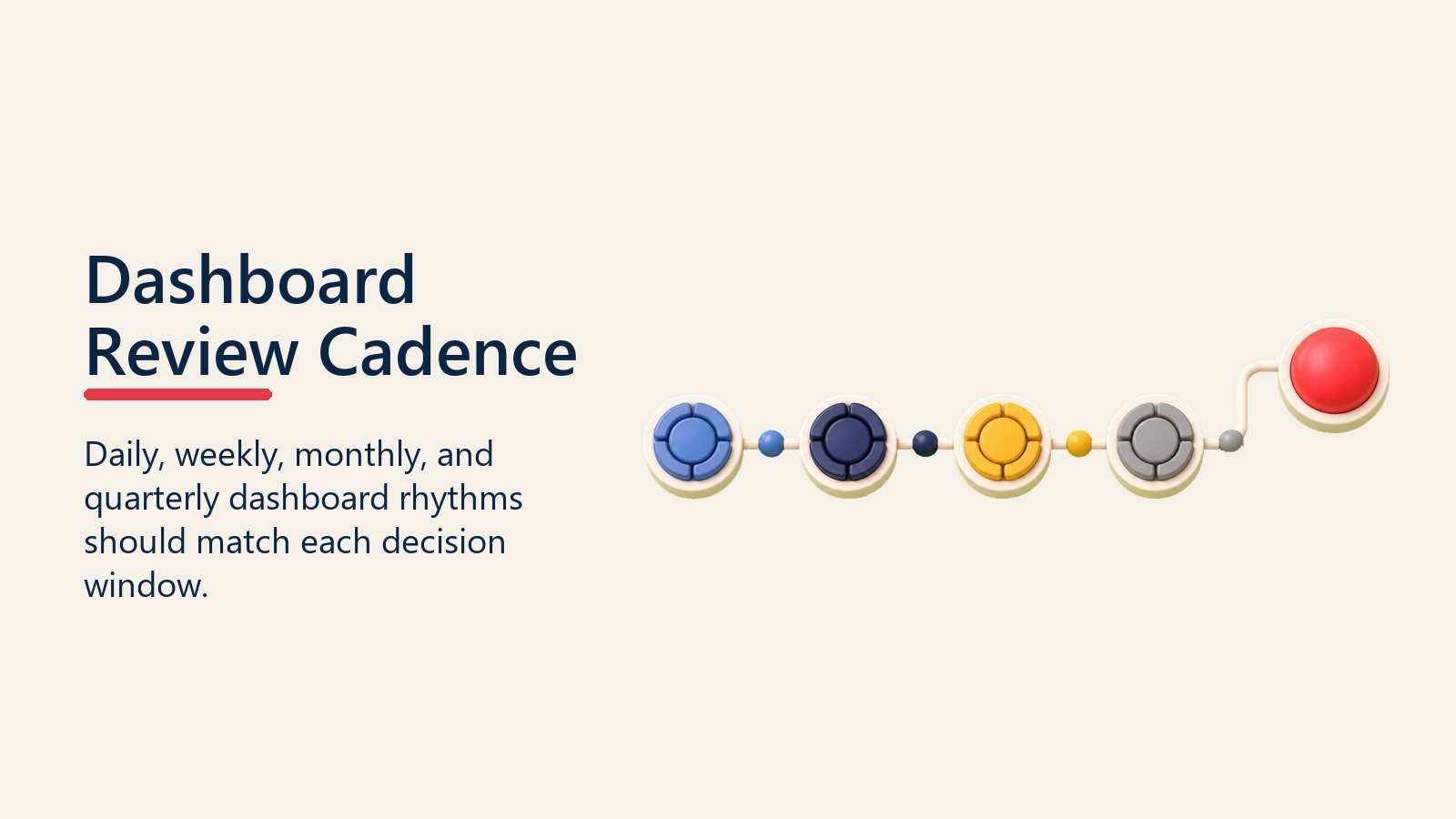
Daily exception alerts go to DSRs (outstanding priority outlets, today's call compliance) and area managers (DSRs running behind plan, priority outlets skipped in the last 48 hours). These are push notifications, not reports to be opened.
Weekly area reviews happen Monday mornings. Area managers review prior week performance for their team before the working week begins. The 30-minute review sets the coaching agenda for the week: which DSRs to accompany, which distribution gaps to address, which product categories need attention.
Monthly business reviews bring regional managers and commercial directors together to review the prior month's performance against plan and set the commercial priorities for the month ahead. The dashboard for these reviews should be prepared in advance, not built during the meeting.
The cadence discipline is what separates organizations that use dashboards as decision tools from those that use them as reporting archives. A dashboard that's reviewed on a defined cadence generates actions. A dashboard that's opened when someone asks a question generates explanations.
Visualisation Choices
The choice of visualization isn't aesthetic. It's functional. Different metrics communicate different things when displayed in different formats.
Heat maps for geographic gaps. Distribution gaps, out-of-stock rates, and call coverage shortfalls across a geographic territory are most legible on a map where color coding shows problem intensity by geography. A heat map that shows the three districts in a region with the lowest must-sell compliance is more actionable than a table of 12 district compliance rates.
Trend lines for distribution build. Numeric and weighted distribution are metrics that matter as trends over 4-13 week periods, not as single-point readings. A trend line showing that weighted distribution for a priority SKU has been building from 42% to 61% over 10 weeks tells a story that a single number can't.
League tables for peer comparison. Area manager and regional rankings are most motivating when displayed as ranked lists with context: who is first, who is last, and what the gap is between adjacent performers. League tables drive peer comparison and internal competition in ways that averages don't.
Bar charts for volume vs. target. Volume performance against target is most immediately legible as a bar chart showing actual vs. plan side by side, with color coding (red for below threshold, amber for below target but within range, green for on or above target). The color coding gives the exception signal instantly without requiring the viewer to calculate the gap. But visualization only matters if the underlying data is fresh enough to act on.
Data Freshness Requirements
Not all FMCG commercial data can be available in real time. Understanding what needs to be current and what can be delayed is essential for managing dashboard infrastructure costs and setting expectations correctly.
| Data Source | Freshness Requirement | Acceptable Lag | Why |
|---|---|---|---|
| DSR call reports | Real-time (T+0) | 15 minutes | Supervisors need to see field activity during the working day |
| GPS location and route data | Real-time (T+0) | 5 minutes | Beat adherence monitoring requires current location |
| Orders captured in SFA | Near real-time (T+1 hour) | 2 hours | Distributor order processing depends on timely order receipt |
| DMS secondary sales | Daily (T+1 day) | 48 hours | Analysis cadence is weekly; 24-48 hour lag is acceptable |
| Distributor stock levels | Daily (T+1 day) | 48 hours | Stock alerts need to precede stock-outs; daily is sufficient |
| Primary sales from ERP | Weekly (T+7) | 7 days | Sell-in vs. sell-out analysis is a weekly and monthly activity |
| Retail audit data | Monthly | 30 days | Third-party audits are structured as monthly panels |
The data freshness requirement drives infrastructure choices. Real-time call reports and GPS data require always-on data pipelines. Weekly primary sales data can be batch-processed. Designing dashboards without specifying freshness requirements first produces either expensive infrastructure for data that doesn't need it, or slow data for decisions that require it.
The SFA and Distributor Management Systems article covers the technology architecture that determines what data freshness is achievable from each source.
Why Do Most FMCG Dashboards Fail to Drive Decisions?
Metric overload. A dashboard with 35 metrics is not a comprehensive dashboard. It's a data export with filters. The discipline is in what you leave out. Every metric on a dashboard should be there because it either signals an action or confirms that no action is needed. Metrics that provide context but don't drive action belong in report annexes, not primary views.
No clear metric owner. When a metric appears on a commercial dashboard with no defined owner, it's nobody's job to improve it. Every metric on an operational dashboard should have a named role responsible for it: the area manager owns call plan adherence for their team. The trade marketing manager owns promotion uptake rates. Without metric ownership, dashboards become observation tools rather than accountability systems.
Static reports mistaken for dashboards. A monthly PowerPoint export of last month's data is a report. Sending it to commercial leaders on the first of the month and calling it a dashboard doesn't make it one. A dashboard is interactive, current to its defined freshness window, and actionable in real time. The distinction matters because static reports support retrospective analysis and dashboards support prospective decision-making. Conflating the two produces systems that look like decision tools but function as historical records.
For how the Revenue Operations Dashboard framework addresses these same failure modes in B2B commercial operations, the parallel architecture for role-specific metrics and cadenced reviews applies directly to FMCG dashboard design. The RevOps Metrics framework also provides a comparable structure for metric selection and ownership in commercial operations.
Dashboards as Decision Tools, Not Reporting Artifacts
The commercial value of a dashboard isn't in what it shows. It's in what decisions it makes possible and how quickly it makes them possible. A DSR who opens their dashboard each morning and knows in 30 seconds which priority outlets to add to today's beat makes better calls than one who reviews a weekly email attachment on Sunday night. An area manager who gets a Monday morning exception report showing which DSRs need coaching attention that week is more specific in their coaching conversations than one who relies on quarterly performance reviews.
The metric hierarchy, role specificity, and cadence discipline described in this article aren't implementation complexity. They're the design principles that determine whether your FMCG sales dashboards change behavior or just document it.
Retail Execution Analytics covers how the underlying analytics practice (from data source management to metric calculation to analysis cadence) supports what dashboards display. The two are complementary: analytics is how you decide what matters, dashboards are how you make it visible and actionable.
Quotable Nuggets
"Poor retail execution and lack of planogram compliance can translate into significant sales losses per retailer in large markets, the range is highly variable depending on category and market size, yet many FMCG companies still rely on static monthly reports to catch these gaps, weeks after the opportunity to respond has passed.", VisionGroup Retail, 2026, a retail image-recognition vendor (source)
"Outperforming sales organizations invest in tools that reduce administrative burden on reps and put decision-relevant data in front of them in the moment they need it, not hours later on a laptop.", McKinsey (source)
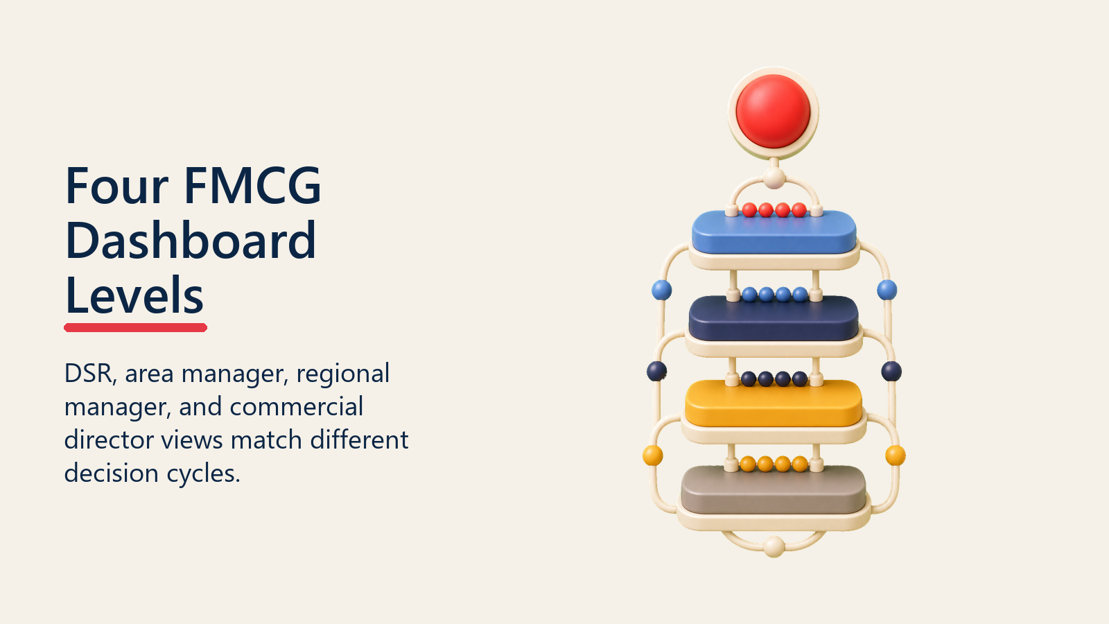
The Four-Level Dashboard Architecture: A structured framework for matching dashboard design to organizational decision cycles in FMCG commercial operations.
- Level 1, DSR Daily View: 5-7 metrics maximum; calls vs. plan, must-sell compliance, orders captured, priority outlets outstanding. Mobile-first, offline-capable.
- Level 2, Area Manager Weekly View: Team-level beat adherence ranked lowest to highest; distribution gaps by channel; volume vs. target by product group; drill-down to DSR and outlet level.
- Level 3, Regional Manager Monthly View: Distribution build trends (numeric and weighted); sell-in vs. sell-out by territory; out-of-stock rates by channel; area manager league table.
- Level 4, National Commercial Director View: Market share proxy; channel mix trends; promotion ROI summary; regional performance index. No individual outlet data.
The test for each level: can the person viewing it take a specific commercial action based on what they see? If not, the metric belongs in a report, not a dashboard.
Frequently Asked Questions about FMCG Sales Dashboards
How many metrics should a DSR daily dashboard show?
Five to seven at most. The daily view should cover calls completed versus planned, must-sell compliance rate, orders captured, new outlets visited, and priority outlets still outstanding for the day. Anything beyond that competes for attention with the decisions the DSR actually needs to make. Usage data consistently shows that field rep dashboards with more than seven data points see much lower daily access rates than those with five or fewer.
What is the difference between a dashboard and a report in FMCG commercial operations?
A dashboard is interactive, current to a defined freshness window (real-time to T+1 day depending on the data source), and designed to support decisions being made now. A report is a structured document summarizing a completed period (week, month, quarter), typically static, and designed to support retrospective analysis. Most FMCG "dashboards" are actually reports: they show last month's data in a visual format. That's useful for analysis but doesn't help an area manager decide where to send a DSR this afternoon.
How should FMCG dashboards handle sell-in vs. sell-out data?
Sell-in data (primary sales from the principal to the distributor) and sell-out data (secondary sales from the distributor to outlets) should always be shown together at the territory and regional level. The gap between them tells you whether the distribution channel is absorbing product at the rate it's being shipped. When sell-in is significantly above sell-out, distributors are accumulating inventory, which is a credit risk, a returns risk, and usually evidence that market demand is being over-estimated. When sell-out runs ahead of sell-in, there's potential for stock-out at the distributor level that will cascade to outlet-level out-of-stocks.
What visualization works best for geographic distribution gaps?
Heat maps, where color intensity indicates the severity of the distribution gap by geographic unit (district, territory, or area). A distribution coverage heat map at the area manager or regional manager level makes geographic patterns visible in seconds that would take minutes to read from a table. The most useful versions overlay the heat map with the outlet universe count in each geographic cell, so the manager can distinguish between gaps caused by low coverage (not enough outlet visits) and gaps caused by low conversion (outlet visits happening but not resulting in listings).
What is the right data freshness standard for each dashboard level in FMCG?
DSR daily views and area manager exception alerts need near-real-time data: call reports and GPS location within 15 minutes, orders captured within 1-2 hours. This requires always-on data pipelines and offline-capable SFA apps that sync when connectivity is available. Weekly area reviews can work with data that's 24-48 hours old, since the coaching decision cycle is 5-10 days. Monthly strategic reviews at the regional and national level can use data with up to a 7-day lag for primary sales from ERP. The critical mistake is designing all dashboard layers with the same data freshness standard, either over-engineering the infrastructure for data that doesn't need to be real-time, or leaving field-level dashboards running on weekly batch exports that make daily exception flagging impossible.
Learn More

Senior Implementation Consultant
On this page
- Dashboard Design Principles
- The Four Dashboard Levels
- Level 1: DSR Daily Dashboard
- Level 2: Area Manager Weekly Dashboard
- Level 3: Regional Manager Monthly Dashboard
- Level 4: National / Commercial Director Dashboard
- Dashboard Cadence and Rhythm
- Visualisation Choices
- Data Freshness Requirements
- Why Do Most FMCG Dashboards Fail to Drive Decisions?
- Dashboards as Decision Tools, Not Reporting Artifacts
- Learn More