Revenue Operations Dashboard: What to Show and What to Leave Out
A Revenue Operations dashboard should not be a wall of charts.
It should show where the revenue system is healthy, where it is leaking, and which operating decision needs attention. If a chart does not lead to action, it probably belongs somewhere else.
Forrester's RevOps operating model research is a useful anchor: RevOps works when operating model, decision rights, and metrics connect. Gartner has reported that forecast confidence is often weak across sales organizations, which is exactly the kind of trust problem a dashboard should expose rather than hide.
A good dashboard is not the biggest one. It is the one that improves the next operating decision.
Key operating facts
- A RevOps dashboard should start from decisions, not metrics. If a chart does not change inspection, prioritization, or action, it may not belong in the main dashboard.
- Executive dashboards should show revenue health, risk, and confidence. Working dashboards should show bottlenecks, exceptions, data quality, and owner action.
- Caveats belong beside the metric, not hidden in a separate note. Leaders need to know when a number is directional, incomplete, or affected by definition changes.
- Dashboard governance matters because every chart can become a source of truth. Definitions should connect back to the revenue data dictionary and reporting owners.
Three dashboard layers
| Dashboard | Audience | Purpose |
|---|---|---|
| Executive | CEO, CRO, finance, board | Revenue health and risk |
| RevOps working | Operators and functional leaders | Bottlenecks and data issues |
| Functional | Marketing, sales, CS | Team execution |
This structure comes from RevOps Metrics.
Dashboard design principles
Use a few rules:
| Rule | Meaning |
|---|---|
| One chart, one decision | Every chart should support a known action |
| Separate executive and operator views | Leaders need signal, operators need diagnosis |
| Show caveats | Data quality warnings belong near the metric |
| Keep definitions stable | Trend analysis breaks when formulas drift |
| Pair outcome with driver | Revenue without funnel health is incomplete |
The dashboard should not try to answer every question. It should help teams decide where to inspect next.
Start with decision inventory
Before designing a dashboard, list the decisions it should support.
Turn this article into takeaways for your work.
Each assistant summarizes the article only for you and suggests best practices for your work.
| Decision | Dashboard signal |
|---|---|
| Do we trust this quarter's forecast? | Commit accuracy, slippage, caveats, forecast movement |
| Do we have enough future pipeline? | Coverage by period, stage mix, source quality |
| Where is the funnel leaking? | Conversion by stage, source, segment, owner |
| Which handoff needs repair? | SLA misses, rejection reasons, handoff completeness |
| Is customer revenue healthy? | GRR, NRR, renewal risk, expansion signals |
| Is data quality blocking decisions? | Missing fields, stale records, duplicate rate, source unknown |
This inventory prevents dashboard sprawl. Without it, every stakeholder asks for a chart that matters to them locally. The final dashboard becomes a library, not a decision surface.
RevOps should ask a blunt question for each chart: what action should a leader take if this moves? If the answer is unclear, move the metric to backup, a functional dashboard, or a periodic analysis.
Executive dashboard
Include:
- Revenue plan vs actual
- Pipeline created
- Pipeline coverage
- Forecast accuracy
- Win rate
- Sales cycle length
- Net revenue retention
- Expansion pipeline
- Data quality risk
Keep it small. Executives need signal, not every diagnostic detail.
Executive dashboard structure
A practical executive dashboard can fit into five sections:
| Section | Metrics |
|---|---|
| Revenue health | Plan vs actual, bookings, ARR or revenue trend |
| Pipeline health | Pipeline created, pipeline coverage, stage mix |
| Forecast health | Commit, best case, forecast accuracy, slippage |
| Customer health | Renewal risk, NRR, expansion pipeline |
| Data health | Missing fields, stale opportunities, source completeness |
This gives leaders a compact view of revenue flow and risk.
Do not bury data-quality warnings. If forecast accuracy is weak because close dates are stale, the dashboard should say so. If pipeline coverage is inflated by early-stage deals, the dashboard should show stage quality.
RevOps working dashboard
Include:
- Lead aging
- SLA breaches
- Routing failures
- Stage aging
- Stale opportunities
- Missing required fields
- Duplicate records
- Handoff completeness
- Forecast slippage
This dashboard exists to drive operating work.
Working dashboard structure
The RevOps working dashboard should be more diagnostic.
Useful sections:
- Lead routing and SLA
- MQL acceptance and rejection
- SQL-to-opportunity conversion
- Stage aging
- Close-date slippage
- Forecast category hygiene
- Closed-won handoff completeness
- Renewal risk aging
- Expansion trigger routing
- Duplicate and missing-field rates
This dashboard is for action owners. It should answer: what is broken, who owns it, and what changed since last review?
Functional dashboards
Functional dashboards can go deeper.
Marketing may need campaign conversion, source quality, cost per lead, and nurture movement. Sales may need pipeline inspection, rep activity, stage aging, and forecast risk. CS may need health, renewal risk, expansion signals, and onboarding milestones.
RevOps should not force every team into one dashboard. But it should govern shared definitions so functional dashboards do not conflict with executive reporting.
Data model
The dashboard depends on a stable data model.
Document:
- Metric name
- Definition
- Formula
- Source system
- Object
- Refresh cadence
- Owner
- Known caveats
- Where it appears
This should live in the Revenue Data Dictionary. If dashboard definitions are not documented, trust will decay.
What to leave out
Leave out metrics that do not create decisions.
Examples:
- Vanity traffic without lead or pipeline context
- Activity counts without outcome
- Raw dashboard exports no one reviews
- Duplicate metrics with slightly different definitions
- Charts that exist only because a tool template included them
- Metrics with data quality too weak for decisions
Removing a metric can improve the dashboard. The point is focus.
Dashboard review cadence
Review dashboard design quarterly.
Ask:
- Which charts were used in decisions?
- Which charts were ignored?
- Which definitions changed?
- Which metrics caused confusion?
- Which data caveats need to be more visible?
- Which new operating question needs a view?
This keeps the dashboard aligned with the business instead of becoming a museum of old questions.
Common mistakes
One dashboard for every audience. Executives and operators need different detail.
No data-quality warnings. Leaders trust metrics that RevOps knows are fragile.
Too many charts. Important signals get lost.
No owner per metric. No one fixes the number when it breaks.
Dashboard replaces cadence. A dashboard does not make decisions. People do.
Readiness checklist
Before publishing:
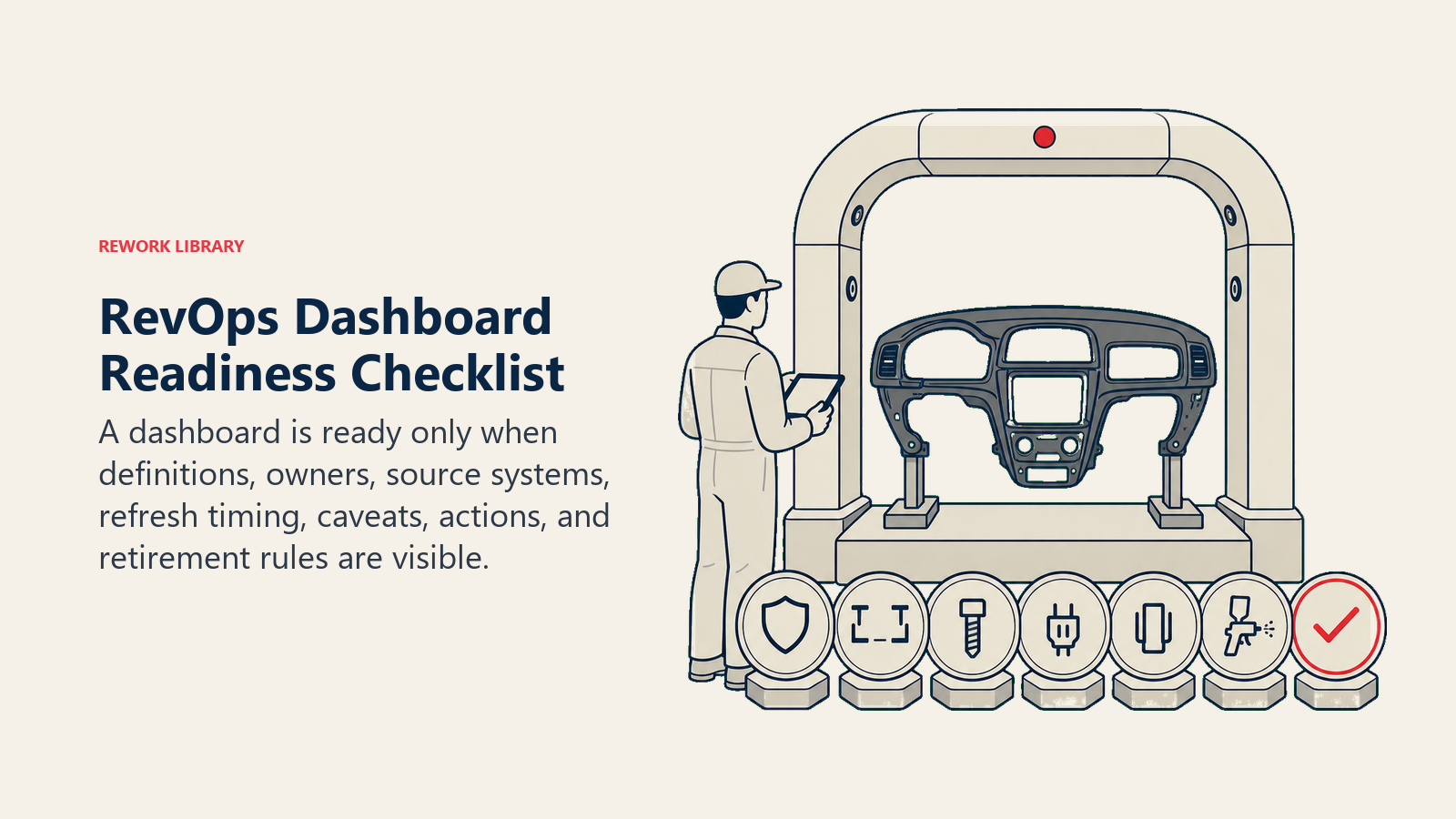
- Audience is defined.
- Metrics map to decisions.
- Definitions are documented.
- Data caveats are visible.
- Owners are assigned.
- Refresh cadence is clear.
- Functional leaders agree on shared metrics.
- RevOps owns change control.
The dashboard is working when leaders stop asking which number is right and start asking what action should follow.
Dashboard examples
An executive dashboard might show:
| Metric | Why it matters |
|---|---|
| Revenue plan vs actual | Shows progress against plan |
| Pipeline created vs target | Shows future revenue supply |
| Pipeline coverage | Shows whether enough pipeline exists |
| Forecast accuracy | Shows trust in near-term revenue calls |
| Stage aging | Shows where pipeline is getting stale |
| NRR | Shows customer revenue health |
| Expansion pipeline | Shows growth inside the base |
| Data-quality score | Shows whether reports are trustworthy |
The working dashboard can show the diagnostic layer underneath:
| Signal | Operating action |
|---|---|
| MQL aging | Fix routing or owner response |
| Rejection reason spike | Review targeting or qualification |
| Close-date slippage | Inspect forecast rules |
| Missing handoff fields | Review closed-won workflow |
| Duplicate rate rising | Fix matching or import process |
Data-quality score
A RevOps dashboard should include a data-quality view because bad data changes how leaders interpret every metric.
Useful quality checks:
- Unknown source rate
- Duplicate account or contact rate
- Opportunities without next step
- Opportunities with stale close dates
- Missing forecast category
- Missing closed-won handoff fields
- Renewal records without owner
- Expansion opportunities without source signal
Data quality should not be hidden in an admin report. If executive metrics depend on weak fields, executives should see the caveat.
Dashboard ownership
Every dashboard needs ownership.
Define:
- Business owner
- Data owner
- Technical owner
- Definition owner
- Review cadence
- Change approval path
For executive dashboards, RevOps usually owns definition governance, finance owns planning alignment, and functional leaders own performance interpretation.
Change control
Dashboard metrics should not change quietly.
When a formula changes:
- Document the old definition.
- Document the new definition.
- Explain why it changed.
- Note whether history was restated.
- Notify dashboard users.
This is especially important for board metrics, forecast metrics, and source-to-revenue reporting.
Visual design rules
Keep the dashboard simple:
- Put key metrics first.
- Use trend lines for directional metrics.
- Use tables for accountability lists.
- Use warnings for data caveats.
- Avoid decorative charts.
- Avoid showing every possible cut on the first page.
RevOps dashboards are working tools. They should be easy to scan.
Launch plan
Launch in stages:
- Confirm audience and decisions.
- Select core metrics.
- Document definitions.
- Validate data with finance and functional leaders.
- Add caveats.
- Review with a small group.
- Publish and collect feedback.
- Schedule quarterly dashboard cleanup.
The first version should be trusted, not exhaustive.
Launch rule
A RevOps dashboard should reduce ambiguity.
If leaders leave the dashboard review with more questions about definitions than decisions, the dashboard is not ready. Fix the definitions, caveats, and ownership before adding more charts.
Example executive layout
A strong executive layout can be one page:
| Row | Content |
|---|---|
| 1 | Revenue plan, actual, forecast, and variance |
| 2 | Pipeline created, pipeline coverage, and stage mix |
| 3 | Forecast accuracy, close-date slippage, and commit conversion |
| 4 | Renewal risk, NRR, expansion pipeline |
| 5 | Data-quality warnings and open operating risks |
This is enough for a leadership conversation. Details can live in drill-down views.
Example RevOps working layout
The working layout should show where to act:
| Area | Signals |
|---|---|
| Lead flow | Routing age, SLA breach, acceptance rate |
| Pipeline | Stage aging, stale next steps, slippage |
| Forecast | Commit hygiene, close-date movement, risk fields |
| Handoff | Closed-won completeness, onboarding delay |
| Customer | Renewal risk age, expansion signal routing |
| Data | Duplicates, missing fields, source completeness |
This view should be reviewed by RevOps and functional owners. It is not meant to impress executives. It is meant to drive work.
Metric hierarchy
Use a hierarchy:
- North-star business outcomes
- Funnel drivers
- Operational controls
- Data-quality checks
For example, revenue attainment is an outcome. Pipeline coverage is a driver. Stage aging is an operational control. Close-date completeness is a data-quality check.
Mixing these without hierarchy creates confusion. Leaders may treat a data-quality check like a business outcome or ignore it entirely.
Dashboard failure modes
Common failures:
Dashboard sprawl. Everyone builds their own version.
Metric drift. Formulas change without notice.
No caveats. Weak data appears precise.
No decision mapping. Charts are interesting but unused.
Slow refresh. Leaders export to spreadsheets because the dashboard lags.
No adoption review. RevOps never checks whether the dashboard is used.
Adoption review
After launch, review adoption:
- Which charts are opened?
- Which charts are discussed in meetings?
- Which charts drive actions?
- Which charts create confusion?
- Which charts should be removed?
Dashboard adoption is not page views alone. A dashboard is adopted when it becomes part of the operating cadence.
Adoption checklist
Before finalizing:
- Executive page fits on one screen.
- Working page has owner-level diagnostics.
- Definitions link to the data dictionary.
- Caveats are visible.
- Metrics map to cadence.
- Owners know what to do when a metric changes.
The dashboard should make revenue management calmer. If it creates more debate than action, it needs less chart volume and more governance.
Adoption review operating example
If pipeline coverage shows 4x target, the executive view may look healthy. The working view should show whether that coverage is real.
RevOps should inspect:
- Stage mix
- Stage aging
- Close-date slippage
- Source quality
- Segment mix
- Forecast category
- Historical win rate
If most coverage sits in early stage with old close dates, the dashboard should not let leaders feel safe. It should show that coverage is low quality.
Dashboard governance meeting
Run a short monthly dashboard governance meeting:
- Review metric disputes.
- Review data-quality warnings.
- Approve or reject definition changes.
- Retire unused charts.
- Add views only when tied to decisions.
This keeps the dashboard from growing without discipline.
Dashboard governance meeting operating example
A useful dashboard changes a conversation. Instead of "Why do marketing and sales numbers differ?", leaders can ask "Why did SQL-to-opportunity conversion fall in enterprise inbound?" That is the level of clarity RevOps should protect.
Governance checklist
Before launch, test the dashboard in a real meeting. Ask leaders to use it to make one decision. If they need another spreadsheet, a private explanation, or a different definition, the dashboard is not ready.
Also check whether every metric has a named owner. A metric without an owner becomes a complaint, not a control. RevOps should make ownership visible next to the number when possible.
The final test is whether the dashboard survives a hard question. If the CRO asks why forecast changed, finance asks whether pipeline coverage is real, or CS asks where renewal risk appears, the dashboard should point to a governed answer or a visible caveat. If the answer depends on a person explaining the spreadsheet, dashboard governance is incomplete.
A dashboard is ready when it can carry that conversation without private translation. Leaders may still disagree about the decision, but they should not need to argue about what the metric means, where it came from, or whether the caveat is hidden.
Dashboard adoption and retirement
Dashboard adoption should be measured by use in decisions, not page views.
Ask:
- Which meetings use this dashboard?
- Which decisions did it support this month?
- Which metrics were challenged?
- Which charts were ignored?
- Which caveats changed interpretation?
- Which users exported data to another spreadsheet?
If leaders keep exporting data, the dashboard may not answer their real question. If a chart is never discussed, it may belong in backup. If a metric is challenged every month, the definition or source-of-truth model needs work.
RevOps should retire dashboards and charts deliberately. A stale dashboard creates quiet risk because someone may still use it as a source of truth. Retire a view when the metric is obsolete, the owner is gone, the decision no longer exists, or a better governed view replaced it.
Dashboard review scenarios
Test the dashboard with real operating scenarios before launch.
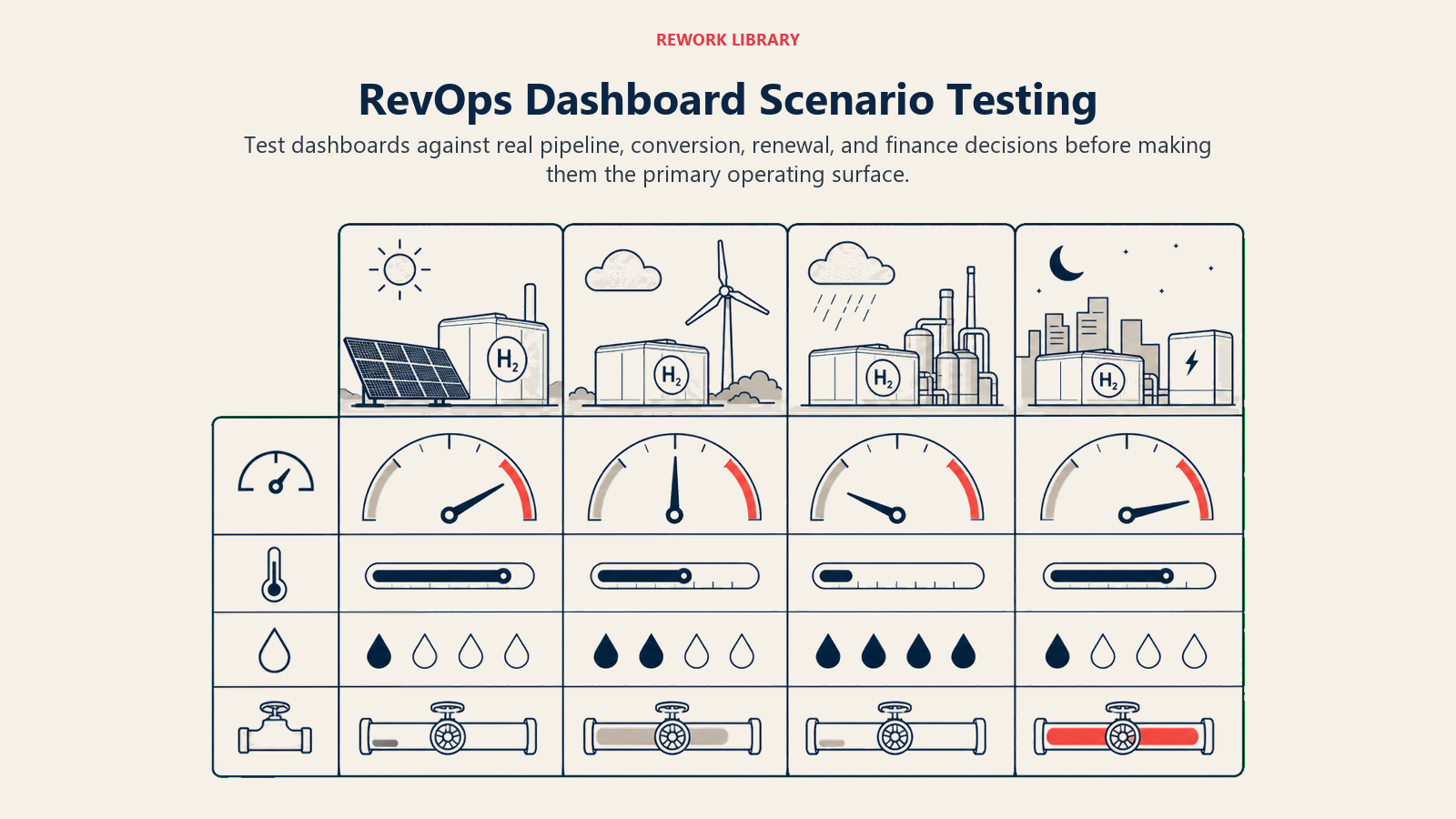
| Scenario | Dashboard should show |
|---|---|
| Forecast changed materially this week | Movement by category, deal, segment, and caveat |
| Pipeline coverage looks high but conversion is weak | Stage mix, aging, source quality, and historical win rate |
| Marketing says lead quality improved | Acceptance rate, rejection reasons, SQL conversion, opportunity quality |
| Sales says pipeline is healthy | Coverage by period, stage quality, close-date movement, stale deals |
| CS sees renewal risk rising | Renewal forecast, risk reasons, customer health, expansion impact |
| Finance questions a board metric | Definition, source, owner, refresh cadence, caveat |
If the dashboard cannot support these scenarios, it may still be useful as a report, but it is not ready as the main RevOps dashboard. Scenario testing is better than asking stakeholders whether they like the layout. It forces the dashboard to prove it can support a real decision.
RevOps should keep the test scenarios as part of dashboard documentation. When the business changes, rerun the scenarios. A dashboard that worked for a new-business motion may not work when renewal and expansion become a larger share of revenue.
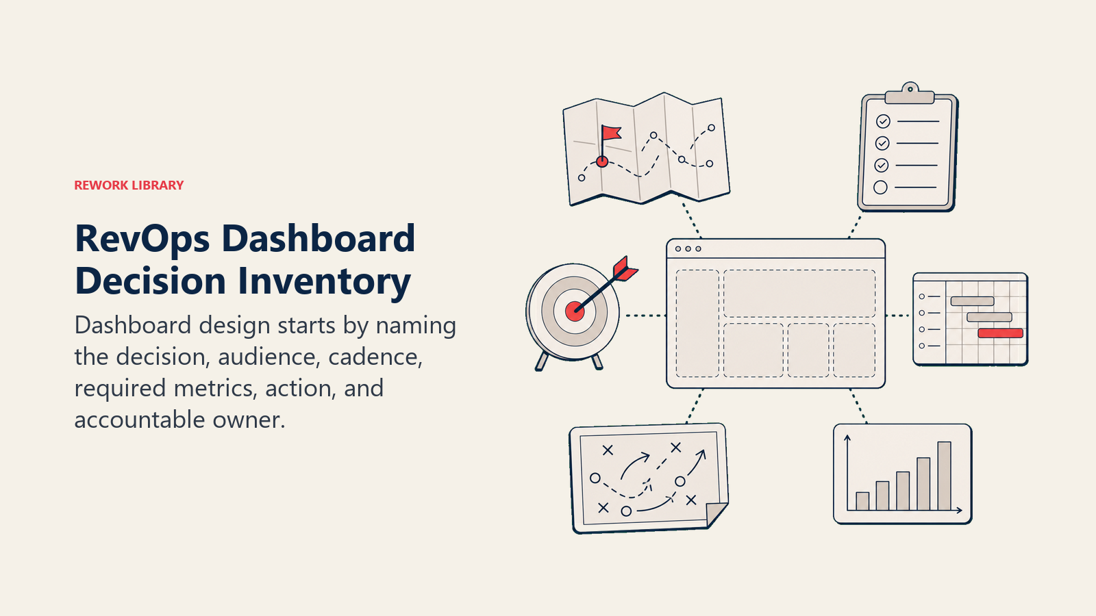
Dashboard decision packet
A RevOps dashboard should have a decision packet before it launches.
| Packet item | What to define |
|---|---|
| Audience | Who uses the dashboard |
| Decision | What decision the dashboard supports |
| Metrics | Which metrics are included and excluded |
| Definitions | Formula, source system, caveats, and owner |
| Cadence | When the dashboard is reviewed |
| Action path | What happens when a metric moves |
| Retirement rule | When the dashboard should be removed |
This prevents dashboard sprawl. If no one can name the decision, the dashboard should not ship as an executive surface.
Frequently Asked Questions about Revenue Operations Dashboard
What is the most important RevOps dashboard rule?
Tie every chart to a decision. If no one knows what action follows a metric change, remove or move the chart.
Should every team use the same dashboard?
No. Teams need functional dashboards. But shared definitions and executive metrics should be governed by RevOps.
Learn more

Senior Operations & Growth Strategist
On this page
- Three dashboard layers
- Dashboard design principles
- Start with decision inventory
- Executive dashboard
- Executive dashboard structure
- RevOps working dashboard
- Working dashboard structure
- Functional dashboards
- Data model
- What to leave out
- Dashboard review cadence
- Common mistakes
- Readiness checklist
- Dashboard examples
- Data-quality score
- Dashboard ownership
- Change control
- Visual design rules
- Launch plan
- Launch rule
- Example executive layout
- Example RevOps working layout
- Metric hierarchy
- Dashboard failure modes
- Adoption review
- Adoption checklist
- Adoption review operating example
- Dashboard governance meeting
- Dashboard governance meeting operating example
- Governance checklist
- Dashboard adoption and retirement
- Dashboard review scenarios
- Dashboard decision packet
- Learn more