Spaghetti Diagram: Map and Reduce Wasted Motion
Turn this article into takeaways for your work.


Each assistant summarizes the article only for you and suggests best practices for your work.
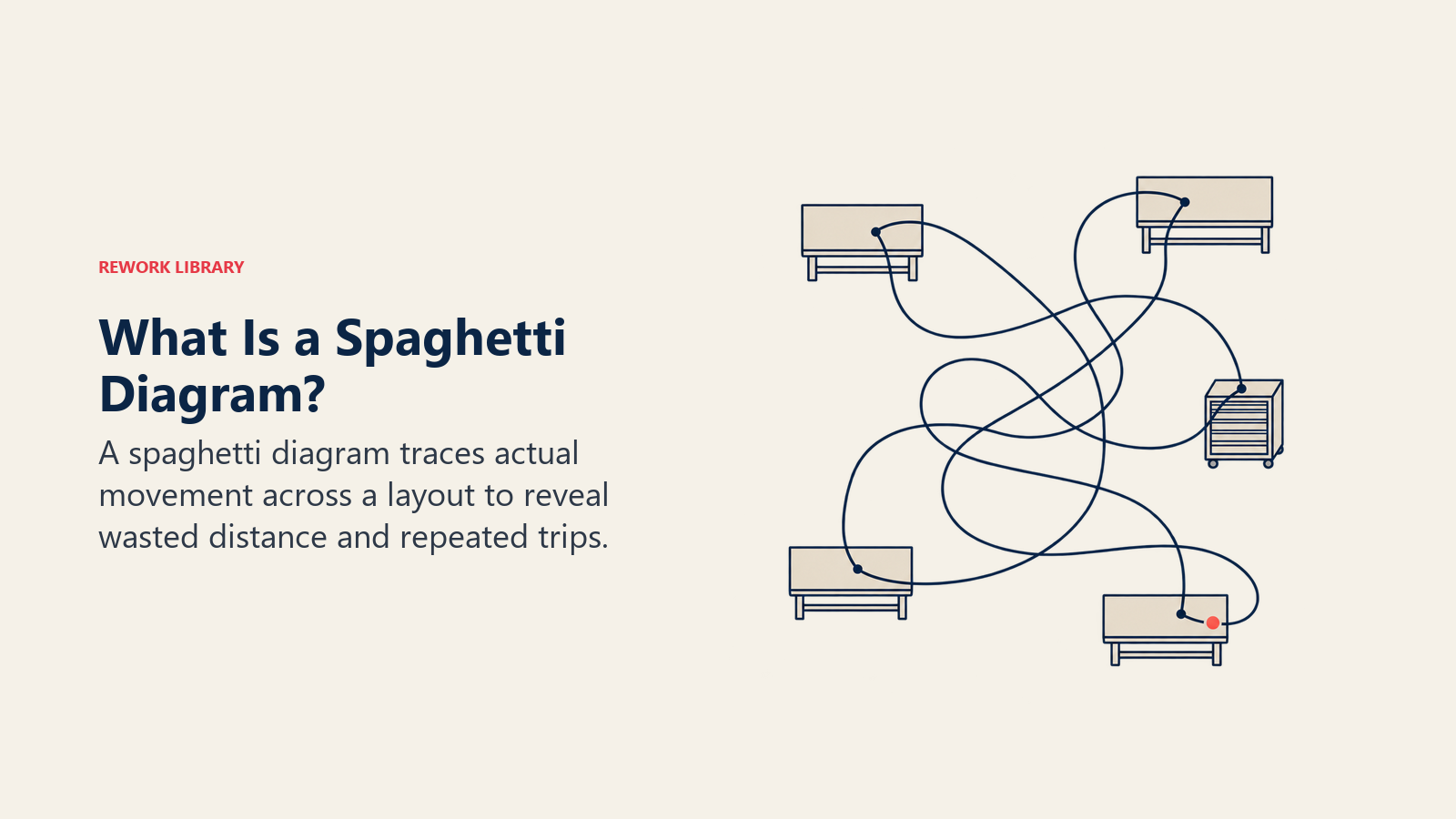
Ask anyone who runs a shift how far their people walk in a day and you'll get a shrug. Ask a spaghetti diagram, and it draws you the answer: a tangle of crossed lines on a floor plan, doubling back on itself, that looks uncannily like a plate of noodles. That tangle is the whole value of the tool. It doesn't describe the process anyone designed. It shows the one people actually run.
A spaghetti diagram is a trace of real movement, laid over a to-scale layout, drawn while someone or something moves through it. The Lean Enterprise Institute defines it plainly as "a diagram of the path taken by a product as it travels through the steps along a value stream," noting that in a typical facility the route "often looks like a plate of spaghetti" (Lean Enterprise Institute). Run the same exercise around a person instead of a product and you get the same tangle for a different reason. Either way, distance and handoffs stop being an impression and become a line on paper you can measure with a ruler.
That's the one thing this tool is uniquely good at. A process map tells you what happens. A spaghetti diagram tells you where it happens and how far apart those places sit, which turns "there's a lot of unnecessary walking around here" from a complaint into a number a supervisor can act on this week.
Key Facts: Spaghetti Diagrams
- The name describes exactly what the finished drawing looks like: "a diagram of the path taken by a product as it travels through the steps along a value stream" (Lean Enterprise Institute).
- A spaghetti chart of assembly work at Thrustmaster of Texas found technicians walking 110 steps each per unit, over seven miles of combined walking, which translated to nearly 10 hours of wasted time per product (Lean Enterprise Institute, 2016).
- At one Japanese acute-care hospital, nurses walked an average of 6.18 km on 12-hour long-day shifts and 4.76 km on night shifts across 14 wards, with ward type and nurse-call volume driving the largest differences (Journal of Nursing Management, 2025).
- The same waste shows up on a screen: office workers toggle between apps and windows roughly 1,200 times a day, costing almost four hours a week, about 9% of work time, reorienting after each switch (Harvard Business Review, 2022).
What a Spaghetti Diagram Is, and Where the Name Comes From
A spaghetti diagram starts with a real floor plan, drawn to scale, not sketched from memory. An observer stands where they can see the work, watches one subject move, and draws a single continuous line every time that subject changes location: workstation to shelf, shelf to bench, bench to printer, printer back to the desk. Every leg of the route becomes a line segment. By the end of a shift, or even an hour, the segments overlap into the recognizable tangle that gives the tool its name.
Nobody claims credit for coining the name, and it has stuck because it says exactly what the finished diagram looks like once it's done honestly. It grew up alongside time-and-motion study and process mapping inside lean practice, and it survived because it needs almost no training to read. Show a supervisor a spaghetti diagram of their own department and you don't have to explain the methodology. The mess speaks for itself.
What it is not: a flowchart, a value stream map, or a process narrative. Those tools show sequence and logic. A spaghetti diagram shows geography. It answers one question with unusual clarity: given where things and people actually sit, how far does work have to travel to get done? That's a narrower question than "how does this process work," but it's a question the other tools answer badly, because a flowchart box is the same size on paper whether the two steps it connects sit three feet apart or three buildings apart.
Motion Waste vs Transport Waste: Why the Difference Changes What You Draw
Before you draw anything, decide what you're tracing. A spaghetti diagram can map two distinct kinds of waste, and confusing them produces a diagram that answers the wrong question.
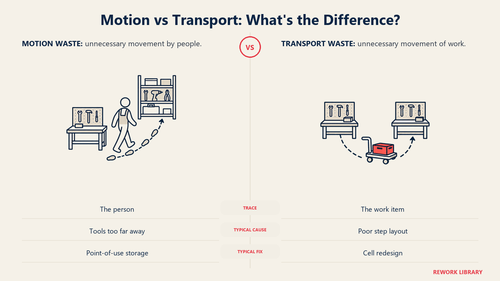
Lean's eight wastes separate the two precisely, and the distinction matters here more than almost anywhere else in the toolkit. As the framework is applied in muda, mura, muri, motion is unnecessary movement by people, while transportation is unnecessary movement of materials or work between locations. A spaghetti diagram catches both, but only if you pick one and trace it consistently.
| Dimension | Motion waste | Transport waste |
|---|---|---|
| What moves | A person's body | Material, a work item, or a document |
| What you trace | The operator, technician, nurse, or clerk | The product, part, sample, or file |
| Typical cause | Poor workstation layout, shared tools kept too far away, searching for something | Poor cell or department layout, batching, unnecessary handoffs between steps |
| Example | Reaching across a bench, walking to a shared printer, crossing a ward to answer a call light | A part traveling from the mill to the paint booth, a lab sample traveling from the ward to the lab |
| Typical fix | Point-of-use storage, workstation redesign, 5S | Cell redesign, relocating a shared resource, a dedicated handler route |
The distinction changes what you draw. Trace a single operator's feet for motion. Trace a single unit of work, the part or the folder, for transport. Mapping the wrong one produces a diagram that is technically accurate and still misses the real waste. An operator can walk efficiently around a station that is still forcing the product itself along a terrible route between machines, and the reverse is just as common: a part travels a short, sensible route while the person attending it burns most of a shift walking to fetch things the layout keeps too far away.
Some processes need both views. A production cell might get one diagram of the operator's steps and a second, drawn separately, of the part's path between machines. Overlaying the two onto a single drawing usually makes both illegible. It's better to produce two clean diagrams than one confusing one, and to label each with which subject it's tracing before anyone else looks at it.
How to Run a Spaghetti Diagram Exercise
The method is simple enough to teach on the floor in five minutes. What makes it useful is discipline about observing the real thing rather than reconstructing it later from memory.
| Step | What to do |
|---|---|
| 1. Pick one subject | One operator or one product or work item, never both on the same diagram |
| 2. Get a scaled layout | A printed or digital floor plan proportional to the real space, not a rough sketch |
| 3. Go to the gemba | Observe live, at the actual workstation, ward, or kitchen line, the way a gemba walk does |
| 4. Time-box the observation | Pick a representative window, a full work cycle or a fixed block such as 30 to 60 minutes |
| 5. Draw the actual path | Trace with one continuous line, numbering each leg in the order it happens |
| 6. Count trips | Tally repeat trips to the same destination separately from one-off legs |
| 7. Measure or estimate distance | Pace it out, read it off the scaled plan, or use a wheel or rangefinder for precision |
| 8. Record it | Distance, trip count, elapsed time, and the reason for each trip, on paper or in a simple log |
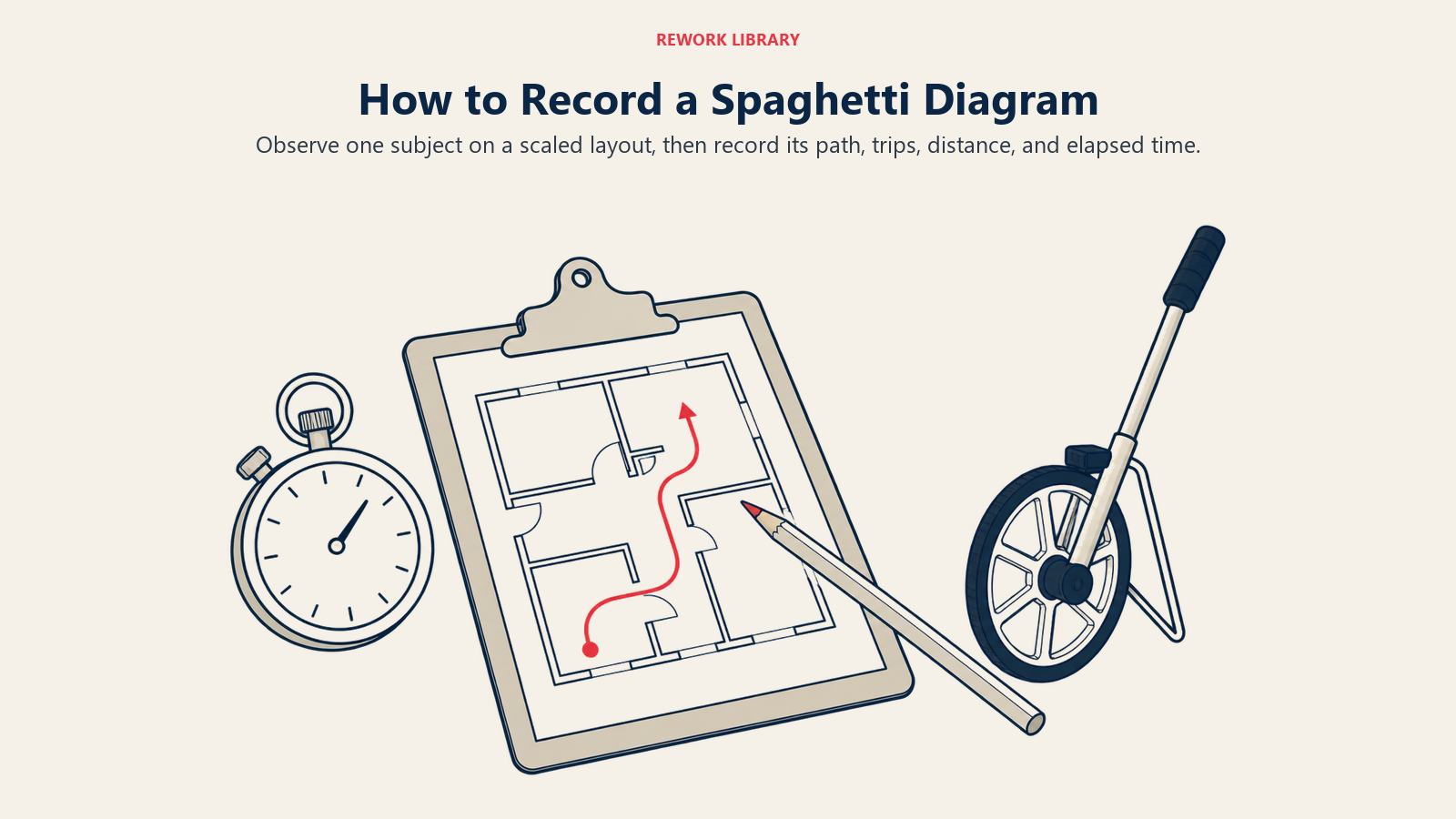
What to bring: a printed scaled floor plan on a clipboard, or a tablet with a drawing app open, a stopwatch or phone timer, a different colored pen for each subject if you're tracking more than one person or item, and a simple tally sheet for trip counts and reasons. None of this requires specialized software. A pencil and a floor plan produce a usable first diagram in under an hour.
A trip log is worth keeping alongside the drawing itself, because the diagram shows you the shape of the waste and the log gives you the numbers that justify fixing it.
| Leg # | From | To | Distance | Purpose |
|---|---|---|---|---|
| 1 | Workstation | Shared printer | 42 ft | Print packing label |
| 2 | Shared printer | Workstation | 42 ft | Return to pack the order |
| 3 | Workstation | Supply shelf | 65 ft | Fetch tape |
| 4 | Supply shelf | Workstation | 65 ft | Return with tape |
What to tell the team, before you start: this is a study of the layout and the process, not of the person. That framing matters as much as the method. A gemba walk works because it observes without judging, and a spaghetti diagram carries the same risk of feeling like surveillance if you draw it quietly and explain later. Tell people what you're doing, why you're doing it, and what happens to what you record, before the pen touches paper. A diagram drawn in secret reads as an inspection the moment someone notices, and the trust it costs outlasts whatever you were trying to measure.
Quantifying the Waste: Turning Steps Into Hours
The arithmetic behind a spaghetti diagram is simple, and that simplicity is the point. It turns a visual impression into a number a budget owner can weigh against the cost of a fix.
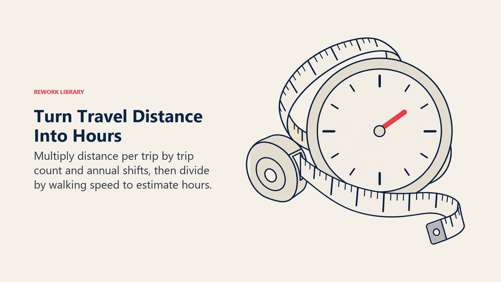
Distance per trip x trips per shift x shifts per year = total annual distance traveled. Divide that distance by a walking pace to get annual hours, and multiply the hourly cost of the role by those hours to see what the waste is actually worth.
The table below is an illustrative worked example, not a reported case study, built to show the mechanics of the calculation on a packing station where a shared label printer sits across the room from the pack bench.
| Metric | Before (shared printer across the room) | After (point-of-use printer at the bench) |
|---|---|---|
| Round-trip distance | 80 ft | 6 ft |
| Trips per shift | 24 | 24 |
| Shifts per year | 250 | 250 |
| Annual distance walked | 480,000 ft (about 91 miles) | 36,000 ft (about 6.8 miles) |
| Annual walking time (at a 3 mph pace) | About 30 hours per packer | About 2.3 hours per packer |
| What changed | Nothing; printer stayed centralized | A second, dedicated printer installed at the station |
Nobody sped up the packing itself in that example. The entire gain came from shortening the trip, which is the same lesson value stream mapping teaches about wait time: the work rarely needs to get faster, the distance around the work does.
Real cases tend to be blunter than illustrative math. At Thrustmaster of Texas, a marine propulsion equipment manufacturer, a spaghetti chart of the tunnel-thruster assembly area found technicians taking 110 steps each per unit, adding up to over seven miles of combined walking and, translated into minutes, nearly 10 hours of wasted time per product (Lean Enterprise Institute, 2016). The team redesigned the assembly layout around the flow the diagram exposed, and within 18 months the plant reached 100% on-time delivery with what the case study describes as significant cost reductions.
The tool is still in active use by manufacturers working with the U.S. Manufacturing Extension Partnership network. A 2025 case at Polycor's Indiana facility describes time spent building a spaghetti diagram alongside a digital value stream map of its most complex product line as part of a broader lean training effort that contributed to a 9.8% production increase and an anticipated $265,000 in additional annual revenue (NIST MEP, 2025). The diagram wasn't the whole program in either case. It was the observation that told the team where to spend the redesign effort.
Spaghetti Diagram vs Value Stream Map vs Process Map vs Swimlane Diagram
Teams often reach for the wrong tool because these four get used loosely as synonyms. They aren't. Each shows a different dimension of the same process, and each hides what the others show.
| Tool | What it shows | What it hides | Best use |
|---|---|---|---|
| Spaghetti diagram | The real physical (or digital) path traveled, its distance, and how often it repeats | Sequence logic, decision points, timing between steps, who owns each step | Diagnosing motion or transport waste tied to a specific layout |
| Value stream map | End-to-end material and information flow, with cycle time and wait time on a timeline | Physical distance and layout-specific waste, unless paired with a spaghetti diagram | Finding where wait time and work-in-progress concentrate across a full value stream |
| Process map or flowchart | The sequence of steps and decisions in a process | Physical distance, who does what across departments, elapsed time | Documenting how a process is supposed to run, for training or onboarding |
| Swimlane diagram | Which role or team owns each step, and where handoffs cross boundaries | Physical distance, time in queue | Mapping accountability and handoff gaps in a cross-functional process |
These tools pair well rather than compete. A spaghetti diagram is usually a companion exercise, run at the same floor visit as a value stream mapping session, or drawn right after a business process mapping or swimlane exercise has already told you which handoff to look at more closely. Only a scaled trace turns "the handoff to the lab is slow" into "the handoff to the lab is 140 feet and a flight of stairs away," which is a very different repair job than a slow approval sitting in someone's inbox.
Where Spaghetti Diagrams Show Up Outside the Factory
The tool travels well because the underlying question, how far does work have to go, applies anywhere people or material move through a defined space.
| Setting | What's traced | Typical finding |
|---|---|---|
| Manufacturing cell | Operator or part path between stations | Long walks to a shared tool or piece of equipment |
| Warehouse | Picker path across aisles for one order or one wave | The same aisle crossed repeatedly for items that could be grouped or reslotted |
| Hospital nursing unit | Nurse path across a shift | Distance driven heavily by ward layout and call volume (Journal of Nursing Management, 2025) |
| Specimen transport | Sample path from collection to lab | Multiple manual relay legs instead of a direct route |
| Restaurant kitchen | Line cook path between stations | Repeated crossing of the line for a shared fridge, pass, or expo point |
| Laboratory | Analyst or sample path between instruments | Backtracking between benches not sequenced to match the actual workflow |
| Office and records | Document or approval path across desks | The same physical or digital handoff crossing the same desks over and over |
| Digital application layout | Screen and window path across a shift | Frequent toggling between systems that don't talk to each other |
The hospital case is the clearest published example of the physical version outside manufacturing. The 2025 study of nurse walking distance across 14 wards at a Japanese acute-care hospital found average shift distances of 4.17 km on 8-hour day shifts, 6.18 km on 12-hour long-day shifts, and 4.76 km on 12-hour night shifts, with emergency wards and higher nurse-call volume both driving distances up significantly (Journal of Nursing Management, 2025). A spaghetti diagram of a single shift makes that same pattern visible at the ward level: which supply room forces the longest walk, which bed positions sit furthest from the nurse station, and whether the layout or the call pattern is the bigger driver.
Digital spaghetti deserves its own explanation, because the "layout" is a screen instead of a floor, and the statistics describing it don't come from spaghetti-diagram studies themselves. They come from research tracking how often people move between applications, which measures the same shape of waste in a different medium. A study covering 137 users across 20 teams at three Fortune 500 companies found that workers toggled between apps and websites roughly 1,200 times a day, at a cost of a little over two seconds per switch, adding up to almost four hours a week, about 9% of work time, spent reorienting after each toggle (Harvard Business Review, 2022). One team in the study, working a supply-chain process across 22 different applications, toggled roughly 350 times per transaction, which meant individual employees switched more than 3,600 times in a single day. Draw that as a diagram and you'd get the same tangled mess as a factory floor, just traced across windows instead of workstations. The fix borrows the same logic too: consolidate the tools that live at the same "station" in the workflow instead of asking a person to keep walking between them.
Turning the Diagram Into a Change
A spaghetti diagram that never leads to a change is just an interesting drawing. The value shows up in what you do with what it points to.
| Finding on the diagram | Intervention |
|---|---|
| Long, repeated trip to a shared tool or resource | Point-of-use storage, or a duplicate placed at the station |
| Two subjects' paths crossing constantly | Cell redesign around the actual sequence of use |
| Someone leaving their station to fetch supplies | A water spider or material handler route, paced to demand rather than run ad hoc |
| Search motion inside a cluttered station | 5S, so a place exists for everything the diagram shows people hunting for |
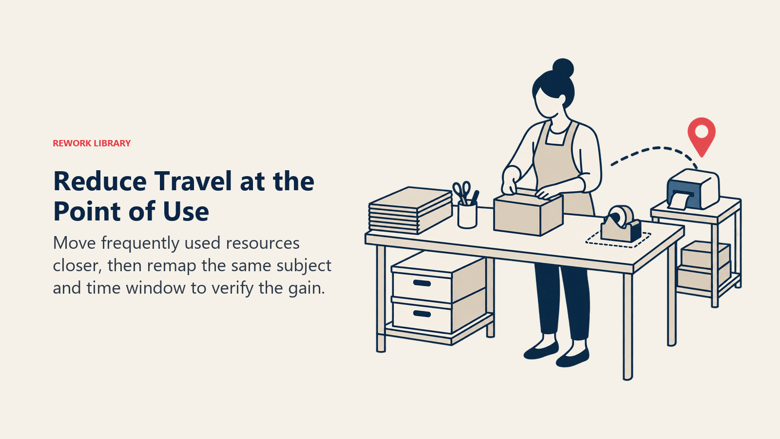
| The same interdepartmental trip made every day | Relocate the shared resource, printer, supply cabinet, or terminal closer to the point of use |
Cell redesign and point-of-use storage handle most of what a motion-focused diagram surfaces. A water spider role, an internal handler who delivers materials on a fixed route so operators never leave their stations, is the standard answer when the diagram shows transport waste instead: it moves the walking off the value-adding operator and onto a role built for it. That role only works cleanly once the cell itself is arranged for single-piece flow, because a layout still built around large batches will keep generating detours no route can fully absorb.
5S matters here for a second reason beyond search time. It gives the redesign somewhere to live. A newly shortened path decays back into a tangle within weeks if nothing marks where the relocated tool, cart, or printer belongs, which is exactly what 5S's "set in order" step is for.
The step teams skip most often is the follow-up remap. Redraw the diagram after the change, using the same subject, the same time-box, and the same method you used the first time, and compare trip counts and distance directly against the baseline. Once the new path is confirmed to hold, write it into standard work so the layout and the sequence survive turnover, a new hire, or someone quietly moving a cart back to where it used to sit.
Common Pitfalls
A spaghetti diagram is hard to draw badly, but easy to use badly. These are the mistakes that show up most often.
| Pitfall | Why it happens | The fix |
|---|---|---|
| Mapping the ideal path instead of the observed one | The team draws the documented procedure instead of watching real work | Stand at the gemba and trace what you actually see, not what's written down |
| A single-shift snapshot that misses variation | One observation window gets treated as the whole pattern | Repeat the observation across at least two shifts, and a high-volume day if one exists |
| Mapping the person instead of the product when the product is the problem | The easier subject gets traced instead of the one the complaint is actually about | Decide motion vs transport waste first, then pick the subject that matches |
| Drawing it once and never re-measuring | The diagram gets treated as a finished deliverable, not a baseline | Schedule the follow-up remap before the redesign starts, not after |
| Treating a shorter line as the goal instead of a shorter lead time | The team optimizes for how tidy the redrawn diagram looks | Track hours saved and trips avoided, and connect the result back to lead time, not the drawing's appearance |
None of these mistakes are hard to avoid. They're just easy to miss because the tool feels too simple to need discipline. It doesn't need much, but it needs that.
A spaghetti diagram earns its reputation as one of the simplest tools in the lean kit because it asks almost nothing of the person running it: pick a subject, watch it move, draw the line. What it demands instead is honesty about what you actually see, and enough follow-through to redraw the line after you've changed the layout. Do both, and a tangle of noodles on a floor plan turns into a specific number of hours a year that no longer has to be walked.
Related Reading
- Muda, Mura, Muri: The 3 Wastes of Lean
- Value Stream Mapping: How to Map and Improve a Process
- Business Process Mapping: Types, Symbols, and Steps
- Swimlane Diagram: How to Map Cross-Functional Processes
- Gemba Walk: How to Observe Work Where It Happens
- 5S Methodology at Work
- Standard Work
- Kaizen Event

Customer Success Operations Manager
On this page
- What a Spaghetti Diagram Is, and Where the Name Comes From
- Motion Waste vs Transport Waste: Why the Difference Changes What You Draw
- How to Run a Spaghetti Diagram Exercise
- Quantifying the Waste: Turning Steps Into Hours
- Spaghetti Diagram vs Value Stream Map vs Process Map vs Swimlane Diagram
- Where Spaghetti Diagrams Show Up Outside the Factory
- Turning the Diagram Into a Change
- Common Pitfalls
- Related Reading