The 7 Quality Control Tools: What They Are and When to Use Each
Turn this article into takeaways for your work.
Each assistant summarizes the article only for you and suggests best practices for your work.
The 7 quality tools are a set of graphical and statistical techniques that any frontline team can use to find, analyze, and fix quality problems without needing a statistics degree. Kaoru Ishikawa, the Japanese quality pioneer who introduced them in the 1960s, argued that these seven tools alone could solve 95% of workplace quality problems.
What are the 7 quality control tools?
The 7 quality tools (also called the seven basic tools of quality) are a collection of problem-analysis techniques introduced by Kaoru Ishikawa that help teams collect data, spot patterns, identify root causes, and monitor process stability using visual methods. Ishikawa championed them in Japanese manufacturing as a practical alternative to complex statistical methods that most workers couldn't apply on the shop floor.
The tools don't require specialized software or advanced math. A check sheet is a hand-drawn tally table. A histogram is a bar chart of frequency. Their power comes not from individual sophistication but from how they chain together: data collected with a check sheet feeds a Pareto chart, which points to the category worth investigating with a fishbone diagram.
Key Facts
- Kaoru Ishikawa's 1968 textbook "Guide to Quality Control" popularized the seven tools and is still referenced in Six Sigma curricula worldwide.
- ASQ (American Society for Quality) reports that organizations using structured quality tools in their improvement projects see defect reduction rates two to three times higher than those that rely on intuition alone (ASQ Quality Progress, 2022).
- A 2021 survey by the International Journal of Production Research found that Pareto analysis and cause-and-effect diagrams were the two most commonly deployed quality tools across manufacturing and service industries.
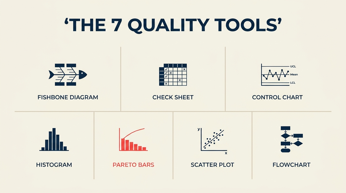
The 7 quality tools at a glance
| Tool | What it does | Best for |
|---|---|---|
| Cause-and-effect (fishbone) diagram | Maps potential causes of a problem to categories | Root cause brainstorming |
| Check sheet | Structured tally of defect types or events | Real-time data collection on the floor |
| Control chart | Plots process output over time against control limits | Detecting process instability or drift |
| Histogram | Shows frequency distribution of a measurement | Understanding spread and shape of variation |
| Pareto chart | Ranks defect categories by frequency (80/20) | Prioritizing which problems to tackle first |
| Scatter diagram | Plots two variables to reveal correlation | Testing whether a suspected cause drives an effect |
| Stratification (flowchart) | Separates data by source or groups steps in a process | Isolating which machine, shift, or step is the outlier |
The 7 quality tools explained
1. Cause-and-effect diagram (fishbone or Ishikawa diagram)
A fishbone diagram looks exactly like it sounds: a horizontal spine representing the problem, with branches fanning out to represent categories of potential causes. The classic manufacturing version uses six categories (the "6 Ms"): Machine, Method, Material, Measurement, Man, and Mother Nature (environment). Service teams often substitute People, Process, Policy, and Place.
The tool's job is to make a brainstorm structured. Without it, root-cause sessions tend to circle the same two or three obvious suspects. The fishbone forces teams to examine every category systematically before settling on a culprit.
When to use it: Once you've confirmed a problem exists (via a check sheet or control chart) and you need to generate a complete list of possible causes before running experiments or pulling data.
2. Check sheet
A check sheet is a pre-designed form for counting and categorizing observations as they happen. Think of a table with defect types along one axis and time periods or shifts along the other. Each time a defect occurs, the inspector makes a tally mark in the right cell.
The check sheet's strength is speed and consistency. It requires no software, no interpretation in the moment, and produces clean, structured data that flows directly into a Pareto chart or histogram.
When to use it: At the point of production or service delivery, when you want to count how often different defect types occur and when. It's the starting point for most data-driven quality investigations.
3. Control chart
A control chart tracks a process measurement (cycle time, dimension, error rate) plotted in sequence over time, with three horizontal lines overlaid: the process mean and upper and lower control limits calculated from the data itself. Points inside the limits represent normal variation. Points outside the limits, or non-random patterns inside them, signal that something has changed.
The key distinction is between common cause variation (random fluctuation the process always produces) and special cause variation (a new, identifiable factor that has entered the system). Control charts separate these two categories so teams don't waste time fixing normal variation or miss the signal of a real shift.
When to use it: Whenever a process runs repeatedly and you want to know whether it's stable or drifting. Control charts are standard in Six Sigma Control phases to confirm that improvements hold over time.
4. Histogram
A histogram groups a set of measurements into ranges (bins) and displays the count in each bin as a bar. The resulting shape tells you a lot: a symmetric bell curve suggests a stable, normally distributed process; a skewed distribution suggests a boundary condition or floor effect; a bimodal shape (two humps) suggests two different populations mixed together, perhaps two machines or two operators.
The histogram works on data that's already been collected. It doesn't show time sequence, so it won't tell you when a shift happened, only what the distribution looks like overall.
When to use it: After collecting a batch of measurements and before running capability analysis. It answers "what does the spread look like?" rather than "is the process stable?"
5. Pareto chart
A Pareto chart is a bar chart where categories are sorted from most to least frequent, with a cumulative percentage line overlaid. It visualizes the Pareto principle: roughly 80% of problems typically come from 20% of causes. In practice the split is rarely exactly 80/20, but the concentration is almost always real.
The chart makes prioritization obvious. If "wrong-size packaging" accounts for 63% of customer complaints and "late delivery" accounts for 18%, the decision about where to spend improvement resources isn't a debate.
When to use it: After collecting check sheet data, when you need to choose which defect category to focus on. It's also useful mid-project to confirm that the category you addressed has actually dropped.
6. Scatter diagram
A scatter diagram plots pairs of observations: one variable on the X axis, another on the Y axis. Each pair becomes a dot. The pattern of dots reveals whether the two variables are correlated: a tight upward-sloping cluster suggests positive correlation; a downward slope suggests negative correlation; a random cloud suggests no relationship.
Scatter diagrams show correlation, not causation. Finding a correlation between oven temperature and defect rate doesn't prove temperature causes the defects, but it tells you the relationship is worth investigating with a controlled experiment.
When to use it: When you have a hypothesis about a cause-and-effect relationship and want to check it against real data before running a more expensive experiment.
7. Stratification (or flowchart)
The seventh tool has two accepted variants depending on which quality authority you follow. Ishikawa's original list includes stratification: separating pooled data by source (machine, shift, operator, supplier) to see whether one subgroup is driving the overall problem. Others, including the ASQ, list the flowchart as the seventh tool.
Both are genuinely useful. Stratification is an analytical technique: if your check sheet shows 200 defects this month, stratifying by shift might reveal that 170 of them occurred on the night shift, immediately narrowing the investigation. A flowchart maps the sequence of steps in a process, making it possible to spot where handoffs, decision points, or inspection gaps create quality risk.
When to use stratification: When aggregate data hides a subgroup pattern. Apply it to any collected dataset before drawing conclusions.
When to use a flowchart: At the start of a quality project, to document what actually happens in a process versus what the procedure says should happen.
How to choose the right quality tool
Choosing comes down to two questions: what do you already know, and what do you need to learn next?
Step 1: Confirm the problem is real
Use a check sheet or pull historical defect data. If you don't know the frequency or pattern of the problem, you can't assess its size or prioritize it.
Step 2: Prioritize which category to investigate
If check sheet data shows multiple defect types, build a Pareto chart. Focus on the category that accounts for the largest share of defects.
Step 3: Understand variation
If the problem is process drift or instability over time, use a control chart. If you want to understand the spread and shape of a measurement, use a histogram.
Step 4: Generate potential causes
Once you've confirmed what's happening and how often, use a cause-and-effect diagram to brainstorm why. Include everyone who touches the process.
Step 5: Test suspected causes
Use a scatter diagram to check whether a suspected cause and the defect measure are correlated. Use stratification to check whether the problem is concentrated in one shift, machine, or supplier.
Step 6: Monitor the fix
After implementing a change, return to the control chart to confirm the process has stabilized at the improved level.
7 quality tools example: a worked sequence
Here's how the tools chain together in a real scenario. A packaging line at a food manufacturer is generating too many customer complaints about damaged goods.
Check sheet: The quality team designs a check sheet with five defect categories: crushed corner, split seam, missing label, incorrect weight, and wrong item. Over two weeks, operators tally every defect by category and shift.
Pareto chart: The tallied data goes into a Pareto chart. Crushed corner accounts for 71% of all defects. Split seam accounts for 19%. The other three categories together account for 10%. The team decides to focus exclusively on crushed corners for now.
Cause-and-effect diagram: The team holds a fishbone session for "crushed corner defects." They identify 11 potential causes across four categories: stacking height during transit (Method), carton blank thickness variation (Material), conveyor pressure setting (Machine), and operator awareness of stack limits (Man).
Scatter diagram: They pull data on conveyor pressure settings and crushed corner rates across 30 production runs. The scatter plot shows a clear positive correlation: higher pressure settings are associated with higher defect rates.
The team adjusts the pressure setting and updates the operating procedure. After two weeks, they rebuild the Pareto chart. Crushed corner defects have dropped from 71% of complaints to 18%. The fix holds on the control chart for six weeks, confirming stability.
Best practices
Start with a check sheet, not a hypothesis. Teams often skip data collection and jump straight to cause analysis based on what someone remembers happening last month. Structured data collection first removes that bias.
Use the tools in sequence. The 7 quality tools work as a chain, not a menu. Skipping steps, such as building a fishbone before a Pareto chart, means you might investigate a low-frequency cause while the high-frequency one goes untouched.
Keep the visuals visible. Post control charts and Pareto charts where the team works, not buried in a shared drive. When operators see the data in their environment, they engage with it differently than when it appears in a slide deck.
Combine tools for deeper insight. A control chart alone tells you a process is unstable. Stratification on the same data tells you which shift or machine is responsible. These combinations are where the tools become genuinely diagnostic rather than just descriptive.
Pair with structured problem-solving methods. The 7 tools support but don't replace methods like A3 problem solving or affinity diagram sessions. Use the tools to generate and validate the data that structured methods need to drive decisions.
Frequently asked questions
Who invented the 7 quality tools? Kaoru Ishikawa compiled and popularized them in Japan during the 1960s, drawing on existing statistical and analytical techniques. He introduced them in his 1968 text "Guide to Quality Control" and argued they should be standard knowledge for all factory workers, not just quality engineers.
Are the 7 quality tools the same as the 7 management and planning tools? No. The 7 management and planning tools (also called the 7 new quality tools or 7 MP tools) are a separate set developed in the 1970s for strategic planning and more complex, language-based data. They include the affinity diagram, relations diagram, tree diagram, matrix diagram, prioritization matrix, process decision program chart, and activity network diagram. The original 7 quality tools are for operational and process-level data; the management tools are for planning and strategy.
Do you need Six Sigma certification to use these tools? No. The 7 quality tools are intentionally simple enough for any team member to apply with basic training. Six Sigma programs teach them as foundational skills, but you don't need a Belt certification to run a check sheet or build a Pareto chart. Many teams use them informally in daily huddles and weekly reviews without any formal quality program.
What's the difference between a control chart and a run chart? A run chart plots data points in time sequence without control limits. A control chart adds statistically derived upper and lower control limits, which allows you to distinguish random variation from signals that something has changed. Run charts are simpler and useful for spotting trends; control charts are more powerful for detecting process instability.
Can these tools apply to service industries, not just manufacturing? Yes. The tools originated in manufacturing, but they translate directly to any repeatable process. A call center can use a check sheet to tally call resolution failure types, a Pareto chart to prioritize the most common failure, and a control chart to monitor average handle time. Healthcare, logistics, finance, and software teams all use the 7 quality tools routinely.
Quality problems rarely announce their cause. What they do announce is their pattern, and that's exactly what these seven tools are designed to surface. Start with the data before forming a theory, use the Pareto principle to focus your effort, and return to the control chart to confirm the fix holds. That sequence, repeated consistently, is what separates teams that improve from teams that stay busy.

Senior Operations & Growth Strategist
On this page
- What are the 7 quality control tools?
- The 7 quality tools at a glance
- The 7 quality tools explained
- 1. Cause-and-effect diagram (fishbone or Ishikawa diagram)
- 2. Check sheet
- 3. Control chart
- 4. Histogram
- 5. Pareto chart
- 6. Scatter diagram
- 7. Stratification (or flowchart)
- How to choose the right quality tool
- Step 1: Confirm the problem is real
- Step 2: Prioritize which category to investigate
- Step 3: Understand variation
- Step 4: Generate potential causes
- Step 5: Test suspected causes
- Step 6: Monitor the fix
- 7 quality tools example: a worked sequence
- Best practices
- Frequently asked questions