Territory Analytics and Dashboards: Giving Agri-Input Sales Leaders the Visibility to Act Before a Season Is Lost
Turn this article into takeaways for your work.


Each assistant summarizes the article only for you and suggests best practices for your work.
Most agri-input sales reviews are autopsies. By the time primary sales data is reconciled, secondary sell-through numbers arrive from distributors, and the area manager puts together a territory summary, the Kharif sowing window has closed. The seeds are in the ground. The fungicide decision has been made. The competing brand's agronomist was at that dealer three weeks ago, and you didn't know. Review meetings in this industry too often answer one question: what happened? The better question, the one that actually protects revenue, is: what's happening right now, and what do we do about it before the season decides for us?
Territory dashboards built for agri-input commercial teams have to answer that second question. Speed of signal to decision is the primary design constraint, not comprehensiveness, not elegance, and not the preferences of the finance team that usually ends up owning the BI tool.
The Three Dashboard Layers in Agri-Input Commercial Management
A territory analytics system isn't a single dashboard. It's a stack of three views, each serving a different audience and answering a different question. When companies try to build one dashboard for everyone, they end up with a report that's too detailed for a national sales head and too aggregated for a field representative. The result is that nobody uses it.
The right architecture separates the layers explicitly:
Rep level covers daily activity: calls completed versus plan, demo plot status (registered, crop stage, harvest outcome), new dealer activations, and any pending complaint or sample follow-up. This view exists so that the area manager can see, without a phone call, whether a rep in the Punjab wheat belt is on track for the week or needs a redirect before Friday.
Territory and area level answers the coverage question: how much of the addressable market is the territory actually reaching? This means active dealer count versus potential dealer universe, secondary sell-through run-rate by SKU, and dealer health signals like stock aging or return rates. For a territory covering 40 villages in Maharashtra's Vidarbha cotton belt, this layer tells you which sub-districts are underserved and whether primary sales to distributors are actually moving to farmers or sitting in the channel.
Regional and national level rolls territory signals into market share proxies, campaign performance versus plan, and forecast accuracy. This is where a regional manager watching five territories across Rajasthan's mustard belt can see which territory is falling behind the season plan and where to direct the crop protection specialist's next field visit.
| Layer | Audience | Key Metrics | Update Frequency | Primary Question Answered |
|---|---|---|---|---|
| Rep | Field rep, area manager | Calls vs. plan, demo plot status, new dealers | Daily | Is the rep executing the field plan today? |
| Territory/Area | Area manager, territory manager | Active dealers, secondary run-rate, SKU mix | Daily (activity), weekly (secondary) | Is the territory on track to hit seasonal targets? |
| Regional/National | Regional head, commercial director | Fill rate, market share proxy, forecast vs. actuals | Weekly (ops), monthly (financials) | Where does leadership need to intervene across the portfolio? |
The right metrics at each layer are what give the dashboard its teeth. The question is which specific numbers actually move decisions.
Key Facts: Territory Analytics and Decision Speed
- Sales reps across industries spend only 28% of their working week on active selling, per Salesforce's State of Sales research. For agri-input area managers reviewing five territories before heading to the field, a dashboard that surfaces exceptions in 60 seconds does more to reclaim productive time than any workflow redesign.
- McKinsey's analysis of sales automation finds that companies can free up approximately 20% of sales team capacity by automating non-customer-facing activities such as data entry and status reporting. Territory dashboards connected to live SFA feeds are the primary mechanism for capturing this capacity in field-based agri-input sales operations.
- As a rough operational benchmark, secondary sales data in many Indian agri-input distribution networks reaches area managers with a lag of 10 to 14 days when collected through manual distributor reports. This estimate reflects practitioner experience across the sector rather than a published study, and the exact lag depends on distributor reporting discipline and system integration.
Key Metrics by Layer
Getting the metric list right is harder than it looks. Most agri-input dashboards fail not because the data isn't available but because they track everything and prioritize nothing. These are the metrics that actually drive decisions at each layer.
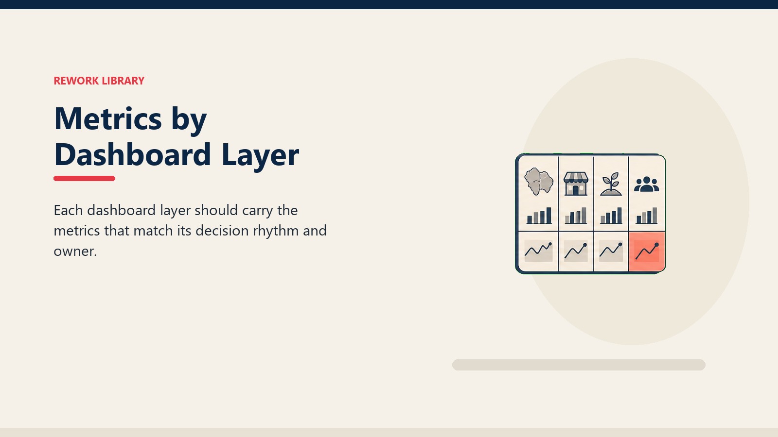
Rep-level metrics: Calls completed versus plan is the leading indicator of everything else. If a rep in the Rabi season across Haryana is completing 60% of planned calls in week two, the pipeline problem is visible before it becomes a revenue problem. Demo plot metrics matter in a different way: the number of demo plots registered at sowing time predicts the quality of the harvest-season conversation with farmers, which in turn predicts brand preference going into the next season. New dealer activation count rounds out the rep view, especially during the first half of the season when the network is still being built out.
Territory-level metrics: Active dealer count versus the potential dealer universe in the territory tells you about reach. Secondary sales run-rate, meaning actual sales from distributor to retailer or farmer, is the only real signal of whether primary billing is converting to consumption or sitting as channel inventory. SKU mix versus plan catches the substitution problem: a territory that's hitting volume on low-margin generics while specialty molecules fall behind is on a different trajectory than the primary sales numbers suggest. Connecting secondary sales tracking to territory dashboards is the single highest-value integration in the agri-input commercial stack.
Region-level metrics: Territory fill rate, which is the percentage of territories at or above 80% of their seasonal plan by a given week, gives regional leadership a portfolio view without requiring them to audit each territory manually. Stock-out incidents at key distributors during peak demand periods signal a supply chain or demand-planning failure that needs immediate escalation. Primary-to-secondary lag, the number of days between primary billing to a distributor and confirmed secondary movement, surfaces channel stuffing risk before it becomes a write-off problem at season end.
Data Sources and Integration Architecture
The metrics are only as good as the data feeding them. Agri-input commercial teams typically have four source systems, and very few have integrated them cleanly.
SFA and CRM activity data is the foundation. Every rep call, demo plot registration, and dealer visit should flow through a sales force automation (SFA) system in real time. This is non-negotiable for daily dashboards. If reps are still submitting paper call reports or end-of-day WhatsApp messages to their managers, the dashboard will always be a day or more behind. Agri Sales CRM and SFA systems designed for field conditions, low connectivity, offline sync, voice input, are the prerequisite infrastructure. Wikipedia's overview of sales force management systems describes the foundational SFA capability stack, the same layer that territory dashboards depend on for real-time activity feeds.
Distributor secondary sales reports are the hardest data source to integrate. In India, most distributors send secondary sales data weekly or monthly, in formats that range from tally exports to handwritten statements. In the US Midwest, distributors may have electronic data interchange (EDI) connections or point-of-sale (POS) integrations, but the data model is still inconsistent across the territory. The practical architecture for most agri-input companies in the near term is a structured reporting template (Excel or app-based) with weekly submission deadlines, combined with a data ops function that normalizes it before it hits the dashboard. A World Bank analysis of agri-input market inefficiencies in Africa found that information gaps across the distribution chain are as damaging as logistics failures, the same structural problem that secondary reporting frameworks are designed to close.
Crop-area data provides the denominator for potential benchmarking. If a territory has 120,000 hectares of Kharif soybean in Maharashtra's Latur district and the company's crop protection portfolio covers that crop, the addressable market is calculable. Layering actual coverage against that potential shows white space that call plan adherence numbers alone won't reveal. FAO's Crop Calendar provides validated planting and harvest windows for over 100 crops across 50+ countries, and that same seasonal structure is what territory potential benchmarks must be built on.
Weather and phenology signals adjust the calendar. A delayed monsoon in the Vidarbha cotton belt compresses the effective sowing window. A dry spell in Brazil's Cerrado during the Safrinha corn season changes the fungicide application timing. Dashboards that ignore phenology will generate false alerts, flagging reps as behind plan when the crop itself isn't ready for the next input application. The best implementations treat phenology as a calendar modifier, shifting target dates for demo registrations and treatment windows by region rather than holding all territories to the same fixed schedule.
In practice, these four sources connect through a central data layer, either a cloud data warehouse or an on-premise aggregation server, that feeds the dashboard tool. The SFA pushes daily. Secondary sales data lands weekly. Crop-area data is updated once or twice per season. Weather inputs update daily or every few hours for field-level accuracy. Data plumbing solved, the next question is how to design the dashboard itself so area managers actually open it.
Dashboard Design Principles for the Agri-Input Field
How a dashboard is built matters as much as what it tracks. These principles separate agri-input commercial dashboards that get used from the ones that sit on a SharePoint page nobody opens.
Exception-first design: The dashboard should show red before green. An area manager reviewing five territories on Monday morning doesn't need to see which territories are performing well. They need to know which one is falling behind and why. Color-coded exception flags, not tables of numbers, should be the primary visual layer.
Mobile-accessible for field conditions: Area managers in agri-inputs spend more time between villages than at desks. The dashboard needs to load on a 4G connection in 10 seconds, show the three most important exceptions without scrolling, and let the manager drill down with a tap. A dashboard that requires a laptop and a PowerPoint export from IT every Friday is not a decision tool; it's a reporting ritual.
Drilldown path in three clicks: National to regional to territory to rep should be navigable in three clicks or fewer. If a commercial director in a Mumbai office spots a shortfall in the Pune region during a Wednesday morning review, they should be able to reach the specific territory and the specific rep conversation within the same session without calling anyone.
Update cadence matched to decision speed: Activity data (calls, visits, demo registrations) should update daily. Secondary sales should update weekly at minimum, daily where the distributor data infrastructure supports it. Financial metrics like net sales realization and margin mix can update monthly. Mixing these cadences without labeling them clearly creates confusion: an area manager who sees "secondary sales" data that's three weeks old during sowing season will make a wrong call.
Dashboard Design Checklist:
- Does every metric have a clear "act if this" threshold defined?
- Are red exceptions surfaced before green confirmations?
- Can the dashboard be read on a 6-inch mobile screen in daylight?
- Is the data update timestamp visible on every view?
- Can a national sales head reach rep-level detail in three clicks?
- Are secondary sales data age and source labeled explicitly?
- Are seasonal benchmarks adjusted for crop phenology by region?
- Does the dashboard connect to field reporting and demo tracking as a drilldown source?
Quotable Nugget: McKinsey research finds that companies can free up approximately 20% of sales team capacity by automating non-customer-facing activities such as data entry and status updates. In agri-input companies with compressed seasonal selling windows, a 20% capacity gain redirected to dealer visits and farmer touchpoints during the 6 to 8 week peak period has a disproportionate revenue impact compared to the same gain in a year-round B2B business.
From Dashboard to Decision: Intervention Triggers
A dashboard that flags exceptions is only useful if the organization knows what to do when an exception fires. The most effective agri-input commercial teams define intervention triggers before the season starts, not during it.
Intervention triggers translate metric thresholds into specific actions and clear ownership. They remove the ambiguity that causes delays: a manager who has to decide whether a 68% call plan adherence number is "concerning enough to act on" will often decide to wait another week. A manager who has a pre-agreed trigger at 70% knows exactly what to do.
| Metric | Threshold | Trigger Action | Who Acts |
|---|---|---|---|
| Call plan adherence | Below 70% by end of week 2 | Area manager field visit + rep coaching session | Area manager |
| Active dealer coverage | Below 60% of potential universe by week 4 of season | Territory review with distributor partner, white space activation plan | Territory manager |
| Secondary sell-through vs. primary | Less than 40% sell-through by week 6 | Channel inventory audit, promotion or pull-through program | Commercial manager |
| Demo plot harvest outcome registration | Below 50% of registered plots by harvest window | Rep accountability review, seed company partnership check | Area manager + regional head |
| Stock-out incidents at key distributors | Any stock-out during peak sowing weeks | Supply chain escalation within 24 hours | Supply chain + commercial manager |
Sales review meetings should be structured around dashboard exceptions, not territory-by-territory status updates. A weekly area review that starts with "show me the territories below threshold" takes 30 minutes. One that starts with "let's go around and each territory updates us" takes two hours and surfaces the same problems later.
Dashboard outputs also connect to longer-cycle decisions. A territory that consistently falls below coverage benchmarks through multiple seasons may be undersized, may be carrying the wrong dealer network profile, or may have a rep-to-geography mismatch. These signals feed territory design and field force alignment decisions at the start of the next planning cycle. And KPI trending across seasons informs incentive structure reviews: if the secondary sell-through metric is chronically below trigger thresholds company-wide, it may be that the incentive plan rewards primary billing without enough weight on channel throughput. But even the best-designed dashboard programs fail when the organizational habits around them are wrong.
Why Do Agri-Input Dashboard Programs Fail?
Most dashboard initiatives in agri-input companies fail for predictable reasons. They're worth naming directly because they tend to recur regardless of the BI tool or the budget invested.
Dashboards built for finance, not field managers. The finance team often controls the data warehouse and the reporting tool, so dashboards get designed around financial close cycles, P&L structures, and SKU-level margin reporting. These are important, but they're not what an area manager in Andhra Pradesh needs at 7am before heading to a dealer meeting. The symptom is a dashboard that nobody in the field opens voluntarily. The root cause is that the design process didn't include area managers as primary users. The fix is to prototype with area managers first, build the finance layer separately, and resist the urge to consolidate both audiences into one view. Business intelligence (BI) tools used in this context should be evaluated on how fast they surface exceptions to a field manager on mobile, not on the richness of their P&L (profit and loss) modeling features.
Data latency that makes the dashboard decorative. If secondary sales data arrives two weeks late, the dashboard is showing the Rabi wheat territory's sell-through position from before the critical urea application window. Decisions made on it aren't timely; they're archaeological. The symptom is that managers stop trusting the numbers and revert to phone calls for real information. The root cause is a data collection process that hasn't been redesigned alongside the dashboard program. The fix is to establish weekly secondary reporting as a commercial discipline, not a request that distributors can ignore, and to build the latency into the dashboard's own display so users always know how fresh their data is.
Metric overload without action triggers. A dashboard with 40 metrics and no defined thresholds is a reporting library, not a decision tool. When everything is tracked and nothing is prioritized, managers spend review time discussing numbers rather than making decisions. The symptom is long review meetings with no clear action items. The root cause is that the design process focused on "what can we track" instead of "what do we need to act on." The fix is to start with five metrics per layer that have pre-agreed triggers, ship that version, and add metrics only when there's a clear decision they enable.
Frequently Asked Questions about Territory Analytics and Dashboards
How often should territory dashboards be reviewed in-season?
Activity dashboards (calls, visits, demo registrations) should be reviewed daily or every other day by area managers during peak sowing and application windows. Secondary sales dashboards should be reviewed weekly at the territory level and bi-weekly at the regional level. Monthly reviews are appropriate for financial and forecast metrics. The cadence should compress during the four to six weeks of peak season activity in each crop zone, and area managers should have the authority to escalate directly from dashboard exceptions without waiting for the weekly review cycle.
What's the minimum viable dashboard for a company just starting territory analytics?
Start with three metrics at the rep level (calls vs. plan, demo plots registered, new dealers) and two at the territory level (active dealer count vs. potential, secondary sell-through vs. primary). Connect them to your SFA system and commit to weekly secondary sales reporting from your top 20% of distributors by volume. Build the intervention triggers before you launch the dashboard. You can add layers once the team has built the habit of acting on exceptions rather than just reviewing them.
How do we handle territories that span multiple crop seasons or crop types?
Define separate benchmarks for each crop calendar within the territory. A rep covering both Kharif cotton and Rabi wheat in Telangana has two distinct peak periods with different call plan structures, demo plot timelines, and secondary sell-through patterns. The dashboard should display both crop-season tracks simultaneously, with phenology-adjusted targets for each, and the area manager review should address both in the same session rather than treating them as separate territory reviews.
Our distributors won't send secondary sales data consistently. What do we do?
This is a commercial relationship problem before it's a data problem. Secondary reporting should be a condition of distributor partnership status, tied to the priority access, credit terms, or promotional programs that distributors value. Start by requiring it from your top 10 distributors in each territory, those who represent 70% or more of your primary billing volume. Use a standardized template with a fixed weekly submission deadline. Appoint a commercial operations role to chase submissions and flag non-compliance to the territory manager. Once you've demonstrated that the data actually drives favorable decisions for compliant distributors, adoption typically improves.
How do [agri-input KPIs and metrics](/libraries/agri-inputs-growth/agri-sales-kpis-metrics) connect to dashboard design?
KPIs define what matters; dashboards make those KPIs visible and actionable. The right sequence is to define your seasonal KPIs first, agree on the intervention thresholds for each, and then build the dashboard to surface those thresholds in real time. Dashboards built before the KPI set is agreed tend to track what's easy to measure rather than what drives the business. Many of the metric structures referenced in this article align directly with the KPI frameworks used in agri-input commercial management and are worth reviewing together with your commercial leadership team before starting a dashboard build.
Learn More

Senior Implementation Consultant