Pareto Analysis: The 80/20 Rule for Prioritization
Turn this article into takeaways for your work.
Each assistant summarizes the article only for you and suggests best practices for your work.
Pareto analysis is a structured decision-making technique that helps teams identify which small number of causes is responsible for the majority of problems. It's one of the most practical tools in process improvement because it tells you where to focus first, rather than treating every issue as equally urgent.
Most quality problems, customer complaints, and operational failures follow a skewed distribution. A handful of root causes account for most of the damage, while a long tail of minor issues contribute comparatively little. Pareto analysis makes that imbalance visible and actionable.
What is Pareto analysis?
Pareto analysis is a prioritization method based on the 80/20 rule: roughly 80% of effects come from 20% of causes. The goal is to separate the vital few causes (the 20% worth fixing now) from the trivial many (the 80% that matter less), so teams spend their effort where it returns the most.
The principle traces back to Italian economist Vilfredo Pareto, who observed in 1906 that approximately 80% of Italy's land was owned by 20% of the population. He found a similar concentration pattern in pea pods in his garden, which suggested the distribution was natural rather than coincidental.
Decades later, quality pioneer Joseph M. Juran applied Pareto's observation to quality management. Juran coined the phrase "vital few and trivial many" and made the Pareto chart a standard tool in quality improvement programs, including what later became Six Sigma and Total Quality Management.
Today, Pareto analysis is used across functions: operations, customer support, product development, finance, and sales.
Key Facts
- Joseph Juran introduced the "vital few and trivial many" framing in the 1950s, and it has been a cornerstone of quality management ever since. The American Society for Quality (ASQ) lists the Pareto chart as one of the seven basic quality tools.
- The 80/20 ratio is a general pattern, not a law. Real distributions may split 70/30 or 90/10. The principle holds: a minority of causes drives a majority of effects.
- "The Pareto principle is the key to establishing priorities.", Joseph M. Juran, Juran's Quality Handbook, widely cited as the definitive statement on the vital-few principle.
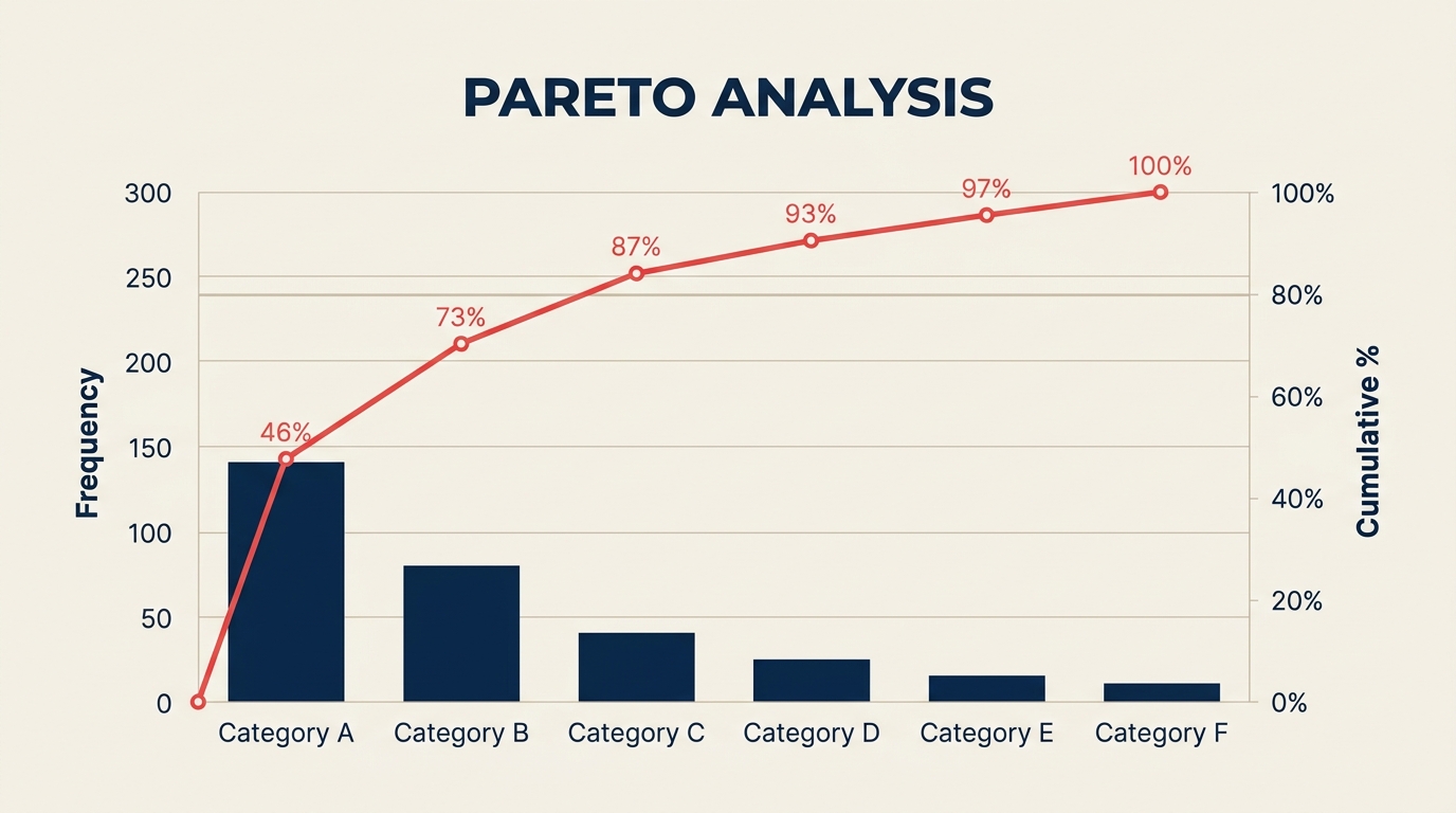
What is a Pareto chart?
A Pareto chart is a specific bar chart that visualizes the results of a Pareto analysis. It combines two visual elements:
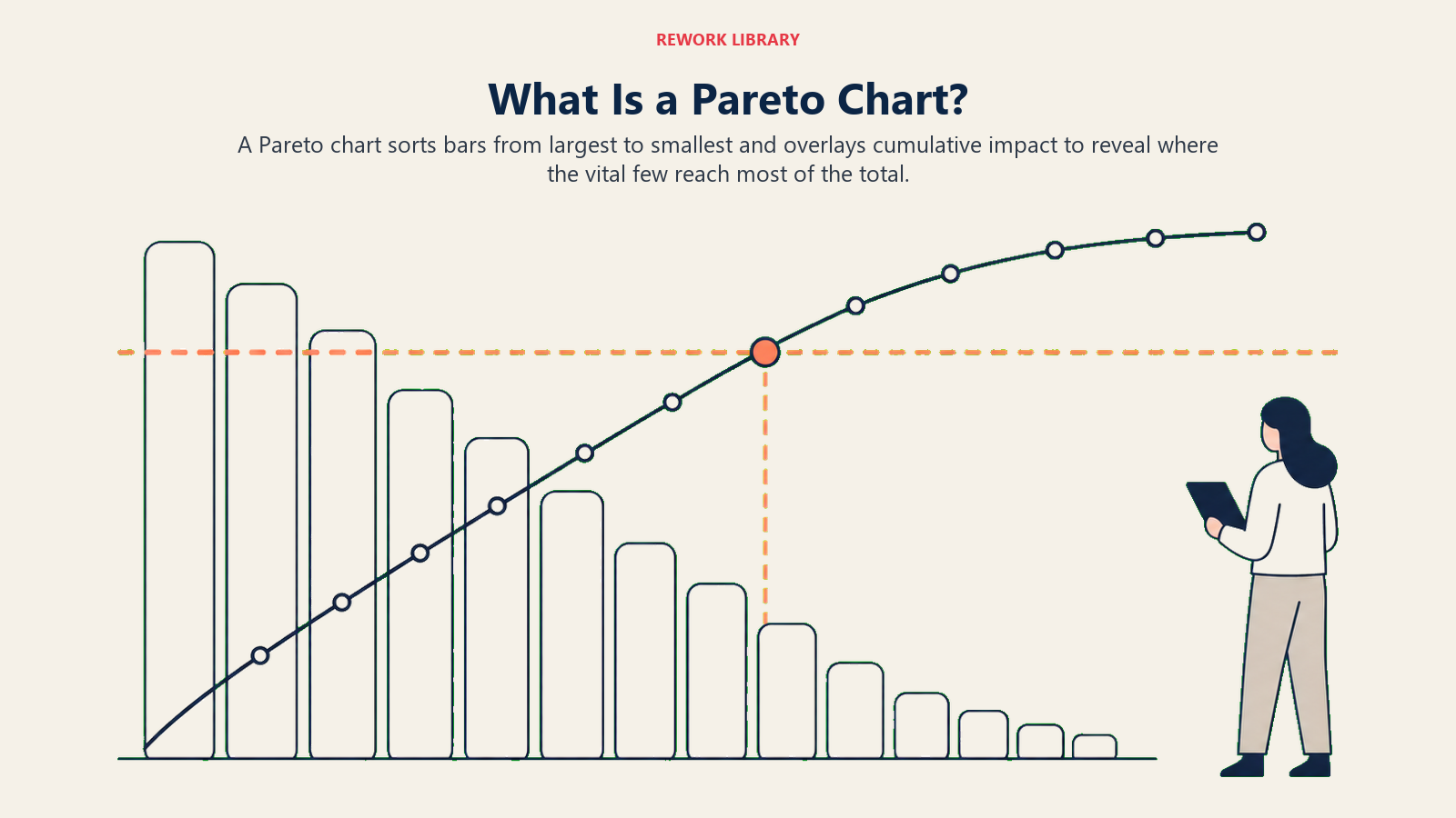
- Descending bars representing each cause category, sorted from highest to lowest frequency (or impact).
- A cumulative percentage line that rises from left to right, showing what proportion of total effects is covered as you move through the categories.
The cumulative line crossing the 80% mark is the visual signal: everything to the left of that crossing point represents your vital few.
This is what makes a Pareto chart different from a plain bar chart. A regular bar chart shows you relative sizes. A Pareto chart adds the cumulative line, which makes the 80/20 cutoff obvious without any arithmetic.
Here's a simplified example from a customer support scenario:
| Complaint Category | Count | Cumulative % |
|---|---|---|
| Slow response time | 42 | 38% |
| Wrong information given | 31 | 66% |
| Issue not resolved | 14 | 79% |
| Rude agent | 8 | 86% |
| Transferred too many times | 6 | 91% |
| Other | 10 | 100% |
In this case, three categories (slow response, wrong information, and unresolved issues) account for roughly 79% of all complaints. That's where the team should focus.
For a deeper look at visualizing causal relationships in quality problems, see the fishbone diagram, which pairs well with Pareto analysis during root cause identification.
Benefits of Pareto analysis
It focuses resources where they matter most. Teams have limited time and budget. Pareto analysis prevents the common trap of treating 20 problems as equally urgent when three of them are responsible for most of the harm.
It builds alignment on priorities. When leaders disagree about what to fix first, a Pareto chart provides objective evidence. The data speaks before the politics do.
It's fast to run. Collecting defect or complaint counts, sorting them, and plotting them takes hours, not weeks. It doesn't require specialized software or statistics expertise.
It works at every level. A frontline supervisor can run a Pareto analysis on daily defects. A VP can run one on quarterly revenue leakage drivers. The method scales.
It integrates naturally with other improvement tools. Pareto analysis identifies the vital few problems; root cause analysis and the five whys then drill into why those problems occur. DMAIC uses Pareto analysis in the Measure and Analyze phases.
Limitations and common mistakes
Pareto analysis is powerful, but it has real limits. Knowing them prevents misuse.
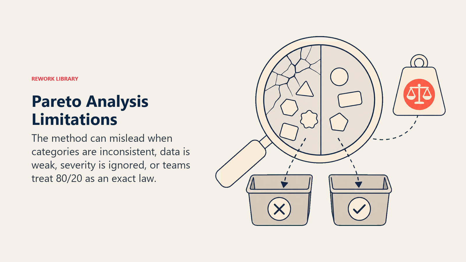
The 80/20 split isn't always exact. Real data might show 65/35 or 90/10. The point is the principle: concentration exists. Don't dismiss a finding because it's 72/28 instead of 80/20.
Garbage in, garbage out. Pareto analysis only works if the underlying data is accurate. If defects are logged inconsistently, or if complaint categories are vague, the chart will mislead. Clean data categories matter before you start.
It ignores effort and cost. The chart shows frequency or volume, not the cost to fix each category. A cause contributing 15% of defects might be cheapest to eliminate. Always pair Pareto output with a basic cost-vs-impact check before committing resources.
It's a starting point, not a complete answer. Pareto analysis tells you what to prioritize. It doesn't tell you why the problem exists or how to fix it. You still need root cause analysis and structured improvement methods like DMAIC or Kaizen to close the loop.
Categories can hide complexity. Lumping diverse issues into a single bucket ("Other" or "Miscellaneous") inflates its apparent size. Always push for specific, discrete categories.
How to do a Pareto analysis (step by step)
Step 1: Define the problem and time period
Choose a specific outcome you want to improve: defects per shift, customer complaints per month, support tickets per week. Pin down the time frame so your data is consistent. Vague scopes produce vague answers.
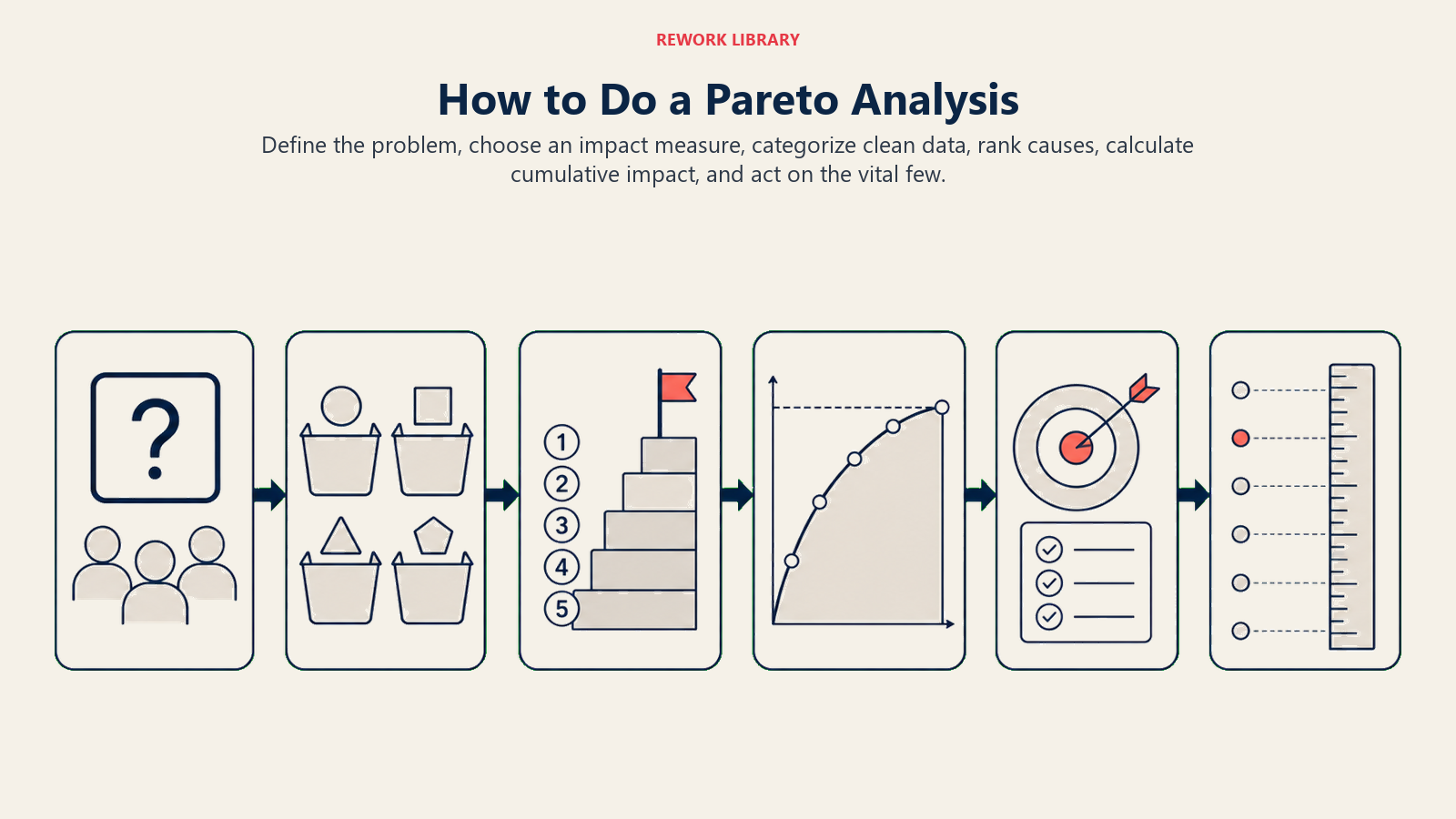
Step 2: Choose your measure
Decide what you'll count. Options include frequency (how often each cause occurs), cost (dollar impact per cause), time (hours lost per cause), or severity (a weighted score). Frequency is the most common starting point. Match the measure to the decision you're trying to make.
Step 3: Collect and categorize data
List every occurrence of the problem and assign it to a cause category. Categories should be mutually exclusive and collectively exhaustive. If a defect could belong to two categories, add a tiebreaker rule and stick to it. Aim for 5 to 15 categories; too few hides variation, too many obscures patterns.
Step 4: Sort categories from highest to lowest
Rank categories by your chosen measure. The highest-frequency (or highest-impact) category goes first. This is the basis for the descending bars in your chart.
Step 5: Compute cumulative percentages
Calculate the total across all categories. Then for each category (starting from the top), divide the running total by the grand total. Multiply by 100 for a percentage. This gives you the cumulative percentage column.
| Cause | Count | Running Total | Cumulative % |
|---|---|---|---|
| A | 50 | 50 | 40% |
| B | 35 | 85 | 68% |
| C | 18 | 103 | 82% |
| D | 10 | 113 | 90% |
| E | 12 | 125 | 100% |
Step 6: Draw the chart and act on the vital few
Plot the bars left to right (highest to lowest). Add the cumulative line. Draw a horizontal reference at 80%. The categories to the left of where the line crosses 80% are your vital few. Now build improvement plans for those categories specifically, using tools like the fishbone diagram, five whys, or value stream mapping to find and eliminate root causes.
For broader improvement frameworks that use Pareto as an input, see PDCA and Lean methodology.
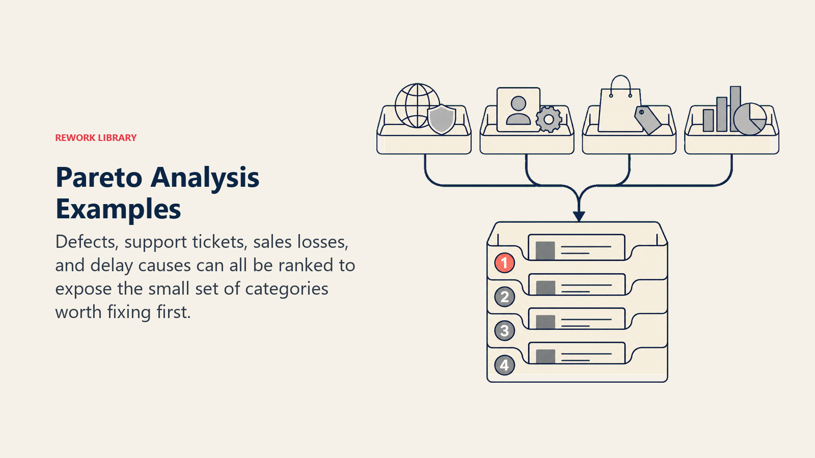
Pareto analysis examples
Manufacturing defects
A plant manager tracking defects over 30 days:
| Defect Type | Count | Cumulative % |
|---|---|---|
| Surface scratch | 87 | 35% |
| Dimensional error | 74 | 65% |
| Missing component | 37 | 80% |
| Discoloration | 20 | 88% |
| Packaging damage | 16 | 95% |
| Other | 14 | 100% |
Three defect types (surface scratch, dimensional error, missing component) account for 80% of all defects. The team launches targeted investigations into those three before addressing anything else. This is a textbook application in Six Sigma and Total Quality Management.
Customer support tickets
A support director finds that three ticket categories (login issues, billing errors, and integration failures) drive 78% of escalations. Rather than hiring more agents, they fix the login flow, automate billing reconciliation, and add an integration health dashboard. Volume drops without adding headcount.
Sales accounts
A revenue operations team discovers that 22% of accounts generate 76% of annual recurring revenue. The team restructures account management: dedicated customer success for that 22%, lighter-touch automation for the rest. Retention rates climb in the high-value segment.
Inventory management
A logistics manager uses Pareto analysis on stock-out incidents. Three SKUs are responsible for 81% of all stock-outs. Reorder points and safety stock are adjusted for those three SKUs alone, improving fill rates across the board.
Best practices
Do: Start with clean, well-categorized data. A Pareto chart built on fuzzy data will misdirect your team.
Do: Combine Pareto analysis with root cause analysis. Knowing the vital few categories tells you what to fix. Root cause analysis tells you why it's broken and how to fix it permanently.
Do: Rerun the analysis after implementing improvements. Once you eliminate the top cause, the distribution shifts and new vital-few categories emerge.
Do: Use the chart as a communication tool. A single visual showing that three issues drive 80% of complaints is more persuasive in an executive meeting than a spreadsheet of counts.
Don't: Treat the 80/20 split as exact. It's a pattern, not a rule. Act on concentration wherever you find it.
Don't: Ignore the trivial many forever. After tackling the vital few, reassess. Some previously minor categories may grow.
Don't: Skip the effort dimension. A category with 15% of defects but 5% of fix cost might be worth addressing before a 40% category that requires a major process overhaul.
Pareto analysis won't solve every prioritization challenge on its own, but it does something few other tools can: it makes the case for focus. When teams spread effort evenly across every problem, improvement is slow and results are thin. When they identify the vital few and attack those specifically, the same resources produce dramatically better outcomes. Start with clean data, run the analysis honestly, and let the chart tell you where your leverage is.
Related reading

Senior Operations & Growth Strategist
On this page
- What is Pareto analysis?
- What is a Pareto chart?
- Benefits of Pareto analysis
- Limitations and common mistakes
- How to do a Pareto analysis (step by step)
- Step 1: Define the problem and time period
- Step 2: Choose your measure
- Step 3: Collect and categorize data
- Step 4: Sort categories from highest to lowest
- Step 5: Compute cumulative percentages
- Step 6: Draw the chart and act on the vital few
- Pareto analysis examples
- Manufacturing defects
- Customer support tickets
- Sales accounts
- Inventory management
- Best practices
- Related reading