Histogram: How to Analyze Process Variation
Turn this article into takeaways for your work.


Each assistant summarizes the article only for you and suggests best practices for your work.
A histogram is one of the most practical tools in process management because it turns a column of numbers into a picture of what your process is actually doing. When your team argues about whether variation is "normal" or a real problem, a histogram settles the debate in seconds.
Understanding how to use a histogram quality tool is not optional for operations leaders. It's a basic skill, and skipping it means making decisions from averages that hide the full story.
What Is a Histogram?
A histogram is a bar chart that shows the frequency distribution of continuous data grouped into ranges called bins. Each bar represents how often measurements fall within a specific range. Together, the bars reveal the shape, center, and spread of your process variation.
The histogram is one of the 7 basic quality tools (also called the 7 QC tools), originally formalized by Kaoru Ishikawa in the 1960s as a set of simple, visual methods for quality analysis.
Histogram vs. bar chart: In a regular bar chart, bars represent distinct categories (product types, regions, departments) and there are gaps between them. In a histogram, the data is continuous (measurements, times, weights), bars touch each other, and the x-axis represents a numerical scale divided into equal ranges.
Key Facts
- The 7 basic quality tools, which include the histogram, were formalized by Kaoru Ishikawa around 1968 to give frontline workers a practical toolkit for quality control. (Ishikawa, "Guide to Quality Control," 1968)
- The histogram as a statistical display was named and introduced by Karl Pearson in 1895 as part of his work on frequency curves. (Pearson, "Contributions to the Mathematical Theory of Evolution," 1895)
- Sturges' Rule, the most common guideline for choosing the number of bins in a histogram, was published by Herbert Sturges in 1926: k = 1 + 3.322 log(n), where n is the sample size. (Sturges, "The Choice of a Class Interval," Journal of the American Statistical Association, 1926)
"An average hides the story; a histogram tells it."
Why Use a Histogram?
A table of 200 measurements tells you very little at a glance. You can compute an average, but the average does not tell you whether all your parts cluster tightly around the target or scatter all over the place.
A histogram does three things a table cannot:
1. Makes variation visible. You can see immediately whether your process produces a tight, consistent output or a wide, unpredictable spread.
2. Shows position relative to spec limits. Once you draw vertical lines on a histogram for your lower and upper specification limits (LSL and USL), you can see at a glance whether your process output fits inside the window or whether defects are escaping on one or both sides.
3. Reveals non-normal patterns. Skewed distributions, twin peaks, gaps, and cliffs all signal something worth investigating. Statistical process control (SPC) methods assume roughly normal data, so spotting these patterns early protects your analysis from false conclusions.
How to Read a Histogram: Common Shapes
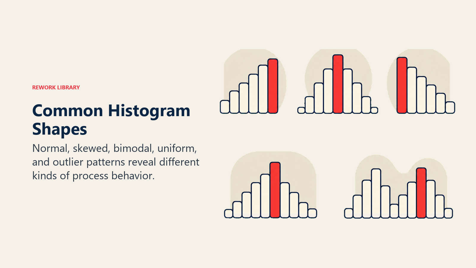
The shape of a histogram carries meaning. Here is a reference table for the patterns you will encounter most often:
| Shape | What it looks like | What it often signals |
|---|---|---|
| Normal (bell) | Symmetric, single peak in the center | Stable, well-centered process; most outputs meet spec |
| Right-skewed | Long tail to the right; peak shifted left | Lower bound constraint (e.g., no negatives); tool wear over time |
| Left-skewed | Long tail to the left; peak shifted right | Upper limit cutting off values; 100% inspection removing defects |
| Bimodal (twin peaks) | Two distinct humps | Two separate process streams mixed together (two machines, two operators, two shifts) |
| Plateau (uniform) | Bars roughly equal height, no clear peak | Multiple sources mixed; process lacks a dominant setting |
| Edge-peak | Spike at one end of the range | Truncated data from sorting, inspection, or re-work removal |
| Comb (irregular) | Alternating tall and short bars | Measurement rounding or gauge resolution too coarse for the bin width |
Reading shape first, then position, then width gives you a structured interpretation every time.
How to Create a Histogram
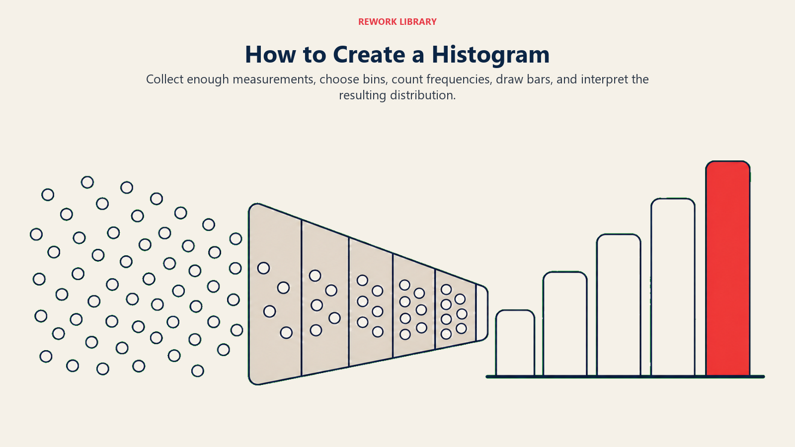
You need at least 50 data points for a histogram to be reliable, and 100 or more produces cleaner patterns. Here are the six steps:
Step 1: Collect the Data
Gather your process measurements in a single list. Record the sample size (n). Make sure the data comes from one process condition; mixing data from before and after a process change will create misleading shapes.
Step 2: Find the Range
Subtract the smallest value from the largest: Range = Maximum - Minimum. This tells you how wide your x-axis needs to be.
Step 3: Choose the Number of Bins
Use Sturges' Rule as a starting point: k = 1 + 3.322 x log(n). For 100 data points, that gives you about 8 bins. The square-root method is simpler: k = sqrt(n), which gives 10 bins for 100 data points. Both are reasonable starting points. Adjust up or down to avoid bars that look empty or bars that lump everything together.
Step 4: Set the Bin Width
Bin width = Range / Number of bins. Round to a convenient number that matches your measurement precision. All bins must be the same width.
Step 5: Tally the Frequencies
Count how many data points fall into each bin. A check sheet is a useful tool for this step when you are tallying by hand.
Step 6: Draw the Bars
Plot frequency (count) on the y-axis and the bin ranges on the x-axis. Draw touching bars, one per bin, with height equal to frequency. Add a title, label both axes with units, note your sample size, and draw your specification limits as vertical lines if applicable.
Histogram Examples by Function
Manufacturing: part dimensions. A machining team measures the diameter of 150 shaft parts. The histogram shows a bell shape centered slightly above the target, with the right tail crossing the USL. This tells the engineer to adjust the process mean downward, not to increase tolerances.
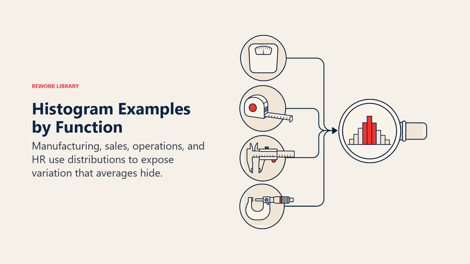
Customer support: call handle time. A support director plots 200 call handle times. The histogram is right-skewed with a long tail beyond 15 minutes. The team investigates the tail and finds a subset of calls involving a specific product category that needs a dedicated script.
HR: time-to-hire. An HR manager plots 80 recent hires by days-to-offer. The histogram shows a bimodal pattern: one peak at 18 days and another at 42 days. When the team separates data by role type, they find that technical roles follow one path and administrative roles follow another. Combining them in a single average had hidden this entirely.
These examples share a pattern: the histogram reveals a segment or shift that a summary statistic masks.
Histogram vs Other Quality Tools
A histogram is not the right tool for every question. Here is how it compares to two close cousins:
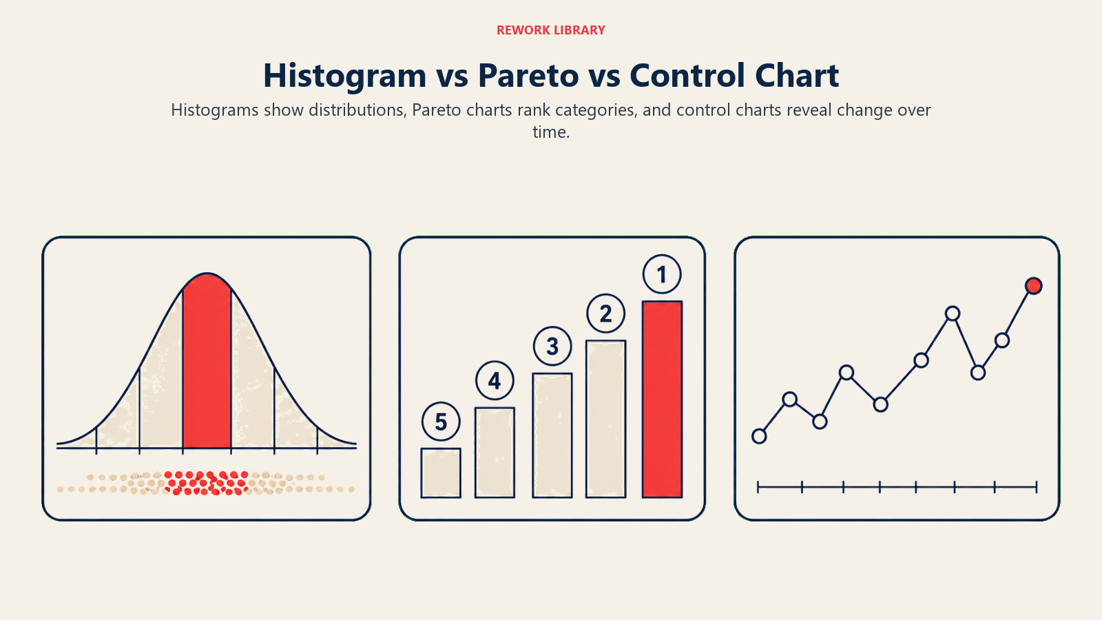
Histogram vs. Pareto chart. A Pareto analysis ranks discrete defect categories (wrong part, missing label, surface scratch) by frequency to show which few categories cause most of the problems. Use a Pareto chart when your data is categorical. Use a histogram when your data is continuous measurements.
Histogram vs. run chart or control chart. A histogram collapses time out of the picture. It shows the distribution of all values over a period, but not the sequence. A run chart or control chart preserves the time order and reveals trends, cycles, or sudden shifts. For a complete picture, use both: the histogram for distribution shape and the control chart for time-based behavior.
The fishbone diagram pairs well with a histogram when you use the distribution shape to form hypotheses about root causes, then use the fishbone to structure the investigation.
The DMAIC framework from Six Sigma typically uses histograms in the Measure and Analyze phases to characterize process performance before attempting improvement.
Total quality management programs use histograms as a foundational diagnostic across all functions, not just manufacturing.
For comparing relationships between two continuous variables, a scatter diagram extends the analysis that a histogram begins.
Best Practices
Minimum sample size. Do not read too much into a histogram with fewer than 50 data points. Shapes become stable and trustworthy at 100+ observations.
Bin count rules of thumb. Sturges' Rule (k = 1 + 3.322 log n) and the square-root rule (k = sqrt n) are both reasonable. If your histogram looks too spiky, add more bins. If it looks like one or two big blobs, reduce bins.
Label everything. Include the variable name, units of measurement, sample size, date range, and process condition. A histogram without context is impossible to act on six months later.
One condition at a time. If you mix data from two machines, two operators, or pre- and post-change periods, you risk creating an artificial bimodal shape. Stratify first, then plot.
Draw spec limits. Overlaying your LSL and USL on the histogram is the single fastest way to see whether your process is capable. If bars extend beyond either limit, you have a defect rate to quantify and reduce.

On this page
- What Is a Histogram?
- Why Use a Histogram?
- How to Read a Histogram: Common Shapes
- How to Create a Histogram
- Step 1: Collect the Data
- Step 2: Find the Range
- Step 3: Choose the Number of Bins
- Step 4: Set the Bin Width
- Step 5: Tally the Frequencies
- Step 6: Draw the Bars
- Histogram Examples by Function
- Histogram vs Other Quality Tools
- Best Practices