Fishbone-Diagramm (Ishikawa): Ursachenanalyse erklärt
Turn this article into takeaways for your work.
Each assistant summarizes the article only for you and suggests best practices for your work.
Wenn etwas schiefläuft, zeigt die Mehrheit der Teams auf die Person, die dem Problem am nächsten ist. Das fühlt sich schnell an. Es fühlt sich logisch an. Aber es ist fast immer falsch, und es garantiert, dass das Problem wiederkommt. Das Fishbone-Diagramm existiert, um diesen Reflex zu stoppen und ihn durch systematisches Denken über die tatsächliche Ursache des Fehlers zu ersetzen.
Ob Sie ein Six-Sigma-Projekt, eine Lean-Prozessüberprüfung oder ein Post-Incident-Debrief durchführen: Das Fishbone-Diagramm gibt Ihrem Team eine strukturierte Karte, der es folgen kann, anstatt ein Ratespiel zu spielen.
Was ist ein Fishbone-Diagramm?
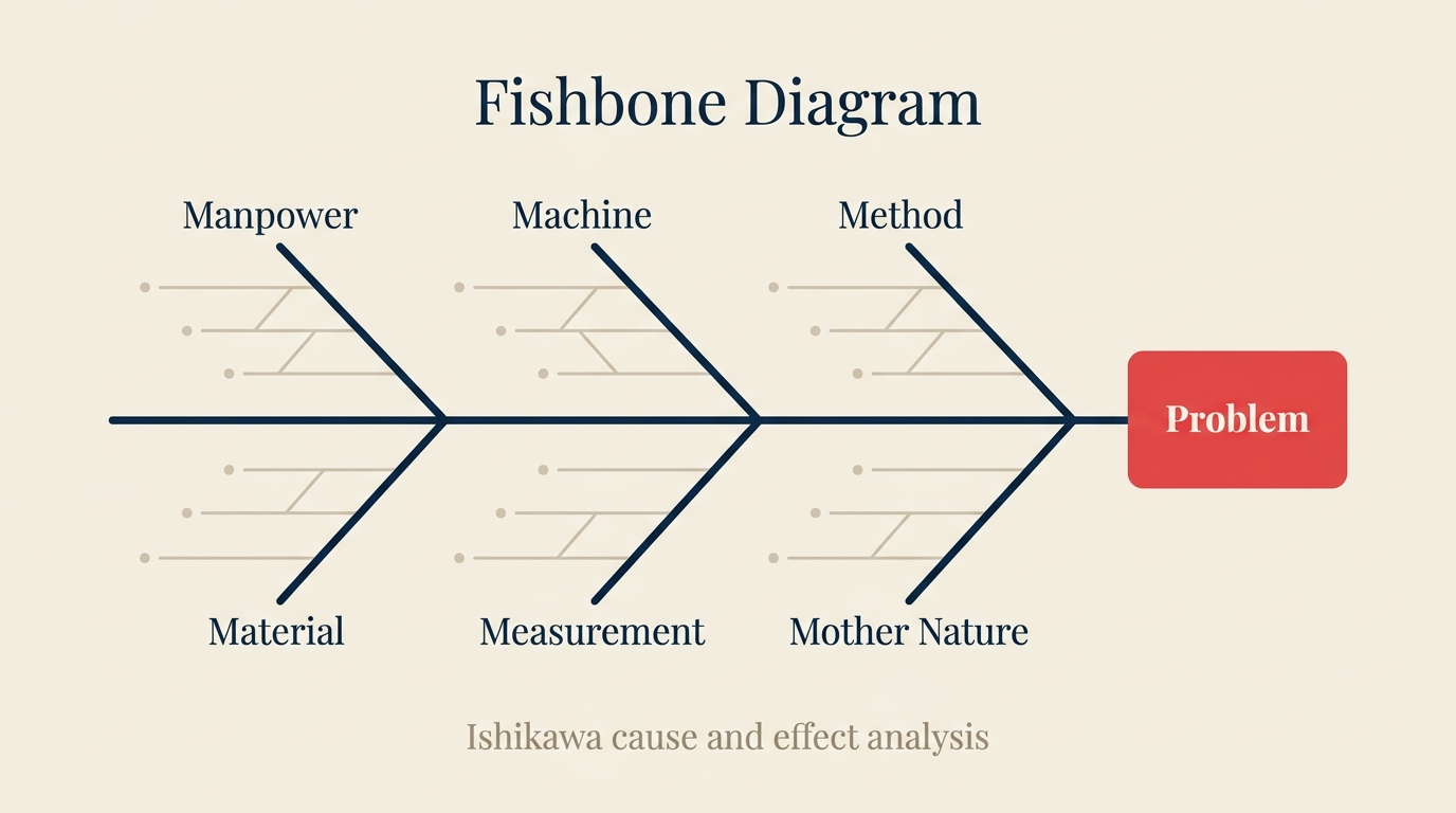
Ein Fishbone-Diagramm (auch Ishikawa-Diagramm oder Ursache-Wirkungs-Diagramm genannt) ist ein visuelles Werkzeug zur Ursachenanalyse, das potenzielle Ursachen eines Problems in einem strukturierten, verzweigten Format anordnet, das einem Fischskelett ähnelt. Die Problembeschreibung sitzt am "Kopf" des Fisches auf der rechten Seite. Die "Wirbelsäule" verläuft horizontal nach links. Hauptursachenkategorien zweigen von der Wirbelsäule als "Knochen" ab, und spezifische Einflussfaktoren zweigen von jedem Kategorieknochen ab.
Das Werkzeug wurde vom japanischen Qualitätskontrollexperten Kaoru Ishikawa in den 1960er Jahren während seiner Arbeit bei den Kawasaki-Schiffswerften entwickelt. Ishikawa suchte nach einer Möglichkeit, die multiplen Ursache-Wirkungs-Beziehungen zu visualisieren, die Qualitätsfehler verursachen, etwas, das Flowcharts und einfache Listen nicht erfassen konnten. Das Diagramm, das er entwarf, wurde zu einem Eckpfeiler des Total Quality Management (TQM) und fand später seinen Weg in Six Sigma DMAIC (Define, Measure, Analyze, Improve, Control) und Lean-Manufacturing-Methoden weltweit.
Die Stärke des Fishbone liegt nicht in der Zeichnung. Sie liegt in der Diskussion, die die Zeichnung erzwingt. Wenn ein funktionsübergreifendes Team gemeinsam ein Fishbone-Diagramm ausfüllt, hört es auf, darüber zu streiten, wer schuld ist, und beginnt, abzubilden, wo das System kaputt ist.
Key Facts
- Kaoru Ishikawa entwickelte das Ursache-Wirkungs-Diagramm erstmals in den 1960er Jahren bei den Kawasaki-Schiffswerften. Später kodifizierte er die Methode in seinem 1985 erschienenen Buch What Is Total Quality Control? The Japanese Way (Prentice-Hall), das zum grundlegenden Text für Qualitätszirkel weltweit wurde.
- Die American Society for Quality (ASQ) listet das Fishbone-Diagramm als eines der 7 Grundwerkzeuge der Qualität auf, einem Satz, der auch Regelkarten, Prüfblätter und Pareto-Analyse umfasst. ASQ berichtet, dass diese 7 Werkzeuge in über 50 % der strukturierten Problemlösungsprojekte in Fertigung, Gesundheitswesen und Dienstleistungsbranchen eingesetzt werden.
- Eine Umfrage der International Association for Six Sigma Certification (IASSC) aus dem Jahr 2019 ergab, dass die Ursache-Wirkungs-Analyse (einschließlich Fishbone-Diagramme) zu den drei meistgenutzten Werkzeugen von zertifizierten Praktikern in Analyze-Phase-Projekten gehört, neben der 5-Whys-Technik und Statistical Process Control.
Die 6M: Standardkategorien für ein Fishbone-Diagramm
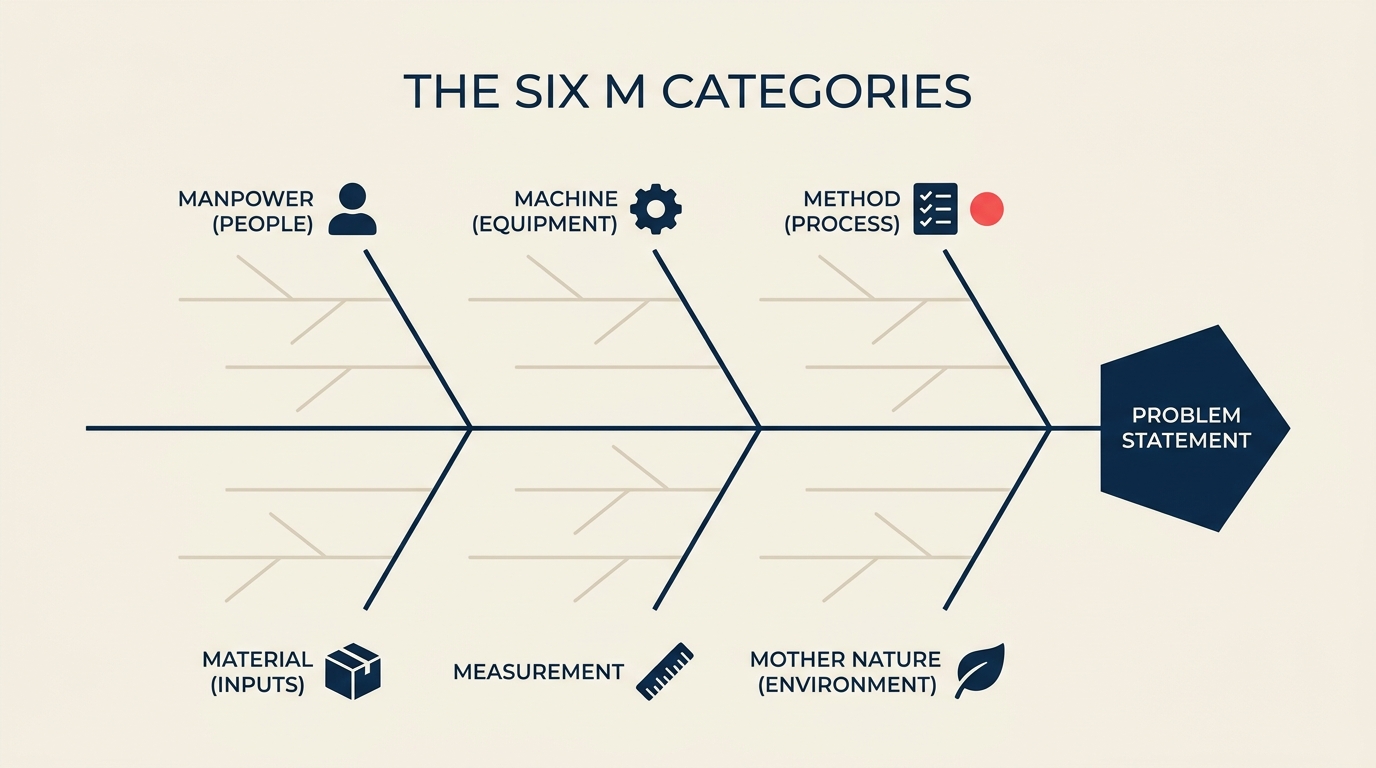
Das in der Fertigung und im Betrieb am weitesten verbreitete Fishbone-Framework ist die 6M-Methode. Jedes "M" steht für eine Hauptkategorie potenzieller Ursachen. Ihr Team führt für jede ein Brainstorming zu spezifischen Faktoren durch.
Manpower (Menschen)
Dieser Knochen deckt alles ab, was mit den Menschen im Prozess zusammenhängt: Qualifikationslücken, unzureichende Schulung, unklare Verantwortlichkeiten, Ermüdung, Fehler bei der Schichtübergabe und Einstellungs- oder Motivationsprobleme. Es ist die Kategorie, zu der die meisten Teams zuerst springen, weshalb das Fishbone-Diagramm Sie zwingt, alle anderen zu untersuchen, bevor Sie hier landen.
Machine (Ausrüstung)
Ausrüstung deckt die Werkzeuge, Hardware und Software ab, von denen Ihr Prozess abhängt: Verschleiß, Kalibrierungsabweichungen, veraltete Firmware, Werkzeugfehlanpassungen und Wartungslücken. In Wissensarbeitskontexten erstreckt sich dies auf Software-Bugs, langsame Systeme und fehlende Integrationen.
Method (Prozess)
Dieser Knochen untersucht, wie die Arbeit erledigt wird: dokumentierte Verfahren, Standard Operating Procedures (SOPs), Workflow-Design, Sequenzierungsfehler und fehlende Kontrollpunkte. Wenn der Prozess selbst das Problem ist, hilft es nicht, die Person zu reparieren, die ihn ausführt.
Material (Eingaben)
Material deckt die Roheingaben ab, die in Ihren Prozess eingehen: physische Materialien, Datenfeeds, Lieferantenqualität, Charge-Codierung und die Genauigkeit der zwischen den Schritten weitergegebenen Informationen. Schlechte Eingabequalität ist eine der am häufigsten unterdiagnostizierten Ursachen für Fehler sowohl in der Fertigung als auch in Dienstleistungsprozessen.
Measurement (Messung)
Kalibrierungsfehler, ungenaue Messgeräte, inkonsistente Datenerhebungsmethoden und subjektive Kennzahlen leben hier. Wenn Sie den Prozess nicht zuverlässig messen können, wissen Sie nicht, ob Ihre Änderungen tatsächlich funktionieren. Dieser Knochen wird in Dienstleistungsbranchen häufig übersprungen, wo angenommen wird, dass die Messpraktiken in Ordnung sind, bis sie sich als unzureichend erweisen.
Mother Nature (Umgebung)
Umgebung deckt externe Bedingungen ab, die den Prozess beeinflussen: Temperatur, Luftfeuchtigkeit, Beleuchtung, Lärm, Marktvolatilität, regulatorische Änderungen oder saisonale Nachfragespitzen. In Dienstleistungs- und Wissensarbeit erstreckt sich dies oft auf die Organisationskultur oder Teamdynamik, die außerhalb der Kontrolle eines einzelnen Managers liegt.
Alternative Frameworks: Für Dienstleistungsbranchen bevorzugen viele Teams die 4P-Methode (People, Process, Policies, Plant) oder die 8P-Methode für Marketing (Product, Price, Place, Promotion, People, Process, Physical evidence, Productivity). Die 6M bleiben der Standard für Fertigung und Betrieb. Das richtige Framework ist das, das Ihr Team konsequent einsetzen wird.
So erstellen Sie ein Fishbone-Diagramm in 6 Schritten
Sie brauchen keine spezielle Software. Ein Whiteboard, Haftnotizen oder eine gemeinsame digitale Leinwand funktionieren gleich gut. Was zählt, ist, wer im Raum ist.
Schritt 1: Einigung auf die Problembeschreibung
Schreiben Sie das Problem an den Kopf des Fisches. Seien Sie spezifisch. "Qualitätsprobleme" ist keine Problembeschreibung. "Fehlerquote an Linie 4 überstieg im 2. Quartal 2026 6 %, gegen ein Ziel von 1,5 %" ist eine Problembeschreibung. Vage Probleme erzeugen vage Analysen.
Schritt 2: Die Wirbelsäule zeichnen
Zeichnen Sie einen horizontalen Pfeil, der nach rechts auf das Problemfeld zeigt. Das ist Ihre Wirbelsäule. Sie verankert visuell den Rest des Diagramms.
Schritt 3: Hauptknochen hinzufügen
Zeichnen Sie diagonale Linien, die von der Wirbelsäule abzweigen, drei oben und drei unten, und beschriften Sie jede mit einer Ursachenkategorie. Für die meisten Betriebsteams beginnen Sie mit den 6M. Für ein Dienstleistungsteam verwenden Sie 4P oder welches Framework am besten zu Ihrem Kontext passt.
Schritt 4: Ursachen pro Knochen sammeln (Brainstorming)
Fragen Sie für jede Kategorie: "Welche Faktoren in diesem Bereich könnten das Problem verursachen oder dazu beitragen?" Schreiben Sie jeden Faktor als Unterast des Hauptknochens. Filtern Sie Ideen in dieser Phase nicht. Das Ziel ist Breite, nicht Tiefe. Holen Sie alle im Raum ein, nicht nur die Fachexperten.
Schritt 5: "Warum" fragen, bis Sie eine Grundursache erreichen
Fragen Sie für jede identifizierte Ursache weiter "warum" (hier integriert sich die 5-Whys-Technik natürlich). Gehen Sie über das unmittelbare Symptom hinaus. "Maschine 3 war ausgefallen" ist keine Grundursache. "Der Wartungsplan von Maschine 3 wurde übersprungen, weil das Arbeitsauftragssystem überfällige Wartungen nicht automatisch markiert" ist näher dran.
Schritt 6: Priorisieren
Nicht alle Knochen sind gleich. Verwenden Sie eine Pareto-Abstimmung oder einfache Punkteabstimmung, um zu identifizieren, welche zwei oder drei Ursachen das Team für die wahrscheinlichsten Treiber des Problems hält. Diese werden zum Schwerpunkt Ihrer nächsten Verbesserungsphase. Dieser Schritt verbindet sich direkt mit den Lean-Methoden-Prinzipien zur Fokussierung auf hochimpaktige Verschwendungsquellen.
Praxisbeispiel: Hohe Fehlerquote in einer Fertigungslinie
Betrachten Sie ein Produktionsteam, das die Problembeschreibung untersucht: "Fehlerquote an Linie 4 erreichte im April 6 %, gegen ein Ziel von 1,5 %." So könnte das abgeschlossene Fishbone-Diagramm über jeden 6M-Ast hinweg aussehen.
Manpower: Neue Mitarbeiter in der Nachtschicht erhielten nur zwei Tage Einarbeitung statt der üblichen fünf. Die Schichtübergabedokumentation erfolgt mündlich und nicht schriftlich, was zu Informationsverlust zwischen Tag- und Nachtschicht führt.
Machine: Maschine 3 hatte seit 14 Wochen keine planmäßige Kalibrierungsprüfung; das Standardintervall beträgt 6 Wochen. Ein Drehmomentschlüssel zeigt einen Verschleiß, der nicht seinem Alter entspricht, was darauf hindeutet, dass er möglicherweise schwerer belastet wird als bewertet.
Method: Die Standard Operating Procedure (SOP) für Linie 4 wurde zuletzt vor 18 Monaten aktualisiert und spiegelt die Komponentenabmessungen des neuen Lieferanten nicht wider. Es gibt keine Standardarbeitscheckliste zu Beginn jeder Schicht.
Material: Komponenten von Lieferant B zeigen eine höhere Maßstreuung als Lieferant A, aber beide sind im Lagersystem identisch kodiert, sodass die Bediener sie an der Linie nicht unterscheiden können. Eine Charge aus März wurde falsch etikettiert und könnte in die Produktion eingeflossen sein.
Measurement: Eine Wiederholbarkeits- und Reproduzierbarkeitsstudie (Gauge R&R) wurde an der Hauptmessstation noch nie durchgeführt. Die Fehlererfassung erfolgt manuell auf Papierformularen, die erst Stunden später in das System eingegeben werden, was eine Verzögerung bei der Erkennung erzeugt.
Mother Nature: Die Anlage hat keine Feuchtigkeitskontrolle in der Produktionshalle. Daten zeigen höhere Fehlerquoten in den Sommermonaten, wenn die Umgebungsluftfeuchtigkeit 65 % übersteigt, was mit der bekannten Materialempfindlichkeit übereinstimmt.
Nach der Erstellung dieses Diagramms führte das Team eine Punkteabstimmung durch und identifizierte die Machine- und Method-Knochen als die wahrscheinlichsten Primärtreiber. Sie leiteten zuerst Korrekturmaßnahmen zum Kalibrierungsplan und der SOP ein, anstatt standardmäßig die Nachtschichtbesatzung zu schulen.
Diese Art strukturierter Analyse steht im Kern jeder Prozessmanagement-Praxis, die Wiederauftreten verhindern will, anstatt nur den unmittelbaren Vorfall zu beheben.
Fishbone vs. 5 Whys vs. Pareto: Was wann einsetzen
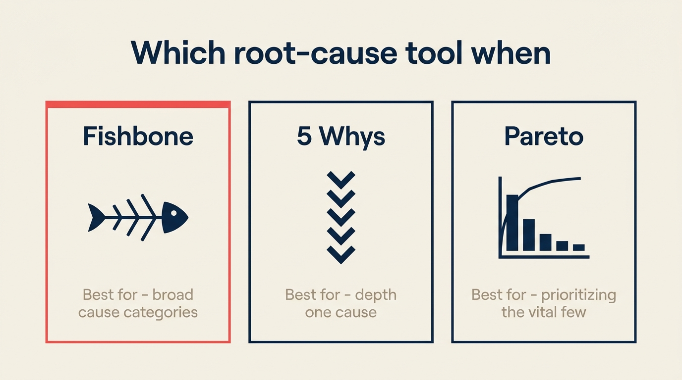
Diese drei Werkzeuge erscheinen häufig gemeinsam in der Analyze-Phase von Six Sigma und Lean-Projekten. Sie ergänzen sich, konkurrieren nicht.
| Werkzeug | Am besten für | Stärke | Schwäche |
|---|---|---|---|
| Fishbone-Diagramm | Abbildung einer breiten Palette potenzieller Ursachen über Kategorien hinweg | Erzwingt Breite; verhindert, dass Teams sich auf einen Ursachentyp fixieren | Sagt nicht, welche Ursache am wichtigsten ist |
| 5 Whys | Tiefes Bohren in eine einzelne Ursachenkette | Schnell; funktioniert ohne Daten; deckt systemische Fehler auf | Kann mehrere beitragende Ursachen übersehen; leicht durch Anwesende im Raum beeinflusst |
| Pareto-Analyse | Priorisierung, welche Ursachen zuerst behoben werden sollen | Datengesteuert; wendet die 80/20-Regel an, um den Aufwand zu fokussieren | Erfordert zuverlässige Fehlerhäufigkeitsdaten; übersieht seltene, aber hochimpaktige Ursachen |
Die typische Abfolge: Führen Sie ein Fishbone-Diagramm durch, um alle möglichen Ursachen abzubilden. Verwenden Sie 5 Whys, um in die wahrscheinlichsten Kandidaten zu bohren. Verwenden Sie dann ein Pareto-Diagramm, um zu bestätigen, welche Ursachen für den Großteil des Fehlungsvolumens verantwortlich sind, bevor Sie Ressourcen für Lösungen einsetzen.
Varianten: 4M, 4P, 8P-Fishbones
Die 6M sind der Standard in der Fertigung, aber nicht das einzige Framework.
Die 4M-Methode (Mensch, Maschine, Methode, Material) ist eine vereinfachte Version für Teams, die neu im Umgang mit dem Werkzeug sind oder an einfachen Prozessproblemen arbeiten, bei denen Umgebung und Messung weniger variabel sind.
Die 4P-Methode (People, Process, Policies, Plant/Equipment) ist im Gesundheitswesen, bei Finanzdienstleistungen und anderen Dienstleistungsbranchen beliebt, wo "Machine" und "Material" nicht sauber auf die Arbeit abgebildet werden können.
Die 8P-Methode (Product, Price, Place, Promotion, People, Process, Physical evidence, Productivity and Quality) erweitert das Framework auf Marketing- und Customer-Experience-Probleme, bei denen die Ursachenkategorien grundlegend anders sind als in einer Fertigungslinie.
Die zugrunde liegende Struktur ist unabhängig davon, welche Variante Sie verwenden, dieselbe. Wählen Sie die, die zu Ihrer Branche und dem Vokabular Ihres Teams passt. Konsistenz über Projekte hinweg ist wichtiger als die "beste" Wahl des Frameworks in der Theorie.
Für Teams, die im Rahmen einer formalen Business Process Management- oder Prozessoptimierungs-Praxis arbeiten, entsprechen die 6M in der Regel besser der vorhandenen Dokumentation und der funktionsübergreifenden Sprache.
Häufige Fehler bei der Durchführung eines Fishbone-Diagramms
Das Diagramm richtig zu erstellen, ist einfacher, wenn Sie wissen, was typischerweise schiefläuft.
- Zu früh aufhören. Teams fügen Ursachen auf der ersten Ebene hinzu und nennen es fertig. Echte Grundursachen liegen gewöhnlich zwei oder drei Ebenen tiefer. Treiben Sie Unteräste weiter, bevor Sie zu einem Schluss kommen.
- Ursachen mit Symptomen vermischen. "Hohe Fehlerquote" ist Ihre Problembeschreibung, keine Ursache. Wenn Sie es auf einen Knochen schreiben, haben Sie das Problem nur zweimal beschrieben. Jeder Punkt auf den Knochen muss eine potenzielle Ursache sein, keine Wiederholung des Effekts.
- Ursachenkategorien auslassen. Wenn ein Team nur zwei oder drei Knochen ausfüllt und die anderen leer lässt, bedeutet das in der Regel, dass es Annahmen in die Sitzung einbringt, keine frische Analyse. Jeder Knochen verdient ernsthafte Aufmerksamkeit, bevor er als unbedeutend eingestuft wird.
- Zu Lösungen springen. Das Fishbone-Diagramm ist ein Analysewerkzeug, kein Aktionsplanungswerkzeug. Lösungen auf das Diagramm zu schreiben, bevor die Grundursache bestätigt ist, ist einer der häufigsten Wege, einen Prozessverbesserungszyklus zu verschwenden.
- Falsche Personen im Raum. Das Fishbone-Diagramm funktioniert am besten mit einer funktionsübergreifenden Gruppe, die die Personen einschließt, die die Arbeit tatsächlich ausführen. Ein Diagramm, das nur von Managern erstellt wurde, erfasst selten, was an der Linie oder am Schreibtisch passiert.
- Kein Follow-through. Ein schönes Fishbone-Diagramm auf einem Whiteboard, das nie eine Korrekturmaßnahme antreibt, ist eine Dekoration, kein Qualitätswerkzeug. Das Diagramm liefert nur Wert, wenn es zu einer priorisierten Liste von Ursachen führt, die untersucht oder behoben werden sollen. Das Fishbone mit einer Aktualisierung einer Standard Operating Procedure oder einem Kaizen-Event zu verbinden, schließt den Kreislauf.
Wann ein Fishbone-Diagramm einsetzen (und wann etwas anderes wählen)
| Szenario | Fishbone einsetzen? | Hinweise |
|---|---|---|
| Komplexes Problem mit mehreren vermuteten Ursachen über Abteilungen hinweg | Ja | Kernanwendungsfall |
| Post-Incident-Review nach einem Qualitätsfehler oder Serviceausfall | Ja | Gut für funktionsübergreifendes Debrief |
| Schulung neuer Teammitglieder in strukturierter Problemlösung | Ja | Visuelles Format macht das Denken explizit |
| Einzelursachenproblem, das Sie bereits gut verstehen | Nein | 5 Whys ist schneller und ausreichend |
| Sie müssen priorisieren, welche Probleme zuerst behoben werden sollen | Nein | Verwenden Sie stattdessen ein Pareto-Diagramm oder eine Risikomatrix |
| Sie befinden sich in der Define- oder Measure-Phase eines DMAIC-Projekts | Noch nicht | Sparen Sie das Fishbone für die Analyze-Phase |
| Grundursache bereits durch Daten bestätigt | Nein | Gehen Sie direkt zum Lösungsdesign |
Häufig gestellte Fragen
Warum heißt das Fishbone-Diagramm Ishikawa?
Das Diagramm ist nach Kaoru Ishikawa benannt, dem japanischen Qualitätsingenieur, der es in den 1960er Jahren bei Kawasaki Heavy Industries entwickelte. Ishikawa versuchte, ein einfaches visuelles Werkzeug zu schaffen, mit dem Fabrikarbeiter Qualitätsprobleme systematisch analysieren könnten, ohne statistische Kenntnisse zu benötigen. Er bezog das Diagramm später in seinen umfassenderen Rahmen für Qualitätszirkel und TQM ein. Der Name "Ishikawa-Diagramm" wird in der Qualitätsmanagementliteratur gleichbedeutend mit "Fishbone-Diagramm" und "Ursache-Wirkungs-Diagramm" verwendet.
Was ist der Unterschied zwischen einem Fishbone-Diagramm und 5 Whys?
Ein Fishbone-Diagramm bildet potenzielle Ursachen über mehrere Kategorien gleichzeitig ab und gibt Ihnen einen breiten Überblick darüber, woher ein Problem stammen könnte. Die 5-Whys-Methode bohrt vertikal in eine einzelne Ursachenkette, indem sie wiederholt "warum" fragt, bis eine Grundursache gefunden ist. Die beiden Werkzeuge ergänzen sich gut: Verwenden Sie das Fishbone, um zu identifizieren, welche Ursachen es wert sind, untersucht zu werden, und wenden Sie dann 5 Whys auf jeden Kandidaten an, um die eigentliche Grundursache zu finden. Sich nur auf 5 Whys zu verlassen, birgt das Risiko, Ursachen in Kategorien zu übersehen, an die Ihr Team nicht gedacht hat zu hinterfragen.
Wie viele Ursachen sollte jeder Knochen haben?
Es gibt keine feste Regel. Ein typischer Knochen in einer gut moderierten Sitzung hat drei bis sechs Unterursachen, aber komplexe Systeme können mehr erzeugen. Was zählt, ist, dass jede Unterursache spezifisch und umsetzbar ist, nicht dass Sie eine bestimmte Anzahl erreichen. Wenn ein Knochen weniger als zwei Ursachen hat, bedeutet das wahrscheinlich, dass die Gruppe diese Kategorie nicht tief genug hinterfragt hat. Wenn ein Knochen mehr als zehn hat, überlegen Sie, ob Unterursachen auf verschiedenen Spezifitätsniveaus geschrieben werden und ob einige gruppiert werden sollten.
Kann das Fishbone-Diagramm außerhalb der Fertigung verwendet werden?
Ja. Das Fishbone-Diagramm wird häufig im Gesundheitswesen (Patientensicherheitsereignisse, Medikamentenfehler), in der Softwareentwicklung (Post-Mortems und Bug-Analyse), in Dienstleistungsbranchen (Analyse von Kundenbeschwerden) und im Marketing (Analyse von Kampagnenleistungsfehlern) eingesetzt. Die 6M werden manchmal durch Frameworks ersetzt, die besser zum Kontext passen, wie die 4P für Dienstleistungen oder die 8P für Marketing. Die zugrunde liegende Logik ist universell: Anstatt die nächststehende Person zu beschuldigen, bilden Sie das System ab und finden Sie, wo es tatsächlich versagt.
Das Fishbone-Diagramm löst Ihre Probleme nicht. Aber es stellt sicher, dass Sie die richtigen lösen. Und in den meisten Betriebskontexten ist dieser Unterschied mehr wert als jedes andere Werkzeug in Ihrem Qualitätswerkzeugkasten.

Senior Operations & Growth Strategist
On this page
- Was ist ein Fishbone-Diagramm?
- Die 6M: Standardkategorien für ein Fishbone-Diagramm
- Manpower (Menschen)
- Machine (Ausrüstung)
- Method (Prozess)
- Material (Eingaben)
- Measurement (Messung)
- Mother Nature (Umgebung)
- So erstellen Sie ein Fishbone-Diagramm in 6 Schritten
- Schritt 1: Einigung auf die Problembeschreibung
- Schritt 2: Die Wirbelsäule zeichnen
- Schritt 3: Hauptknochen hinzufügen
- Schritt 4: Ursachen pro Knochen sammeln (Brainstorming)
- Schritt 5: "Warum" fragen, bis Sie eine Grundursache erreichen
- Schritt 6: Priorisieren
- Praxisbeispiel: Hohe Fehlerquote in einer Fertigungslinie
- Fishbone vs. 5 Whys vs. Pareto: Was wann einsetzen
- Varianten: 4M, 4P, 8P-Fishbones
- Häufige Fehler bei der Durchführung eines Fishbone-Diagramms
- Wann ein Fishbone-Diagramm einsetzen (und wann etwas anderes wählen)
- Häufig gestellte Fragen
- Warum heißt das Fishbone-Diagramm Ishikawa?
- Was ist der Unterschied zwischen einem Fishbone-Diagramm und 5 Whys?
- Wie viele Ursachen sollte jeder Knochen haben?
- Kann das Fishbone-Diagramm außerhalb der Fertigung verwendet werden?