Kano-Modell: Kundenzufriedenheit gezielt priorisieren
Turn this article into takeaways for your work.
Each assistant summarizes the article only for you and suggests best practices for your work.
Das Kano-Modell ist das Framework, das Features, die Kunden selbstverständlich erwarten, von solchen trennt, die sie wirklich begeistern. Ohne dieses Modell investieren Produkt- und Prozessteams ihr Budget in Verbesserungen, die die Zufriedenheit überhaupt nicht steigern.
Was ist das Kano-Modell?
Das Kano-Modell ist ein Framework zur Priorisierung von Produktfeatures, das Professor Noriaki Kano von der Universität der Wissenschaften in Tokio im Jahr 1984 entwickelte. Es ordnet Features von Produkten oder Dienstleistungen ihrem Einfluss auf die Kundenzufriedenheit zu und hilft Teams zu entscheiden, was gebaut, verbessert oder gestrichen werden soll.
Kanos Erkenntnis war einfach, aber kontraintuitiv: Nicht alle Features wirken sich gleich auf die Zufriedenheit aus. Manche sind schlichte Grunderwartungen. Andere steigern die Zufriedenheit linear. Eine dritte Gruppe begeistert Kunden gerade deshalb, weil sie sie nicht erwartet haben. Sein Aufsatz von 1984, "Attractive Quality and Must-Be Quality", führte die Kategorien ein, die Produktteams bis heute verwenden.
Das Modell veranlasst Teams dazu, alle Features nicht mehr als gleichwertig zu behandeln, sondern jedes danach einzuteilen, wie Kunden tatsächlich auf sein Vorhandensein oder Fehlen reagieren.
Zahlen und Fakten
Professor Noriaki Kano veröffentlichte 1984 seinen grundlegenden Aufsatz "Attractive Quality and Must-Be Quality" und stellte das Framework an der Universität der Wissenschaften in Tokio vor. Er gilt bis heute als eines der meistzitierten Werke in der Qualitätsmanagement-Literatur.
80 % der Features in einem durchschnittlichen Softwareprodukt werden selten oder nie genutzt, laut dem CHAOS Report der Standish Group und der 2019 State of Product Leadership-Studie von Pendo. Das Kano-Modell gehört zu den wichtigsten Werkzeugen, mit denen Teams diese Verschwendung reduzieren.
Kano-Analysen sind heute in ISO 9001 und Six Sigma-Lehrplänen weltweit verankert, was zeigt, dass das Modell als Standard-Planungswerkzeug für Qualität anerkannt ist und nicht als akademische Nischenmethode gilt.
Die 5 Kategorien des Kano-Modells
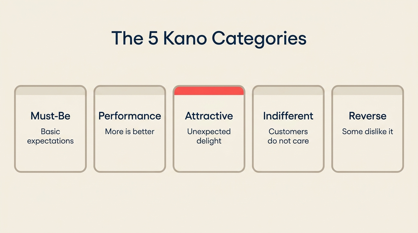
Kano definierte fünf Beziehungen zwischen einem Feature und der Kundenzufriedenheit. Drei davon sind für die meisten Teams handlungsrelevant; zwei sollte man kennen, um sie zu vermeiden.
| Kategorie | Auch bekannt als | Definition | Beispiel | Entwicklung über die Zeit |
|---|---|---|---|---|
| Must-Be | Basis, Schwellenwert | Erwartete Features, deren Fehlen Unzufriedenheit erzeugt, deren Vorhandensein aber als selbstverständlich gilt | Sicherheitsgurt im Auto; Anmeldesicherheit in einer App | Bleibt Must-Be. Erfüllt sein ist unsichtbar; nicht erfüllt zu werden ist fatal. |
| One-Dimensional | Leistung, Linear | Je mehr vorhanden ist, desto zufriedener sind Kunden; je weniger, desto unzufriedener | Akkulaufzeit eines Telefons; Upload-Geschwindigkeit einer Plattform | Bleibt linear. Jede messbare Verbesserung zahlt sich aus. |
| Attractive | Begeisterungsfaktoren | Unerwartete Features, die bei Vorhandensein überproportionale Begeisterung erzeugen, bei Fehlen aber keine Unzufriedenheit verursachen | Kostenloses Gepäck-Upgrade; ein KI-Entwurfstool, das kein Mitbewerber bisher anbietet | Entwickelt sich zu One-Dimensional und dann zu Must-Be, sobald Kunden es erwarten. |
| Indifferent | Neutral | Features, die Kunden nicht interessieren, ob vorhanden oder nicht | Farbe der Serverwände; eine Einstellung, die niemand öffnet | Bleibt Indifferent. Diese Features streichen oder zurückstellen. |
| Reverse | Negativ | Features, die manche Kunden aktiv ablehnen, wenn sie vorhanden sind | Verpflichtende Tutorial-Bildschirme; Autoplay-Video mit Ton | Variiert je nach Segment. Identifizieren Sie, welches Segment widerspricht und für wen es Attractive ist. |
Die wertvollste strategische Erkenntnis aus dieser Tabelle ist das Verfall-Muster der Attractive-Features. Was heute begeistert, wird morgen zur Grunderwartung. Deshalb bringen Unternehmen wie Apple und Spotify jeden Zyklus etwas Neues: Die Begeisterungskurve bewegt sich immer in Richtung Must-Be.
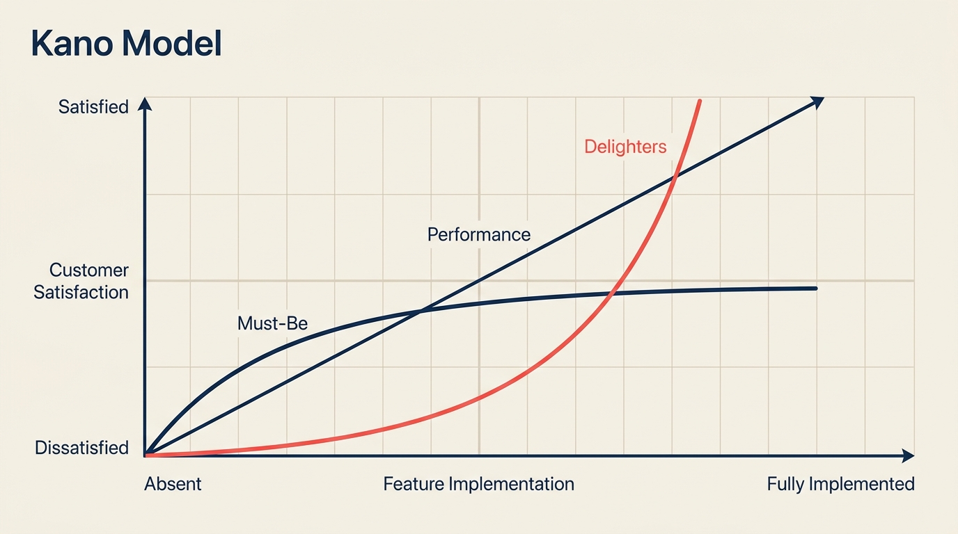
Der Kano-Modell-Graph
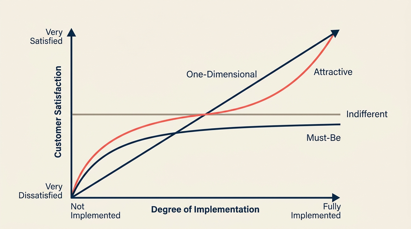
Der Kano-Graph trägt Kundenzufriedenheit auf der vertikalen Achse auf (von "Sehr unzufrieden" unten bis "Sehr zufrieden" oben) und den Grad der Umsetzung (oder Funktionalität) auf der horizontalen Achse (von "Nicht umgesetzt / Fehlt" links bis "Vollständig umgesetzt / Vorhanden" rechts).
Drei Kurven verlaufen durch diesen Raum:
Must-Be-Kurve. Beginnt unten links und flacht nach rechts in den neutralen Bereich ab. Vollständige Umsetzung bedeutet, dass der Kunde es kaum bemerkt. Nicht umgesetzt bedeutet, dass die Zufriedenheit stark sinkt. Die Kurve erreicht nie den Begeisterungsbereich.
One-Dimensional-Kurve. Eine Diagonale von unten links (fehlt = unzufrieden) nach oben rechts (vollständig vorhanden = sehr zufrieden). Dies ist der lineare Tausch: Mehr investieren bringt mehr Zufriedenheit. Budgetentscheidungen für Performance-Features sind unkompliziert.
Attractive-Kurve. Beginnt im neutralen Bereich links (fehlt, aber niemand erwartet es) und steigt nach rechts steil an (vorhanden = hohe Begeisterung). Das entscheidende Merkmal: Die linke Hälfte der Kurve liegt auf der Nulllinie, nicht darunter. Fehlt ein Begeisterungsfaktor, schadet das nicht. Wird er geliefert, überrascht er und gewinnt Kunden.
Die Indifferent-Kategorie erscheint als flache Linie auf dem Nullpunkt (neutral) durch den gesamten Graphen. Die Reverse-Kategorie ist das Spiegelbild von One-Dimensional und verläuft von oben links nach unten rechts.
Den Graphen in seiner Gesamtheit zu lesen zeigt, wo sich Investitionen lohnen. Features oberhalb der Diagonalen bei geringen Implementierungskosten sind Begeisterungsfaktoren, die schnell ausgeliefert werden sollten. Features unterhalb der Diagonalen bei hohen Kosten sind Must-Bes, die mit minimaler Qualität erfüllt, aber nicht übermäßig ausgebaut werden sollten.
Wie man eine Kano-Analyse durchführt
Eine Kano-Analyse umfasst vier Schritte. Sie ist strukturierter als eine typische Kundenbefragung, da jedes Feature zweimal abgefragt wird: einmal positiv, einmal negativ.
Schritt 1: Features für die Bewertung auswählen
Wählen Sie 10 bis 20 konkrete Features oder Verbesserungen. Vage Punkte ("bessere Performance") liefern unklare Ergebnisse. Konkrete Punkte ("Ladezeit unter 1 Sekunde") ermöglichen saubere Kategorisierungen. Beziehen Sie Kandidaten aus Ihrem Backlog, Support-Tickets, Mitbewerber-Feature-Listen oder den Roadmap-Debatten Ihres Teams.
Schritt 2: Funktionale und dysfunktionale Fragenpaare formulieren
Jedes Feature bekommt genau zwei Fragen:
- Funktionale Frage: "Wie würden Sie sich fühlen, wenn dieses Feature vorhanden wäre?"
- Dysfunktionale Frage: "Wie würden Sie sich fühlen, wenn dieses Feature nicht vorhanden wäre (oder entfernt würde)?"
Beide Fragen verwenden dieselben fünf Antwortmöglichkeiten:
- Ich mag das
- Ich erwarte das (selbstverständlich)
- Ich bin neutral
- Ich kann damit leben
- Ich mag das nicht
Formulieren Sie jedes Paar in verständlicher Sprache. Vermeiden Sie doppelte Verneinungen. Testen Sie die Fragen vorab an zwei oder drei Kollegen. Schlechte Frageformulierungen sind die häufigste Ursache für schlechte Kano-Daten.
Schritt 3: Kunden befragen und Antworten kategorisieren
Sammeln Sie Antworten von einer repräsentativen Stichprobe (30 bis 100 Befragte sind typisch; mehr für wichtige Features). Gleichen Sie dann die funktionalen und dysfunktionalen Antworten jedes Befragten anhand der Kano-Auswertungstabelle ab:
| Funktionale Antwort | Dysfunktionale Antwort | Kategorie |
|---|---|---|
| Mag ich | Mag ich nicht | One-Dimensional |
| Mag ich | Neutral / Kann damit leben | Attractive |
| Mag ich | Erwarte ich | Attractive |
| Erwarte ich | Mag ich nicht | Must-Be |
| Neutral | Mag ich nicht | Must-Be |
| Neutral | Neutral | Indifferent |
| Mag ich | Mag ich | Fraglich (Frage überprüfen) |
| Mag ich nicht | Mag ich | Reverse |
Fassen Sie die Kategorien aller Befragten zusammen. Die häufigste Kategorie eines Features ist seine Kano-Klassifizierung. Wenn ein Feature fast gleichmäßig auf zwei Kategorien aufgeteilt ist, signalisiert das oft eine Segmentierungsmöglichkeit: Verschiedene Kundentypen bewerten es unterschiedlich.
Schritt 4: Roadmap priorisieren
Wenden Sie folgende Logik an:
- Must-Be-Features, die noch nicht erfüllt sind: Zuerst beheben. Das sind Grundvoraussetzungen. Hier zu versagen schadet dem Vertrauen, unabhängig von den Begeisterungsfaktoren.
- One-Dimensional-Features mit Performance-Lücke: Proportional investieren. Diese steigern die Zufriedenheit direkt, daher ist die ROI-Rechnung klar.
- Attractive-Features, die Mitbewerber nicht haben: Schnell ausliefern. Das Begeisterungsfenster schließt sich, sobald sich der Markt anpasst.
- Indifferent-Features: Streichen oder zurückstellen. Budget dafür auf die oben genannten Bereiche umlenken.
- Reverse-Features, die ein Schlüsselsegment betreffen: Entfernen oder optional machen.
Kombinieren Sie die Kano-Priorisierung mit bestehenden Frameworks. MoSCoW-Priorisierung funktioniert gut neben Kano: Must-Be entspricht "Must Have", One-Dimensional entspricht "Should Have", Attractive entspricht "Could Have" und Indifferent entspricht "Won't Have".
Kano-Modell-Beispiel
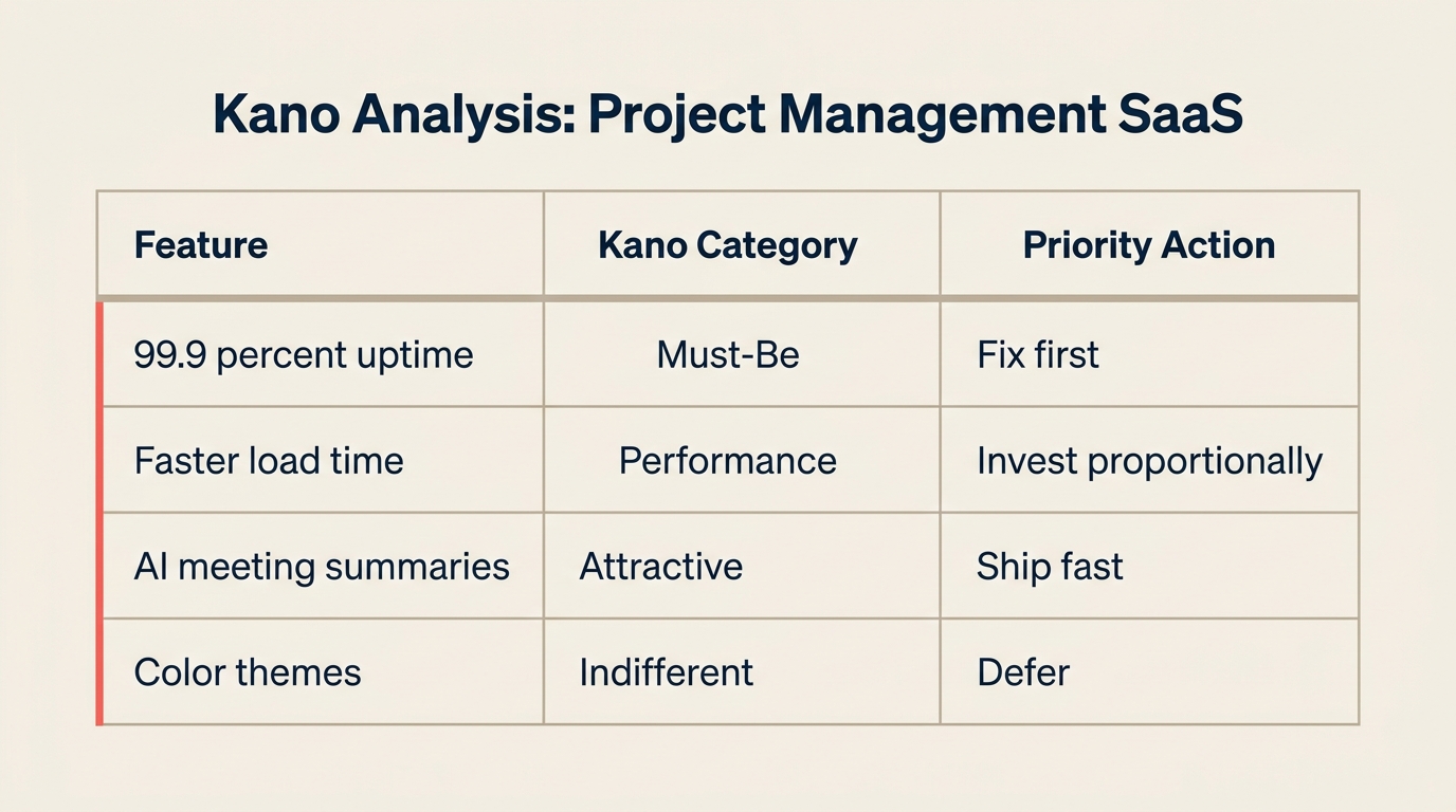
Betrachten Sie ein B2B-Projektmanagement-SaaS-Produkt, das seine Roadmap für das nächste Quartal bewertet. Das Team befragte 60 Kunden zu acht möglichen Features:
| Feature | Kano-Kategorie | Begründung | Priorität |
|---|---|---|---|
| Uptime über 99,9 % | Must-Be | Kunden erwarten es; Ausfallzeiten lösen sofort Churn aus | Zuerst beheben, wenn Lücke besteht |
| Schnellere Aufgaben-Ladezeit | One-Dimensional | Jede gesparte Sekunde steigert die Zufriedenheit; jede hinzukommende Sekunde schadet | Proportional investieren |
| KI-generierte Meeting-Zusammenfassungen | Attractive | Kein Mitbewerber bietet das; Kunden, die es im Beta hatten, liebten es | Schnell ausliefern |
| Gantt-Diagramm-Ansicht | One-Dimensional | Mehr Zeitplan-Sichtbarkeit = mehr Zufriedenheit bei PM-Nutzern | Proportional investieren |
| 40+ Farbthemen | Indifferent | Umfrage zeigte 78 % neutral oder gleichgültig | Zurückstellen |
| Single Sign-On (SSO) | Must-Be | Enterprise-Kunden benötigen es für Compliance; Fehlen blockiert Deals | Zuerst beheben |
| Slack-Integration | One-Dimensional | Mehr Integrationen = höheres Engagement in diesem Segment | Proportional investieren |
| Ambiente-Hintergrundmusik | Reverse | 35 % lehnten das aktiv ab; 60 % gleichgültig | Aus der Roadmap entfernen |
Das Ergebnis: Das Team deprioririsierte die Farbthemen und Musik-Features vollständig, markierte SSO als unverzichtbar für die Enterprise-Expansion und beschleunigte die KI-Meeting-Zusammenfassung als Wettbewerbsdifferenzierungsmerkmal, bevor Mitbewerber es liefern.
Diese Art strukturierter Evidenz ersetzt die meinungsgetriebenen Argumente, die die meisten Roadmap-Reviews verlangsamen. Sie gibt dem Team zudem eine vertretbare Antwort, wenn Führungskräfte fragen, warum ein Feature nicht im nächsten Sprint ist.
Vorteile und Grenzen
Wo das Kano-Modell echten Mehrwert liefert:
- Bringt Kundendaten in die Priorisierung, statt sich auf das interne Bauchgefühl zu verlassen
- Trennt "nice to have" von Grundvoraussetzungen mit Klarheit
- Identifiziert Chancen zur Wettbewerbsdifferenzierung, bevor Mitbewerber sie entdecken
- Reduziert Feature-Überfrachtung, indem Indifferent-Kategorien sichtbar werden
- Funktioniert branchenübergreifend: Produktentwicklung, Service-Design, Prozessmanagement, Kundenerfahrung
Wo Teams auf Schwierigkeiten stoßen:
- Die Fragebogengestaltung ist schwieriger als sie aussieht; schlechte Frageformulierungen verzerren alle Ergebnisse
- Ergebnisse sind eine Momentaufnahme. Features verfallen im Laufe der Zeit von Attractive zu Must-Be, daher muss die Analyse jährlich oder nach größeren Marktveränderungen wiederholt werden
- Kleine Stichproben liefern unzuverlässige Kategorisierungen, besonders bei Features, die sich auf zwei Kategorien aufteilen
- Ordnet Features nicht innerhalb derselben Kategorie; es ist ein zweites Werkzeug nötig (Aufwand-Nutzen-Matrix, Value Proposition Canvas), um sie zu sequenzieren
- Kunden können oft nicht artikulieren, was sie begeistern würde, sondern nur, was sie bereits erwarten
Das Kano-Modell funktioniert am besten in Kombination mit anderen Qualitäts- und Priorisierungsmethoden. Teams, die Six Sigma einsetzen, verwenden Kano in der Define-Phase, um Critical-to-Quality (CTQ)-Anforderungen zu ermitteln. Total Quality Management-Programme nutzen es, um Verbesserungsprojekte auf den echten Kundenwert auszurichten. Teams für Value Stream Mapping verwenden es, um zu entscheiden, welche Prozessschritte optimiert und welche eliminiert werden sollen.
Häufig gestellte Fragen
Wer hat das Kano-Modell entwickelt und wann? Professor Noriaki Kano von der Universität der Wissenschaften in Tokio entwickelte das Modell. Sein 1984 erschienener Aufsatz "Attractive Quality and Must-Be Quality" führte das Framework in die Qualitätsmanagement-Literatur ein. Kano baute auf Kundenzufriedenheitsforschung aus den 1970er Jahren auf, aber sein Kategorisierungs- und Graphen-Ansatz wurde zum Standard, dem Qualitätspraktiker weltweit heute folgen.
Was sind die 5 Kategorien des Kano-Modells? Die fünf Kategorien sind Must-Be (Basis), One-Dimensional (Leistung), Attractive (Begeisterungsfaktoren), Indifferent und Reverse. Must-Be-Features werden erwartet und als selbstverständlich angesehen. One-Dimensional-Features skalieren die Zufriedenheit linear mit der Investition. Attractive-Features überraschen und begeistern. Indifferent-Features bewegen die Zufriedenheit nicht. Reverse-Features werden von manchen Kundensegmenten aktiv abgelehnt, wenn sie vorhanden sind.
Was ist der Unterschied zwischen einer funktionalen und einer dysfunktionalen Frage? Eine funktionale Frage fragt, wie ein Kunde sich fühlen würde, wenn ein Feature vorhanden wäre. Eine dysfunktionale Frage fragt, wie er sich fühlen würde, wenn es nicht vorhanden wäre. Beide werden benötigt, um ein Feature korrekt zu kategorisieren. Ein Befragter, der "Ich mag das" bei Vorhandensein und "Ich mag das nicht" bei Fehlen antwortet, hat ein One-Dimensional-Ergebnis geliefert. Ein Befragter, der "Ich mag das" bei Vorhandensein, aber "neutral" bei Fehlen antwortet, hat ein Attractive-Ergebnis geliefert. Die Kombination ist es, was die Kano-Analyse präziser macht als eine einzelne Zufriedenheitsbewertung.
Bleiben Attractive-Features für immer Attractive? Nein. Das ist eine der wichtigsten und am wenigsten genutzten Erkenntnisse des Modells. Attractive-Features verfallen mit der Zeit. Sie wandeln sich von Attractive zu One-Dimensional (sobald Kunden sie zu erwarten beginnen) und schließlich zu Must-Be (sobald sie zur Grundvoraussetzung im Markt werden). Frühe Smartphone-Touchscreens waren 2007 Attractive; bis 2012 waren sie Must-Be. KI-generierte Inhaltszusammenfassungen sind für viele SaaS-Tools heute Attractive; das wird sich ändern. Die Konsequenz: Begeisterungsfaktoren schnell ausliefern und Kunden regelmäßig befragen, um den Verfall zu verfolgen.
Wie verhält sich das Kano-Modell zur MoSCoW-Priorisierung? Beide Frameworks helfen Teams bei der Entscheidung, was gebaut werden soll. MoSCoW-Priorisierung klassifiziert Features in Must Have, Should Have, Could Have und Won't Have, basierend auf Teamurteil und Projektbeschränkungen. Kano klassifiziert Features basierend auf gemessenen Kundendaten. Sie ergänzen sich: Kano sagt Ihnen, wie Kunden sich fühlen, MoSCoW hilft Ihnen bei der Lieferentscheidung angesichts von Zeit und Budget. Viele Produktteams führen zuerst eine Kano-Analyse durch, um ihre MoSCoW-Entscheidungen zu fundieren.
Das Kano-Modell sagt Ihnen nicht, wie schnell Sie liefern oder wie viel Sie ausgeben sollen. Aber es sagt Ihnen, welche Richtung für Kunden wichtig ist, und das ist die Frage, die die meisten Roadmap-Debatten nie mit echten Daten beantworten. Beginnen Sie mit einer kleinen Umfrage, kategorisieren Sie Ihre zehn wichtigsten Backlog-Elemente, und Sie werden wahrscheinlich zwei oder drei Features finden, über die das Team gestritten hat und die sich für die tatsächlichen Nutzer als Indifferent herausstellen.

Senior Operations & Growth Strategist
On this page
- Was ist das Kano-Modell?
- Zahlen und Fakten
- Die 5 Kategorien des Kano-Modells
- Der Kano-Modell-Graph
- Wie man eine Kano-Analyse durchführt
- Schritt 1: Features für die Bewertung auswählen
- Schritt 2: Funktionale und dysfunktionale Fragenpaare formulieren
- Schritt 3: Kunden befragen und Antworten kategorisieren
- Schritt 4: Roadmap priorisieren
- Kano-Modell-Beispiel
- Vorteile und Grenzen
- Häufig gestellte Fragen