Bahasa Indonesia
Histogram: Cara Menganalisis Variasi Proses
Turn this article into takeaways for your work.
Each assistant summarizes the article only for you and suggests best practices for your work.
Histogram adalah salah satu alat paling praktis dalam manajemen proses karena mengubah kolom angka menjadi gambaran tentang apa yang sebenarnya dilakukan proses Anda. Ketika tim Anda berdebat apakah variasi itu "normal" atau masalah yang nyata, histogram menyelesaikan perdebatan itu dalam hitungan detik.
Memahami cara menggunakan histogram quality tool bukanlah hal opsional bagi para pemimpin operasi. Ini adalah keterampilan dasar, dan melewatkannya berarti membuat keputusan dari rata-rata yang menyembunyikan cerita yang sebenarnya.
Apa Itu Histogram?
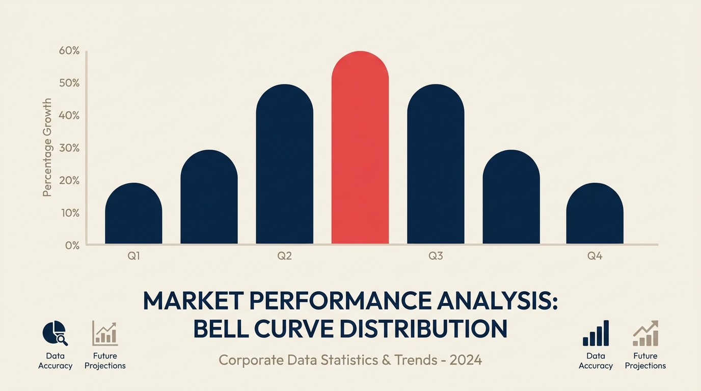
Histogram adalah diagram batang yang menunjukkan distribusi frekuensi dari data kontinu yang dikelompokkan ke dalam rentang yang disebut bin. Setiap batang mewakili seberapa sering pengukuran jatuh dalam rentang tertentu. Bersama-sama, batang-batang ini mengungkapkan bentuk, pusat, dan sebaran variasi proses Anda.
Histogram adalah salah satu dari 7 alat kualitas dasar (juga disebut 7 QC tools), yang awalnya diformalkan oleh Kaoru Ishikawa pada tahun 1960-an sebagai seperangkat metode visual sederhana untuk analisis kualitas.
Histogram vs. diagram batang: Dalam diagram batang biasa, batang mewakili kategori yang berbeda (jenis produk, wilayah, departemen) dan ada jarak di antaranya. Dalam histogram, datanya kontinu (pengukuran, waktu, berat), batang-batangnya saling bersentuhan, dan sumbu x mewakili skala numerik yang dibagi menjadi rentang yang sama.
Fakta kunci
- 7 alat kualitas dasar, yang mencakup histogram, diformalkan oleh Kaoru Ishikawa sekitar tahun 1968 untuk memberi pekerja garis depan seperangkat alat praktis untuk kontrol kualitas. (Ishikawa, "Guide to Quality Control," 1968)
- Histogram sebagai tampilan statistik dinamai dan diperkenalkan oleh Karl Pearson pada tahun 1895 sebagai bagian dari karyanya tentang kurva frekuensi. (Pearson, "Contributions to the Mathematical Theory of Evolution," 1895)
- Sturges' Rule, panduan paling umum untuk memilih jumlah bin dalam histogram, dipublikasikan oleh Herbert Sturges pada tahun 1926: k = 1 + 3,322 log(n), di mana n adalah ukuran sampel. (Sturges, "The Choice of a Class Interval," Journal of the American Statistical Association, 1926)
"Rata-rata menyembunyikan ceritanya; histogram menceritakannya."
Mengapa Menggunakan Histogram?
Tabel berisi 200 pengukuran memberi tahu Anda sangat sedikit sekilas pandang. Anda bisa menghitung rata-rata, tetapi rata-rata tidak memberi tahu Anda apakah semua part Anda mengelompok rapat di sekitar target atau tersebar ke mana-mana.
Histogram melakukan tiga hal yang tidak bisa dilakukan tabel:
1. Membuat variasi terlihat. Anda bisa langsung melihat apakah proses Anda menghasilkan output yang rapat dan konsisten atau sebaran yang lebar dan tidak dapat diprediksi.
2. Menunjukkan posisi relatif terhadap batas spesifikasi. Setelah Anda menggambar garis vertikal pada histogram untuk batas spesifikasi bawah dan atas (LSL dan USL), Anda bisa melihat sekilas apakah output proses Anda cocok di dalam jendela tersebut atau apakah defect lolos di salah satu atau kedua sisi.
3. Mengungkap pola yang tidak normal. Distribusi yang miring, dua puncak, celah, dan tebing semuanya menandakan sesuatu yang layak diselidiki. Metode statistical process control (SPC) mengasumsikan data yang kurang lebih normal, jadi mendeteksi pola-pola ini lebih awal melindungi analisis Anda dari kesimpulan yang salah.
Cara Membaca Histogram: Bentuk-Bentuk Umum
Bentuk histogram membawa makna. Berikut tabel referensi untuk pola yang paling sering Anda temui:
| Bentuk | Seperti apa bentuknya | Apa yang sering ditandakan |
|---|---|---|
| Normal (lonceng) | Simetris, satu puncak di tengah | Proses stabil dan terpusat dengan baik; sebagian besar output memenuhi spesifikasi |
| Miring ke kanan | Ekor panjang ke kanan; puncak bergeser ke kiri | Batasan batas bawah (misalnya, tidak ada nilai negatif); keausan alat seiring waktu |
| Miring ke kiri | Ekor panjang ke kiri; puncak bergeser ke kanan | Batas atas memotong nilai; inspeksi 100% menghilangkan defect |
| Bimodal (dua puncak) | Dua gundukan yang berbeda | Dua aliran proses terpisah yang tercampur (dua mesin, dua operator, dua shift) |
| Dataran (seragam) | Batang dengan tinggi kurang lebih sama, tidak ada puncak yang jelas | Berbagai sumber tercampur; proses tidak memiliki pengaturan dominan |
| Puncak tepi | Lonjakan di salah satu ujung rentang | Data terpotong dari penyortiran, inspeksi, atau penghapusan rework |
| Sisir (tidak teratur) | Batang tinggi dan pendek yang bergantian | Pembulatan pengukuran atau resolusi gauge terlalu kasar untuk lebar bin |
Membaca bentuk terlebih dahulu, kemudian posisi, kemudian lebar, memberi Anda interpretasi yang terstruktur setiap saat.
Cara Membuat Histogram
Anda membutuhkan setidaknya 50 titik data agar histogram bisa diandalkan, dan 100 atau lebih menghasilkan pola yang lebih bersih. Berikut enam langkahnya:
Langkah 1: Kumpulkan Data
Kumpulkan pengukuran proses Anda dalam satu daftar. Catat ukuran sampel (n). Pastikan data berasal dari satu kondisi proses; mencampur data dari sebelum dan sesudah perubahan proses akan menciptakan bentuk yang menyesatkan.
Langkah 2: Temukan Rentangnya
Kurangi nilai terkecil dari nilai terbesar: Rentang = Maksimum - Minimum. Ini memberi tahu Anda seberapa lebar sumbu x Anda perlu dibuat.
Langkah 3: Pilih Jumlah Bin
Gunakan Sturges' Rule sebagai titik awal: k = 1 + 3,322 x log(n). Untuk 100 titik data, itu memberi Anda sekitar 8 bin. Metode akar kuadrat lebih sederhana: k = akar(n), yang memberikan 10 bin untuk 100 titik data. Keduanya adalah titik awal yang masuk akal. Sesuaikan naik atau turun untuk menghindari batang yang terlihat kosong atau batang yang menggabungkan semuanya menjadi satu.
Langkah 4: Tetapkan Lebar Bin
Lebar bin = Rentang / Jumlah bin. Bulatkan ke angka yang mudah sesuai dengan presisi pengukuran Anda. Semua bin harus memiliki lebar yang sama.
Langkah 5: Hitung Frekuensinya
Hitung berapa banyak titik data yang jatuh ke setiap bin. Check sheet adalah alat yang berguna untuk langkah ini ketika Anda menghitung secara manual.
Langkah 6: Gambar Batangnya
Plot frekuensi (jumlah) pada sumbu y dan rentang bin pada sumbu x. Gambar batang yang saling bersentuhan, satu per bin, dengan tinggi sama dengan frekuensi. Tambahkan judul, beri label kedua sumbu dengan satuannya, catat ukuran sampel Anda, dan gambar batas spesifikasi Anda sebagai garis vertikal jika berlaku.
Contoh Histogram Berdasarkan Fungsi
Manufaktur: dimensi part. Sebuah tim permesinan mengukur diameter 150 part poros. Histogram menunjukkan bentuk lonceng yang terpusat sedikit di atas target, dengan ekor kanan melewati USL. Ini memberi tahu engineer untuk menyesuaikan rata-rata proses ke bawah, bukan menambah toleransi.
Layanan pelanggan: waktu penanganan panggilan. Seorang direktur support memplot 200 waktu penanganan panggilan. Histogramnya miring ke kanan dengan ekor panjang melebihi 15 menit. Tim menyelidiki ekor tersebut dan menemukan subset panggilan yang melibatkan kategori produk tertentu yang membutuhkan skrip khusus.
HR: time-to-hire. Seorang manajer HR memplot 80 perekrutan terbaru berdasarkan hari-hingga-tawaran. Histogramnya menunjukkan pola bimodal: satu puncak pada 18 hari dan satu lagi pada 42 hari. Ketika tim memisahkan data berdasarkan jenis peran, mereka menemukan bahwa peran teknis mengikuti satu jalur dan peran administratif mengikuti jalur lainnya. Menggabungkannya dalam satu rata-rata telah menyembunyikan hal ini sepenuhnya.
Contoh-contoh ini memiliki pola yang sama: histogram mengungkap segmen atau pergeseran yang disembunyikan oleh statistik ringkasan.
Histogram vs Alat Kualitas Lainnya
Histogram bukan alat yang tepat untuk setiap pertanyaan. Berikut perbandingannya dengan dua sepupu dekatnya:
Histogram vs. Diagram Pareto. Analisis Pareto memberi peringkat kategori defect diskret (part salah, label hilang, goresan permukaan) berdasarkan frekuensi untuk menunjukkan kategori mana yang menyebabkan sebagian besar masalah. Gunakan diagram Pareto ketika data Anda kategorikal. Gunakan histogram ketika data Anda adalah pengukuran kontinu.
Histogram vs. run chart atau control chart. Histogram menghilangkan dimensi waktu dari gambarannya. Ia menunjukkan distribusi semua nilai selama periode tertentu, tetapi bukan urutannya. Run chart atau control chart mempertahankan urutan waktu dan mengungkap tren, siklus, atau pergeseran mendadak. Untuk gambaran yang lengkap, gunakan keduanya: histogram untuk bentuk distribusi dan control chart untuk perilaku berbasis waktu.
Fishbone diagram cocok berpasangan dengan histogram ketika Anda menggunakan bentuk distribusi untuk membentuk hipotesis tentang akar masalah, lalu menggunakan fishbone untuk menyusun investigasinya.
Kerangka DMAIC dari Six Sigma biasanya menggunakan histogram dalam fase Measure dan Analyze untuk mengkarakterisasi kinerja proses sebelum mencoba melakukan perbaikan.
Program total quality management menggunakan histogram sebagai diagnostik fundamental di seluruh fungsi, bukan hanya manufaktur.
Untuk membandingkan hubungan antara dua variabel kontinu, scatter diagram memperluas analisis yang dimulai oleh histogram.
Praktik Terbaik
Ukuran sampel minimum. Jangan terlalu banyak menyimpulkan dari histogram dengan kurang dari 50 titik data. Bentuknya menjadi stabil dan dapat dipercaya pada 100+ observasi.
Aturan praktis jumlah bin. Sturges' Rule (k = 1 + 3,322 log n) dan aturan akar kuadrat (k = akar n) keduanya masuk akal. Jika histogram Anda terlihat terlalu berduri, tambahkan lebih banyak bin. Jika terlihat seperti satu atau dua gumpalan besar, kurangi bin.
Beri label pada semuanya. Sertakan nama variabel, satuan pengukuran, ukuran sampel, rentang tanggal, dan kondisi proses. Histogram tanpa konteks mustahil untuk ditindaklanjuti enam bulan kemudian.
Satu kondisi dalam satu waktu. Jika Anda mencampur data dari dua mesin, dua operator, atau periode sebelum dan sesudah perubahan, Anda berisiko menciptakan bentuk bimodal yang palsu. Stratifikasi terlebih dahulu, baru plot.
Gambar batas spesifikasi. Melapiskan LSL dan USL Anda pada histogram adalah cara tercepat untuk melihat apakah proses Anda kapabel. Jika batang melampaui salah satu batas, Anda memiliki tingkat defect yang perlu diukur dan dikurangi.
Pertanyaan yang Sering Diajukan
Apa perbedaan antara histogram dan diagram batang?
Diagram batang menunjukkan frekuensi atau nilai untuk kategori yang berbeda (wilayah, jenis produk, departemen). Batang-batangnya dipisahkan oleh jarak karena kategorinya tidak kontinu. Histogram menunjukkan distribusi frekuensi dari data numerik kontinu, dengan batang yang saling bersentuhan karena rentangnya berdekatan. Anda menggunakan diagram batang untuk "berapa banyak defect per lini produk?" dan histogram untuk "bagaimana distribusi pengukuran torsi di 200 baut?"
Berapa banyak bin yang seharusnya dimiliki histogram?
Mulailah dengan Sturges' Rule: k = 1 + 3,322 x log(n). Untuk 50 titik data, itu sekitar 7 bin. Untuk 200 titik data, sekitar 9. Metode akar kuadrat lebih sederhana: k = akar(n), yang memberikan sekitar 14 bin untuk 200 titik data. Tidak ada satu jawaban yang benar-benar tepat. Tujuannya adalah melihat bentuk dengan jelas tanpa terlalu banyak noise (terlalu banyak bin) atau terlalu banyak penghalusan (terlalu sedikit bin).
Apakah histogram termasuk salah satu dari 7 QC tools?
Ya. Tujuh alat kualitas dasar adalah: cause-and-effect diagram (fishbone), check sheet, control chart, histogram, diagram Pareto, scatter diagram, dan stratifikasi (atau flowchart dalam beberapa versi). Seperangkat alat ini dipopulerkan oleh Kaoru Ishikawa pada tahun 1960-an dan masih diajarkan dalam program kualitas ISO dan lean hingga saat ini.
Bisakah histogram menunjukkan apakah proses saya kapabel?
Histogram memberi Anda indikasi visual: jika distribusinya cocok di dalam batas spesifikasi dengan ruang tersisa, kapabilitasnya terlihat masuk akal. Namun untuk indeks kapabilitas formal (Cp, Cpk), Anda membutuhkan rata-rata, standar deviasi, dan asumsi normalitas yang mendekati. Histogram membantu Anda memeriksa asumsi normalitas itu secara visual sebelum menjalankan perhitungan kapabilitas.
Apa arti histogram bimodal?
Dua puncak biasanya berarti dua aliran proses yang berbeda tercampur dalam data Anda. Sumber yang umum: dua mesin yang berjalan dengan pengaturan sedikit berbeda, dua operator dengan teknik berbeda, dua lot bahan baku, atau dua periode waktu (sebelum dan sesudah perubahan yang tidak tercatat). Solusinya adalah memisahkan data berdasarkan sumbernya dan memplot setiap kelompok secara terpisah sebelum menarik kesimpulan apa pun.
Histogram cepat dibuat dan langsung memberikan hasil. Jika Anda menjalankan inisiatif perbaikan proses dan belum memplot data baseline Anda sebagai histogram, mulailah dari sana. Bentuk distribusinya akan memberi tahu Anda lebih banyak dalam sekali pandang daripada seminggu meninjau spreadsheet.

Senior Operations & Growth Strategist
On this page
- Apa Itu Histogram?
- Mengapa Menggunakan Histogram?
- Cara Membaca Histogram: Bentuk-Bentuk Umum
- Cara Membuat Histogram
- Langkah 1: Kumpulkan Data
- Langkah 2: Temukan Rentangnya
- Langkah 3: Pilih Jumlah Bin
- Langkah 4: Tetapkan Lebar Bin
- Langkah 5: Hitung Frekuensinya
- Langkah 6: Gambar Batangnya
- Contoh Histogram Berdasarkan Fungsi
- Histogram vs Alat Kualitas Lainnya
- Praktik Terbaik
- Pertanyaan yang Sering Diajukan