Strategy Canvas: The Blue Ocean Visualization Tool
Turn this article into takeaways for your work.


Each assistant summarizes the article only for you and suggests best practices for your work.
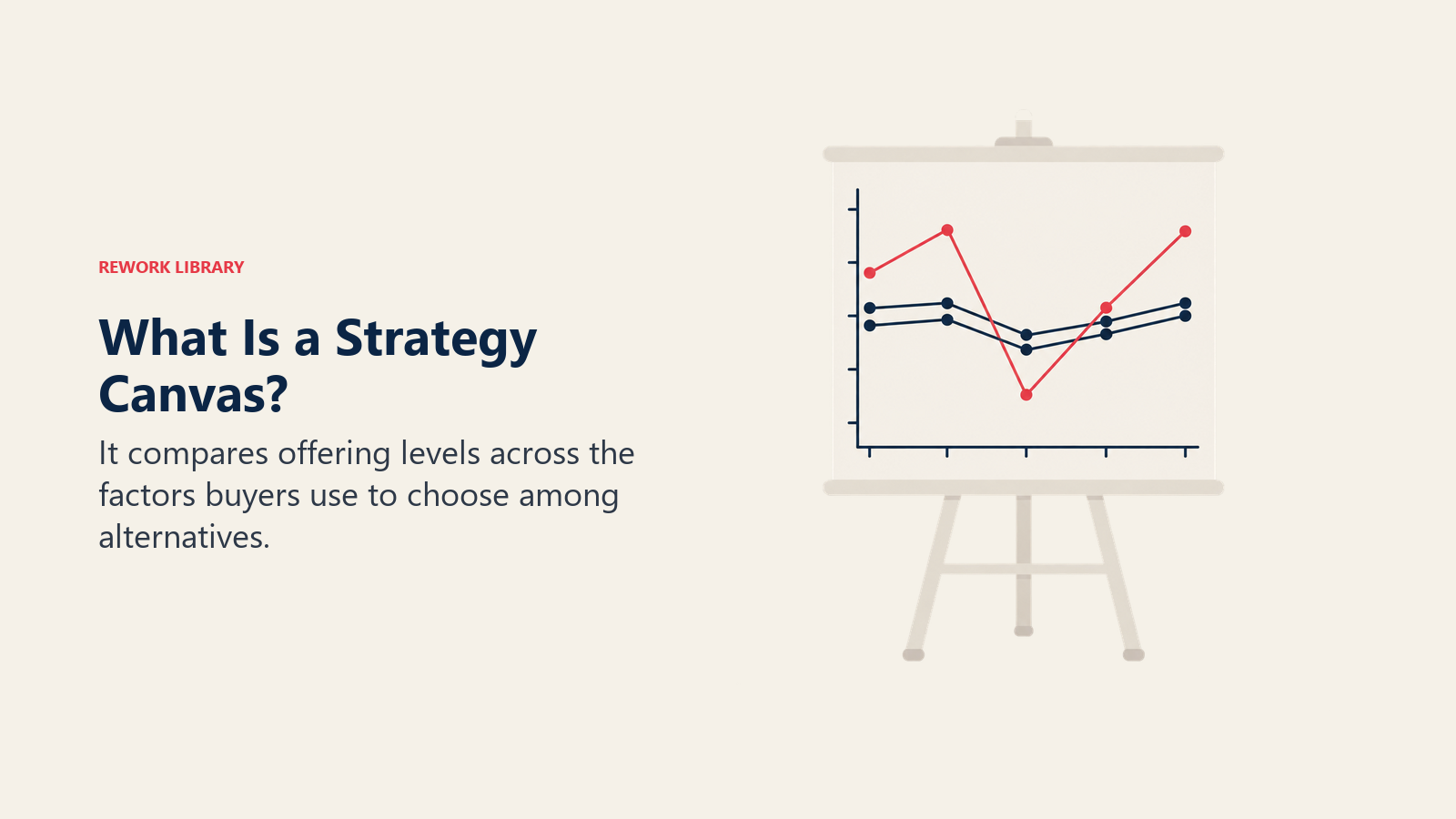
Most strategy documents describe an industry in paragraphs and bullet points. A strategy canvas draws it as one picture instead: factors along the bottom, offering level up the side, and one connected line per player showing how much of each factor they deliver. Put your line next to a rival's and you find out in ten seconds whether you're genuinely different, or just telling yourself you are in the deck.
The tool comes from W. Chan Kim and Renee Mauborgne, INSEAD professors who introduced it in their October 2004 Harvard Business Review article and expanded it a year later in Blue Ocean Strategy. It's the diagnostic half of blue ocean thinking: the picture you draw honestly before you touch the Eliminate-Reduce-Raise-Create grid that redesigns the curve into something new.
Blue Ocean Strategy already owns the full theory this tool sits inside: red versus blue oceans, value innovation, the six paths framework, and the model's criticisms. This page owns the canvas itself: how to build one this week, choose factors that mean something, score them honestly when there's no ruler for "service level," read a finished canvas, and avoid the mistakes that turn a useful diagnostic into a slide nobody trusts.
Key Facts: Strategy Canvas
- A strategy canvas is "a one-page visual analytic that depicts the way an organization configures its offering to buyers in relation to those of its competitors," built by W. Chan Kim and Renee Mauborgne. (Blue Ocean Strategy, Strategy Canvas tool page)
- Kim and Mauborgne, both INSEAD professors, introduced the canvas in their "Blue Ocean Strategy" article in the October 2004 issue of Harvard Business Review, then expanded it into their 2005 book of the same name. (Harvard Business Review, October 2004)
- A compelling value curve has three qualities: focus, divergence, and a message clear enough to work as a tagline. (Blue Ocean Strategy, 5 Compelling Strategy Canvas Examples)
- Casella Family Brands redrew wine's curve around its [yellow tail] brand, and cumulative sales reached 25 million cases by 2005, the best-selling 750ml red wine in the US market. (Blue Ocean Strategy, 7 Powerful Blue Ocean Strategy Examples)
- Medellin built the world's first urban cable car system dedicated to public transport by repurposing ski-resort chairlift technology, at roughly half the cost of a comparable railway, and it now carries about 30,000 passengers a day. (Blue Ocean Strategy, 5 Compelling Strategy Canvas Examples)
What a Strategy Canvas Actually Shows
A strategy canvas has exactly three moving parts, and knowing what each one measures is what separates a canvas that changes a strategy conversation from one that just looks nice in a deck.
| Element | What it is | What it shows |
|---|---|---|
| Horizontal axis | The competing factors an industry invests in (price, speed, range, service, and so on) | Where the fight is actually happening, in the buyer's language, not the org chart's |
| Vertical axis | The offering level buyers receive on each factor, low to high | How much of each factor a player actually delivers, as buyers experience it |
| Value curve | One connected line running through every factor for one player | A player's entire strategic profile, visible in one shape instead of a page of bullets |
Plot your own company, then three to five relevant competitors the same way, and something becomes hard to unsee: most curves in most industries look nearly identical. Everyone invests in the same factors, at roughly the same level, because that's what "competing" has come to mean inside the category. A canvas doesn't argue that's bad. It just makes it visible, usually for the first honest time in years.
This is a buyer-facing tool by design, worth stating early since two other tools here get confused with it. A perceptual map plots how customers subjectively perceive brands on two attributes like price and quality, built from survey data, not how much of a factor a company delivers. A strategic group map plots firms by objective strategic choices, like price tier or distribution breadth. The canvas sits between them: more factors than a perceptual map, more operational than a strategic-group chart, and built to be redesigned, not just read.
Where the Strategy Canvas Came From
The canvas isn't a generic consulting invention with a vague origin story. It has a specific author, publication date, and book.
| Milestone | What happened |
|---|---|
| October 2004 | Kim and Mauborgne publish "Blue Ocean Strategy" in Harvard Business Review, introducing the canvas and the four actions framework |
| 2005 | Harvard Business School Press publishes Blue Ocean Strategy: How to Create Uncontested Market Space and Make the Competition Irrelevant, expanding the canvas into a full methodology |
| Ongoing | Kim and Mauborgne continue the work as co-directors of the INSEAD Blue Ocean Strategy Institute |
Both authors were, and still are, strategy professors at INSEAD. It wasn't built as a marketing exercise, but as an analytical device closer in spirit to a value chain diagram or a five-forces grid than to a brainstorming icebreaker, which is also why it holds up as a standalone diagnostic even for teams with no interest in a full blue ocean move.
How to Choose Your Competing Factors
Everything downstream depends on this step, and it's the one almost every team gets wrong first.
The mistake everyone makes first
Teams building their first canvas default to listing what they're proud of internally: tech stack, certifications, headcount, process maturity. None of that belongs on a canvas unless a buyer can perceive it and weigh it against alternatives.
| Buyer-visible factor (belongs on the canvas) | Internal feature (doesn't belong) |
|---|---|
| Time from order to delivery | Which warehouse management system you run |
| Number of support channels a customer can reach | The org structure of your support team |
| Price per unit or seat | Your internal gross margin target |
| Range of product variations offered | Your supplier consolidation strategy |
| How quickly a new user reaches a first result | The framework your onboarding flow was built in |
The fastest test: would a customer, mid-decision, comparing you to a rival, ever say a sentence containing it? "They're faster to set up" survives. "They use a more modern tech stack" only survives if a buyer can feel that difference in speed or reliability; otherwise it's an internal feature wearing a buyer-facing disguise.
Grounding factors in what buyers are trying to accomplish, not what your product happens to offer, is the discipline jobs-to-be-done thinking is built for, and a value proposition canvas catches most internal-feature mistakes before they reach the chart. It also matters who you're asking: different segments weigh factors differently, a market segmentation problem hiding inside a canvas exercise, so build separate canvases for meaningfully different buyer groups rather than averaging preferences into a chart representing nobody.
Most working canvases land on five to nine factors. Fewer means the industry hasn't been thought through; more than twelve means the list hasn't been edited down to what drives a purchase decision, and a crowded axis makes every curve look like a seismograph reading instead of a strategy.
How to Score the Offering Level Honestly
Price has a natural unit. Almost nothing else on a canvas does, which is exactly where honesty starts to slip.
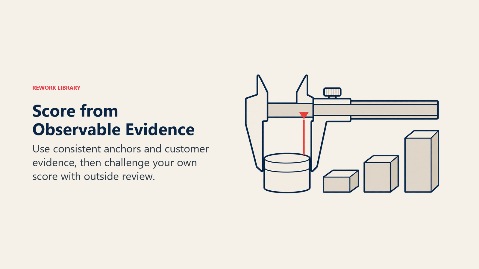
There's no ruler for "service quality" or "ease of use" the way there's a ruler for dollars, so every team has to build its own consistent scale and then resist the human urge to grade its own offering on a curve. A simple 1-to-5 or 1-to-10 scale works fine as long as every point is anchored to something observable, not a feeling.
| Scale point | What it means, using "ease of onboarding" as the factor | What it should not mean |
|---|---|---|
| 1 (low) | A new user needs a scheduled call with a specialist first | "We think onboarding is weak" |
| 3 (mid) | A new user reaches a working result within a day, with some reading | "Onboarding is fine, nothing special" |
| 5 (high) | A new user reaches a working result within minutes, unassisted | "Our onboarding team works hard" |
Three practices keep it honest. Score from evidence you'd defend to a skeptical board member (support tickets, win-loss interviews, time-to-value data, competitor demos you've sat through), not a gut feeling from whoever built the feature. Score rivals from what a buyer would actually experience, not their marketing copy; a website claiming "24/7 support" doesn't earn a 5 if first response runs two days. And have someone outside the immediate team score your own company blind, then compare notes: internal teams reliably rate their own weak factors a point higher than an outsider would, and that gap is usually where the real conversation needs to happen.
How to Plot Your Curve and Your Rivals' Curves
Once the factors and scores exist, plotting the canvas is mechanical, which is why the diagnosis feels so uncomfortably objective.
Lay the chosen factors left to right, often lowest-investment to highest, though there's no fixed rule. Set the vertical axis as an offering-level scale, low at bottom, high at top. Plot a point for your company on each factor, then connect the points into one line: your as-is value curve. Repeat for each of the three to five competitors from your competitive analysis, using the same axis, factors, and scoring discipline, so every curve is comparable.
You don't need design software for a usable first version. A whiteboard, a factor list, and one marker color per player produces a diagnosis just as honest as a polished slide; the value sits in the discipline of scoring, not production quality.
Mark your own curve distinctly, then step back and read the whole picture, not any single factor. That full-chart read is where the canvas earns its keep.
How to Read a Finished Canvas
A finished canvas is a diagnosis, and like any diagnosis it has a handful of recognizable patterns worth learning to spot.
| Pattern | What the curve looks like | What it tells you |
|---|---|---|
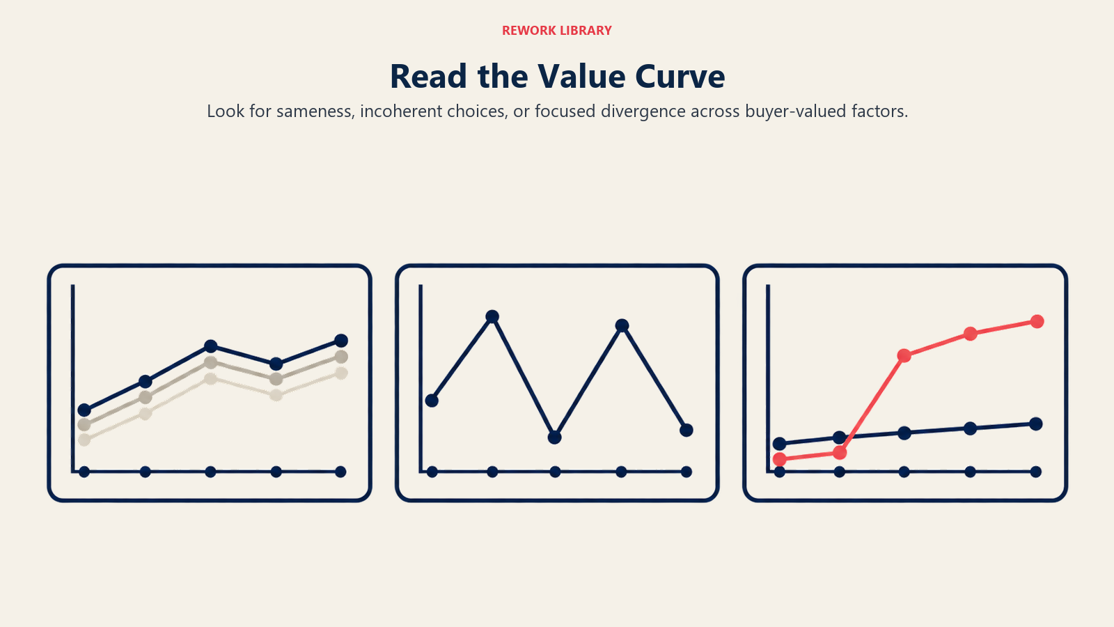
| Convergent curves | Every player's line tracks close to every other across most factors | The industry has commoditized around the same factors at the same levels; you're in a red ocean whether the deck admits it or not |
| A zig-zagging curve | Your line spikes up on some factors, drops low on others, with no pattern connecting the highs and lows | No coherent strategy behind the offering, just features added at different times for different reasons |
| A divergent curve | Your line runs meaningfully higher than rivals on some factors, lower on others the industry assumes are essential | The signature of a genuine strategic choice, the shape a value-innovation move produces |
Convergence is the most common finding, and the most uncomfortable, because it usually contradicts what leadership believed about its own differentiation. A cluster of nearly identical curves means customers choose almost entirely on price, the only factor left that varies. That connects directly to competitive positioning: if your positioning statement claims a distinct place in the customer's mind but your curve sits on top of three competitors' curves, the position exists on a slide and nowhere else. It is also the visual form of the survivability test a value proposition has to pass, since a claim a rival could copy word for word tomorrow produces exactly this shape.
A zig-zagging curve is a different problem: not too much sameness, but too much randomness, the fingerprint of a product built by chasing whichever competitor's feature made the most noise that quarter. The fix isn't to zig-zag harder the other way. It's to run the factor list through the ERRC grid below and make deliberate choices instead of reactive ones.
A genuinely divergent curve is what the exercise aims for. Kim and Mauborgne's own tools describe three qualities separating a compelling curve from an arbitrary one: focus, divergence, and a message clear enough to work as a tagline. Focus means the curve concentrates investment on a few factors instead of spreading thin everywhere. Divergence means the shape genuinely differs from the pack, not just at the edges. And the tagline test is the simplest gut check: if you can't compress the curve into one honest sentence a customer would say back to you, it probably isn't divergent enough yet. That third test connects to a unique selling proposition: a curve that passes the tagline test and a USP a competitor cannot repeat usually describe the same strategic choice from two angles.
The ERRC Grid: Turning a Diagnosis into a Redesigned Curve
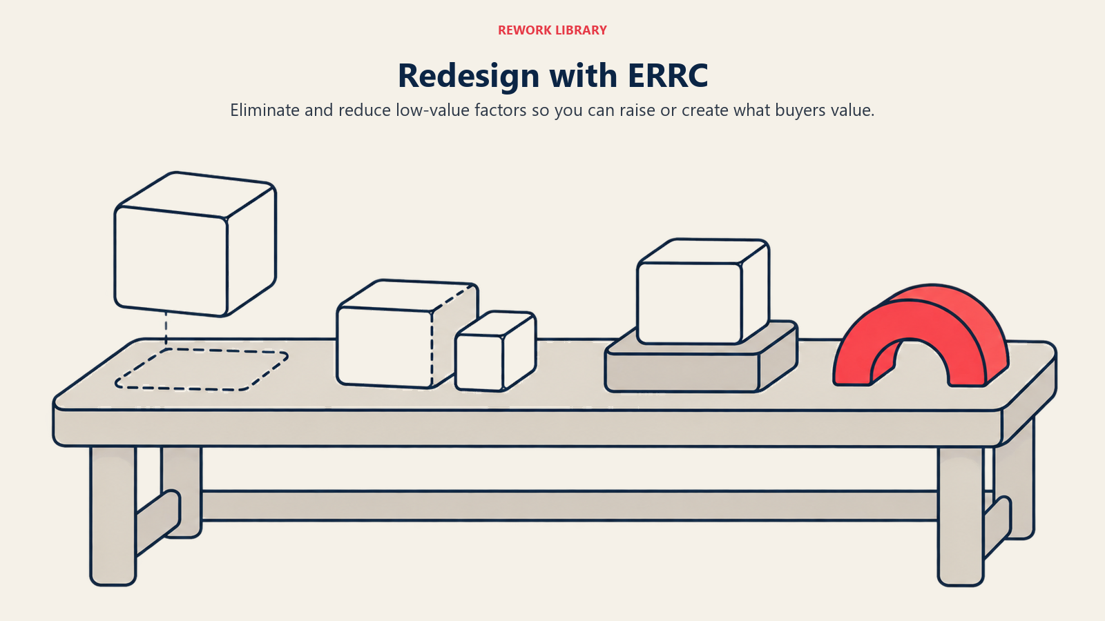
A canvas that only describes the current red ocean is half a tool. The other half is the Eliminate-Reduce-Raise-Create grid, which forces a redesigned curve out of the diagnosis.
| Question | What it forces you to decide |
|---|---|
| Eliminate | Which factors does the industry take for granted that buyers don't actually value? Cost drivers with no real payoff; removing them funds the rest of the grid |
| Reduce | Which factors is the industry over-delivering relative to what buyers need? These inflate cost without a proportional return |
| Raise | Which factors should go well above the industry standard, because buyers want more than they're getting? |
| Create | Which factors has the industry never offered? These define the new curve, not just a better version of the old one |
Working all four boxes matters more than it sounds, because most first drafts only fill in Raise and Create. Adding is intuitive; removing something the whole industry has always included takes nerve, especially when your own team built competency around it. That discomfort is useful: eliminations usually pay for the creates, and a redesign that only raises and creates just becomes a more expensive red-ocean curve.
The grid's output is a new set of scores for your own line, plotted on the same canvas as the current-state curves. If it still tracks close to competitors, the redesign hasn't gone far enough. Blue Ocean Strategy covers the ERRC grid's full theoretical grounding and the six paths framework used to spot candidates in the first place; this page's job is narrower, showing how the output becomes a new line on the chart you already built. Building the capability behind that new curve belongs to differentiation strategy.
Worked Example: Redrawing a Value Curve Step by Step
Medellin, Colombia's second-largest city, is a cleaner worked example than the usual circus and wine stories: every step is documented with real numbers, not a marketing anecdote repeated without a source.
Step 1: The industry and the factors that mattered
Sergio Fajardo was elected mayor of Medellin in 2003. The city needed to connect poor hillside neighborhoods to the center, where residents paid an outsized cost in time and safety for a commute wealthier flatland residents didn't face. The factors that mattered weren't what a transit engineer would default to: cost per trip, route directness to hillside homes, frequency, and whether the trip felt safe and dignified rather than a daily grind.
Step 2: The curve that already existed
Buses served the hillside cheaply but slowly, with no fixed schedule riders could plan around. A conventional rail line would have solved speed and reliability, but at a cost and construction footprint the terrain made close to impossible.
Step 3: Apply the ERRC grid
Instead of building rail, planners looked across a different industry entirely, ski resorts, and repurposed chairlift technology into an urban transit mode. They eliminated the need for a dedicated flat rail corridor. They reduced comfort and top speed relative to a train. They raised frequency, hillside coverage, and route directness well above what buses offered. And they created something the category hadn't offered before: a scenic, almost amusement-park-like ride.
Step 4: Read the resulting curve
The finished Metrocable line was built at roughly half the cost of a comparable railway, and now carries about 30,000 passengers a day. Its curve diverges from both incumbents legibly: it beats the bus on reliability, frequency, and dignity, and beats a hypothetical rail line on cost and speed to build, while giving up comfort a train would offer. The redesign compresses into a tagline that passes Kim and Mauborgne's own compelling-curve test: "the price of the bus, the convenience of the train, the fun of the amusement park."
An illustrative scored canvas
The published case doesn't score every factor numerically, and inventing precise numbers for a real public project is the fabricated score this page argues against. The table below is our own illustrative interpretation, built from the ERRC choices above, scored 1 to 5 purely to show what a finished canvas looks like once numbers replace prose. Treat the shape, not the digits, as the takeaway.
| Factor (1 to 5 scale) | Local bus | Hypothetical rail line | Metrocable |
|---|---|---|---|
| Cost per trip for the rider | 5 | 2 | 4 |
| Hillside route directness | 2 | 3 | 5 |
| Frequency and reliability | 2 | 4 | 4 |
| Ride comfort | 3 | 5 | 3 |
| Rider experience ("fun") | 2 | 2 | 5 |
Read left to right and the story matches the ERRC grid: Metrocable doesn't win on comfort, and doesn't pretend to. It wins by pairing cost efficiency with hillside access and frequency, then creating an experience factor neither incumbent offered.
Common Mistakes That Break a Strategy Canvas
Most canvases fail for one of four repeatable reasons, each avoidable once you know to look for it.
| Mistake | What it looks like | The fix |
|---|---|---|
| Too many factors | Fifteen-plus items on the axis, most tied for last place in importance | Cut to the five to nine factors that actually drive the purchase decision; a crowded axis hides the story |
| Internal features, not buyer-visible factors | Axis labels like "tech stack" a customer would never say out loud | Run every candidate factor through the buyer's-sentence test first |
| Scoring by wishful thinking | Your own company scores a 5 on every factor, based on opinion rather than evidence | Score from support data, win-loss interviews, and outside review |
| Drawn once, never redrawn | A canvas built for one offsite two years ago, still treated as current | Rebuild it on a fixed cadence, especially after a competitor launch or pricing change |
The last mistake is the quietest, and often costliest: competitors imitate a divergent curve the moment it starts working, factors that seemed exotic two years ago become table stakes, and a canvas nobody has touched since the last offsite describes a market that no longer exists.
Strategy Canvas vs Perceptual Map vs Feature Comparison Chart
These three look similar enough on a slide to get swapped for each other, and each swap produces a different bad decision.
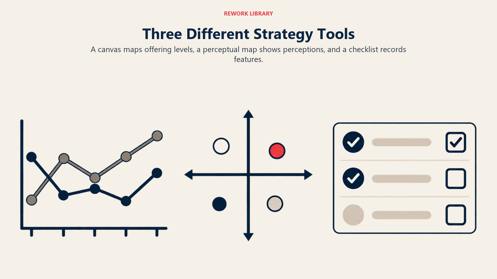
| Dimension | Strategy Canvas | Perceptual Map | Feature Comparison Chart |
|---|---|---|---|
| What it plots | Offering level across many competing factors | Two subjective attributes, from customer perception data | A checklist of yes/no features across products |
| Dimensions | Five to nine factors, one line per player | Exactly two axes | As many rows as there are features, no connecting line |
| Data source | A mix of buyer evidence and honest internal scoring | Customer surveys or brand-tracking studies | Spec sheets, often self-reported by vendors |
| Built to do | Diagnose the industry, then redesign via the ERRC grid | Find open positioning space in the customer's mind | Help a buyer compare capabilities during evaluation |
| Where it breaks down | Useless if factors chosen are internal, not buyer-visible | Useless if the axes aren't what buyers actually weigh | Rewards feature count over the shape of the experience |
The feature comparison chart is worth calling out by name, because it's the tool teams reach for by default and mistake for a canvas. A checklist of checkmarks tells a buyer what a product includes. It says nothing about how much of each thing is delivered relative to a competitor, and has no mechanism for showing where to eliminate, raise, or create. A strategy canvas and a business model canvas get confused for a similar reason despite mapping different things: the canvas plots what buyers experience across an industry's competing factors, while the business model canvas maps the internal operating logic, partners, and revenue streams that would have to change to deliver a redesigned curve.
Conclusion
A strategy canvas earns its place by refusing to let a team describe its own differentiation in adjectives. It forces a factor list buyers would recognize, a scoring discipline that resists wishful thinking, and a single line that either looks meaningfully different from the competition or doesn't. Most first attempts land on convergence, which stings, and that sting is the point: you can't redesign a curve you haven't honestly drawn first. Draw it, read it against focus, divergence, and a tagline that survives contact with a real customer, then redraw it before the next planning cycle instead of leaving it framed on a wall from the last one.
Related Reading
- Blue Ocean Strategy: the full theory the canvas sits inside, value innovation, the six paths, and the model's criticisms.
- Perceptual Mapping: the two-axis, customer-perception tool this page distinguishes itself from.
- Strategic Group Mapping: plots firms by strategic choices, not buyer-facing factors.
- Competitive Positioning: where a company chooses to stand once the canvas shows the open space.
- Differentiation Strategy: building the capability behind a Raise or Create decision, not just plotting it.
- Unique Selling Proposition: the one-sentence test a divergent curve's tagline needs to pass.
- Jobs to Be Done: grounds your factor list in what buyers are trying to accomplish.
- Value Proposition Canvas: a second check on whether a factor maps to a real customer job, pain, or gain.
- Market Segmentation: why two very different buyer groups usually need two canvases, not one.
- Competitive Analysis: defining the set of three to five rivals you plot alongside your own curve.
- Value Proposition: the sentence a divergent curve has to compress into, and the tests it has to pass.
- Business Model Canvas: the internal operating-model map you'll need once a redesigned curve gets built.

Co-Founder & COO
On this page
- What a Strategy Canvas Actually Shows
- Where the Strategy Canvas Came From
- How to Choose Your Competing Factors
- The mistake everyone makes first
- How to Score the Offering Level Honestly
- How to Plot Your Curve and Your Rivals' Curves
- How to Read a Finished Canvas
- The ERRC Grid: Turning a Diagnosis into a Redesigned Curve
- Worked Example: Redrawing a Value Curve Step by Step
- Step 1: The industry and the factors that mattered
- Step 2: The curve that already existed
- Step 3: Apply the ERRC grid
- Step 4: Read the resulting curve
- An illustrative scored canvas
- Common Mistakes That Break a Strategy Canvas
- Strategy Canvas vs Perceptual Map vs Feature Comparison Chart
- Conclusion
- Related Reading