Controle Estatístico de Processo (SPC): Métodos e Exemplos
Turn this article into takeaways for your work.
Each assistant summarizes the article only for you and suggests best practices for your work.
O controle estatístico de processo é a disciplina de usar dados em tempo real e estatística para monitorar, controlar e melhorar um processo antes que os defeitos cheguem ao cliente. É uma das ferramentas de qualidade mais práticas que um gestor pode implantar, e está no coração da manufatura enxuta, do Six Sigma e da gestão de operações moderna.
O que é controle estatístico de processo?
O controle estatístico de processo (Statistical Process Control, SPC) é um método de controle de qualidade que aplica técnicas estatísticas para monitorar as saídas de um processo e detectar quando ele está se comportando de forma inesperada. Em vez de inspecionar produtos acabados e esperar que os problemas apareçam tarde, o SPC observa o próprio processo, em tempo real, para que você possa intervir enquanto o produto ainda está sendo fabricado.
A ideia central é simples: todo processo tem variação natural. O SPC distingue entre variação que é normal (chamada de causa comum) e variação que sinaliza que algo deu errado (chamada de causa especial). Quando apenas a variação de causa comum está presente, o processo está "sob controle." Quando surge uma causa especial, esse é um sinal para investigar e agir.
O SPC foi desenvolvido por Walter Shewhart no Bell Labs na década de 1920 e popularizado globalmente por W. Edwards Deming. Hoje ele aparece nas indústrias automotiva, farmacêutica, de alimentos, semicondutores e de serviços.
Dados-chave
- Empresas que usam SPC na manufatura relatam redução de defeitos de 50% ou mais no primeiro ano de implantação (ASQ Quality Progress, 2022).
- Uma pesquisa de 2023 do International Journal of Production Research constatou que 67% dos fabricantes certificados ISO 9001 usam alguma forma de monitoramento estatístico em seus parâmetros de processo críticos.
- Deming estimou que 94% dos problemas de qualidade se originam no sistema (causa comum) e apenas 6% em causas especiais individuais, o que significa que a maioria dos defeitos não pode ser corrigida culpando os funcionários.
Variação de causa comum versus causa especial
Entender a diferença entre esses dois tipos de variação é a base do SPC.
| Tipo de variação | Definição | Exemplo | Ação correta |
|---|---|---|---|
| Causa comum | Variação natural e aleatória, embutida no processo | Pequenas diferenças de peso em produtos embalados devido à vibração da máquina | Melhorar o sistema (redesenhar, reequipar) |
| Causa especial | Variação anormal a partir de um evento identificável | Um novo operador seguindo um procedimento diferente | Investigar e eliminar a causa raiz |
Reagir à variação de causa comum como se fosse causa especial (interferência) na verdade piora os processos. O SPC evita esse erro ao definir limites de controle racionais com base nos próprios dados.
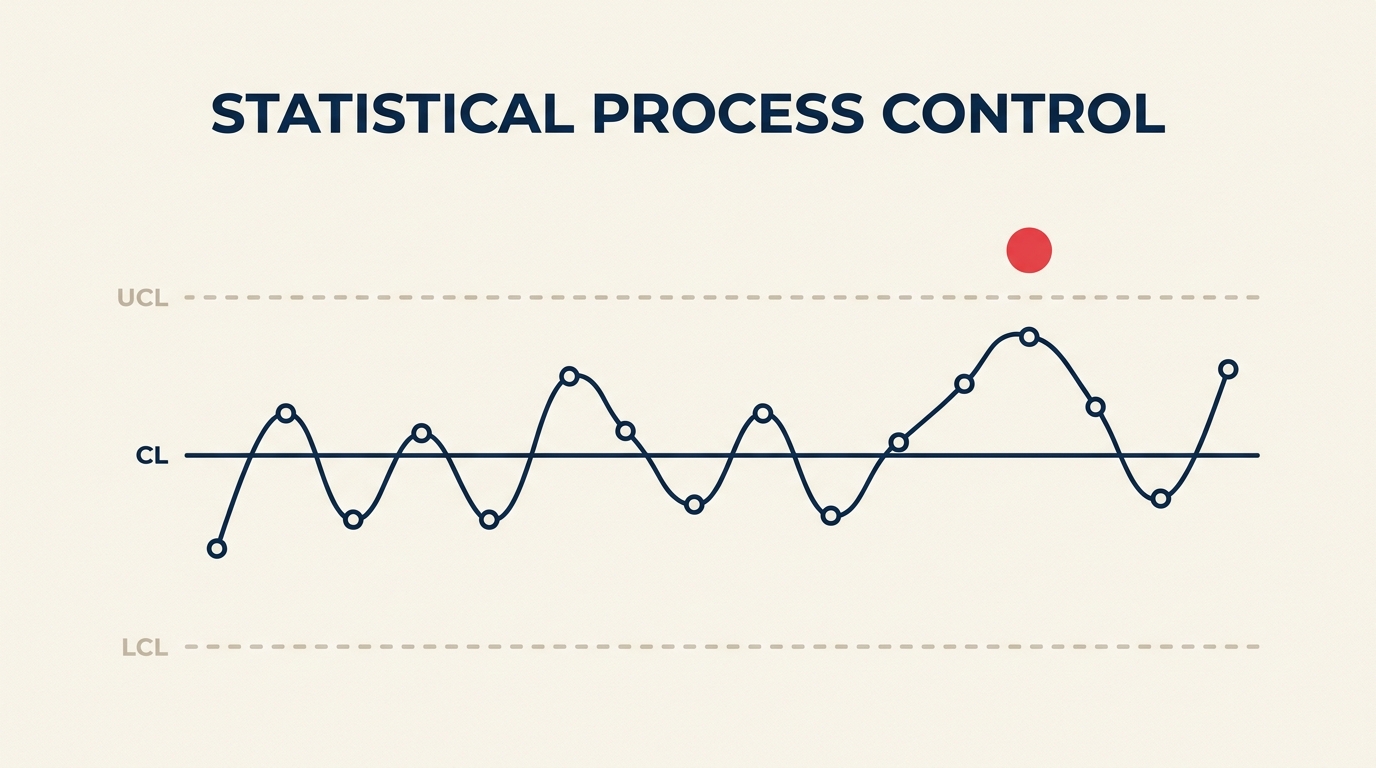
Cartas de controle: o coração do SPC
Uma carta de controle é a principal ferramenta do SPC. É uma carta de execução com três linhas de referência horizontais adicionadas:
- Linha central (LC): a média do processo
- Limite superior de controle (LSC): média mais três desvios-padrão
- Limite inferior de controle (LIC): média menos três desvios-padrão
Esses limites são calculados a partir de dados reais do processo, não de especificações ou tolerâncias. Quando um ponto de dado cai fora do LSC ou do LIC, ou quando um padrão não aleatório aparece dentro dos limites, a carta sinaliza uma causa especial.
Regras de sinal comuns incluem:
- Um ponto além do limite de 3 sigma
- Oito pontos consecutivos de um mesmo lado da linha central
- Seis pontos seguidos com tendência constante de subida ou descida
Reagir rapidamente aos sinais é o que torna o SPC uma ferramenta de controle em tempo real, e não uma auditoria retrospectiva. Vale a pena combinar a análise de carta de controle com métricas de capacidade de processo (Cp/Cpk), que medem o quão bem o processo se encaixa dentro dos limites de especificação depois que você confirmou que ele está sob controle estatístico.
SPC versus inspeção
A garantia de qualidade tradicional depende de inspecionar a saída no final de um ciclo de produção. Você fabrica o produto, depois verifica. Os problemas dessa abordagem são bem documentados: é cara, é lenta e detecta defeitos somente depois que o desperdício já foi gerado.
Deming descreveu a inspeção de fim de linha como "tarde demais, cara demais e não confiável." Seu argumento era que, se um processo é capaz e está sob controle, a inspeção 100% se torna, em grande parte, redundante. Se o processo não é capaz, a inspeção não vai corrigi-lo de qualquer forma. Só a melhoria do processo faz isso.
O SPC inverte o modelo. Você monitora o processo em tempo real e reage a sinais antes que os defeitos se formem. Algumas diferenças práticas:
| Fator | Inspeção de fim de linha | SPC |
|---|---|---|
| Quando os problemas são detectados | Depois da produção | Durante a produção |
| Ação tomada | Separar ou retrabalhar produtos acabados | Ajustar o processo imediatamente |
| Desperdício gerado | Alto (defeitos já produzidos) | Baixo (processo corrigido cedo) |
| Informação produzida | Aprovado/reprovado por lote | Dados de tendência sobre o comportamento do processo |
| Perfil de custo | Intensivo em mão de obra, reativo | Custo de implantação do monitoramento, depois economias proativas |
O SPC não elimina a inspeção completamente. Setores críticos de segurança ainda exigem verificações finais. Empresas farmacêuticas sujeitas à FDA 21 CFR Part 211, por exemplo, combinam SPC para monitoramento em processo com testes de liberação baseados em amostragem porque a regulamentação exige ambos. Mas mesmo ali, o SPC reduz drasticamente a carga de inspeção ao prevenir defeitos em vez de encontrá-los. Menos falhas surpresa na inspeção final significam menos retrabalho, menos lotes rejeitados e um caminho mais curto da produção até a liberação.
Como implementar SPC
Colocar o SPC em funcionamento é um exercício prático de engenharia e gestão. Aqui estão as etapas principais.
Passo 1: Defina o processo e selecione a métrica
Escolha uma variável de saída chave para monitorar. Pode ser uma dimensão, peso, tempo de ciclo, volume de enchimento ou taxa de erro. A métrica deve ser mensurável, diretamente relacionada à qualidade e coletada em uma frequência prática.
Use uma folha de verificação para registrar dados de forma consistente desde o início.
Passo 2: Valide o sistema de medição
Dados ruins produzem cartas de controle enganosas. Antes de coletar dados de processo, realize um estudo Gauge R&R (Repetibilidade e Reprodutibilidade) para confirmar que seu dispositivo de medição e seus operadores produzem resultados consistentes.
Passo 3: Colete dados de linha de base
Reúna de 20 a 30 subgrupos racionais (ou leituras individuais) de um processo operando em condições normais. Esses dados de linha de base são usados para calcular sua linha central e seus limites de controle.
Passo 4: Escolha a carta de controle certa
Tipos de dados diferentes exigem cartas diferentes (veja a seção Tipos de Cartas de Controle abaixo). Escolher a carta errada gera limites de controle incorretos.
Passo 5: Calcule e plote os limites de controle
Calcule o LSC, o LIC e a linha central a partir dos seus dados de linha de base. Plote os limites na carta. Esses limites devem permanecer fixos até que você melhore deliberadamente o processo.
Passo 6: Monitore o processo e responda aos sinais
Plote novos pontos de dados em tempo real. Quando um sinal aparecer, siga um plano de reação definido: pare e investigue, identifique a causa raiz, corrija-a e documente o resultado. Use o DMAIC quando a investigação revelar um problema sistêmico mais profundo.
Passo 7: Revise e recalcule periodicamente
Depois de uma melhoria genuína no processo, recalcule os limites de controle usando a nova linha de base. Limites baseados no desempenho antigo não refletem mais a realidade atual. Algumas equipes definem uma revisão de calendário (trimestral, por exemplo) para avaliar se o processo mudou o suficiente para justificar novos limites. Outras disparam uma revisão sempre que um projeto DMAIC é encerrado, tratando os novos limites como parte do entregável da fase de controle.
Tipos de cartas de controle
Escolher a carta certa depende de duas coisas: se seus dados são contínuos (medidos) ou de atributo (contados), e como seus subgrupos estão estruturados.
| Carta | Tipo de dado | Tamanho do subgrupo | Usar quando |
|---|---|---|---|
| X-barra & R | Contínuo | 2 a 10 | Monitorar a média e a amplitude do processo com subgrupos pequenos |
| X-barra & S | Contínuo | 10 ou mais | Igual à X-barra & R, mas mais precisa para subgrupos maiores |
| I-MR (Individuais e Amplitude Móvel) | Contínuo | 1 | As medições são feitas uma de cada vez (processos lentos, testes destrutivos) |
| Carta p | Atributo (proporção) | Variável | Acompanhar a proporção de itens defeituosos quando o tamanho do subgrupo varia |
| Carta np | Atributo (contagem) | Fixo | Contar o número de itens defeituosos quando o tamanho do subgrupo é constante |
| Carta c | Atributo (contagem) | Área/unidade fixa | Contar defeitos por unidade quando as unidades têm o mesmo tamanho |
| Carta u | Atributo (contagem) | Área/unidade variável | Contar defeitos por unidade quando as unidades variam de tamanho |
Um histograma e um diagrama de dispersão são companheiros úteis quando você está no processo de escolher um tipo de carta. O histograma mostra se seus dados seguem uma distribuição aproximadamente normal (um pré-requisito para a maioria das cartas de variáveis), enquanto o diagrama de dispersão ajuda a entender as relações entre entradas e saídas antes de decidir qual variável vale a pena monitorar.
Se você ainda estiver em dúvida sobre qual carta se encaixa na sua situação, o AIAG SPC Reference Manual (atualmente em sua segunda edição) contém uma árvore de decisão que guia você pelo tipo de dado, estrutura do subgrupo e frequência de medição. A maioria dos pacotes de software de gestão da qualidade também seleciona automaticamente o tipo de carta com base nos dados que você insere.
Benefícios e limitações
Benefícios
- Alerta precoce: os problemas são detectados durante a produção, não depois.
- Decisões objetivas: os limites de controle removem o palpite dos julgamentos de "isso é normal?"
- Menos combate a incêndios: processos estáveis e sob controle liberam a atenção da gestão para o trabalho de melhoria, em vez de resposta a emergências.
- Conhecimento do processo: as cartas constroem memória institucional sobre como um processo se comporta ao longo do tempo.
- Redução de custos: menos defeitos, menos retrabalho e menos sucata reduzem diretamente os custos operacionais.
Limitações
- Exige coleta de dados estável: se os sistemas de medição não são confiáveis ou a coleta de dados é inconsistente, as cartas ficam enganosas.
- A escolha da carta importa: o tipo de carta errado produz limites incorretos e sinais falsos.
- Investimento em treinamento: operadores e engenheiros precisam entender o que os sinais significam e como responder. Uma carta na parede que ninguém usa é pior do que nenhuma carta.
- Não substitui o design do processo: o SPC controla um processo existente. Se o processo é fundamentalmente incapaz de atender às especificações, o SPC vai confirmar isso, mas não corrigir. Você precisa de análise de capacidade de processo (Cp/Cpk) e mudanças de engenharia para isso.
- Pode gerar fadiga de alertas: regras excessivamente sensíveis ou limites mal mantidos geram sinais falsos demais, fazendo as equipes ignorarem a carta.
Perguntas frequentes
Qual é a diferença entre SPC e SQC? O controle estatístico de qualidade (Statistical Quality Control, SQC) é a disciplina mais ampla que cobre tanto a amostragem estatística para inspeção de aceitação quanto o SPC. O SPC é o subconjunto de monitoramento em tempo real do SQC. Quando as pessoas dizem "controle estatístico de processo," elas se referem especificamente à abordagem de carta de controle para monitorar a produção em andamento.
Quantos pontos de dados eu preciso antes de poder definir limites de controle? A maioria dos livros didáticos e o manual AIAG SPC recomendam pelo menos 20 a 25 subgrupos (ou leituras individuais para cartas I-MR). Menos pontos produzem estimativas de limite instáveis. Se você precisar começar com menos dados, trate os limites iniciais como provisórios e recalcule depois de coletar 25 pontos.
O SPC pode ser usado em ambientes de serviço e escritório? Sim. O SPC se aplica sempre que você tem um processo repetível e uma saída mensurável. Aplicações comuns em serviços incluem tempos de atendimento de chamadas, erros de processamento de faturas, tempos de ciclo de entrega e tempos de espera do cliente. Os tipos de carta são os mesmos; só as métricas mudam.
Qual é a relação entre limites de controle e limites de especificação? Os limites de controle são calculados a partir da variação real do processo. Os limites de especificação são definidos pelo cliente ou pela equipe de engenharia. Eles são completamente independentes um do outro. Um processo pode estar sob controle estatístico (todos os pontos dentro dos limites de controle) e ainda ser incapaz de atender às especificações. É exatamente isso que índices de capacidade de processo como Cp e Cpk medem.
Quando devo recalcular os limites de controle? Recalcule depois de uma melhoria confirmada e intencional no processo. Não recalcule só porque pontos caíram fora dos limites. Remover dados "ruins" para obter limites mais estreitos anula o propósito do SPC. Os limites devem refletir o processo estável e melhorado que você realmente quer operar.
O SPC é uma das ferramentas de qualidade mais antigas ainda em uso ativo, e conquistou essa longevidade por ser genuinamente eficaz. Comece com uma métrica, uma carta e um plano de reação comprometido. Conforme sua equipe ganha confiança com o básico, expanda para mais variáveis e integre os achados do SPC aos seus ciclos de melhoria DMAIC mais amplos.

Senior Operations & Growth Strategist
On this page
- O que é controle estatístico de processo?
- Variação de causa comum versus causa especial
- Cartas de controle: o coração do SPC
- SPC versus inspeção
- Como implementar SPC
- Passo 1: Defina o processo e selecione a métrica
- Passo 2: Valide o sistema de medição
- Passo 3: Colete dados de linha de base
- Passo 4: Escolha a carta de controle certa
- Passo 5: Calcule e plote os limites de controle
- Passo 6: Monitore o processo e responda aos sinais
- Passo 7: Revise e recalcule periodicamente
- Tipos de cartas de controle
- Benefícios e limitações
- Benefícios
- Limitações
- Perguntas frequentes