SaaS Metrics Dashboard: Your Revenue Command Center
Turn this article into takeaways for your work.
Each assistant summarizes the article only for you and suggests best practices for your work.
Your company tracks 147 different metrics across multiple systems. Marketing has their dashboard showing MQLs and campaign performance. Sales has pipeline reports in the CRM. Customer success tracks health scores in their platform. Finance has ARR spreadsheets. The CEO looks at a different set of numbers entirely.
Nobody can answer a simple question: are we healthy or not?
This is dashboard chaos, drowning in metrics while starving for insights. Companies collect vast amounts of data but struggle to transform it into actionable intelligence that drives better decisions.
The solution isn't more dashboards. It's better dashboard architecture that provides the right metrics to the right people at the right level of detail, all derived from a single source of truth.
Dashboard Hierarchy
Different stakeholders need different views of your business. Build a hierarchy that serves each audience appropriately.
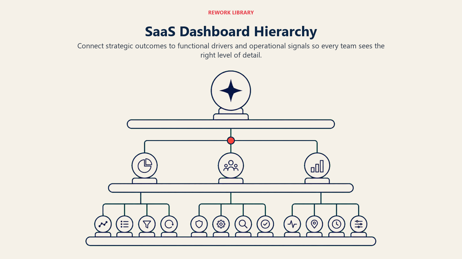
Executive Dashboard (Board-Level)
The executive dashboard answers: are we hitting our strategic goals? It shows ARR trajectory, growth rate, unit economics, cash position, and top risks.
This dashboard doesn't include operational details. Executives don't need to know how many sales calls happened last week. They need to know if the business is on track.
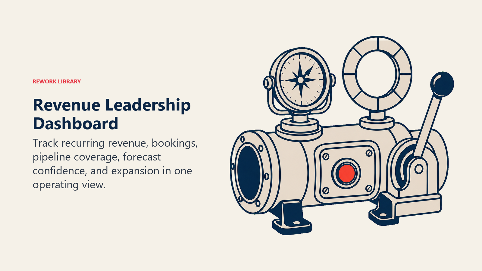
Revenue Leadership Dashboard
Revenue leaders (CRO, VP Sales, VP Marketing, VP CS) need visibility into pipeline health, conversion metrics, team performance, and forecast accuracy.
This dashboard bridges strategy and operations. It shows whether tactical execution is delivering strategic results.
Department Dashboards (Marketing, Sales, CS)
Each revenue department needs metrics specific to their function. Marketing needs campaign performance, lead quality, and attribution. Sales needs pipeline by stage, deal velocity, and quota attainment. CS needs health scores, churn risk, and expansion pipeline.
These dashboards are operational, they drive daily and weekly decisions about where to focus effort.
Rep/Manager Operational Dashboards
Individual contributors and frontline managers need granular visibility into their books of business. Sales reps need their pipeline, activity tracking, and opportunities requiring attention. CSMs need their account portfolios, health trends, and upcoming renewals.
These dashboards are tactical tools for managing day-to-day work.
Core SaaS Metrics Framework
Every SaaS dashboard should include these foundational metric categories. Understanding SaaS economics and unit metrics provides the foundation for building effective dashboards.
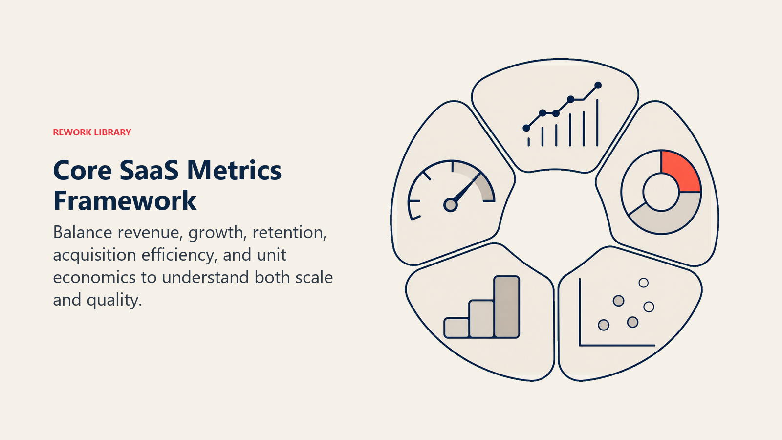
Growth Metrics
ARR and Net New ARR: Your current ARR run-rate and quarterly/monthly net additions. Show the waterfall: new ARR, expansion ARR, contraction ARR, and churn ARR.
Growth Rate: Quarter-over-quarter and year-over-year ARR growth percentage. This reveals whether growth is accelerating or decelerating.
Logo Metrics: New customers added, churned customers, net logo growth. These complement ARR metrics by showing customer acquisition momentum.
Efficiency Metrics
CAC (Customer Acquisition Cost): Total sales and marketing spend divided by new customers acquired. Track trend over time and by channel.
LTV (Lifetime Value): Average revenue per customer multiplied by average customer lifetime. Use cohort-based calculations for accuracy.
LTV:CAC Ratio: The fundamental unit economics metric. Healthy SaaS businesses target 3:1 or higher, customers generate three times what you spent to acquire them.
Magic Number: Net new ARR divided by sales and marketing spend from the prior quarter. Above 0.75 suggests efficient growth.
Health Metrics
Churn Rate: Both logo churn (percentage of customers) and dollar churn (percentage of ARR). Track monthly and annualized.
Net Revenue Retention (NRR): ARR from a cohort of customers one year later divided by starting ARR. Above 100% means expansion exceeds churn. Learn more about optimizing net revenue retention as a growth lever.
Gross Revenue Retention (GRR): ARR retained from a cohort excluding expansion. Measures pure retention strength.
Customer Health Distribution: Percentage of ARR in healthy, at-risk, and critical health status. Implementing effective customer health scoring is essential for proactive retention.
Pipeline Metrics
Pipeline Coverage: Total pipeline value divided by ARR target for the period. Most SaaS companies need 3-5x coverage. Detailed pipeline coverage analysis helps identify gaps early.
Pipeline Velocity: How quickly opportunities move through stages. Measured as (number of opportunities × average deal size × win rate) / sales cycle length.
Conversion Rates: Stage-to-stage conversion percentages that reveal where deals stall or fall out.
Activity Metrics
These vary by team but typically include calls made, meetings held, emails sent, proposals delivered, and demos conducted. Activity metrics are leading indicators of results metrics.
Executive Dashboard Design
What does a great executive dashboard include?
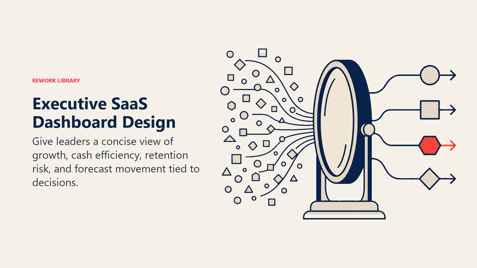
ARR Waterfall
Visualize ARR movement as a waterfall chart showing: starting ARR, plus new ARR, plus expansion ARR, minus contraction, minus churn, equals ending ARR.
This single chart tells the growth story clearly. Is expansion strong? Is churn accelerating? Where's momentum coming from?
Growth Rate Trend
Show quarterly growth rates over the past 8-12 quarters. Is growth accelerating (great), steady (fine), or decelerating (concerning)?
Include targets so it's clear whether performance meets expectations.
Key Efficiency Ratios
Display LTV:CAC, magic number, and CAC payback period (months to recover acquisition cost). These metrics reveal whether growth is capital efficient.
Include benchmarks so stakeholders know if 4.2:1 LTV:CAC is good (yes) or concerning (no).
Cash Burn and Runway
For companies not yet profitable, show monthly burn rate and months of runway remaining. This context is critical for strategic planning.
Top 10 Accounts at Risk
List your largest accounts showing churn risk. This makes abstract churn forecasts concrete and enables executive intervention on critical accounts.
Strategic Initiatives Status
Track 3-5 key strategic projects (product launches, market expansions, major partnerships). Show status and impact on metrics.
This connects execution to outcomes so the board understands what's driving (or not driving) results.
Revenue Leadership Dashboard
What does the revenue leadership team need to see?
Pipeline Coverage by Quarter
Show pipeline coverage for current quarter, next quarter, and two quarters out. This visibility enables proactive gap-filling when coverage drops.
Segment by rep, segment, or region to identify where pipeline is strong or weak.
Forecast vs Actual Tracking
Display commit, likely, and upside forecasts alongside actual results. Track accuracy over time to build confidence in forecasting capability. Improving forecast accuracy is critical for revenue predictability.
When forecasts miss, this dashboard makes gaps visible early enough to take corrective action.
Win Rate by Segment
Break down win rates by company size, industry, lead source, and deal size. This reveals where sales execution is strong and where it needs improvement.
Declining win rates in a key segment signal competitive pressure or product-market fit concerns.
Sales Cycle Trends
Track average sales cycle length over time. Lengthening cycles indicate deal friction, competitive pressure, or economic headwinds.
Show cycle length by segment to identify where deals are slowing down.
Rep Performance Rankings
Display quota attainment, pipeline generation, and win rate for each rep. This transparency drives accountability and enables coaching prioritization.
Avoid public shaming, this dashboard is for leadership, not all-hands meetings.
Revenue Team Capacity
Show current headcount, planned hires, ramp status of new reps, and effective capacity. This helps leadership understand if team size matches targets.
If you need to generate $20M ARR but your team capacity is $15M, you have a gap requiring either more reps or better productivity.
Marketing Dashboard
Marketing needs metrics that connect activities to pipeline and revenue.
MQL Volume and Trend
Show MQL generation by week/month with trend lines. Are you on track for monthly targets? Is volume increasing or flat?
MQL to SQL Conversion
Track what percentage of marketing's leads qualify as SQLs after sales contact. This measures lead quality objectively. Strong conversion rate optimization practices improve this metric systematically.
Poor conversion means either lead quality issues or sales-marketing misalignment on qualification standards.
Pipeline Generated
Show pipeline value created from marketing-sourced leads. This connects marketing activity to revenue outcomes.
Track both current quarter pipeline and future quarter pipeline to show marketing's impact on near and long-term growth.
CAC by Channel
Calculate acquisition cost by marketing channel (paid search, content, events, partners). This enables budget optimization, invest more in efficient channels, less in expensive ones.
Marketing-Sourced Revenue
Track closed ARR that traces back to marketing touches. Use multi-touch attribution if possible to credit marketing fairly.
This metric justifies marketing investment by showing actual revenue impact, not just lead generation.
Campaign ROI
For major campaigns, show investment, leads generated, pipeline created, and closed revenue. Calculate ROI to determine which campaigns to repeat or kill.
Website Conversion Funnel
Track visitors → demo requests → trial signups → opportunities. Identify where prospects drop off and optimize those steps.
Sales Dashboard
Sales teams need pipeline visibility and activity tracking.
Pipeline by Stage
Visualize current pipeline with opportunities segmented by stage. This shows where deals are clustering and where attention is needed.
Include aging indicators to identify stale opportunities that need updating or removal.
Forecast Categories
Show pipeline organized by forecast category: commit (90%+ confidence), likely (50% confidence), pipeline (< 50% confidence).
This structure helps sales leaders assess forecast reliability and identify risk.
Deal Velocity Metrics
Track how quickly opportunities move through stages. Slow-moving deals need attention, they might be stalled, need executive involvement, or should be disqualified.
Activity Metrics
Display calls, meetings, emails, and demos conducted. These leading indicators predict future pipeline and closed deals.
Compare rep activity levels to identify who needs coaching on work habits.
Win/Loss Analysis
Show win rates, common loss reasons, and competitive win/loss data. This intelligence informs sales strategy and training focus.
Track these metrics over time to see if competition is intensifying or if your win rate is improving with better sales execution.
Quota Attainment
Display each rep's progress toward quota with time remaining in the quarter. This visibility drives urgency and helps managers prioritize coaching.
Customer Success Dashboard
CS teams need health visibility and renewal tracking.
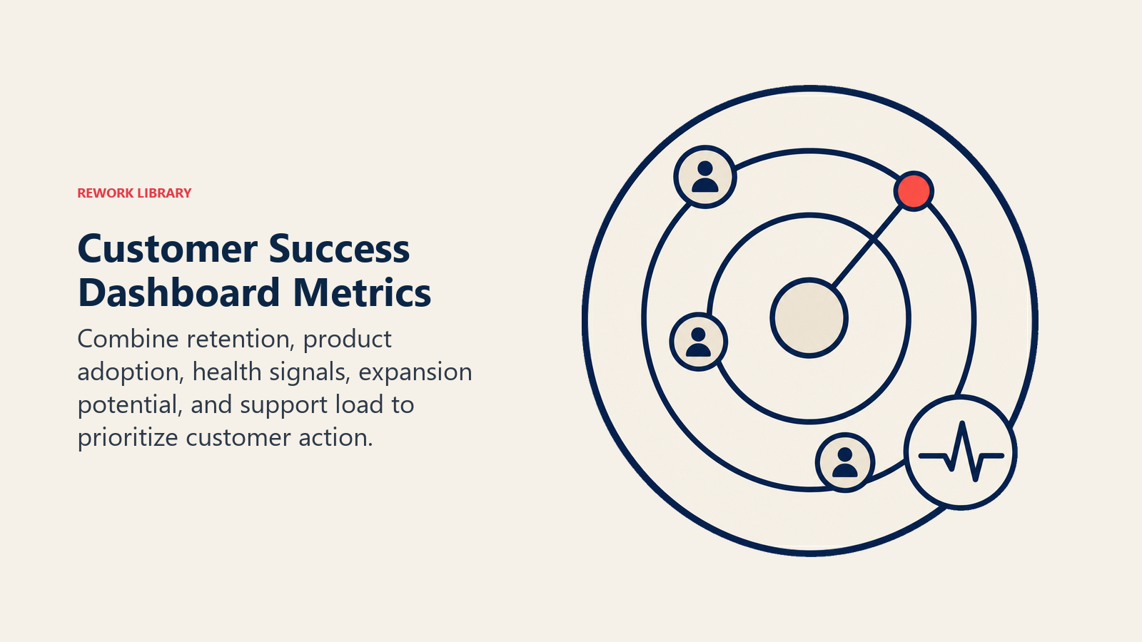
Customer Health Distribution
Show percentage of ARR in each health category (healthy, at-risk, critical). Ideal distribution is 70%+ healthy, 20% at-risk, <10% critical.
If too much ARR is at-risk, CS needs more resources or better processes for driving adoption.
NRR and GRR Trends
Track retention metrics by cohort over time. Improving retention curves show that CS strategies are working. A comprehensive churn reduction framework addresses retention systematically.
Declining retention requires investigation, is it product issues, target market problems, or CS execution gaps?
Churn Forecast
Project churn for upcoming periods based on renewal pipeline and health scores. This enables proactive intervention on at-risk accounts.
Expansion Pipeline
Show expansion opportunities by stage with expected close dates. Treat expansion like a sales pipeline with qualification and tracking.
CSM Account Load
Display how many accounts and how much ARR each CSM manages. Overloaded CSMs can't provide adequate service, increasing churn risk.
Adoption Metrics
Track product usage metrics by customer segment. Low adoption predicts churn; high adoption predicts retention and expansion.
Support Ticket Trends
Monitor ticket volume, resolution time, and customer satisfaction. Spikes in tickets or declining satisfaction scores indicate problems.
Dashboard Design Principles
Good dashboards follow consistent design principles.
Metric Hierarchy (Top-Down)
Place the most important metrics at the top. Viewers should see the headline numbers (ARR, growth rate, churn) before diving into supporting details.
Drill-Down Capability
Enable clicking on summary metrics to see underlying data. If NRR is 95%, let users drill down to see which customer segments are driving that number.
Trend Visualization
Show metrics over time, not just current values. A snapshot tells you where you are; a trend tells you where you're going.
Threshold Alerts
Highlight metrics that fall outside acceptable ranges. Red/yellow/green indicators or conditional formatting draw attention to problems.
Comparison Periods
Show metrics compared to: prior period (month, quarter, year), plan/target, and historical average.
This context reveals whether performance is good or bad.
Annotations for Context
Add notes explaining spikes, dips, or changes. A sudden CAC increase makes sense when annotated "launched paid search campaign."
Without context, viewers waste time investigating normal variance.
Technology Options
What tools enable these dashboards?
Native CRM Dashboards
Salesforce, HubSpot, and other CRMs have built-in dashboard and reporting tools. These work well for sales pipeline metrics but struggle with cross-system analysis.
BI Platforms
Tableau, Looker, and Mode are purpose-built for business intelligence. They connect to multiple data sources, offer sophisticated visualization, and enable self-serve analysis. Selecting the right tools is part of building your overall SaaS tech stack.
These platforms are powerful but require technical setup and ongoing maintenance.
Purpose-Built SaaS Tools
ChartMogul and Baremetrics specialize in SaaS metrics. They connect to billing systems and calculate MRR, churn, LTV automatically.
Easy to implement but less flexible than general-purpose BI platforms.
Custom Builds (Retool, Internal Dev)
Some companies build custom dashboards using tools like Retool or internal engineering resources. This provides maximum flexibility but requires ongoing development investment.
Data Architecture
Dashboards are only as good as the data they're built on. Proper product analytics setup ensures clean, reliable data flows.
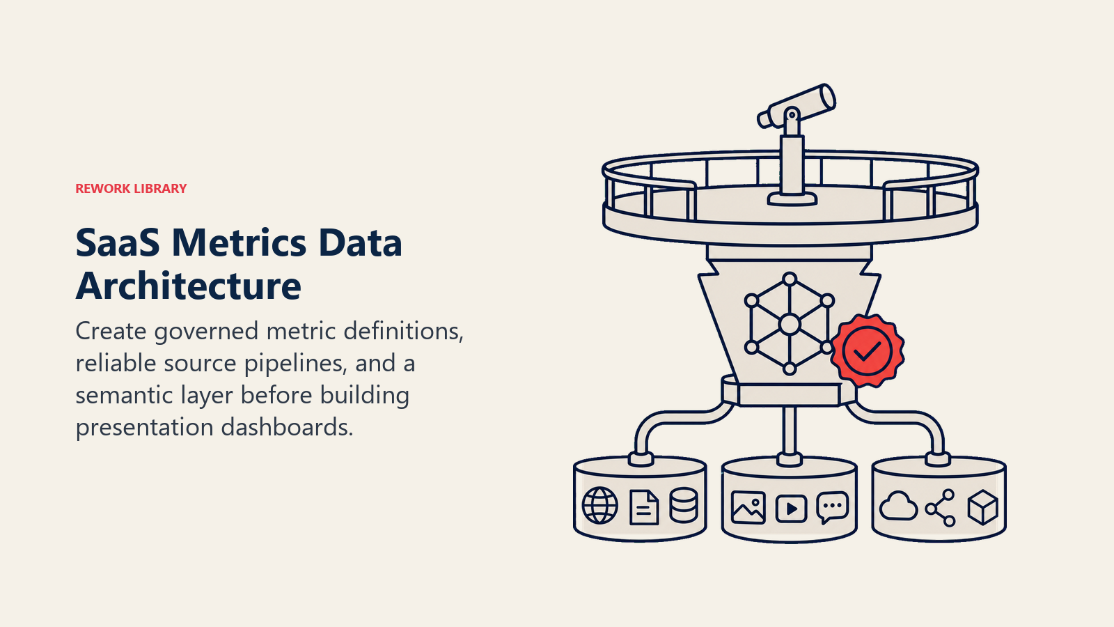
Single Source of Truth
All dashboards should pull from the same underlying data. When marketing and sales have different ARR numbers, trust evaporates.
Establish one system (usually your CRM or data warehouse) as the source of truth for each metric type.
Refresh Frequency
How often do dashboards update? Real-time for operational dashboards (pipeline, health scores). Hourly for management dashboards. Daily for executive dashboards.
Match refresh frequency to decision-making cadence.
Data Quality Checks
Implement automated checks that flag anomalies. If your churn rate suddenly quadruples, that's probably a data error, not reality.
These checks prevent bad data from driving bad decisions.
Calculation Definitions
Document exactly how each metric is calculated. When everyone agrees that CAC = (sales + marketing spend) / new customers, debates about performance end.
Publish a metrics dictionary that defines every calculation.
Historical Preservation
Don't overwrite historical data when you recalculate metrics. Keep snapshots so you can analyze trends accurately.
Implementation Roadmap
Build dashboard capability in phases.
Phase 1: Core Metrics (Week 1-2)
Start with foundational metrics: ARR, growth rate, pipeline, churn. Get these working reliably before adding complexity.
Phase 2: Department Dashboards (Week 3-4)
Build dedicated views for marketing, sales, and CS with metrics relevant to each function.
Phase 3: Operational Dashboards (Week 5-8)
Create rep-level and manager-level dashboards for daily/weekly use.
Phase 4: Advanced Analytics (Ongoing)
Layer on cohort analysis, predictive models, and sophisticated visualizations as your data infrastructure matures.
Governance and Maintenance
Dashboards require ongoing care.
Metric Definitions Documentation
Maintain clear documentation of what every metric means and how it's calculated. Update this when calculations change.
Calculation Logic Transparency
Make calculation logic visible. If users can see the SQL or formula behind a metric, they trust it more.
Regular Audits
Quarterly, audit dashboard accuracy by comparing dashboard numbers to ground truth (like comparing dashboard ARR to financial system ARR).
User Training
Train teams on how to read and use dashboards. Don't assume dashboards are self-explanatory.
Evolution Process
Dashboards should evolve as your business evolves. Create a process for requesting new metrics, removing obsolete ones, and updating calculations.
Common Mistakes
Avoid these dashboard pitfalls:
Too Many Metrics: Dashboards with 50+ metrics overwhelm rather than inform. Focus on metrics that drive decisions.
Vanity Metrics: Metrics that look impressive but don't connect to business outcomes (total website traffic without conversion context).
No Context: Showing current values without trends, targets, or comparisons makes metrics meaningless.
Stale Data: Dashboards that don't refresh regularly become untrusted and unused.
No Ownership: Every dashboard needs an owner responsible for accuracy, relevance, and maintenance.
Conclusion
Great dashboards transform data into decisions by providing the right metrics to the right people at the right level of detail.
This doesn't happen by accident. It requires thoughtful architecture, solid data infrastructure, clear metric definitions, and ongoing governance.
The companies that excel at metrics dashboards operate with transparency, make decisions based on data rather than gut feel, identify problems early while they're still fixable, and align teams around shared understanding of business health.
If your teams look at different numbers, if dashboard accuracy is questioned, or if important decisions happen without data, your dashboard architecture needs work.
Build dashboards as a core capability of your RevOps function. The visibility and alignment they create become competitive advantages that compound as you scale.
Related Resources
Deepen your understanding of SaaS metrics and operations with these related guides:
- SaaS Economics & Unit Metrics - Master the fundamental economic drivers of SaaS business models
- ARR Forecasting - Build accurate revenue forecasts using dashboard data
- Product Analytics Setup - Implement the analytics infrastructure that powers dashboards
- Customer Health Scoring - Design health scoring systems that predict churn and expansion
- Pipeline Coverage Analysis - Analyze pipeline health to ensure you hit revenue targets
- Churn Reduction Framework - Use retention metrics to drive proactive customer success

Senior Operations & Growth Strategist
On this page
- Dashboard Hierarchy
- Executive Dashboard (Board-Level)
- Revenue Leadership Dashboard
- Department Dashboards (Marketing, Sales, CS)
- Rep/Manager Operational Dashboards
- Core SaaS Metrics Framework
- Growth Metrics
- Efficiency Metrics
- Health Metrics
- Pipeline Metrics
- Activity Metrics
- Executive Dashboard Design
- ARR Waterfall
- Growth Rate Trend
- Key Efficiency Ratios
- Cash Burn and Runway
- Top 10 Accounts at Risk
- Strategic Initiatives Status
- Revenue Leadership Dashboard
- Pipeline Coverage by Quarter
- Forecast vs Actual Tracking
- Win Rate by Segment
- Sales Cycle Trends
- Rep Performance Rankings
- Revenue Team Capacity
- Marketing Dashboard
- MQL Volume and Trend
- MQL to SQL Conversion
- Pipeline Generated
- CAC by Channel
- Marketing-Sourced Revenue
- Campaign ROI
- Website Conversion Funnel
- Sales Dashboard
- Pipeline by Stage
- Forecast Categories
- Deal Velocity Metrics
- Activity Metrics
- Win/Loss Analysis
- Quota Attainment
- Customer Success Dashboard
- Customer Health Distribution
- NRR and GRR Trends
- Churn Forecast
- Expansion Pipeline
- CSM Account Load
- Adoption Metrics
- Support Ticket Trends
- Dashboard Design Principles
- Metric Hierarchy (Top-Down)
- Drill-Down Capability
- Trend Visualization
- Threshold Alerts
- Comparison Periods
- Annotations for Context
- Technology Options
- Native CRM Dashboards
- BI Platforms
- Purpose-Built SaaS Tools
- Custom Builds (Retool, Internal Dev)
- Data Architecture
- Single Source of Truth
- Refresh Frequency
- Data Quality Checks
- Calculation Definitions
- Historical Preservation
- Implementation Roadmap
- Phase 1: Core Metrics (Week 1-2)
- Phase 2: Department Dashboards (Week 3-4)
- Phase 3: Operational Dashboards (Week 5-8)
- Phase 4: Advanced Analytics (Ongoing)
- Governance and Maintenance
- Metric Definitions Documentation
- Calculation Logic Transparency
- Regular Audits
- User Training
- Evolution Process
- Common Mistakes
- Conclusion
- Related Resources