アフィニティ・ダイアグラムとは:アイデア整理の手順と実例
Turn this article into takeaways for your work.
Each assistant summarizes the article only for you and suggests best practices for your work.
アフィニティ・ダイアグラムは、雑多なアイデアや不満、観察結果の山を、自然な関連性に基づいて意味のあるグループに整理する手法です。紙の上で見ると拍子抜けするほどシンプルなツールですが、チームの問題への向き合い方を確実に変える力を持っています。
アフィニティ・ダイアグラムとは
アフィニティ・ダイアグラムとは、大量の定性データやアイデア、観察結果を自然な関連性に基づいてクラスターに整理するための構造化されたグループ手法であり、整理されていないリストのままでは隠れたままになるパターンを浮かび上がらせます。
これは、1970年代に日本科学技術連盟(JUSE)によって体系化された「新QC七つ道具」の一つで、連関図法やツリーダイアグラムなどと並ぶ手法です。この手法は、1960年代にフィールドデータを整理する方法として日本の人類学者・川喜田二郎氏が考案したもので、そのため「KJ法」とも呼ばれています。
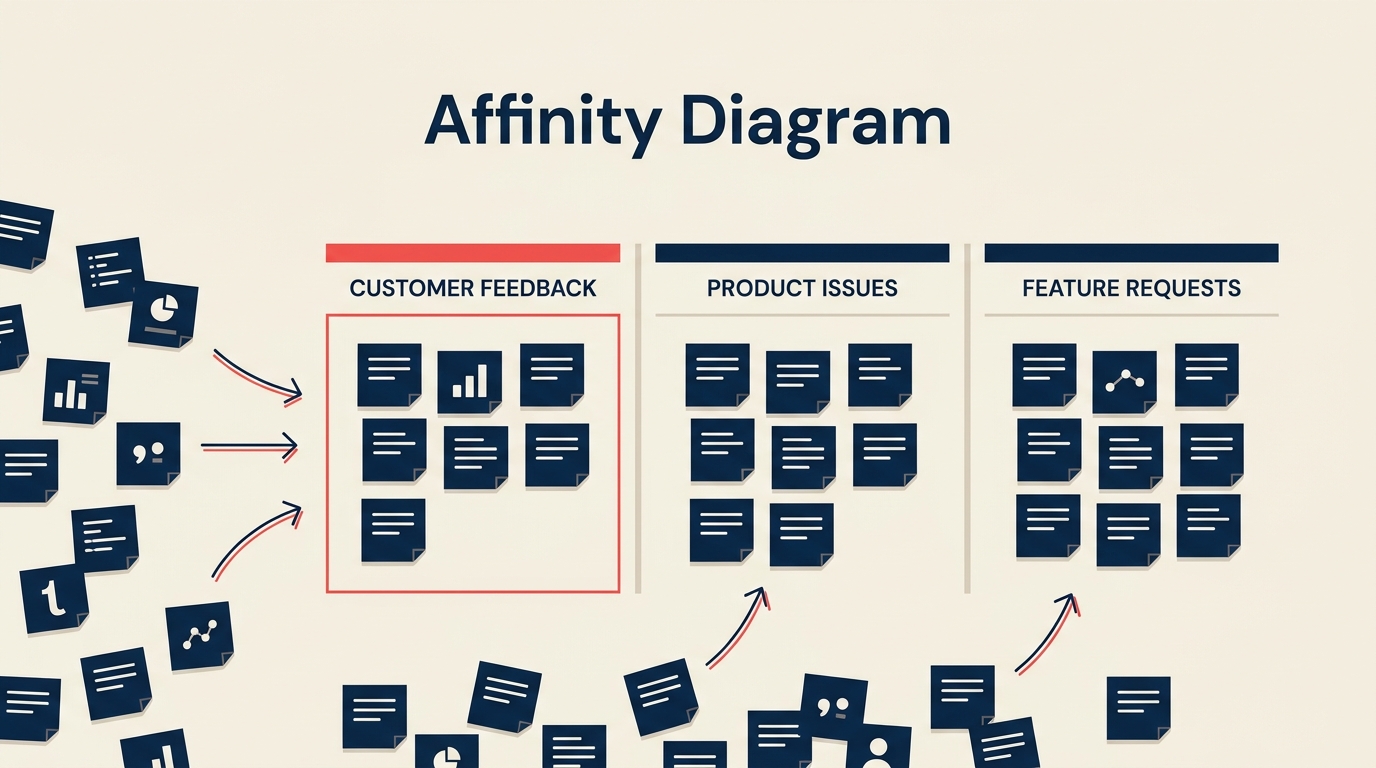
基本的な仕組みはシンプルです。各アイデアやデータは1枚のカードまたは付箋に書き出されます。チームはそれらのカードを黙って(サイレントに)グループに仕分けし、その後、共通点に基づいて各グループに名前を付けます。結果として得られるのは、ランキング付きのリストでも、あらかじめ原因構造が決まったフィッシュボーンでもなく、テーマの視覚的な地図です。構造をデータに押しつけるのではなく、データから発見するのです。
重要な事実
- アフィニティ・ダイアグラムは、JUSEによって標準化され、1979年出版の『新QC七つ道具』(1983年に英訳)に収録された、新QC七つ道具(7つの管理・計画ツール)の一つです。(出典:JUSE / ASQ Quality Resources)
- 川喜田二郎氏は1960年代にKJ法を考案し、民族誌的なフィールドデータを整理する手法として、定性データ統合の最も初期の体系化された手法の一つとなりました。(出典:ASQ「What is an Affinity Diagram?」)
- ASQは、アフィニティ・ダイアグラムを新QC七つ道具の最初のツールとして位置づけており、データがまだ構造化されておらずカテゴリーが未確定な、問題解決の最も初期の段階で適用されるのが一般的です。
アフィニティ・ダイアグラムを使うべき場面
すべての状況にこのツールが向いているわけではありません。次のような場合に最も効果を発揮します。
- 整理が必要な、大量(目安として20項目以上)でまとまっていないアイデアやデータがある場合。
- チームがまだどのようなカテゴリーが存在するかを把握していない場合。すでに区分が分かっているなら、単純なリストの方が速いです。
- 一人の意見が構造を決めてしまうことなく、合意を浮かび上がらせたい場合。サイレントソートの工程は意図的なもので、最初に発言した人の意見に引きずられる「アンカリング」を減らします。
- 根本原因分析の初期段階で、フィッシュボーン・ダイアグラムを作る前に不満や症状を整理する必要がある場合。
- 顧客の声(VOC)のセッションを実施し、大量の顧客コメントを整理する必要がある場合。
- チーム内で優先順位について意見が割れており、解決策に進む前に共通認識を作る必要がある場合。
データセットが小さい(15項目未満)場合、カテゴリーが自明な場合、因果関係を示すツールが必要な場合には、あまり向いていません。そのような場合は、フィッシュボーン・ダイアグラムやなぜなぜ分析(5 Whys)の方が適しています。
アフィニティ・ダイアグラムの作り方
データの量にもよりますが、プロセス全体には45分から2時間ほどかかります。参加人数は5〜8名が現実的な範囲です。それより少ないと部門横断的な視点が十分に集まらず、多すぎるとサイレントソートの工程が混乱します。
ステップ1:問いや課題を定義する
作業スペースの上部に、明確な焦点となる問いを書きます。「オンボーディング中に顧客が直面する障壁は何か」「最終検査工程で不良品が増えている理由は何か」といった具合です。この問いがあることで、議論が脱線せずに済み、別のテーマに属するカードが追加されたときのフィルターにもなります。
ステップ2:個々のカードにアイデアを書き出す
各参加者は、アイデアや観察結果、データを1枚のカードに1つずつ書きます。物理的な付箋をホワイトボードに貼る方法でも、コラボレーションツール上のバーチャルカードでも、どちらでも構いません。「決済確認メールの到着が20分遅れる」のように、具体的で明確な表現を目指します。「メールが遅い」のような曖昧な表現より役立ちます。
この段階では評価をしないことが重要です。当たり前に思えることや重複していると感じることも含めて、すべて書き出しましょう。後のグループ化の工程でノイズからシグナルをふるい分けるため、量が重要になります。
ステップ3:カードを黙ってグループに仕分ける
すべてのカードを壁に貼り出し、参加者に会話をせずにグループへ移動させます。この沈黙は単なる形式ではありません。最初に発言した人の考えに全員が引きずられる早期のアンカリングを防ぐためのものです。誰かが自分が置いたカードを動かしても、そのままにしておきましょう。納得できなければ戻せば構いません。1枚のカードをめぐって何度も引っぱり合いが起きるのは有益なデータで、たいていはそのアイデアが2つのグループにまたがっていることを意味し、それ自体が注目すべきパターンです。
動きが落ち着くまで仕分けを続けます。多くのチームは10〜20分程度でおおよその合意に達します。
ステップ4:各グループに名前を付ける
グループが安定してきたら、チームで各クラスターに名前を付けます。名前は、単にグループ内で最も頻出する単語を繰り返すのではなく、カード群が共有している本質を捉えたものにします。遅延メールへの不満、見過ごされたSlackメッセージ、応答のなかった電話といったカードが含まれるクラスターであれば、「メール」よりも「コミュニケーションの遅延」の方が有用です。強いグループ名は、後の問題定義や改善仮説の枠組みになることが多くあります。
あるカードが本当に2つのグループにまたがる場合は、コピーしても構いません。どこにも当てはまらないカードがあれば、「その他」の1枚グループにしておき、主要なクラスターが固まった後に見直します。
ステップ5:アフィニティ・ダイアグラムを描く
名前を付けたグループを、物理的またはデジタルで、整理された形で配置します。各クラスターの周囲に境界線を引き、上部にグループ名を記入します。任意で、関連するグループ同士を線でつなぎます。完成したダイアグラムは、問題の全体像に関するチームの共有イメージになります。写真を撮るかエクスポートして、プロセスの次のツールへの入力として活用しましょう。
アフィニティ・ダイアグラムの活用例
| ユースケース | 適用方法 | 出力の活用先 |
|---|---|---|
| スプリント振り返り | チームが1枚のカードに1つずつ観察結果(うまくいったこと、いかなかったこと、不明確なこと)を書く。カードは「コミュニケーションの不足」や「要件の不明確さ」といったテーマに分類される。 | テーマの大きさで優先順位付けされた振り返りのアクションアイテム |
| 顧客の声分析 | 80件の顧客インタビューの発言をカードに転記。サイレントソートにより「オンボーディングの分かりにくさ」「価格の不透明さ」「連携機能の不足」という主要テーマが浮かび上がる。 | カノモデル分析のためのCTQ入力 |
| 根本原因ブレインストーミング | チームが不良品急増の考えられる原因を出し合う。カードは「設備」「プロセス」「教育」「材料」に分類される。 | フィッシュボーン・ダイアグラムやなぜなぜ分析(5 Whys)セッションの出発点 |
| プロダクト発見 | デザインチームがユーザビリティテストから得た120件のユーザーリサーチの観察結果を整理する。グループから3つの異なるユーザーメンタルモデルが浮かび上がる。 | デザイン原則とナビゲーション構造 |
振り返りのユースケースは、掘り下げる価値があります。多くのチームは、振り返りを自由形式のリストとして進め、その結果、誰も優先順位をつける気力がない40項目のリストが出来上がってしまいます。まずアフィニティ演習として進めれば、チームは個々のカードではなくテーマに対して投票することになり、リストは5〜7個の実行可能な領域に絞り込まれ、議論も焦点が定まります。
アフィニティ・ダイアグラムと他のツールとの比較
| ツール | 内容 | 最適な場面 | アフィニティ・ダイアグラムとの主な違い |
|---|---|---|---|
| アフィニティ・ダイアグラム | 仕分けを通じて発見された自然な関連性に基づいてアイデアをグループ化する | カテゴリーが未確定な初期段階の整理 | 帰納的:構造がデータから浮かび上がる |
| フィッシュボーン・ダイアグラム | あらかじめ定義された枝(人、プロセス、設備など)を使って原因を結果に結びつける | 結果が既知の根本原因分析 | 演繹的:構造が最初から決められている |
| マインドマップ | 中心となる概念からアイデアを放射状に広げる。通常は1人またはファシリテーターが作成する | ブレインストーミング、メモ取り、計画立案 | 階層的でファシリテーター主導であり、グループ主導のフラットな仕分けとは異なる |
実務上の意味合いとしては、アフィニティ・ダイアグラムでまずカテゴリーを発見し、その中の一つについてフィッシュボーンで分析を構造化するという流れになります。両者は競合するものではなく、順番に使うものです。
よくある間違い
カテゴリーをあらかじめ書いてしまう。 参加者がカードを仕分ける前に「人、プロセス、テクノロジー」とボードに書いてしまうと、アフィニティ・ダイアグラムが、あらかじめ決められた区分に振り分けるだけの作業になってしまいます。この手法の価値は、グループがデータから浮かび上がることにあります。
一人が仕分けを主導してしまう。 サイレントソートの工程は、まさにこれを防ぐために存在します。誰かが自分の動きを声に出して説明し続けるようであれば、ファシリテーターがやんわりと軌道修正しましょう。まず仕分けをし、グループが安定してからパターンについて議論します。
グループが広すぎる。 30枚のカードが入った「プロセスの問題」というクラスターは役に立ちません。サブグループに分割しましょう。多くのチームは早く止まりすぎる傾向があります。各クラスターが行動につなげられる程度に絞り込まれるまで、グループ名の具体化を粘り強く進めましょう。
名前付けの工程を省略する。 ラベルのないクラスターは、後で見る人の解釈に委ねられてしまいます。名前は共有された意味を作ります。チームが名前について合意できない場合、それはクラスターを分割すべきというサインです。
一度きりの演習として扱う。 アフィニティ・ダイアグラムは問題解決サイクルの最初に効果を発揮します。しかし、半年後に新しいデータで再び演習を行うと、以前のカテゴリーがもう合わなくなっていることがよくあります。それは、問題がどう変化してきたかを示す重要なサインです。
ベストプラクティス
セッションは8人までに限定する。 それを超えると、サイレントソートの管理が難しくなり、サブグループができ始めて、築こうとしている共有イメージが崩れてしまいます。
可能な限り物理的な道具を使う。 手で付箋を動かすことには、画面上でカードをドラッグするのとは異なる認知的な関与が生まれます。リモートチームの場合、バーチャルホワイトボードもうまく機能しますが、技術的な準備のための時間を余分に見込んでおきましょう。
セッション前に参加者へ説明する。 サイレントソートのルール、問いの目的、出力の使い道を説明します。5分間の説明があれば、セッション途中で「え、なぜ話してはいけないの?」という混乱を防げます。
仕分けに時間制限を設ける。 際限のない仕分けはだらだらと続いてしまいます。仕分けの持ち時間は15分だとグループに伝えましょう。ある程度の時間的プレッシャーがあることで、セッションが前に進み、個々のカードの配置に対する過剰な分析を防げます。
QC七つ道具やA3問題解決と組み合わせる。 アフィニティ・ダイアグラムはテーマの全体像を生み出します。そのテーマを観察から解決へと進めるには、構造化された分析が必要です。A3、フィッシュボーン、なぜなぜ分析と組み合わせることで、そのギャップを埋められます。
よくある質問
アフィニティ・ダイアグラムのセッションには何人の参加者が必要ですか? 5〜8人が現実的な範囲です。一人では見落としてしまうアイデアを浮かび上がらせるだけの多様な視点が必要ですが、多すぎるとサイレントソートが手に負えなくなります。より単純な問題で小規模なデータセットの場合は、3〜4人でもうまくいきます。
アフィニティ・ダイアグラムはリモートでも実施できますか? はい。MiroやFigJamのようなバーチャルホワイトボードツールは、カード仕分けの仕組みをうまく再現できます。主な調整点としては、サイレントソートの間は全員をミュートにし、他人のカードを動かしてよいことを事前に合意しておくことです。議論の場ではリモートチームの動きを鈍らせがちな社会的な摩擦が、ここではむしろ役立ちます。リアルタイムで自分の動きを説明できないぶん、参加者はより慎重に仕分けを行う傾向があるためです。
アフィニティ・ダイアグラムとアフィニティ・マッピングの違いは何ですか? 両者は同じ意味で使われています。「アフィニティ・マッピング」はUXリサーチやデザインの文脈でよく使われる呼び方で、「アフィニティ・ダイアグラム」は品質管理や新QC七つ道具のフレームワークで使われる呼び方です。仕組みは同一です。
アフィニティ・ダイアグラムのセッションはどのくらい時間がかかりますか? 20〜40枚のカードの場合、60〜90分を見込みましょう。アイデア出しに15分、サイレントソートに15〜20分、グループ名付けに20分、議論と次のステップに15分です。顧客リサーチのバッチから得られる80枚以上といった大規模なデータセットの場合は、2〜3時間かかることもあります。
代わりにフィッシュボーン・ダイアグラムを使うべきなのはどんな時ですか? 分析対象の結果がすでに分かっていて、あらかじめ定義されたカテゴリー(人、プロセス、設備、環境、測定、材料)を使ってその原因を体系的に探りたい場合はフィッシュボーンを使いましょう。カテゴリーがまだ分からず、データから浮かび上がらせる必要がある場合はアフィニティ・ダイアグラムを使いましょう。
アフィニティ・ダイアグラムの本当の価値は、最後にできあがる見栄えの良いクラスター図そのものではありません。仕分けを一緒に行うことでチームが築く共通認識にこそ価値があります。5人が黙ってカードを動かし、似たようなグループにたどり着いたとき、彼らは公然の議論の政治力学を経ずに合意を見出したことになります。それは、どんな改善プロジェクトにとっても、より速く、より誠実な出発点です。
ダイアグラムは出力ではなく入力として使いましょう。テーマに名前を付けたら、チーム全員で作り上げた問題の共有イメージをもとに、根本原因分析や優先順位付け、プロセス再設計の作業を始めることができます。
