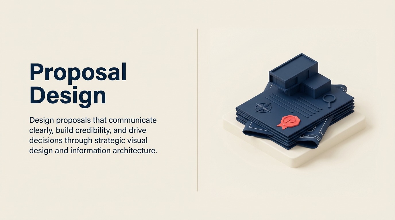
Proposal Design: Visual Communication That Drives Decision-Making
Turn this article into takeaways for your work.
Each assistant summarizes the article only for you and suggests best practices for your work.
A marketing agency redesigned their proposal templates from text-heavy Word documents to visually structured presentations with infographics, whitespace, and clear hierarchy. They A/B tested the designs with 50 prospects each. The visually designed proposals hit 43% win rate versus 27% for traditional text proposals—identical content and pricing. Buyers reviewing visual proposals spent 40% more time engaging with them and were 2.3x more likely to share them with colleagues. Design difference alone improved close rates by 59%.
Visual design impacts proposal persuasiveness by 40-60% according to research on document effectiveness. This isn't about making proposals pretty. It's about cognitive load management, information hierarchy, credibility signaling, and engagement optimization. Well-designed proposals communicate more effectively because they work with how humans process information. Combined with effective executive engagement strategies, strong design amplifies every persuasive element of your proposal.
Most B2B proposals fail design fundamentals: walls of text without visual relief, lack of clear hierarchy that guides attention, inconsistent formatting that creates confusion, poor-quality graphics that damage credibility, and ignored principles of visual communication. The result is proposals that are functionally difficult to read and psychologically uninviting, regardless of content quality.
Design Psychology
Visual Hierarchy and Attention
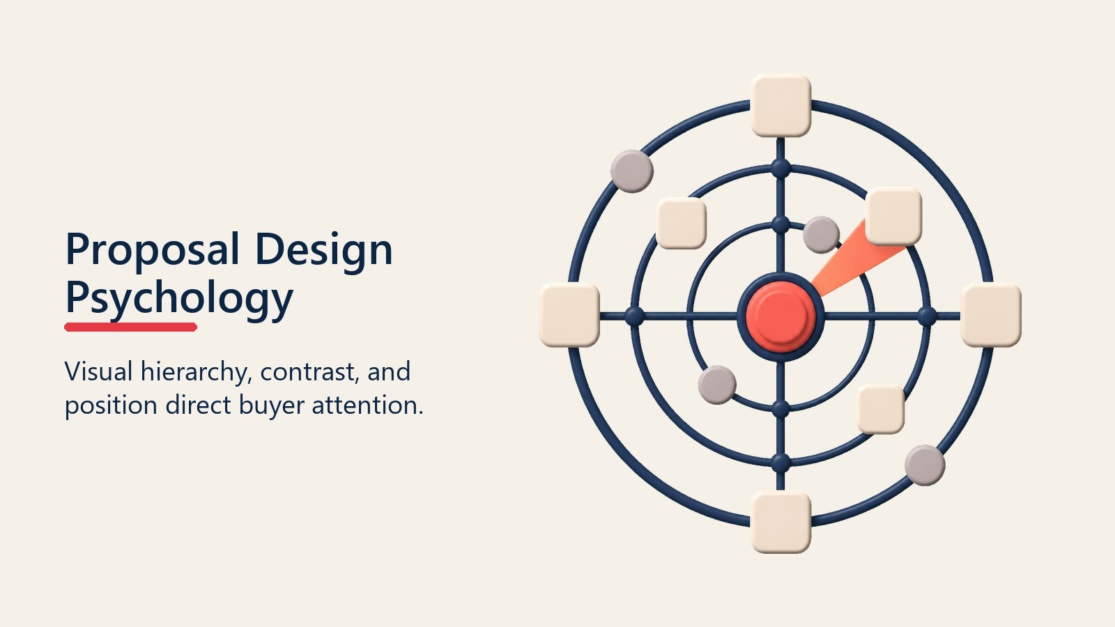
Human attention follows predictable patterns. Larger elements attract attention before smaller ones. Contrast draws the eye to specific areas. Positioning matters—top-left in Western cultures captures attention first. Understanding these patterns lets you direct buyer attention strategically to key messages, value propositions, and calls to action.
Create deliberate hierarchy through size (headlines larger than body text), weight (bold for emphasis), color (strategic highlights), and positioning (important content above fold). This hierarchy guides readers through proposals in intended sequence.
Without hierarchy, everything competes equally for attention, which means nothing stands out. Proposals become undifferentiated walls of text where key messages disappear.
Cognitive Load
Cognitive load refers to mental effort required to process information. Complex proposals with dense text, no visual breaks, and unclear structure create high cognitive load that exhausts readers. Simplified proposals with clear structure, visual organization, and strategic whitespace reduce cognitive load.
Reduce load through chunking information into digestible sections, using bullet points rather than dense paragraphs, including visual elements that clarify complex information, providing adequate whitespace for mental processing, and maintaining consistent formatting.
High cognitive load proposals get abandoned. Readers start with good intentions but fatigue quickly. Low cognitive load proposals get read thoroughly because they don't exhaust mental capacity. Understanding closing psychology principles helps you design for how buyers actually process information.
Trust and Credibility
Design quality signals professionalism and attention to detail. Well-designed proposals suggest you operate with the same quality standards in your product and service delivery. Poorly designed proposals raise doubts: if they can't produce professional proposals, can they deliver professional services?
Credibility signals include professional typography, consistent branding, high-quality imagery, error-free formatting, and cohesive visual language.
Professional Polish
Polish distinguishes professional from amateur work. Perfectly aligned elements, consistent spacing, harmonious color schemes, appropriate imagery, and refined typography demonstrate care and capability.
Lack of polish creates doubt. Misaligned elements, inconsistent fonts, amateurish graphics, or typos suggest carelessness. Buyers wonder if this carelessness extends to product quality, implementation, or support.
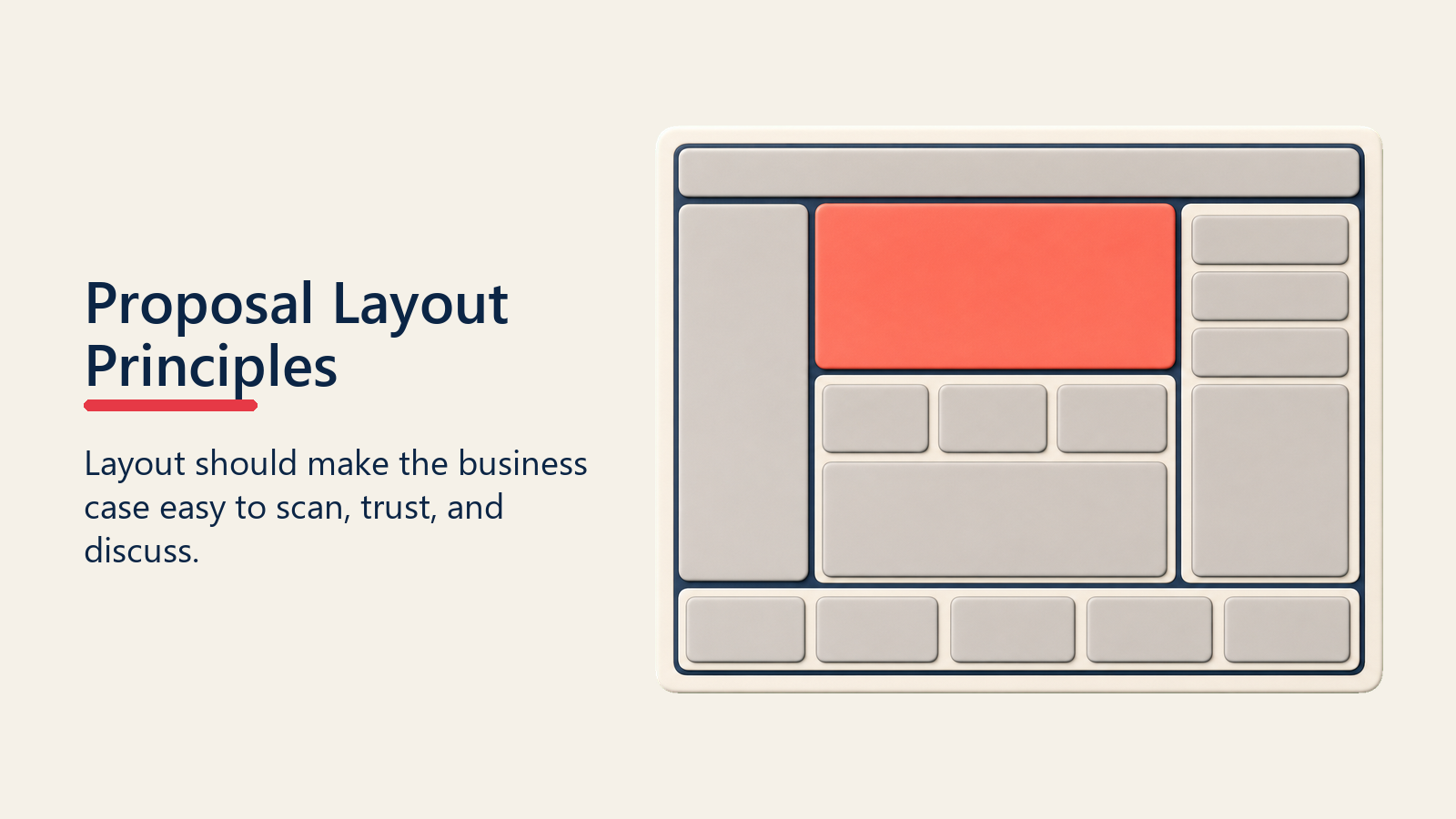
Layout Principles
Proposal layout should make the business case easy to scan, easy to trust, and easy to discuss with internal stakeholders.
Executive Summary First
Structure proposals with executive summaries at the front. Busy decision-makers will read summaries before (and sometimes instead of) full proposals. Place your most persuasive content where it will definitely be seen: the first 2-3 pages.
Executive summaries should be visually distinct: different background color, clear boundaries from body content, and graphical elements that make them immediately recognizable.
Scannable Structure
Design for scanning, not just reading. Most buyers scan proposals initially to assess relevance before committing to detailed reading. Scannable design includes clear section headers, consistent section structure, highlighted key points, informative subheadings, and visual markers that aid navigation.
Test scannability by reviewing proposals in 10-second intervals. What information can readers extract in 10 seconds? 30 seconds? 60 seconds? Quick scanners should extract core value proposition. Deeper readers should find comprehensive details.
Logical Flow
Organize proposals in logical sequence that mirrors buyer thinking: establish the business problem, demonstrate understanding of their situation, introduce your solution, explain how it solves their problem, provide implementation details, justify investment with ROI, establish credibility, and recommend next steps. This structure supports stakeholder alignment efforts by addressing concerns of different decision-makers systematically.
This sequence builds systematically from problem to solution to action. Jumping around confuses readers and breaks narrative flow.
White Space
White space (empty areas without text or graphics) isn't wasted space. It's cognitive breathing room that makes content more approachable. Dense proposals without white space overwhelm readers. Generous white space creates visual calm that invites engagement.
Use white space strategically: margins around page edges (minimum 1 inch), space between sections, padding around graphics and callouts, and line spacing that prevents text from feeling cramped. White space to content ratio should be roughly 40:60.
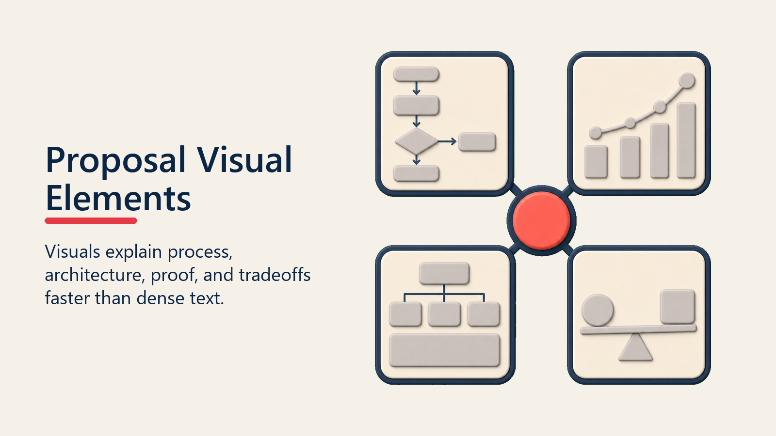
Visual Elements
Visual elements help buyers understand process, architecture, proof, and tradeoffs faster than dense proposal text alone.
Infographics and Data Visualization
Convert data and statistics into visual representations that communicate quickly and memorably. Rather than "Our solution reduced processing time by 43%, errors by 67%, and costs by $230K annually," show these metrics in visual dashboard-style infographic with icons, bars, and clear numbers.
Data visualizations should be self-explanatory: clear labels, intuitive scales, and obvious conclusions. Readers should understand the message without reading explanatory text.
Process Diagrams and Timelines
Illustrate processes and timelines graphically. Implementation roadmaps, workflow diagrams, and project timelines communicate sequence and duration more effectively as visuals than as text descriptions. Use horizontal timelines for chronological progressions, vertical flows for process steps, and swimlane diagrams for multi-party workflows.
Keep process diagrams simple. Complex diagrams with dozens of boxes and arrows create confusion. Break complex processes into multiple simple diagrams.
Architecture Diagrams
Show technical architecture and system relationships through diagrams. How does your solution integrate with their existing systems? What data flows exist? What components interact?
Use standard diagramming conventions: boxes for systems, arrows for data flow, clouds for external services, and cylinders for databases. Familiar symbols reduce interpretation time. Add clear labels and legends.
Screenshots and Mockups
Include product screenshots that show actual functionality. Screenshots make abstract features concrete. For custom implementations, create mockups showing how the solution would look in their environment with their branding and data.
Annotate screenshots to highlight key features. Use arrows, callouts, and numbered circles to draw attention. Clean, high-resolution screenshots demonstrate product polish. Blurry or cluttered screenshots damage credibility.
Icons and Visual Markers
Use icons consistently to mark specific content types: checkmarks for benefits, warning symbols for risks addressed, lightbulbs for insights, and charts for data. Icons create visual anchors that help readers quickly identify content types.
Choose icon sets that are professional and consistent. Mixing icon styles creates visual chaos. Use one coherent icon library throughout.
Typography
Font Selection
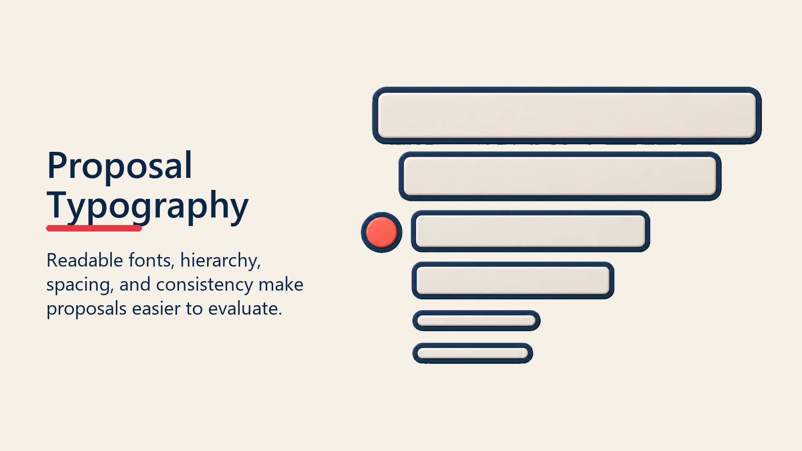
Choose professional, readable fonts. Sans-serif fonts (Arial, Helvetica, Calibri) work well for body text in digital proposals. Serif fonts (Georgia, Times New Roman) work for body text in printed proposals. Use maximum two fonts: one for headlines and one for body text.
Avoid decorative or script fonts except potentially for company names or major headers. Script fonts are hard to read in body text.
Hierarchy and Emphasis
Create typographic hierarchy through size, weight, and style variations. Headlines might be 24pt bold, subheadings 18pt semibold, body text 12pt regular, and captions 10pt italic.
Use consistent hierarchy throughout. All H1 headlines should look identical. All H2 subheadings should share formatting. Consistency reduces cognitive load and creates professional appearance.
Line Length and Spacing
Optimal line length is 50-75 characters (about 10-15 words). Longer lines fatigue eyes. Shorter lines create choppy rhythm. Structure page layouts with appropriate column widths.
Line spacing (leading) should be 120-150% of font size. 12pt font should have 14-18pt line spacing. Too-tight spacing makes text feel cramped. Too-loose spacing disconnects lines. Proper spacing improves readability significantly.
Color and Branding
Color and branding should reinforce credibility without distracting from the buyer's problem, value case, and next decision.
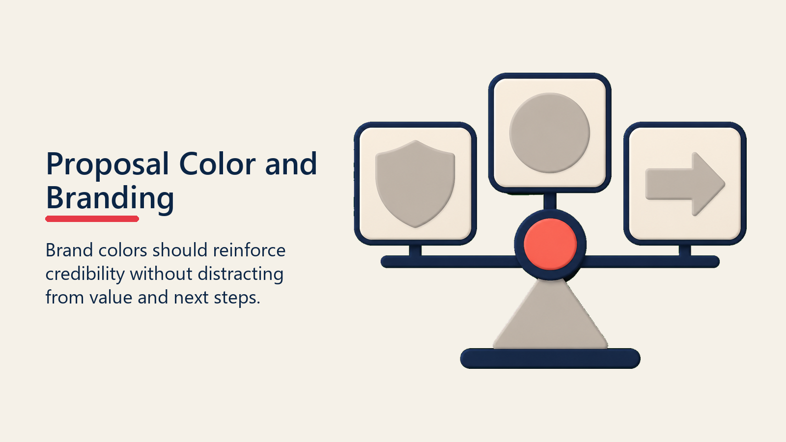
Brand Consistency
Use your brand colors consistently throughout proposals. Primary brand color for headers and key elements, secondary colors for accents and highlights, and neutral colors for body text and backgrounds.
Include your logo prominently on cover page and discretely in headers or footers on subsequent pages.
Color Psychology
Colors carry psychological associations. Blue conveys trust and professionalism (why many B2B brands use blue). Green suggests growth and environmental consciousness. Red signals urgency or warning. Orange conveys energy and innovation.
Limit color palette to 3-5 colors maximum. Too many colors create visual chaos. Well-designed proposals use color sparingly and strategically: primarily neutral colors (black, white, grays) with strategic pops of brand colors for emphasis.
Client Co-Branding
For major deals, consider co-branded proposals that include both your branding and customer's branding. This personalization signals partnership and creates visual connection. Use customer's colors in accent elements or include their logo alongside yours on cover pages.
Co-branding works best for enterprise deals where personalization investment is justified. For smaller deals, simple personalization (customer name, industry-relevant imagery) provides similar psychological effect.
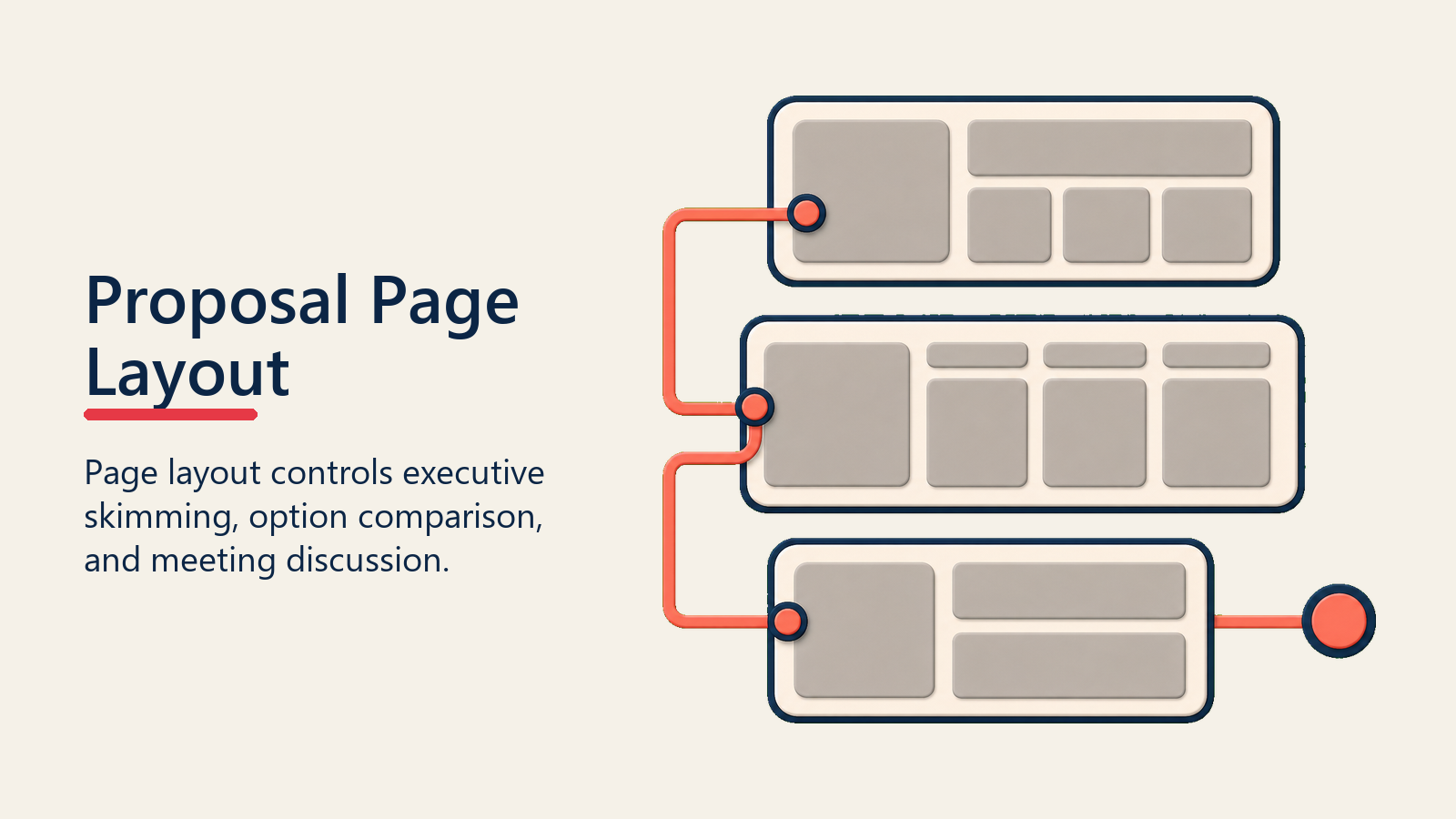
Page Layout
Page layout controls how executives skim, how evaluators compare options, and how the proposal feels in a buying meeting.
Cover Page Impact
Cover pages create first impressions. Include proposal title, customer company name, your company name and logo, date, and compelling visual (relevant photography or graphic). Cover pages should be visually striking while remaining professional.
Avoid generic stock photography that feels impersonal. Use industry-relevant imagery, custom graphics, or customer-specific visuals when possible.
Section Breaks
Use visual section breaks to segment proposals into clear chunks: business challenge, proposed solution, implementation approach, pricing, and next steps. Section breaks might include full-page dividers with section titles, color-coded section headers, or graphic elements that signal transitions.
Clear section breaks help readers navigate and return to specific sections later. They also provide visual rhythm that makes long proposals less monotonous.
Callout Boxes
Highlight key information in callout boxes with background colors, borders, or shading. Use callouts for critical statistics, key benefits, important notes, or action items.
Limit callouts to truly important information. If everything is highlighted, nothing stands out. Use callouts strategically for 5-10 key points throughout proposals.
Data Presentation
Present data in tables, charts, or infographics rather than in-line text. "Year 1 revenue will be $2.1M, Year 2 $3.4M, and Year 3 $5.2M" is harder to process than a simple bar chart showing the same data visually.
Choose appropriate chart types: bars for comparisons, lines for trends over time, pies for proportions (sparingly), and tables for detailed data.
Interactive Proposals
Digital Optimization
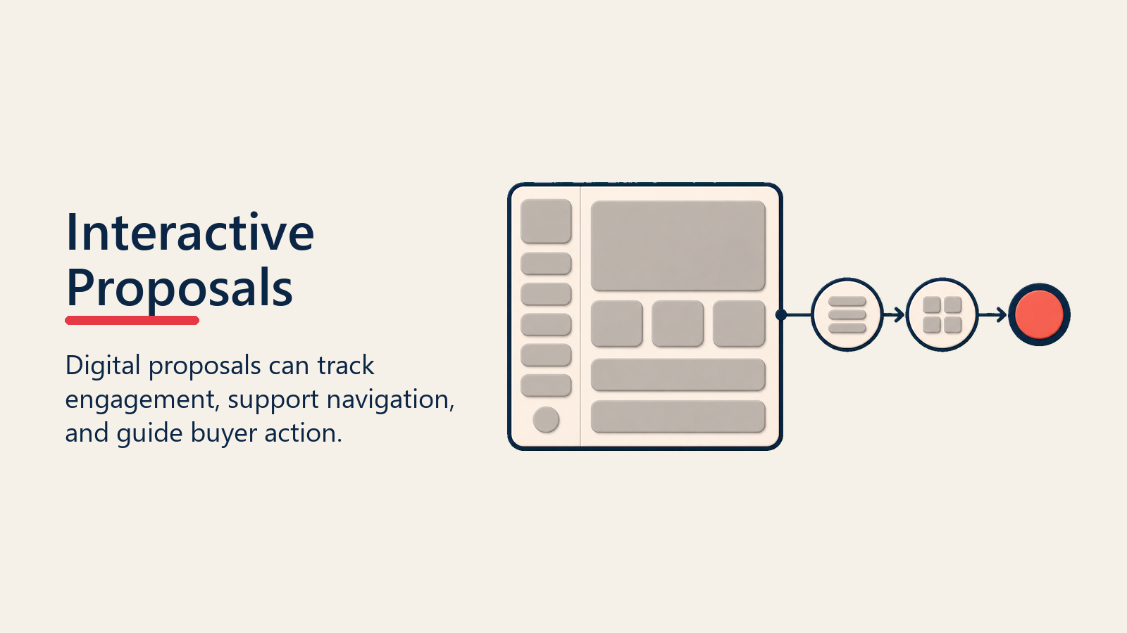
Design proposals for digital consumption. PDF proposals are often read on screens, not printed. Optimize for screen reading: appropriate sizing, clickable table of contents, hyperlinked cross-references, and embedded videos or animations.
Interactive PDFs can include form fields for options selection, calculation tools for ROI customization, and expandable sections for optional details. Integrate these interactive elements with your quote generation process for seamless pricing customization.
Embedded Content
Embed video introductions from executives, product demo videos, customer testimonial videos, or explanatory animations. Video content increases engagement and brings proposals to life. A 2-minute video introduction from your CEO personalizes proposals and demonstrates senior commitment.
Keep videos short (under 3 minutes) and ensure they're relevant. Long videos won't be watched.
Design Tools
Template Development
Invest in professional proposal templates. Well-designed templates ensure consistency, speed development, maintain brand standards, and elevate visual quality. Templates should include pre-designed sections, color schemes, typography standards, and graphic elements.
Develop template variations for different proposal types: solution proposals, pricing proposals, renewal proposals, and RFP responses.
Software Options
Use appropriate tools for proposal design. PowerPoint or Google Slides work well for presentation-style proposals. InDesign excels for document-style proposals. Canva provides accessible design tools for teams without designers. Proposal software like PandaDoc or Proposify offers templates and interactive features.
Choose tools that match team capabilities. Advanced design tools require skills most sales teams lack. User-friendly tools enable quality design without extensive training.
Professional Design Services
For template development or high-stakes proposals, engage professional designers. Designers bring expertise in visual hierarchy, typography, color theory, and layout that most business professionals lack.
Brief designers thoroughly on brand guidelines, target audience, content structure, and business objectives.
Common Mistakes
Avoid these frequent design mistakes: cluttered layouts with insufficient white space, inconsistent formatting across sections, poor-quality or irrelevant imagery, too many fonts and colors, walls of text without visual breaks, complex diagrams that confuse rather than clarify, unprofessional typography choices, misaligned elements, and generic templates without customization.
Test proposals with colleagues before sending. Fresh eyes catch issues you've become blind to. Ask: Is the value proposition clear? Is the layout scannable? Are graphics helpful or distracting? Is the overall impression professional?
Making Design Work
Proposal design is not superficial decoration. It's strategic communication that impacts how effectively your message reaches and persuades buyers. Well-designed proposals reduce cognitive load, guide attention to key points, build credibility through professional polish, and increase engagement through visual interest.
Invest in design capabilities appropriate to your business. At minimum, develop clean, professional templates with clear hierarchy, appropriate white space, and consistent branding. For complex deal strategies or competitive situations, consider custom design that demonstrates extra care and commitment.
Train teams on design principles: visual hierarchy, scannable structure, effective use of graphics, and typography basics. While not everyone needs to become a designer, everyone can avoid common mistakes and apply basic principles that improve proposal quality.
Track the impact of design improvements on win rates and engagement. A/B test design variations when possible. Gather buyer feedback on proposal clarity and professionalism. Use data to refine templates and approaches continuously. Companies that excel at proposal design treat it as a competitive advantage, not an afterthought.
Learn More
- Proposal Development - Develop proposal content that complements strong visual design
- Business Case Creation - Build business cases that can be visualized effectively in proposals
- ROI Calculation - Calculate ROI that can be presented visually for quick comprehension
- Value Reinforcement - Reinforce value through both content and visual design

Senior Operations & Growth Strategist