Churn Metrics and Analysis: Measuring and Understanding Customer Loss
Turn this article into takeaways for your work.
Each assistant summarizes the article only for you and suggests best practices for your work.
Your CEO asks "What's our churn rate?" and you answer "5% monthly." They nod, satisfied. But that single number hides everything that actually matters.
Which customers are churning? Your $100K enterprise accounts or your $500/month SMB customers? Are you losing 5% of logos but 15% of revenue? Is churn accelerating or improving? Are new customers churning faster than mature ones? Is the churn preventable or structural?
A single churn number without context and segmentation is nearly useless. It might satisfy board reporting requirements, but it won't drive improvement. You can't fix what you don't understand, and you can't understand churn by looking at aggregate statistics.
Effective churn analysis needs multiple metrics, segmented views, cohort tracking, reason categorization, and trend analysis. Companies with exceptional retention don't just measure churn. They dissect it, understand it, and use those insights to systematically reduce it.
Core Churn Metrics: The Foundation
Every B2B company needs these fundamental measurements to start making sense of customer loss.
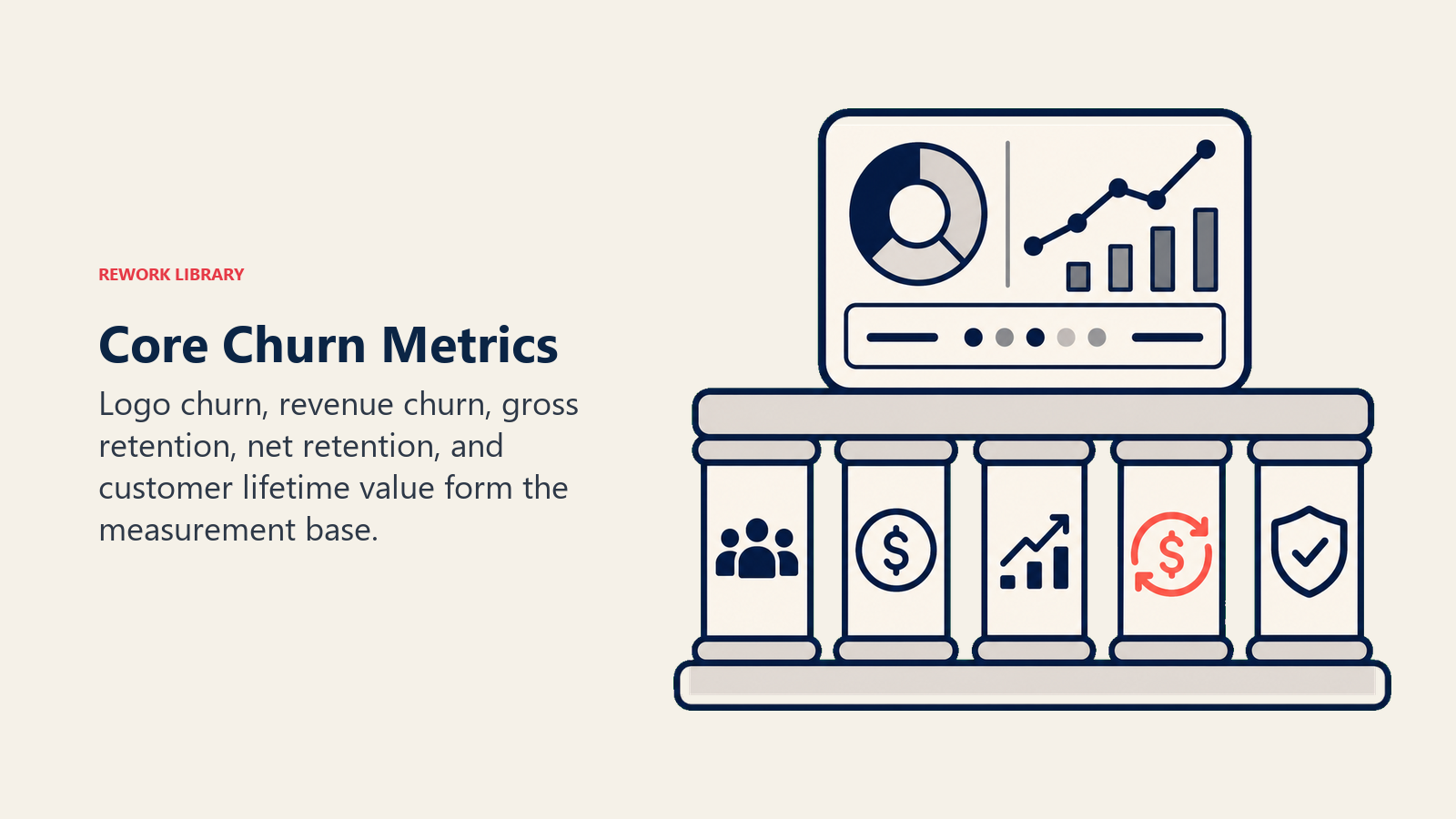
Customer churn rate (logo churn)
This measures the percentage of customers lost in a period.
Formula: (Customers lost in period / Customers at start of period) x 100
Start the month with 500 customers and lose 15? That's 15/500 = 3% monthly customer churn.
This is your headline metric. When people say "churn rate" without qualification, they mean this. It treats all customers equally regardless of size, which can mask serious problems if your big accounts are the ones leaving.
Revenue churn rate (MRR/ARR churn)
This measures the percentage of recurring revenue lost.
Formula: (MRR lost in period / MRR at start of period) x 100
Start the month with $200K MRR and lose $12K? That's 12/200 = 6% monthly revenue churn.
Revenue churn matters more than logo churn for most businesses. Losing one $50K customer hurts more than losing ten $500 customers, but both scenarios show up as the same number in customer churn calculations. The revenue view tells you what's really happening to your business.
Gross vs net churn
This distinction separates total loss from loss after expansion.
- Gross revenue churn = Total MRR lost from churned and downgraded customers
- Net revenue churn = Gross churn minus expansion MRR from existing customers
Here's what this looks like in practice. You lost $12K MRR from churn and downgrades (6% gross churn). But you gained $8K MRR from expansions. Net churn: 6% minus 4% = 2%.
Negative net churn happens when net revenue retention exceeds 100%. Expansion exceeds churn. That's the holy grail for SaaS companies, and it's achievable if you're delivering real value.
Monthly vs annual churn rates
These require careful interpretation. Monthly churn annualizes approximately as: 1 - (1 - monthly rate)^12
So 3% monthly churn gives you approximately 30.6% annual churn, not 36%. The difference matters when you're forecasting or comparing benchmarks.
Be consistent about whether you report monthly or annual rates. Mixing them creates confusion, especially when you're talking to investors or board members who might not catch the distinction.
Cohort-based churn
Track each cohort separately over time. Customers who signed up in Q1 2024, for instance, form a cohort you can follow month by month. You'll see whether retention is improving for newer customers compared to older cohorts.
This gives you a time-based view that aggregate numbers can't provide. If your overall churn rate looks stable, but newer cohorts are performing better at the same lifecycle stage, you're actually making progress.
Churn Rate Calculations: Getting the Math Right
Churn formulas look simple on the surface, but there are several nuances that trip people up when you're actually implementing this in your analytics.
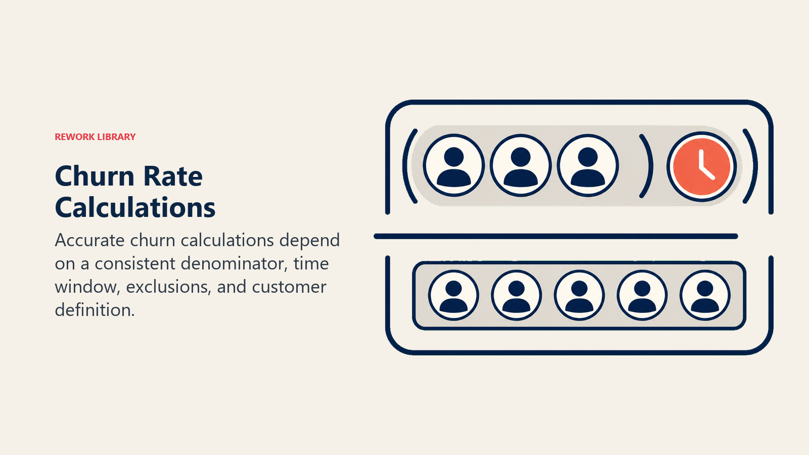
Basic customer churn formula
Customer churn rate = (Customers churned in period / Total customers at start of period) x 100
The time period you choose matters. Monthly is most common for SaaS. Quarterly works better for annual contracts. Annual makes sense for long-cycle businesses. Pick one and stick with it consistently across all your reporting.
Revenue churn formula
Revenue churn rate = (MRR lost from churn and contraction / Total MRR at start of period) x 100
Include both full churn and downgrades in the numerator. A customer going from $1K to $500 MRR represents $500 in revenue churn, even though the logo stays.
Complications and how to handle them
New customers added mid-period: Do NOT include in denominator. Your churn rate denominator is start-of-period count or MRR only. Adding mid-period customers artificially deflates your churn rate and makes it useless for trend analysis.
Customers who both expanded and churned: Use their start-of-period MRR in denominator, count full loss in numerator, track expansion separately. Don't try to net them together.
Customers with irregular payment: Use contract value or average historical payment. Don't penalize your metrics for payment timing issues that have nothing to do with retention.
Partial month churns: Include them. If a customer churns on day 3 of the month, that counts as a churn for that month. Trying to prorate creates more problems than it solves.
Reactivations: Treat as new customer acquisition unless they return within the same month they churned. Otherwise your churn and acquisition numbers get hopelessly tangled.
Advanced Churn Metrics
Once you have the basics working, these metrics add depth to your understanding and give you more levers to pull when you're trying to improve retention.
Time to churn
How long do customers stay before churning?
Calculate average customer lifetime: 1 / monthly churn rate
With 3% monthly churn, you get 1/0.03 = 33.3 months average lifetime. That number directly feeds into your customer lifetime value calculations and tells you how long you have to recoup acquisition costs.
Track this by cohort and segment. If newer customers stick around longer than older ones, your product is getting better. If newer customers churn faster, you've got a problem that needs urgent attention.
Churn by reason
The category breakdown matters more than most companies realize. When you break down why customers leave, patterns emerge:
- Product gaps: 25%
- Competitive losses: 20%
- Budget/pricing: 18%
- Poor adoption: 15%
- Service issues: 12%
- Company changes: 10%
If 25% of churn comes from product gaps, you have a roadmap conversation on your hands. That's not a customer success problem. That's a product problem, and throwing more CSMs at it won't help.
Preventable vs unpreventable churn
Separate addressable issues from structural ones you can't control.
Preventable (typically 60-70%):
- Product gaps you could fill
- Service issues you could fix
- Adoption failures you could prevent
- Competitive losses you could contest
Unpreventable (30-40%):
- Company went out of business
- Acquisition or merger using different stack
- Budget eliminated entirely
- Fundamental product-market misfit
Focus retention efforts on the preventable majority. You can't save a company that just shut down, but you can probably save the customer who's struggling with onboarding.
Save rate
How often do you retain at-risk customers once you identify them?
Save rate = Saves / (Saves + Churns from save attempts) x 100
You attempted to save 30 customers and saved 8? That's 8/30 = 26.7% save rate.
Track overall and by churn reason. Some reasons are more saveable than others. Budget issues might have a 15% save rate. Service issues might have a 60% save rate. This tells you where to invest your intervention efforts.
Churn recovery rate
This tracks win-backs over time.
Recovery rate = Reactivations / Total churned customers over period
50 customers churned over 12 months, 8 returned. That's 8/50 = 16% recovery rate.
Most companies ignore win-back entirely. But if 10-20% of churned customers come back on their own or with light outreach, that's worth building a program around.
Cohort Churn Analysis
Cohorts show you patterns that aggregate metrics hide completely. This is where you start to understand what's really happening in your business over time.
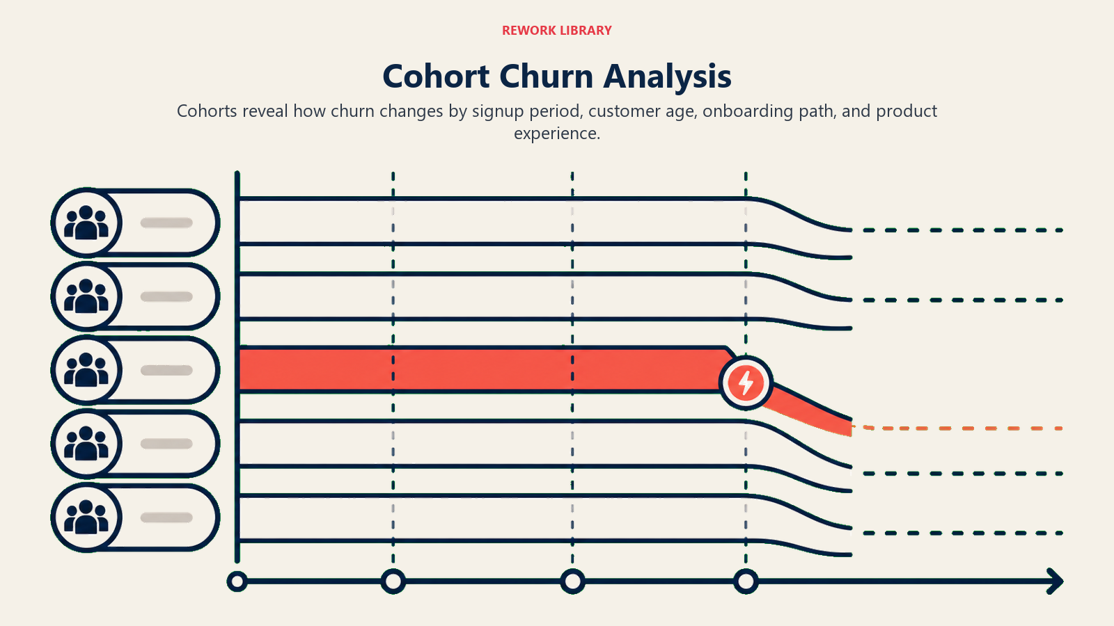
Signup cohort tracking
Group customers by when they started. Track each month's new customers separately as they age. Create a retention curve showing what percentage remains at 1 month, 3 months, 6 months, 12 months, 24 months.
| Cohort | 1mo | 3mo | 6mo | 12mo | 24mo |
|---|---|---|---|---|---|
| Jan 24 | 94% | 87% | 78% | 68% | 58% |
| Feb 24 | 96% | 90% | 82% | 71% | - |
| Mar 24 | 97% | 92% | 85% | - | - |
You can see retention improving for newer cohorts, which is a good sign. You can also see where churn concentrates. In this example, months 3-6 is the high churn period. That tells you exactly when to focus intervention efforts.
Retention curves
Visualize cohort survival over time. Plot retention percentage on the Y-axis against months since signup on the X-axis, with a line for each cohort. Cohorts that curve higher are performing better.
Watch for these patterns:
- Early dropoff (month 1-3): Onboarding or product-market fit issues
- Steady decline: Ongoing value delivery challenges
- Cliff points: Specific moments where churn spikes (renewal periods, post-implementation)
These patterns tell you where to dig deeper. If every cohort has a cliff at month 6, something's happening at that lifecycle stage that needs fixing.
Cohort maturity
New cohorts look optimistic because they haven't hit renewal yet. Mature cohorts show true long-term retention. Don't compare a 3-month-old cohort to a 24-month-old cohort directly. That's apples to oranges.
Wait at least 12 months of data before considering a cohort "mature" for annual contract businesses. Anything less and you're looking at incomplete data that will mislead you.
Year-over-year cohort comparison
Compare Jan 2024 cohort to Jan 2023 cohort at the same lifecycle stage. Are newer cohorts performing better? This tells you whether your retention initiatives are actually working.
Improving cohorts validate retention investments. If each new cohort shows better retention at the same lifecycle points, you're making progress. If not, your retention efforts aren't working and you need to try something different.
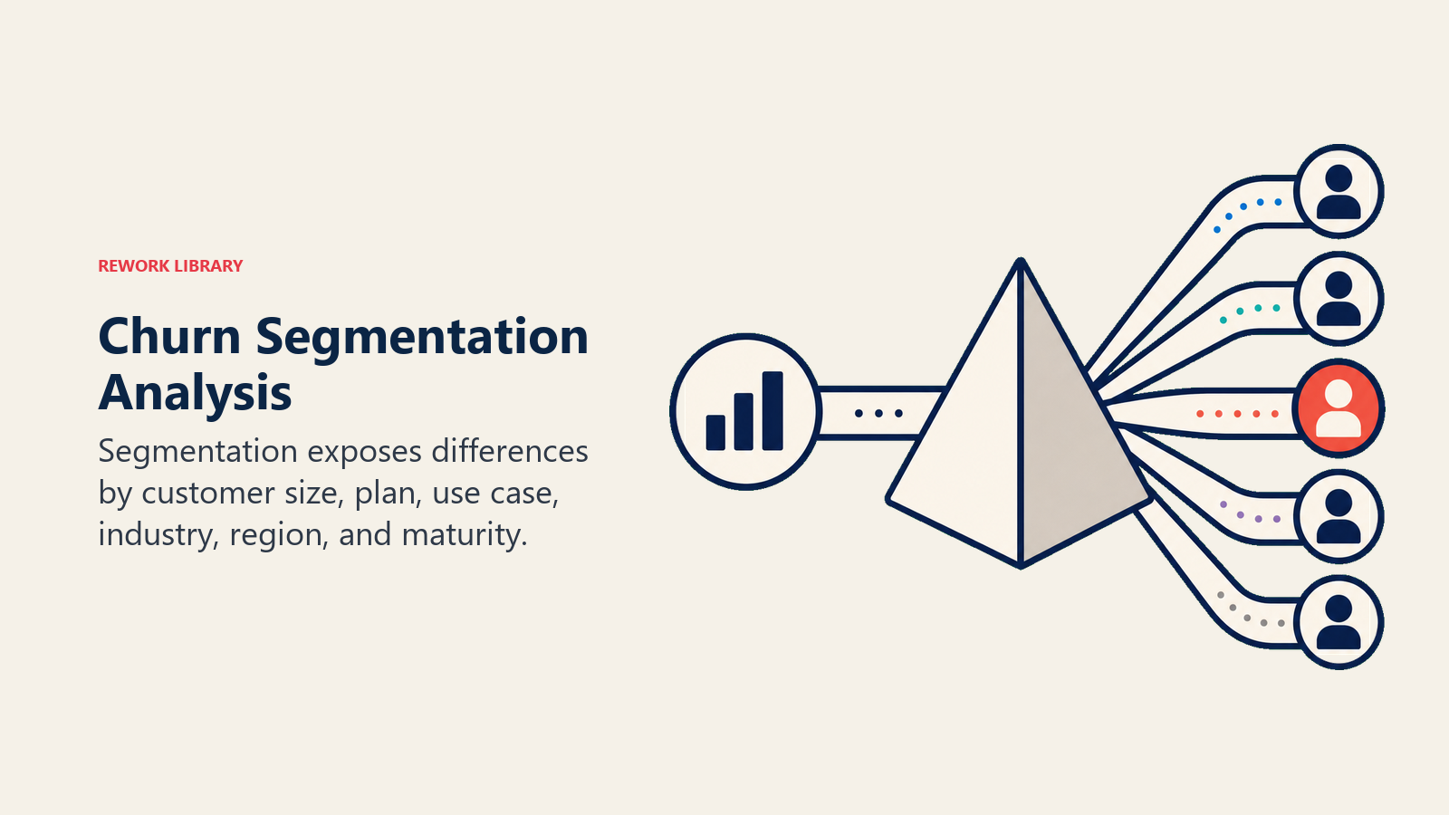
Segmentation Analysis
Aggregate churn masks critical differences between customer groups. Segment everything to understand reality instead of averages.
Churn by customer segment
Here's a typical breakdown that most B2B SaaS companies see:
Enterprise (>$100K ARR): 5% annual churn Mid-market ($25-100K): 15% annual churn SMB (<$25K): 35% annual churn
Smaller customers churn more. That's not surprising. But the breakdown tells you where to focus. If you're losing enterprise customers at 15% annually instead of 5%, you have a serious problem that deserves immediate attention.
Churn by product/plan
Professional plan: 18% annual churn Enterprise plan: 8% annual churn Basic plan: 42% annual churn
Plan-based churn differences might indicate feature set fit or price point sensitivity. Or they might just reflect that customers who need fewer features are naturally less committed. Either way, the data tells you something about your packaging strategy.
Churn by company size
1-10 employees: 45% annual churn 11-50 employees: 28% annual churn 51-200 employees: 18% annual churn 201+ employees: 10% annual churn
Company size often correlates with stability, sophistication, and stickiness. Bigger companies have more inertia. They're also more likely to have dedicated people managing your product, which drives better adoption.
Churn by industry
Healthcare: 12% annual churn Financial services: 15% annual churn Retail: 32% annual churn Technology: 22% annual churn
Industry differences show where you have product-market fit and where you struggle. If retail customers churn at 2-3x your average, maybe you shouldn't be selling to retail. Or maybe you need to build retail-specific features and positioning.
Churn by geography
North America: 18% annual churn EMEA: 22% annual churn APAC: 28% annual churn
Geographic variation might mean localization gaps, support coverage issues, or market maturity differences. If APAC customers churn 50% more than North American customers, you need to figure out why. Bad timezone support? Language barriers? Product doesn't fit local workflows?
Churn by CSM
CSM A: 12% churn across 50 accounts CSM B: 25% churn across 45 accounts
Individual CSM performance differences need investigation. Is CSM B handling harder accounts or delivering worse service? Don't assume you know the answer. Look at their account mix, tenure in role, and what they're actually doing differently.
Churn by acquisition channel
Inbound marketing: 15% churn Outbound sales: 22% churn Partner referrals: 10% churn Paid advertising: 35% churn
Channel-based churn shows quality differences in how customers arrive. Paid advertising customers might be less qualified or have lower intent. Partner referrals might be better fits because someone vouched for you.
Churn Reason Categorization
Systematic categorization enables pattern recognition. Without consistent categories, you're just collecting anecdotes that won't help you make decisions.
Primary categories
Most companies use 5-8 main buckets:
- Product limitations (missing features, performance issues, UX problems)
- Competitive loss (better product, better pricing, better service elsewhere)
- Budget/pricing (can't afford, doesn't justify cost, pricing model misfit)
- Poor adoption (couldn't implement, low usage, didn't see value)
- Service issues (poor support, CSM problems, onboarding failures)
- Company changes (acquisition, shutdown, reorganization, headcount cuts)
- Other/Unknown
Keep your categories stable over time so you can track trends. Changing categories every quarter makes historical comparison impossible.
Secondary categories
Add detail within each primary bucket so you can drill down when needed.
Product limitations breaks down into:
- Missing integration
- Performance/reliability
- UX/usability
- Scalability limits
- Security/compliance gaps
Now you can say "15% of churn is product limitations, and 8% of total churn is specifically missing integrations." That's actionable. "Product limitations" alone is too vague to drive roadmap decisions.
Tagging methodology
Every churned customer should have:
- Primary churn reason (required, single selection)
- Secondary reason if applicable (optional, can be multiple)
- Preventability flag (preventable/unpreventable)
- Detailed notes (free text for context)
Source this from exit interviews, cancellation conversations, and CSM insights. Don't let CSMs just pick "Other" for everything. Make them have the conversation and document what they learn.
Trend tracking over time
Monitor churn reason percentages quarterly.
Q1 2024: Product gaps 30%, Budget 20%, Competitive 18%, Adoption 15%, Service 10%, Company 7% Q2 2024: Product gaps 22%, Budget 18%, Competitive 20%, Adoption 18%, Service 12%, Company 10%
Product gaps declining suggests roadmap improvements are working. Adoption increasing suggests onboarding issues are emerging. These trends tell you what's working and what needs attention.
Leading vs Lagging Indicators
Churn is a lagging indicator. It tells you what already happened. Leading indicators predict what's coming, which gives you time to intervene.
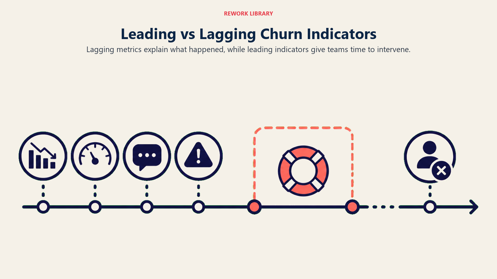
Lagging indicators (actual churn)
These measure outcomes after they happen:
- Monthly/quarterly churn rates
- Revenue lost to churn
- Customer loss counts
- Cohort retention curves
Lagging indicators don't prevent churn. They just tell you how much churn happened. You need them for reporting and accountability, but they won't help you save at-risk customers.
Leading indicators (predictive signals)
Health score decline: Customers whose health drops from green to yellow/red have 5x higher churn risk. That drop is your signal to intervene.
Engagement drop: 50% reduction in product usage predicts churn with 70% accuracy in most SaaS businesses. When someone stops logging in, they're already mentally churned.
Support ticket volume: Spike in tickets correlates with elevated churn risk. Frustrated customers create tickets. Too many unresolved tickets and they leave.
NPS detractor status: Detractors churn at 4x the rate of promoters. If someone gives you a 0-6 score, they're probably already looking for alternatives.
Payment failures: Failed payments predict 65% of subsequent voluntary churn. Sometimes it's just a credit card issue. But often it's intentional neglect because they're not seeing value.
License underutilization: Using less than 30% of purchased licenses indicates value misalignment. They're paying for capacity they don't need, which makes your product feel expensive.
Meeting cancellations: Declined QBR or touchpoint invitations signal disengagement. Customers who won't meet with you are customers who don't value the relationship.
Prediction model accuracy
Good leading indicator models predict 60-80% of upcoming churn 30-90 days in advance. That creates your intervention window. Too far in advance and circumstances change. Too late and you can't turn it around.
Track prediction accuracy using standard classification metrics:
- Customers flagged as at-risk who actually churned: True positives (the goal)
- Customers flagged who didn't churn: False positives (wasted intervention effort)
- Customers who churned without at-risk flag: False negatives (missed opportunities)
- Customers not flagged who didn't churn: True negatives (healthy customers)
Target 70%+ true positive rate (catching most churn) with under 30% false positive rate (not crying wolf constantly). Higher false positive rates burn out your team and train them to ignore the alerts.
Building prediction models
Start simple. Identify 5-10 signals that correlate with churn in your data. Weight them based on predictive strength. Set threshold scores that trigger at-risk designation. Refine based on accuracy.
Simple scoring approach:
- NPS detractor: +30 points
- Usage down 50%: +25 points
- Health score red: +20 points
- Support ticket spike: +15 points
- Payment failure: +10 points
Score above 50 = High risk, above 30 = Medium risk, below 30 = Low risk. This beats no model at all, and you can refine it over time as you learn what actually predicts churn in your business.
Churn Forecasting
Predicting future churn helps with planning and resource allocation. You need to know how many customers you'll lose next quarter so you can plan sales targets, revenue forecasts, and support capacity.
Historical trend projection
The simplest approach is averaging the last 6 months of churn and projecting forward. If you've churned 3-4% monthly consistently, forecast 3.5% continuing.
This works when churn is stable. It completely fails when churn is trending up or down. If your last 6 months were 2%, 2.5%, 3%, 3.5%, 4%, 4.5%, averaging them gives you 3.3% but next month will probably be 5%.
Cohort-based forecasting
Apply historical cohort retention curves to your current customer base. This is more sophisticated and more accurate.
You have 100 customers who signed up 6 months ago. Historical cohorts show 82% retention at 6 months, 71% at 12 months. You can forecast 11% of that cohort (11 customers) will churn in the next 6 months.
Do this math for every cohort in your base and aggregate for total forecast. More work, but much more accurate than simple trending.
Risk pipeline approach
Treat at-risk customers like a sales pipeline. Identify all at-risk customers, assign likelihood of churn (percentage), sum for expected churn.
Example:
- 20 customers at 80% churn risk = 16 expected churns
- 40 customers at 40% churn risk = 16 expected churns
- Total forecast: 32 customer losses
This is more dynamic than historical projection because it responds to current business conditions. If your at-risk pipeline suddenly doubles, your forecast adjusts immediately.
Scenario modeling
Prepare for different futures so you're not caught flat-footed.
Base case: Current trends continue Optimistic: Retention initiatives succeed, churn improves 20% Pessimistic: Competitive pressure increases, churn worsens 30%
Model revenue impact of each scenario. What happens to your business if churn gets 30% worse? How many sales do you need to offset that? This turns churn from an abstract metric into concrete financial planning.
Benchmarking: How You Compare
Context matters. Your churn rate means little without comparison to what's normal or excellent in your category.
Industry benchmarks by business type
B2B SaaS (SMB): 30-50% annual churn (2.5-4% monthly) B2B SaaS (Mid-market): 15-25% annual churn (1.5-2.5% monthly) B2B SaaS (Enterprise): 5-10% annual churn (0.5-1% monthly)
If you're enterprise SaaS running 15% annual churn, you're underperforming. If you're SMB SaaS at 25%, you're doing well. These benchmarks aren't aspirational targets. They're reality checks based on what other companies actually achieve.
Contract length matters
Monthly contracts: Higher churn tolerance, lower switching costs Annual contracts: Lower baseline churn, but renewal cliffs Multi-year contracts: Very low churn (under 5% annually typical)
Don't compare your monthly contract churn to annual contract benchmarks. They're different businesses with different customer behavior patterns. Monthly customers can leave anytime. Annual customers have to think harder about it.
ACV (Annual Contract Value) correlation
Sub-$5K ACV: 40-60% annual churn $5K-$25K ACV: 20-35% annual churn $25K-$100K ACV: 10-20% annual churn $100K+ ACV: 5-10% annual churn
Higher ACV strongly correlates with lower churn. Bigger deals stick. The switching costs are higher, the implementation is deeper, and there's usually a senior stakeholder with skin in the game.
Best-in-class targets
SMB: under 25% annual churn Mid-market: under 12% annual churn Enterprise: under 5% annual churn Negative net revenue churn: 110%+ NRR (expansion exceeds churn)
These are aspirational but achievable with excellent execution. Don't beat yourself up if you're not there yet, but know what's possible so you have something to aim for.
Your goal should be
Better than industry median (you're competitive) Trending toward best-in-class (you're improving) Outperforming competitors in your segment (you're winning)
Don't beat yourself up for not matching enterprise churn benchmarks if you serve SMB. Context matters. But do beat yourself up if you're in the bottom quartile of your segment. That means something's broken.
Reporting and Dashboards
Churn data only drives improvement if it's visible and actionable. Most companies collect all this data and then bury it in spreadsheets nobody looks at.
Executive churn summary
For board or C-suite level, keep it simple:
- Headline numbers: Customer churn %, revenue churn %, net retention %
- Trend arrows: Up/down vs prior period
- YoY comparison: Same period last year
- Top 3 churn drivers with action plans
- Forward forecast with scenarios
Keep it to one page. Executives want signal, not noise. They don't need to see every segment breakdown. They need to know if churn is getting better or worse and what you're doing about it.
Operational churn tracking
CS leadership level needs more detail:
- Current month/quarter churn detail
- Churn by segment, tier, CSM, region
- At-risk pipeline and save progress
- Churn reason breakdown with trends
- Cohort performance comparison
- Leading indicator health
This lives in a dashboard that updates weekly or real-time. CS leaders need to spot problems fast and direct resources to the biggest issues.
Reason breakdown visualization
Use a pie chart or stacked bar showing churn reason percentages. Include trend line showing how reasons shift over time. If competitive losses are growing and product gaps are shrinking, that tells you something important about market dynamics.
Cohort retention heatmap
Rows = cohorts, Columns = months since signup, Cells = retention % Color-code: Green above 80%, Yellow 60-80%, Red below 60%
This makes improving or declining cohorts immediately visible. You can scan it in 10 seconds and spot problems. That's what good dashboards do.
Segment comparison table
| Segment | Churn % | Count | MRR Impact | Primary Reason |
|---|---|---|---|---|
| Enterprise | 4% | 3 | $18K | Product gaps |
| Mid-market | 12% | 18 | $24K | Budget |
| SMB | 28% | 67 | $22K | Adoption |
This shows where churn hurts most and why. In this example, you're losing similar MRR across segments, but for completely different reasons. That means you need different retention strategies for each segment.
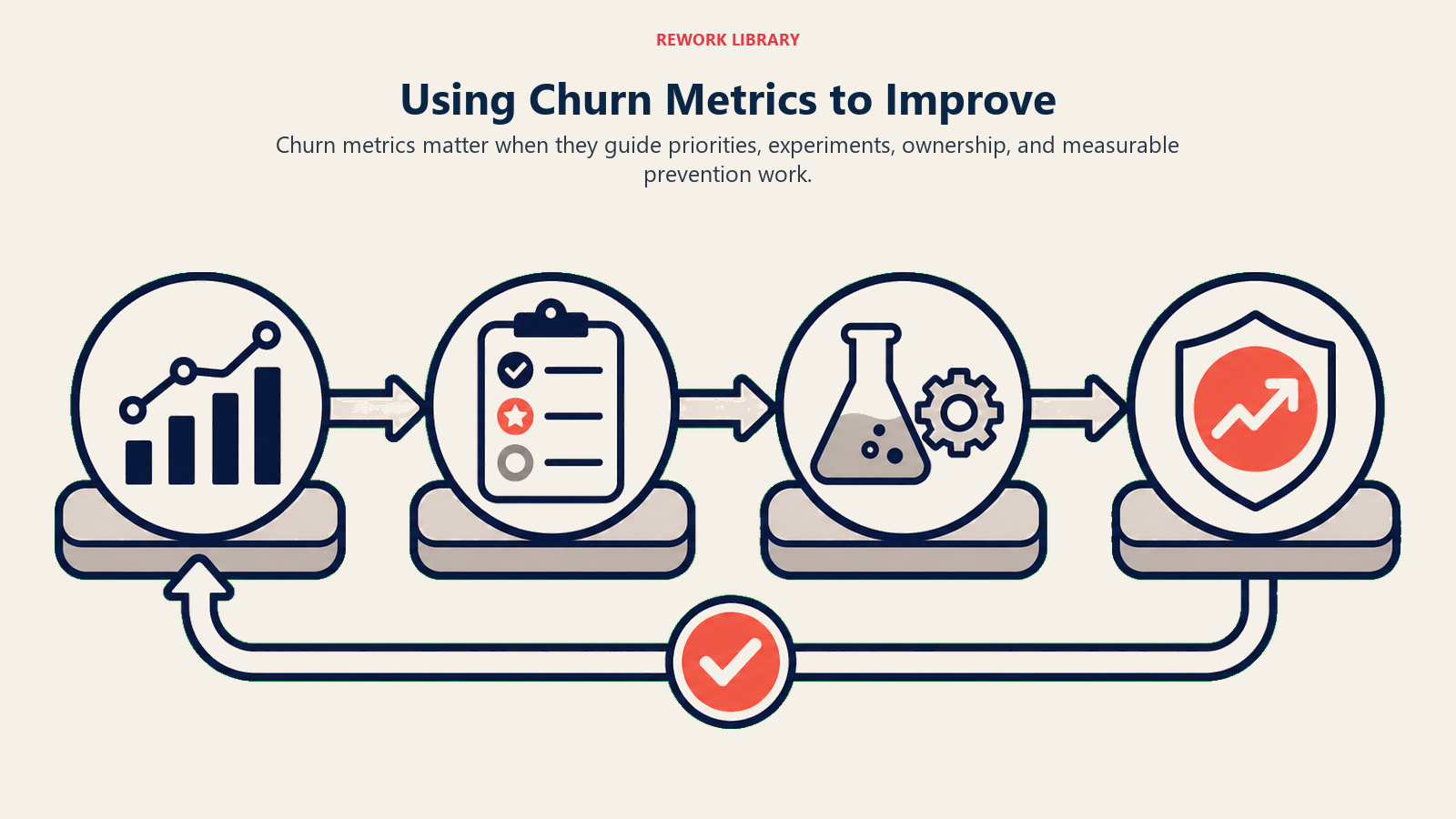
Using Metrics to Actually Improve
Measurement without action is waste. The whole point of churn analytics is turning insights into improvement.
Pattern identification drives focus
When 30% of churn comes from integration gaps and you can address the top 3 integrations, you could reduce total churn by 15-20%. That's a clear business case for product investment. Show the CFO that analysis and watch the roadmap priorities shift.
Root cause correlation
Link churn to preventable causes so you know where to intervene:
Customers who don't complete onboarding in 30 days churn at 3x the rate. The fix: Improve onboarding completion. Not complicated, but you need the data to make the case.
Customers with under 50% license utilization churn at 4x. The fix: Build adoption programs or right-size contracts. Either way, you need to address the value gap.
Customers who've had over 5 support tickets churn at 2.5x. The fix: Improve product quality or support responsiveness. The metric tells you the problem exists. You have to figure out the root cause.
Intervention effectiveness tracking
Implement a retention initiative (better onboarding, proactive health monitoring, customer success programs). Then measure churn before and after.
Success looks like this:
- Pre-initiative: 25% annual churn
- Post-initiative: 18% annual churn
- Improvement: 7 percentage points, 28% reduction
This validates the intervention and justifies continued investment. Without the measurement, you're just guessing whether your initiatives work.
Program ROI calculation
Churn reduction value = (Churn % decrease x Customer base x Average customer LTV)
Cost = Program investment (headcount, tools, time)
ROI = Value / Cost
You reduce churn 5 percentage points across 1,000 customers averaging $10K LTV. That's $500K value. Program costs $150K. ROI is 3.3x. Easy decision to continue funding that program.
Continuous improvement cycle
Measure, analyze, hypothesize causes, implement fixes, measure results, iterate. This is your retention improvement flywheel. Most companies do the first two steps and then stop. The real work is closing the loop and using insights to drive actual change.
Ready to build comprehensive churn analytics? Learn how to identify churn root causes systematically, track retention metrics effectively, understand churn fundamentals deeply, build post-sale reporting and analytics infrastructure, and review overall post-sale metrics to drive business performance.
Related resources:

Senior Operations & Growth Strategist
On this page
- Core Churn Metrics: The Foundation
- Customer churn rate (logo churn)
- Revenue churn rate (MRR/ARR churn)
- Gross vs net churn
- Monthly vs annual churn rates
- Cohort-based churn
- Churn Rate Calculations: Getting the Math Right
- Basic customer churn formula
- Revenue churn formula
- Complications and how to handle them
- Advanced Churn Metrics
- Time to churn
- Churn by reason
- Preventable vs unpreventable churn
- Save rate
- Churn recovery rate
- Cohort Churn Analysis
- Signup cohort tracking
- Retention curves
- Cohort maturity
- Year-over-year cohort comparison
- Segmentation Analysis
- Churn by customer segment
- Churn by product/plan
- Churn by company size
- Churn by industry
- Churn by geography
- Churn by CSM
- Churn by acquisition channel
- Churn Reason Categorization
- Primary categories
- Secondary categories
- Tagging methodology
- Trend tracking over time
- Leading vs Lagging Indicators
- Lagging indicators (actual churn)
- Leading indicators (predictive signals)
- Prediction model accuracy
- Building prediction models
- Churn Forecasting
- Historical trend projection
- Cohort-based forecasting
- Risk pipeline approach
- Scenario modeling
- Benchmarking: How You Compare
- Industry benchmarks by business type
- Contract length matters
- ACV (Annual Contract Value) correlation
- Best-in-class targets
- Your goal should be
- Reporting and Dashboards
- Executive churn summary
- Operational churn tracking
- Reason breakdown visualization
- Cohort retention heatmap
- Segment comparison table
- Using Metrics to Actually Improve
- Pattern identification drives focus
- Root cause correlation
- Intervention effectiveness tracking
- Program ROI calculation
- Continuous improvement cycle