Adoption Metrics: Measuring Product Usage and Engagement
Turn this article into takeaways for your work.
Each assistant summarizes the article only for you and suggests best practices for your work.
A SaaS company was frustrated. They tracked revenue and churn, but couldn't predict which customers would renew or expand. They were always surprised by churn, customers who looked fine suddenly cancelled.
They started tracking adoption metrics:
- Daily, weekly, monthly active users
- Feature adoption depth
- Login frequency and recency
- Workflow completion rates
- User breadth (% of licenses active)
Three months later, they had a different view of their customer base:
High-revenue account that looked healthy:
- Only 30% of licenses active
- Low login frequency (2x/month)
- Using only 2 of 8 core features
- Declining usage trend
- Prediction: At risk → CSM intervened → Retention saved
Mid-revenue account that looked average:
- 85% of licenses active
- High login frequency (4x/week)
- Using 6 of 8 core features
- Growing usage trend
- Prediction: Expansion opportunity → CSM reached out → Upsold 40% more licenses
The lesson: you can't manage what you don't measure. Adoption metrics predict outcomes before they happen.
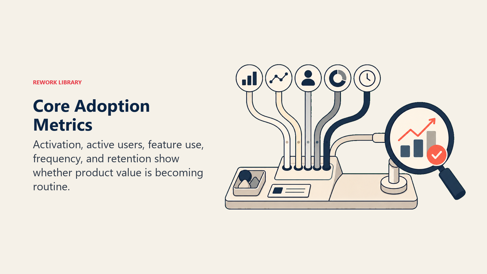
Core Adoption Metrics
Start with the basics that every product should track.
Active Users (DAU, WAU, MAU)
These three metrics form the foundation of adoption tracking. Daily Active Users (DAU) measures users who logged in and took meaningful action today. Weekly Active Users (WAU) counts anyone active at least once in the past 7 days. Monthly Active Users (MAU) captures activity over a 30-day window.
Why do these matter? They give you a baseline measure of product usage. More importantly, trends show you whether engagement is growing or declining. When you compare these numbers across accounts, you'll spot health differences immediately. And they're industry standard, which makes benchmarking easier.
What counts as "good" depends entirely on your product type. Daily products like CRMs and communication tools should target 70-80% DAU/MAU. If users need your product every day to do their jobs, this ratio tells you they've formed a habit. Weekly products (reporting tools, analytics platforms) typically hit 50-60% WAU/MAU. Monthly products like planning tools or admin software should aim for 70-80% MAU compared to total users.
Track these metrics at multiple levels. Overall company-wide numbers show your general health. Account-level data reveals which customers are engaged and which are at risk. Segment by user role or department to understand adoption patterns. And always track by cohort to see if you're improving over time.
User Activation Rate
This metric answers a simple question: what percentage of invited users complete their first meaningful action within a defined timeframe? Most companies use 7-14 days as the window.
The "meaningful action" varies by product. For project management tools, it's creating the first project. CRM systems track logging the first deal. Analytics platforms look for building the first dashboard. Communication tools measure sending the first message.
Here's why activation matters so much: activated users are far more likely to become active users. The correlation with long-term retention is strong. And low activation rates tell you exactly where onboarding friction exists.
Calculate it like this: (Users Who Completed First Action / Users Invited) × 100
Excellent products hit 70%+ activation. Good products land in the 50-70% range. If you're below 50%, you've got work to do on your onboarding experience.
But don't stop at the overall number. Segment activation by time period using weekly cohorts. Break it down by user role because admins and end users behave differently. Compare invitation sources since CSM-led signups often activate faster than self-serve. And track by account size because enterprise and SMB customers follow different patterns.
Login Frequency and Recency
Login frequency tells you how often users show up (daily, weekly, monthly, rarely). Login recency measures days since last login. Together, they provide early warning signals for disengagement.
These metrics differ from MAU in important ways. Someone might technically count as a monthly active user by logging in once, but that single monthly login tells a different story than someone who logs in daily. Frequency shows habit formation. Recency shows current engagement state.
I like to segment users into five frequency buckets. Power Users log in daily or 5+ times per week. Regular Users hit the product 2-4 times weekly. Casual Users show up about once per week. At-Risk Users log in less than weekly. Dormant users haven't logged in for 30+ days.
For recency, use these segments: Active (within 7 days), Recently Active (8-14 days), Declining (15-30 days), At Risk (31-60 days), and Dormant (60+ days).
The real value comes from tracking trends. What percentage of your users fall into each frequency segment? More importantly, are they moving between segments in the right direction? Is your recency distribution getting better or worse? How many users are currently at risk?
Session Duration and Depth
Session duration measures time spent in your product per session. Session depth counts actions or page views during that session.
These metrics show engagement quality, not just quantity. Very short sessions (under 2 minutes) usually mean the user checked something quickly or hit an issue and bailed. Very long sessions can indicate either deep work or someone struggling to complete a simple task. Session depth distinguishes between actual usage and passive browsing.
What's "good" varies wildly by product type. Productivity tools typically see 15-45 minute sessions when users are actually working. Communication tools generate multiple short sessions throughout the day. Reporting tools average 5-15 minutes as users pull data and leave.
Watch for warning signs. Declining session duration over time suggests shrinking engagement. Increasing bounce rates (one-page sessions) mean users aren't finding what they need. Very long sessions paired with low action counts often mean someone's confused or stuck.
Feature Adoption Rate
This measures the percentage of users (or accounts) who've used a specific feature at least once.
Different features carry different weight. Core features predict retention. Advanced features predict expansion. Low adoption of high-value features means you're leaving money on the table because customers aren't getting full value.
Calculate it per feature: (Users Who Used Feature / Total Active Users) × 100
Group your features into three categories. Core Features deliver essential functionality and should hit 70-90% adoption. If adoption is low, you either have a product messaging problem or the feature isn't actually core. Power Features offer advanced functionality and typically reach 30-50% adoption. Lower numbers suggest you need better education or targeting. Niche Features serve specific use cases, so 10-30% adoption is often fine if they're serving their intended segment.
Beyond the adoption rate itself, track time to adoption (how many days until first use), cohort comparison (are newer users adopting faster?), and segment differences (which user types gravitate toward which features?).
User Breadth (% of Licenses Active)
Calculate this simply: (Active Users / Total Licenses) × 100
Low license utilization hits you twice. First, customers aren't realizing the value they paid for. Second, it's the strongest predictor of churn. When renewal comes up, someone asks "Why are we paying for unused seats?" And if you can't give them a good answer, they downgrade or cancel.
Healthy accounts run at 70%+ utilization. You should watch accounts in the 50-70% range. Anything below 50% represents major risk and demands immediate CSM attention.
What causes low utilization? Sometimes companies over-provision, buying more licenses than they need. Other times rollout stalls and not all teams get onboarded. Many users never activate because onboarding failed. Some users try the product and abandon it because it doesn't meet their needs. And occasionally, licenses are reserved for seasonal or intermittent users who inflate the denominator.
Here's how to respond based on utilization levels. At 80%+, you're looking at a potential expansion opportunity. Between 60-80%, things are good; maintain current engagement. The 40-60% range means risk; investigate and intervene. Below 40% requires CSM escalation.
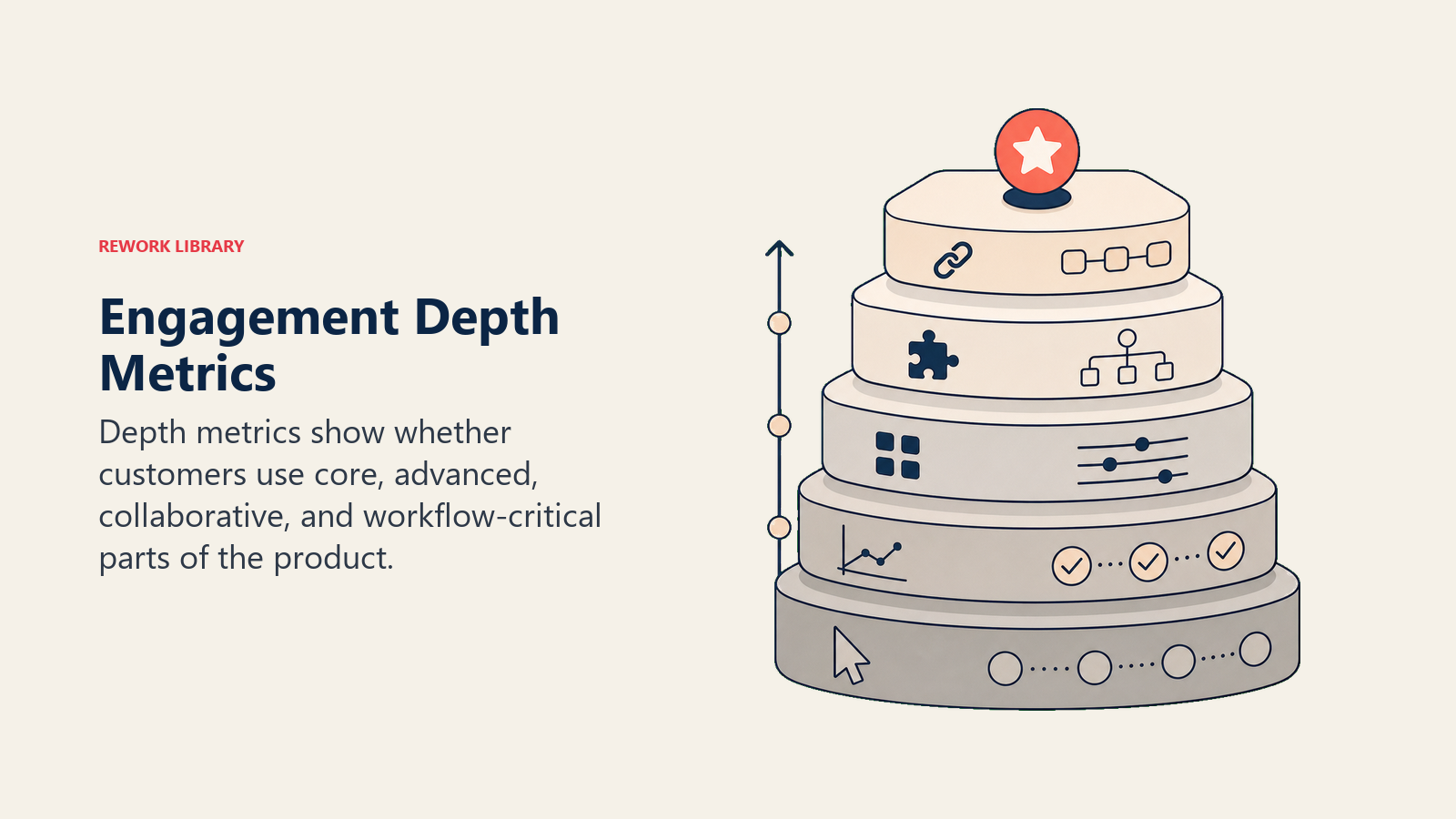
Engagement Depth Metrics
Beyond basic usage, you need to measure how deeply customers engage with your product.
Features Used Per Session
Calculate the average number of distinct features used in each session. This shows product depth and value realization.
Single-feature users are more likely to churn because their engagement is shallow. Multi-feature users stick around because your product is integrated into their workflow. They can't easily replace you.
The math is straightforward: Total Distinct Features Used / Total Sessions
I segment users into three groups. Shallow Users engage with 1-2 features per session. Moderate Users hit 3-4 features. Deep Users work across 5+ features in a typical session.
Track whether users deepen their engagement over time. Compare cohorts to see if newer users reach depth faster than older ones. And identify "gateway" features that lead users to discover other features.
Workflows Completed
Individual actions don't guarantee outcomes. Workflow completion measures whether users actually achieve end-to-end results.
In a CRM, that might be Lead → Opportunity → Closed Deal. For project management, it's Project Created → Tasks Added → Project Completed. In analytics tools, look for Data Connected → Report Built → Report Shared.
Workflow completion equals actual value delivered. You can have high feature usage but low workflow completion if users start tasks but don't finish them.
Track the percentage of workflows started that actually get completed. Measure time to complete workflows to understand efficiency. Count workflows completed per user per period to gauge productivity. And identify which workflows have the highest and lowest completion rates.
Advanced Feature Usage
Advanced features create switching costs. When users invest time setting up automation, building custom reports, or configuring integrations, they're locked in. It's not impossible to switch, but the activation energy required goes way up.
Examples include automation and workflows, API usage, custom reports and dashboards, integrations with other systems, and advanced configuration options.
This metric strongly predicts retention and expansion. It also identifies sophisticated, high-value users who understand your product deeply.
Measure what percentage of accounts use any advanced feature. How many use two or more? Track time to advanced feature adoption. And most importantly, validate the correlation with retention and expansion in your specific product.
Data Volume and Activity
The amount of data customers store or process in your product creates natural switching costs. More data means more investment in your platform.
For CRMs, count contacts, deals, and logged activities. Project management tools track projects, tasks, and files. Analytics platforms measure connected data sources and queries run. Content tools monitor documents stored and collaborators added.
Data volume trends matter more than absolute numbers. Is the account growing their data or has it flatlined? Low data volume suggests they're not really using your product. Growing data volume correlates with growing engagement.
Distinguish between data activity and data storage. Are users creating new data or just viewing old data? The former indicates active usage; the latter might mean they're maintaining legacy data while using another tool for new work.
Integration Usage
Integrations create network effects and serious switching costs. When your product connects to five other tools in a customer's workflow, replacing you means reconfiguring all those connections.
Users who integrate your product into their workflow are stickier. Integration usage predicts retention more strongly than almost any other metric. It identifies customers with mature, embedded usage patterns.
Track the percentage of accounts with at least one active integration. Measure how many have multiple integrations because each additional integration increases stickiness. Identify your most popular integrations. Monitor time to first integration activation. And track usage frequency of the integrations themselves (are they actually being used or just configured?).
API or Automation Usage
API usage represents the highest possible switching cost. Someone wrote custom code against your platform. They're not leaving easily.
This metric indicates sophisticated, high-value usage. It's one of the strongest retention predictors. And it often correlates with expansion because companies building on your API tend to grow their usage.
Measure what percentage of accounts use your API. Count API calls per account to understand depth of integration. Track webhook events configured and automation rules created. And watch for growth in automation usage over time.
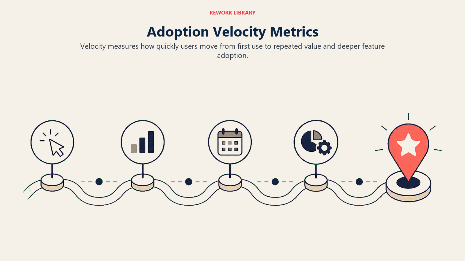
Adoption Velocity Metrics
How fast customers move through adoption stages matters as much as whether they eventually get there.
Time to First Use
Count the days from account creation to first meaningful product use. Speed to value predicts retention. Long time to first use creates high abandonment risk. This metric identifies onboarding friction and gives you a benchmark for improvement efforts.
Targets vary by product complexity. Simple products should achieve same-day activation (0 days). Moderately complex products can take 1-3 days. Complex products typically need 3-7 days. Enterprise products with implementation requirements might need 7-14 days.
Don't just track the average. Look at median and percentile distribution because averages hide problems. Segment by cohort to see if you're improving. Break it down by segment to understand which customer types activate faster. And compare acquisition sources since CSM-led customers often move faster than self-serve.
Time to Active Use
This measures days from first use to reaching your "active user" threshold (typically weekly usage). It tells you how fast users form habits.
Faster is better because it predicts stronger retention. When users hit weekly usage patterns quickly, they're far more likely to stick around. Slow progression to active use reveals where users get stuck after initial activation.
Common milestones include Day 7 (first return visit), Day 14 (second return visit), Day 30 (weekly usage habit), and Day 60 (daily or near-daily usage).
Calculate what percentage of users reach active use by day 30, 60, and 90. Track whether cohorts are improving. Identify segment differences. And validate correlation with long-term retention.
Feature Adoption Timeline
Track days from first product use to first use of each feature. This shows the natural adoption progression and guides your onboarding strategy.
A typical feature adoption curve might look like this: Day 1 sees 90% of users adopt Core Feature A. By Day 3, 70% have used Core Feature B. Day 7 brings 50% to Feature C. Day 14 gets 40% to Feature D. And by Day 30, 20% have tried Advanced Feature E.
Use this data to optimize your onboarding sequence by introducing features in their natural discovery order. Identify slow-adopting features that need better discoverability. Set realistic expectations for feature adoption campaigns. And benchmark cohort improvements to measure the impact of product and onboarding changes.
User Expansion Rate
This measures how fast new users get added to existing accounts. Growing user count signals that your product is spreading within the organization.
It's an organic growth signal, they're voluntarily adding more users. It's a leading indicator of expansion opportunity. And it demonstrates value because companies wouldn't add users to a tool that isn't working.
Calculate it as: (New Users This Period / Users Last Period) × 100
High Growth accounts add 10%+ per month. Moderate Growth runs 5-10% monthly. Stable accounts grow 0-5% per month. Declining accounts show negative growth and should trigger investigation.
Depth Progression Rate
This tracks the speed at which users move from basic to advanced feature usage. It measures value expansion and predicts expansion readiness.
Faster depth progression means faster realization of full value. It helps you identify successful adoption paths that you can replicate. And it tells you which accounts are ready for upsell conversations.
Define depth levels for your product. Level 1 might mean using 1-2 core features. Level 2 adds features 3-4. Level 3 reaches 5+ features. Level 4 includes advanced features. Level 5 incorporates integrations or API usage.
Then track days to reach each milestone, percentage progressing to the next level, cohort comparison, and segment differences.
Cohort-Based Metrics
Analyzing adoption by groups helps you identify patterns and measure improvements.
Activation Rate by Cohort
Compare cohorts by signup period. The January cohort might show 55% activation. February improves to 58% (+3%). March reaches 62% (+4%).
This tells you whether your onboarding improvements are working. You can pinpoint what changed between cohorts. And you learn which improvements actually moved the needle.
Feature Adoption Curves
Track how quickly each cohort adopts features over time. Cohort 1 (January) might reach 40% feature adoption in Week 1, 55% by Week 4, and 62% by Week 8.
Cohort 2 (February, after onboarding improvements) hits 48% in Week 1 (+8%), 64% in Week 4 (+9%), and 71% in Week 8 (+9%).
The insights are clear: your onboarding changes accelerated adoption. The improvement sustained over time. You should apply these learnings to future cohorts and keep iterating.
Retention by Cohort
Build a retention curve for each cohort to see if newer customers stick better than older ones.
Here's what that might look like:
| Cohort | Month 1 | Month 3 | Month 6 | Month 12 |
|---|---|---|---|---|
| Q1 2024 | 92% | 84% | 78% | 72% |
| Q2 2024 | 94% | 87% | 82% | ? |
| Q3 2024 | 95% | 88% | ? | ? |
| Q4 2024 | 96% | ? | ? | ? |
Each cohort retains better than the last. You can predict Q4 2024's retention based on the trend. And you can investigate what's driving the improvement to do more of it.
Power User Development Rate
Track progression from new user to power user by cohort. If Cohort 1 saw 25% become power users by Month 6, and Cohort 2 (after a power user campaign) reached 34% (+9%), you know the campaign worked.
Sustain successful campaigns for future cohorts. Identify characteristics that predict fast power user progression. And use those insights to personalize onboarding paths.
Usage Pattern Evolution
Understanding how usage typically changes over the customer lifecycle helps you spot abnormal accounts that need attention.
Months 0-3 (Onboarding) typically show high support usage, growing active users, and moderate feature depth. Months 4-6 (Growth) bring declining support usage, peak active users, and increasing feature depth. Months 7-12 (Maturity) feature low support usage, stable active users, and high feature depth. Months 12+ (Renewal) show minimal support usage, possibly slight decline (which is normal), and very high feature depth.
When an account deviates from this pattern, investigate why.
User Segment Metrics
Different user types need different metrics.
Admin vs End User Adoption
Admins and end users have different jobs to do. Admins focus on account setup completion, team member invitation rate, integration configuration, and advanced feature usage. End users care about activation rate, daily active usage, core workflow completion, and feature adoption depth.
Measuring both groups the same way misses important signals. Different adoption paths require different success indicators. And they need different interventions when things go wrong.
Role-Based Usage Patterns
Take a CRM as an example. Sales Reps should use the product daily with high activity logging. Their key features are deal management and activity tracking. Success means 5+ deals logged per week.
Sales Managers need the product 3-4 times per week, focusing on reporting. Their key features are dashboards and pipeline reports. Success is regular weekly pipeline review.
Executives use it weekly for high-level insights. They care about executive dashboards. Success is regular dashboard views.
Track metrics appropriate to each role. Don't penalize executives for not logging deals or sales reps for not viewing executive dashboards.
Power User Identification
Define what makes a power user in your product. Typical criteria include daily or near-daily usage, 60%+ feature adoption depth, use of advanced features, growing usage trends, and high data volume.
Why identify them? Recruit power users as advocates and references. Learn from their usage patterns to improve onboarding. Protect their experience with VIP treatment. And leverage them as champions within their accounts.
Track the percentage of users who are power users, time to power user status, power user retention rate (you really don't want to lose them), and correlation with account health.
At-Risk User Indicators
Build an early warning system using signals like declining login frequency, decreasing session duration, feature usage contraction (using fewer features over time), no usage of recently launched features, and support tickets indicating frustration.
Create an at-risk score from 0-100. A score of 0-30 means healthy. 31-50 suggests watching the account. 51-70 indicates risk. 71-100 is critical.
Use the score to prioritize intervention efforts.
Dormant User Tracking
Define dormancy stages. Recently Dormant means 30-60 days without login. Dormant is 60-90 days. Long-Term Dormant exceeds 90 days.
Track the number of dormant users per account and percentage of licenses sitting dormant. Measure re-activation rate (can you wake them up?). And analyze characteristics of users who go dormant to prevent it.
Prioritize re-engagement by targeting high-value roles (managers, admins), recently dormant users (easier to win back), and accounts with many dormant users (suggests a rollout issue).
Account-Level Adoption Scores
Combining multiple metrics into a single health score makes adoption trackable at a glance.
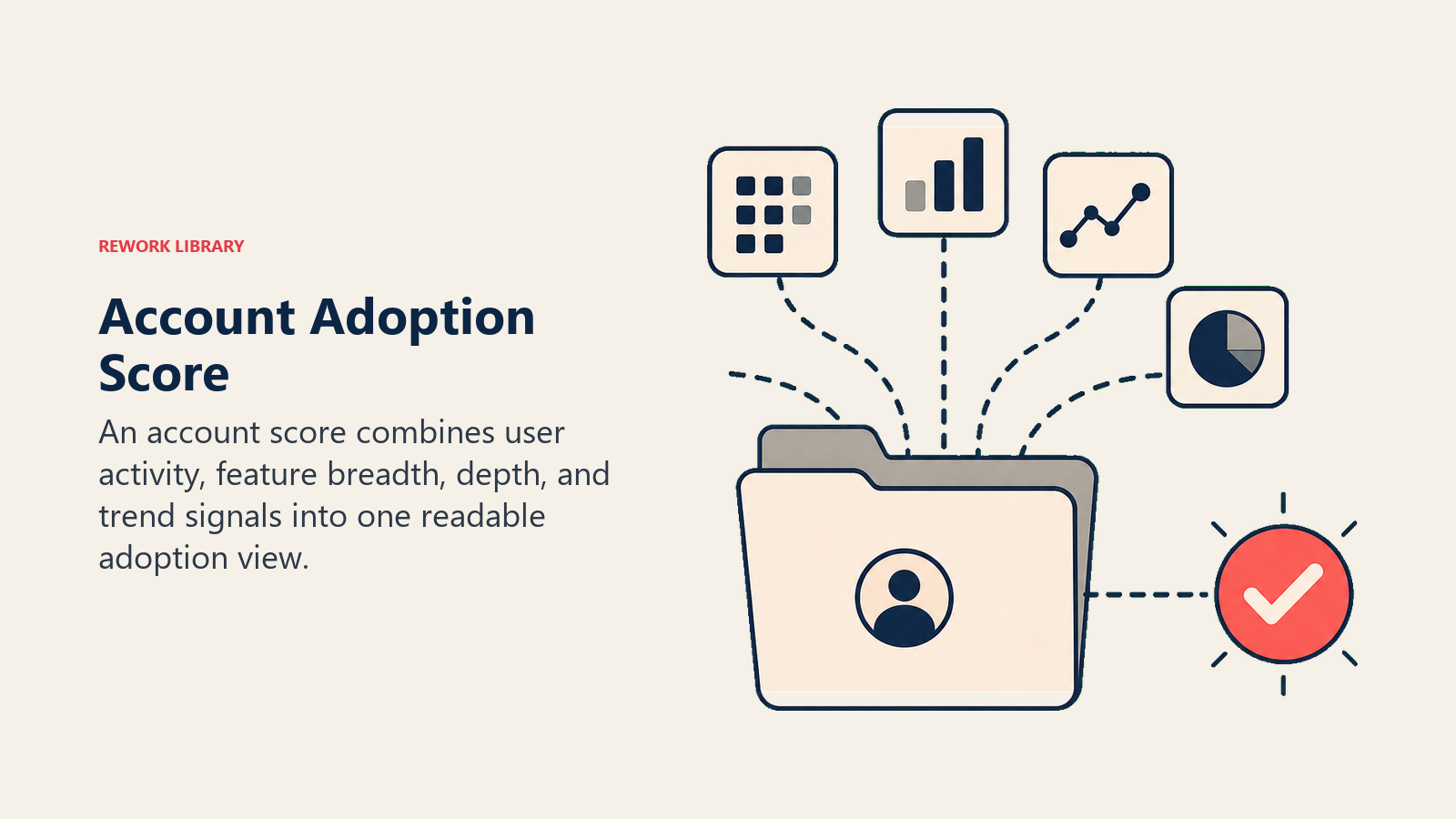
Overall Adoption Score Calculation
Here's an example scoring system:
| Component | Weight | Score (0-100) |
|---|---|---|
| License Utilization | 20% | 75 |
| Login Frequency | 20% | 80 |
| Feature Adoption Depth | 25% | 65 |
| User Engagement | 20% | 70 |
| Advanced Feature Usage | 15% | 60 |
| Overall Score | 100% | 70 |
Calculate the overall score by multiplying each component by its weight: (75×0.20) + (80×0.20) + (65×0.25) + (70×0.20) + (60×0.15) = 70
Adoption Score Components
Common components include Usage Volume (20-25% weight) covering active users, login frequency, and session duration. Usage Depth (25-30%) measures feature adoption, workflow completion, and data volume. Usage Quality (15-20%) looks at advanced features, integrations, and API usage. Usage Trend (15-20%) tracks growth versus decline, user expansion, and feature expansion. Usage Breadth (15-20%) considers license utilization, department spread, and role coverage.
The exact weighting should match what predicts success in your specific product.
Benchmark and Target Setting
Define score ranges that match outcomes. A score of 90-100 suggests exceptional customers who make great references and expansion targets. Scores of 75-89 indicate healthy accounts to maintain and grow. The 60-74 range shows moderate health with room for improvement. Scores of 40-59 mean the account is at risk and needs intervention. Below 39 is critical and requires escalation.
How do you set these benchmarks? Calculate scores for all accounts. Analyze retention by score range. Identify the threshold where retention drops significantly. Set your "healthy" threshold above that point. And consider segment-specific targets if patterns differ by customer type.
For example, you might find that accounts with scores of 70+ have 95% retention, scores of 50-69 show 80% retention, and scores below 50 have only 55% retention. That would suggest setting 70 as your healthy threshold and intervening below it.
Score Trend and Momentum
Track score over time to identify trends. Improving means score increasing month-over-month. Stable means flat within +/- 5 points. Declining means decreasing month-over-month.
Momentum often matters more than absolute score. An account with a score of 65 that's improving is healthier than an account at 75 but declining. The direction of travel predicts future outcomes.
Track score change magnitude (how fast are they improving or declining?), trend consistency (consistent movement or volatile?), and leading indicators (what predicts score changes before they happen?).
Correlation with Outcomes
Validate your score by analyzing correlation with business outcomes. Do high-scoring accounts retain better? At what score does retention risk increase? How much does score impact retention probability?
For expansion, ask whether high-scoring accounts expand more, what score predicts expansion readiness, and which score components matter most for expansion.
Here's an example analysis:
| Score Range | Retention Rate | Expansion Rate |
|---|---|---|
| 90-100 | 98% | 45% |
| 75-89 | 93% | 28% |
| 60-74 | 85% | 12% |
| 40-59 | 68% | 3% |
| 0-39 | 42% | 0% |
This shows clear correlation between score and outcomes. A score of 60 is the threshold for retention risk. You need 75+ for real expansion potential. And the score is predictive, not just descriptive.
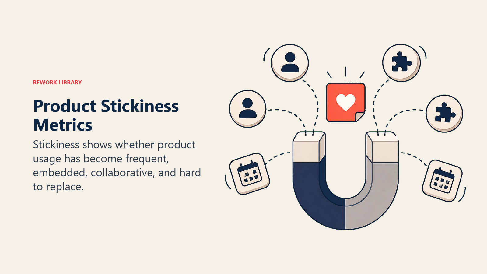
Product Stickiness Metrics
These measure how integral your product is to customer workflows.
DAU/MAU Ratio (Stickiness Score)
Divide Daily Active Users by Monthly Active Users and multiply by 100. If you have 1,000 MAU and 400 DAU, your stickiness is 40%.
What does that mean? The average user logs in 12 days per month (40% of 30 days). Higher stickiness means the product is more integral to daily workflow. Lower stickiness suggests occasional or periodic use.
Benchmarks vary by product type. Daily products like communication tools and CRMs should hit 50-70%. Weekly products like reporting and planning tools target 20-40%. Monthly products for admin and configuration typically see 10-20%.
Track overall stickiness trends, stickiness by segment, correlation with retention, and cohort comparison.
Return Rate and Frequency
Measure what percentage of new users return for their second, third, and fourth sessions. Out of 100 new activated users, maybe 70 return for a second session (70% return rate). Then 55 come back for a third (55% return), and 45 for a fourth (45% return).
Each return makes the next return more likely as habits form. High drop-off between sessions indicates friction or lack of value. And return rates strongly predict long-term retention.
Track return rate curves by cohort, days between sessions (getting shorter means habit is forming), and what drives returns versus abandonment.
Feature Dependency Indicators
Look for signs that users depend on specific features. They access the feature every session. They spend significant time there. The feature serves as an entry point (first action). Or the feature acts as a gateway that drives usage of other features.
Feature dependency equals switching cost. Dependent users are less likely to churn because they'd have to rebuild those workflows elsewhere. This identifies your "must-have" features and should guide product development and onboarding focus.
Measure the percentage of sessions including each feature, order of feature access within sessions, time spent per feature, and feature combinations (which features get used together?).
Workflow Integration Depth
Count how many critical workflows incorporate your product. Is your CRM integrated into the sales team's daily routine? Does the project team use your tool for all project communication? Do executives rely on your analytics for all reporting?
Survey customers: "What workflows does [Product] support?" Analyze usage patterns for frequency and timing. Review integration data showing connections to other systems. And study feature combinations that indicate multi-feature workflows.
Define depth levels. Level 1 is nice to have (occasional use). Level 2 is helpful (regular use for some tasks). Level 3 is important (regular use for key tasks). Level 4 is critical (can't do the job without it).
Platform Centrality
Is your product the central hub or a peripheral tool? Indicators of centrality include multiple integrations connected, API usage (showing custom development investment), multiple features used together, cross-departmental usage, and data migration from other systems.
Central platforms have the highest retention. Peripheral tools get replaced easily. Centrality creates network effects that make your product more valuable over time.
Track integration count per account, cross-departmental user adoption, workflow diversity (variety of use cases), and switching cost indicators.
Adoption Funnel Analytics
Map the journey from awareness to power user to identify where you're losing people.
Awareness to Trial Conversion
This is the first funnel stage. A user gets invited or granted access. What percentage actually log in within 7 days? Typical conversion is 40-60%.
Drop-off happens for predictable reasons. Invitation emails get missed or ignored. Login friction (like password reset issues) creates barriers. The value proposition seems unclear. Or the timing is bad (user hit a busy period).
Optimize by improving invitation messaging, sending multiple reminder touches, simplifying login with SSO, and using in-app notifications.
Trial to Active Usage Conversion
The second funnel stage tracks users who logged in. What percentage become weekly active users within 30 days? Typical conversion runs 50-70%.
Users drop off because they didn't see value in the first session, the product seemed too complex or confusing, competing priorities took over, or key features they needed were missing.
Improve this by creating a better first-session experience, delivering quick wins and early value, implementing progressive onboarding that doesn't overwhelm, and following up with education.
Active to Habit Formation
The third stage measures users who are active weekly. What percentage become daily or near-daily users within 90 days? Typical conversion is 40-60%.
Drop-off at this stage suggests value isn't compelling enough for daily use, the workflow doesn't require daily access, features for deeper engagement are missing, or users rely on alternative tools for some tasks.
Optimize with habit-forming features, well-timed notifications and prompts, better workflow integration, and education on advanced features.
Funnel Drop-Off Analysis
Identify your biggest leaks. Here's an example funnel: 1,000 users invited, 600 logged in (40% drop-off), 420 became weekly active (30% drop-off), 252 formed habit (40% drop-off). Final conversion: 25%.
The biggest leak is the invitation/login stage. Fix that first for maximum impact.
Analyze what's different about users who convert versus those who drop off. Which segments have higher conversion rates? What interventions improve conversion? How do cohorts compare?
Optimization Opportunities
For each funnel stage, identify current conversion rate, benchmark or target conversion rate, and the gap (your opportunity). Hypothesize what's causing drop-off and what might improve conversion. Then test by implementing a change, measuring impact, and iterating.
For example: Current invitation to login conversion is 45%. Your target is 60%. The gap is 15 percentage points. Your hypothesis: better email subject lines. Test with A/B testing three subject line variations. The best variation reaches 54% conversion (+9%). Next test: simplified login process.
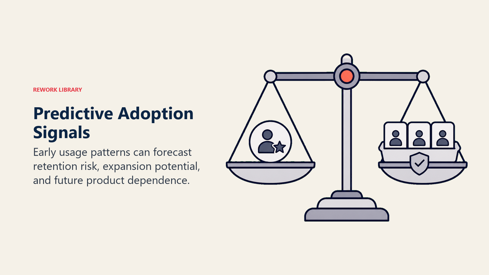
Predictive Adoption Metrics
Use adoption data to predict future outcomes before they happen.
Usage Leading Indicators
Certain early metrics predict long-term retention. Week 4 login frequency strongly predicts month 3 retention. First 30 days feature adoption predicts long-term usage depth. Admin activation speed predicts team rollout success. Integration setup predicts account stickiness.
How do you identify leading indicators? Collect usage data for all customers. Track retention outcomes. Analyze correlation between early usage and retention. Identify metrics with the strongest predictive value. Set thresholds for healthy versus at-risk.
Example finding: Accounts with 3+ integrations by day 60 have 95% retention. Accounts with 0 integrations by day 60 have 68% retention. Action: Make integration setup a key success metric and drive it during onboarding.
Churn Risk Signals from Adoption
Build a warning system using these signals, listed by strength. Critical risk indicators include declining active users month-over-month, key users (admins, champions) going dormant, support tickets mentioning "looking for alternatives," and decreasing feature usage (contraction).
High risk signals are flat usage (not growing), license utilization below 50%, no advanced feature adoption, and no new users added in 90+ days.
Moderate risk shows up as declining session duration, plateaued feature usage, infrequent login by key roles, and no engagement with new features.
Build a churn risk score that combines multiple signals, weights by predictive strength, generates a risk score from 0-100, and alerts CSMs at defined risk thresholds.
Expansion Opportunity Signals
Look for indicators of expansion readiness. High-confidence signals include license utilization over 80% (they need more seats), use of advanced features (ready for premium tier), multiple departments using the product (cross-sell opportunity), and high usage in specific areas (add-on feature opportunity).
Moderate-confidence signals are power user development (growing sophistication), integration usage (embedded in workflows), feature requests for premium capabilities, and growing data volume (approaching plan limits).
Create an expansion opportunity score that combines these signals. Prioritize CSM outreach by score. Track conversation to close rate by score to validate it. And refine scoring based on actual expansion results.
Health Score Integration
Build a comprehensive health score with Adoption (40-50% of total score) covering active users, feature adoption, and usage depth. Engagement (20-30%) includes login frequency, session quality, and user expansion. Sentiment (15-20%) weighs support satisfaction, survey responses, and CSM relationship quality. Outcomes (10-15%) considers business results, ROI achievement, and value realization.
Validate that your health score actually predicts retention. Refine the weights based on correlation analysis. Update the score model quarterly as you learn more. And use it for prioritization and forecasting.
Early Warning Systems
Build an automated alert system with defined thresholds. Trigger alerts when license utilization drops below 60%, active users decline 20%+ month-over-month, key users go dormant for 14+ days, support tickets include keywords like "cancel" or "alternative," or health score drops below 60.
Route alerts appropriately. Critical alerts go to the CSM immediately. High alerts appear in the CSM's daily digest. Moderate alerts show up in weekly reviews. Low alerts feed into monthly trends.
Create response playbooks so each alert type has a defined response. Build escalation paths for unresolved alerts. Track alert → action → outcome to measure effectiveness. And refine alerts based on whether they actually predict problems.
Benchmarking and Targets
Internal Baseline Establishment
Start by understanding your current state. Collect data on active user rates, feature adoption rates, retention by usage level, and typical usage patterns.
Analyze the distribution. What's the median (which matters more than average)? What's the range from 10th to 90th percentile? How much variation exists across segments?
An example baseline might show median WAU/MAU of 52%, top quartile at 71%+, bottom quartile at 28%, with wide variation showing opportunity for improvement.
Segment-Specific Benchmarks
Don't use the same targets for all segments. Enterprise customers typically have higher license counts but lower utilization percentages (which is normal given their size). Mid-market customers show balanced usage. SMB customers often have higher utilization percentages but use fewer advanced features.
Different industries naturally have different usage patterns. Account for these norms. Different use cases also drive different patterns. A sales team using your CRM will look different from a finance team using the same tool.
Set realistic targets based on segment, not overall average. Account for natural variation. Focus on improvement, not perfection.
Industry Comparison (When Available)
General SaaS benchmarks suggest good DAU/MAU is 40%+, good activation rate is 60%+, and good retention is 90%+. But use these cautiously.
Industry benchmarks are often self-reported and inflated. Different product types have wildly different norms. Your product may have unique characteristics. Focus on your own improvement trends rather than external comparisons.
Use external benchmarks for sanity checks (are we in the right ballpark?), investor and board context, and competitive positioning. Don't use them as gospel for target-setting.
Target Setting Methodology
Set good targets by following this process. First, analyze your current state including baseline metrics, distribution across accounts, and trends over time.
Second, identify correlation. What usage level predicts retention? What adoption depth drives expansion? Set targets at levels correlated with success.
Third, set stretch but achievable goals like 10-20% improvement annually, reaching top quartile of current performance, or matching best-in-class cohorts.
Fourth, segment appropriately with different targets for different segments. Account for natural variation. Don't penalize segments with different patterns.
Example: Current median activation is 55%. Top quartile is 72%. Target for next year: 65% median, 80% top quartile.
Goal Tracking and Progress
Run a monthly adoption review covering current metrics versus targets, trend direction (improving or declining?), cohort comparison (recent versus historical), segment performance, and initiatives impact.
Build a simple dashboard:
| Metric | Target | Current | Last Month | Status |
|---|---|---|---|---|
| Activation Rate | 65% | 63% | 61% | ↗ On Track |
| WAU/MAU | 55% | 52% | 51% | ↗ Behind |
| Feature Adoption | 45% | 48% | 47% | ✓ Exceeding |
| License Util. | 70% | 68% | 67% | ↗ On Track |
Reporting and Dashboards
Executive Summary Views
Executives care about overall adoption trends (are we improving?), correlation with retention and expansion, resource allocation (what's working?), comparison to targets, and ROI of adoption initiatives.
Build an executive dashboard with 5-8 key metrics maximum. Show trends over time, not just snapshots. Use simple visuals like line charts and gauges. Color-code status (green/yellow/red). And include a brief narrative summary.
Update monthly.
CSM Operational Dashboards
CSMs need account-level adoption scores, at-risk alerts and trends, intervention priorities, detailed usage breakdowns, and comparison to segment benchmarks.
Build a CSM dashboard with a list of assigned accounts showing health scores. Make it sortable by risk, opportunity, and score change. Enable drill-down to account details. Show usage trends over time. And surface alerts with recommended actions.
Update daily or in real-time.
Customer-Facing Adoption Reports
Share with customers their usage compared to benchmarks, progress over time (celebrating wins), recommendations for improvement, comparison to similar customers (anonymized), and value realized (if measurable).
Deliver through quarterly business reviews (QBRs), monthly email digests, or self-service dashboards if available.
Keep the tone positive and constructive. Focus on their success. Make recommendations actionable. Celebrate progress.
Example: "Your team's adoption has grown 15% this quarter! You're now using 6 of 8 core features (up from 4). Teams using 6+ features see 2x productivity gains. Here are 2 recommended features to explore next..."
Trend Analysis and Insights
Beyond current state, show direction (improving or declining), pace (how fast is it changing?), inflection points (what changed when?), cohort comparison (progress over time), and segment patterns (who's succeeding?).
Generate insights by asking what's driving changes, what worked (double down), what didn't work (adjust or kill), and what to try next (hypotheses).
Alert and Notification System
Route alerts to the right people. CSMs get account health score drops, key user dormancy, license utilization drops, and feature usage decline. CS Leadership sees portfolio health trends, systemic issues affecting many accounts, and target miss warnings. The Product Team receives alerts about feature adoption below expectations, high abandonment of new features, and friction points identified.
Follow alert best practices. Make them actionable (you can respond). Make them timely (when intervention is still possible). Prioritize them (not everything is urgent). And provide context (why this matters).
The Bottom Line
You can't manage what you don't measure. Adoption metrics predict retention, expansion, and customer success outcomes before they happen.
Teams that track comprehensive adoption metrics achieve 20-30% higher retention through early warning and intervention, 2-3x expansion rates by identifying and acting on opportunities, efficient resource allocation by focusing on what matters, predictable outcomes through data-driven forecasting, and continuous improvement via measure → learn → optimize cycles.
Teams that don't track adoption metrics experience churn surprises (didn't see it coming), missed expansion opportunities (didn't know who was ready), wasted effort (working on the wrong things), and inability to scale (can't systematize without data).
The comprehensive adoption metrics framework includes core metrics (active users, activation, frequency), depth metrics (features, workflows, integrations), velocity metrics (time to value, speed to habit), predictive metrics (leading indicators, risk signals), and benchmarking (targets and progress tracking).
Track what predicts success. Act on what the data tells you. Watch your retention and expansion improve.
Ready to build your adoption metrics? Start with adoption fundamentals, review usage tracking analytics, and build customer health monitoring.
Learn more:

Senior Operations & Growth Strategist
On this page
- Core Adoption Metrics
- Active Users (DAU, WAU, MAU)
- User Activation Rate
- Login Frequency and Recency
- Session Duration and Depth
- Feature Adoption Rate
- User Breadth (% of Licenses Active)
- Engagement Depth Metrics
- Features Used Per Session
- Workflows Completed
- Advanced Feature Usage
- Data Volume and Activity
- Integration Usage
- API or Automation Usage
- Adoption Velocity Metrics
- Time to First Use
- Time to Active Use
- Feature Adoption Timeline
- User Expansion Rate
- Depth Progression Rate
- Cohort-Based Metrics
- Activation Rate by Cohort
- Feature Adoption Curves
- Retention by Cohort
- Power User Development Rate
- Usage Pattern Evolution
- User Segment Metrics
- Admin vs End User Adoption
- Role-Based Usage Patterns
- Power User Identification
- At-Risk User Indicators
- Dormant User Tracking
- Account-Level Adoption Scores
- Overall Adoption Score Calculation
- Adoption Score Components
- Benchmark and Target Setting
- Score Trend and Momentum
- Correlation with Outcomes
- Product Stickiness Metrics
- DAU/MAU Ratio (Stickiness Score)
- Return Rate and Frequency
- Feature Dependency Indicators
- Workflow Integration Depth
- Platform Centrality
- Adoption Funnel Analytics
- Awareness to Trial Conversion
- Trial to Active Usage Conversion
- Active to Habit Formation
- Funnel Drop-Off Analysis
- Optimization Opportunities
- Predictive Adoption Metrics
- Usage Leading Indicators
- Churn Risk Signals from Adoption
- Expansion Opportunity Signals
- Health Score Integration
- Early Warning Systems
- Benchmarking and Targets
- Internal Baseline Establishment
- Segment-Specific Benchmarks
- Industry Comparison (When Available)
- Target Setting Methodology
- Goal Tracking and Progress
- Reporting and Dashboards
- Executive Summary Views
- CSM Operational Dashboards
- Customer-Facing Adoption Reports
- Trend Analysis and Insights
- Alert and Notification System
- The Bottom Line