Cumulative Flow Diagram: So lesen Sie eines (mit Beispielen)
Turn this article into takeaways for your work.
Each assistant summarizes the article only for you and suggests best practices for your work.
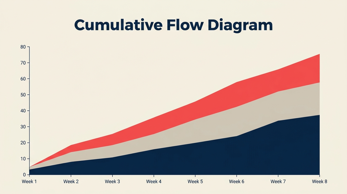
Ein Cumulative Flow Diagram (CFD) ist ein gestapeltes Flächendiagramm, das zeigt, wie viele Arbeitseinheiten an einem bestimmten Tag in jeder Workflowphase stecken und wie sich diese Verteilung über die Zeit verschiebt. Wenn Sie ein Kanban-Board oder einen anderen flussbasierten Prozess betreiben, ist es der schnellste Weg zu erkennen, ob Arbeit reibungslos fließt oder sich irgendwo unbemerkt aufstaut.
Was ist ein Cumulative Flow Diagram?
Ein Cumulative Flow Diagram ist eine visuelle Flow-Metrik, die die Gesamtzahl der Arbeitseinheiten, die in jede Phase eines Workflows eingetreten sind, als farbiges, gestapeltes Band auf einer Zeitachse darstellt. Die vertikale Höhe jedes Bandes zu einem beliebigen Zeitpunkt gibt an, wie viele Einheiten sich gerade in dieser Phase befinden. Das unterste Band stellt typischerweise den "Erledigt"-Status dar und wächst stetig; die Bänder darüber repräsentieren die laufenden Phasen.
Das CFD wurde von David Anderson als zentrale Kanban-Metrik etabliert. Im Gegensatz zu einem Burndown-Chart, das die verbleibende Arbeit gegen einen festen Zeitrahmen verfolgt, misst ein CFD den Fluss kontinuierlich ohne Sprint- oder Iterationsgrenzen.
Kennzahlen
- Teams, die Flow-Metriken wie CFDs aktiv zur WIP-Steuerung nutzen, berichten von bis zu 47 % kürzeren durchschnittlichen Cycle Times im Vergleich zu Teams, die nur die Velocity verfolgen (Kanban University State of Kanban Report, 2023).
- Ein durchschnittliches Wissensarbeits-Element verbringt ungefähr 85 % seiner gesamten Cycle Time wartend, anstatt aktiv bearbeitet zu werden, ein Muster, das CFDs sofort sichtbar machen (Vacanti, "Actionable Agile Metrics," 2. Aufl., 2023).
- Organisationen, die WIP auf Basis von CFD-Auswertungen begrenzen, senken ihre durchschnittliche Lead Time innerhalb der ersten 90 Tage nach Einführung um median 37 % (Lean Kanban Inc. Practitioner Survey, 2022).
So lesen Sie ein CFD
Ein CFD hat drei Beobachtungspunkte: die Bänder selbst, den vertikalen Abstand zwischen zwei Kurven und den horizontalen Abstand zwischen Punkten.
Die farbigen Bänder. Jedes Band repräsentiert einen Workflow-Zustand, gestapelt von unten (erledigt) bis oben (eingehend/Backlog). Die Höhe eines Bandes an einem bestimmten Datum entspricht der Anzahl der Einheiten in diesem Zustand an diesem Tag. Ein schmales, stabiles Band bedeutet, dass Arbeit schnell durchläuft. Ein Band, das sich im Laufe der Zeit verdickt, bedeutet, dass sich Einheiten ansammeln.
Vertikaler Abstand = WIP. Ziehen Sie an einem einzelnen Datum einen vertikalen Schnitt durch das Diagramm. Der Abstand zwischen der Kurve "Einheiten gestartet" und der Kurve "Einheiten abgeschlossen" ist Ihr aktueller Work in Progress. Das bildet WIP-Limits direkt ab: der Abstand sollte in etwa konstant bleiben. Weitet er sich aus, wächst der WIP, und Ihr Prozess nimmt mehr auf, als er fertigstellt.
Horizontaler Abstand = Cycle Time und Lead Time. Verfolgen Sie eine horizontale Linie von dem Punkt, an dem eine Charge das System betreten hat, bis zu dem Punkt, an dem sie es verlassen hat. Diese horizontale Länge ist die durchschnittliche Lead Time für Einheiten, die an diesem Datum eingetreten sind. Eine kürzere horizontale Spanne bedeutet schnellere Lieferung. Deshalb ist ein CFD dichter mit Informationen als Velocity allein: es zeigt sowohl Durchsatz als auch die Zeitdimension.
Bandneigung = Abgangsrate. Je steiler die Oberkante eines Bandes, desto schneller verlassen Einheiten diese Phase. Eine flache Oberkante bedeutet, dass Abgänge ins Stocken geraten sind. Wenn das Band "In Entwicklung" eine Woche lang flach verläuft, ist das ein klares Signal: Einheiten stauen sich auf und bewegen sich nicht weiter.
Was ein CFD über den Fluss aussagt
| Visuelles Muster | Was es bedeutet | Was zu tun ist |
|---|---|---|
| Ein Band weitet sich, andere bleiben flach | Engpass in dieser Phase | Blocker untersuchen, Kapazität erhöhen oder WIP vorgelagert reduzieren |
| Alle Bänder steigen parallel | Gesunder, stabiler Fluss | Tempo beibehalten, auf Abweichungen achten |
| Flacher Abschnitt über alle Bänder | Arbeit hat vollständig aufgehört | Externe Blocker, Teamabwesenheit oder Release-Freeze prüfen |
| Oberes "Backlog"-Band wird steiler | Scope Creep oder neue Arbeit kommt schneller rein als geliefert wird | Intake-Prozess überarbeiten, Priorisierung überprüfen |
| Lücke zwischen "gestartet" und "erledigt" weitet sich | WIP ist außer Kontrolle | WIP-Limits durchsetzen, neue Arbeit pausieren bis Backlog abgebaut ist |
| Bänder komprimieren und konvergieren am rechten Rand | Arbeit läuft am Projektende oder Quartalsende ab | Normal bei Projekten mit fixer Deadline; auf erzwungenes Tempo achten |
Das handlungsfähigste Signal ist meist das sich weitende Band. Wenn Sie es früh erkennen, können Sie einen Reviewer hinzufügen, ein Teammitglied tauschen oder eine Abhängigkeit eskalieren, bevor diese Phase zu einem Deadline-Risiko wird.
So erstellen Sie ein Cumulative Flow Diagram
Die meisten Kanban- und Projekttools (Jira, Linear, Azure DevOps, Targetprocess) generieren CFDs automatisch. Zu wissen, wie man eines manuell erstellt, hilft jedoch zu verstehen, was das Tool tatsächlich zeigt.
Definieren Sie Ihre Workflow-Phasen. Listen Sie jeden Zustand auf, in dem sich eine Arbeitseinheit befinden kann, vom ersten Intake bis zum Erledigt. Ein typisches Software-Team könnte verwenden: Backlog, Bereit, In Entwicklung, Im Review, Im Test, Erledigt.
Sammeln Sie täglich die Anzahl der Einheiten pro Phase. Zählen Sie am Ende jedes Tages, wie viele Einheiten in jeder Phase stecken. Halten Sie das in einer Tabellenkalkulation fest. Sie brauchen keine genauen Zeitstempel; ein konsistenter täglicher Schnappschuss genügt.
In kumulative Summen umrechnen. Addieren Sie für jede Phase die Anzahl des jeweiligen Tages zu einer laufenden Gesamtsumme. Das ist der "kumulative" Teil: Das Diagramm zeigt die Gesamtzahl der Einheiten, die jemals in jede Phase eingetreten sind (oder aktuell dort stecken), nicht nur den heutigen Schnappschuss.
Bänder stapeln. Erstellen Sie in Ihrem Diagrammtool ein gestapeltes Flächendiagramm. Platzieren Sie "Erledigt" unten, dann jede aufeinanderfolgende Phase bis hinauf zu "Backlog" oben. Die x-Achse ist Zeit; die y-Achse ist die kumulative Einheitenanzahl.
Einen konsistenten Zeithorizont festlegen. Ein rollendes 30-Tage-CFD funktioniert gut für aktive Teams. Längere Fenster (90 Tage) offenbaren saisonale Muster; kürzere Fenster (14 Tage) eignen sich besser für Sprint-langes Feedback.
Wöchentlich mit dem Team besprechen. Das CFD ist am nützlichsten als gemeinsames Artefakt. Gehen Sie es in einer Retrospektive oder einem Flow-Review durch. Fragen Sie: Welches Band hat sich verbreitert? Was geschah in dieser Woche im Prozess?
Mit Ihrer WIP-Limits-Richtlinie verknüpfen. Wenn Sie explizite WIP-Limits auf Ihrem Kanban-Board haben, ist das CFD der Weg zu verifizieren, ob diese eingehalten werden. Der Abstand sollte Ihrer vereinbarten WIP-Obergrenze entsprechen.
Häufige Probleme, die ein CFD aufzeigt
Engpässe. Das ist der primäre Anwendungsfall des CFD. Wenn sich ein Phasenband konsistent verbreitert, während die anderen flach bleiben, haben Sie einen Engpass. Es könnte ein einzelner überlasteter Reviewer sein, eine langsame QA-Umgebung oder eine externe Abhängigkeit (wie das Warten auf rechtliche Freigabe). Das CFD sagt Ihnen nicht die Ursache, aber es benennt die Phase, damit Sie nachforschen können.
Scope Creep. Ein CFD erfasst Scope Creep auf eine Weise, die ein Burndown-Chart manchmal verschleiert. Wenn die Oberkante des Diagramms steil ansteigt, kommen neue Einheiten schneller in das System, als Einheiten es verlassen. Auf einem Burndown könnte das wie eine flache Linie aussehen (neue Arbeit kompensiert erledigte Arbeit), aber auf einem CFD wächst die Gesamtdiagrammhöhe schlicht, was die Intake-Rate offensichtlich macht.
Blockierte Arbeit. Wenn ein Band vollständig flach wird, haben Einheiten aufgehört, sich durch diese Phase zu bewegen. Das könnte bedeuten, dass ein Teammitglied abwesend ist, eine Abhängigkeit ungelöst ist oder Arbeit auf eine Entscheidung wartet. Das flache Band ist ein visuelles "Hier steckt etwas fest"-Signal, das in einer Aufgabenliste leicht übersehen wird, auf einem CFD aber unmöglich zu ignorieren ist.
Ungleichmäßige Eingangsraten. Wenn Ihr "Backlog"-Band in scharfen Stufen statt gleichmäßig wächst, ist Ihr Verfeinerungs- oder Planungsprozess chargenweise. Arbeit kommt in großen Schüben statt stetig, was typischerweise zu nachgelagertem Druck führt. Dieses Muster zu erkennen ist der erste Schritt zur Glättung des Intakes.
Verschlechterung der Flow-Effizienz. Wenn der horizontale Abstand zwischen "Einheit gestartet" und "Einheit abgeschlossen" über die Zeit größer wird, steigt Ihre gesamte Cycle Time. Teams bemerken das oft nicht, weil sich kein einzelner Sprint dramatisch langsamer anfühlt. Ein CFD zeigt die Drift über Wochen hinweg.
CFD vs. Burndown-Chart
Beide Tools verfolgen den Fortschritt über die Zeit, beantworten aber unterschiedliche Fragen.
Ein Burndown-Chart fragt: "Werden wir alles in diesem Sprint fertigstellen?" Es setzt einen fixen Umfang, eine fixe Deadline voraus und misst die verbleibende Arbeit gegen eine Ideallinie. Es ist für Scrum-Sprints optimiert.
Ein CFD fragt: "Wie gesund ist unser Fluss?" Es macht keine Annahmen über fixen Umfang oder Zeitboxen. Es misst die Verteilung der Arbeit über Phasen hinweg kontinuierlich, was es besser für Kanban und Scrum-Kanban-Hybride geeignet macht.
Der praktische Unterschied: Wenn ein Sprint drei User Stories in der Mitte des Sprints hinzufügt, setzt das Burndown zurück und die Warnung ist subtil. Auf einem CFD wird das Backlog-Band sichtbar steiler und der Effekt auf die Cycle Time ist sofort ersichtlich.
Teams, die beide Tools nutzen, erhalten ergänzende Signale: Burndown für Sprint-Level-Commitment-Tracking, CFD für systemische Flow-Gesundheit. Wenn Sie bereits Story Points via Velocity verfolgen, ergänzt ein CFD die Zeitdimension, die Velocity allein nicht zeigt. Mehr über Flow-Metriken wie Velocity finden Sie unter Velocity in Agile, um zu sehen, wie CFD und Velocity sich gegenseitig ergänzen.
Häufig gestellte Fragen
Was ist der Unterschied zwischen Cycle Time und Lead Time auf einem CFD? Auf einem CFD ist die Lead Time der horizontale Abstand von dem Zeitpunkt, an dem eine Einheit das System betritt (dem Backlog beitritt), bis sie erledigt ist. Die Cycle Time ist der horizontale Abstand von dem Zeitpunkt, an dem die aktive Arbeit beginnt (die Einheit den Backlog verlässt), bis zum Erledigt. Der Unterschied zwischen beiden ist die Wartezeit im Backlog. Beide sind als horizontale Spanne im selben Diagramm sichtbar.
Wie oft sollte ich ein Cumulative Flow Diagram aktualisieren? Tägliche Schnappschüsse liefern das genaueste Bild. Wöchentliche Schnappschüsse funktionieren bei langsamer fortschreitenden Projekten, können aber kurzfristige Engpässe verbergen, die sich von selbst lösen. Die meisten digitalen Tools aktualisieren CFDs in Echtzeit; wenn Sie Jira oder Azure DevOps verwenden, ist kein zusätzlicher Aufwand erforderlich.
Wie sollte ein "gesundes" CFD aussehen? Ein gesundes CFD zeigt Bänder mit ungefähr konsistenter Breite, die parallel in einem gleichmäßigen Winkel ansteigen. Kein einzelnes Band verbreitert sich dramatisch, der gesamte vertikale Abstand zwischen "Einheiten gestartet" und "Einheiten erledigt" bleibt stabil, und das Diagramm wächst gleichmäßig ohne große Stufenänderungen oben.
Kann ich ein CFD für Scrum verwenden? Ja. CFDs funktionieren in jedem flussbasierten System, einschließlich Scrum. Sie können Ihre Sprint-Zustände als Workflow-Phasen einsetzen. Die Hauptanpassung besteht darin, dass Ihr "Backlog"-Band zu Beginn jedes Sprints während der Planung zurückgesetzt oder stark ansteigen wird, was normal und erwartet ist. Das CFD wird besonders nützlich, wenn Sie das Diagramm über mehrere Sprints hinweg führen, um systemische Engpässe zu erkennen, die Sprint-Grenzen überschreiten.
Mein CFD zeigt ein sehr dickes Band. Was sollte ich zuerst tun? Prüfen Sie die Phase, die das dicke Band repräsentiert. Sprechen Sie mit den Personen, die diese Arbeit erledigen. Häufige Ursachen: zu viele Einheiten einer Person zugewiesen, eine blockierte externe Abhängigkeit oder unklare Akzeptanzkriterien, die dazu führen, dass Einheiten vom Review zurückgewiesen werden. Sobald Sie die Ursache identifiziert haben, begrenzen Sie entweder den eingehenden WIP für diese Phase oder beheben Sie die Einschränkung direkt.
Ein Cumulative Flow Diagram behebt Ihren Prozess nicht von selbst, aber es verhindert, dass Sie raten. Wenn Sie genau sehen können, wo sich Arbeit ansammelt und wie lange Einheiten für den Durchlauf durch jede Phase benötigen, können Sie gezielte statt allgemeine Änderungen vornehmen. Die meisten Teams, die CFDs zusammen mit einer WIP-Limits-Richtlinie einführen, sehen ihre Cycle Time innerhalb von Wochen verbessern, einfach weil das Diagramm das richtige Gespräch unvermeidlich macht.
