Scatter Diagram: How to Find Correlations
Turn this article into takeaways for your work.
Each assistant summarizes the article only for you and suggests best practices for your work.
A scatter diagram is one of the simplest tools in quality management and one of the most misread. Teams use it to see whether two variables move together. But they often stop there, skipping the one step that prevents bad decisions: understanding the difference between correlation and causation.
Before you act on what a scatter diagram shows, you need to know exactly what it is, how to build it correctly, and where it fits in a broader analysis. That's what this guide covers.
What Is a Scatter Diagram?
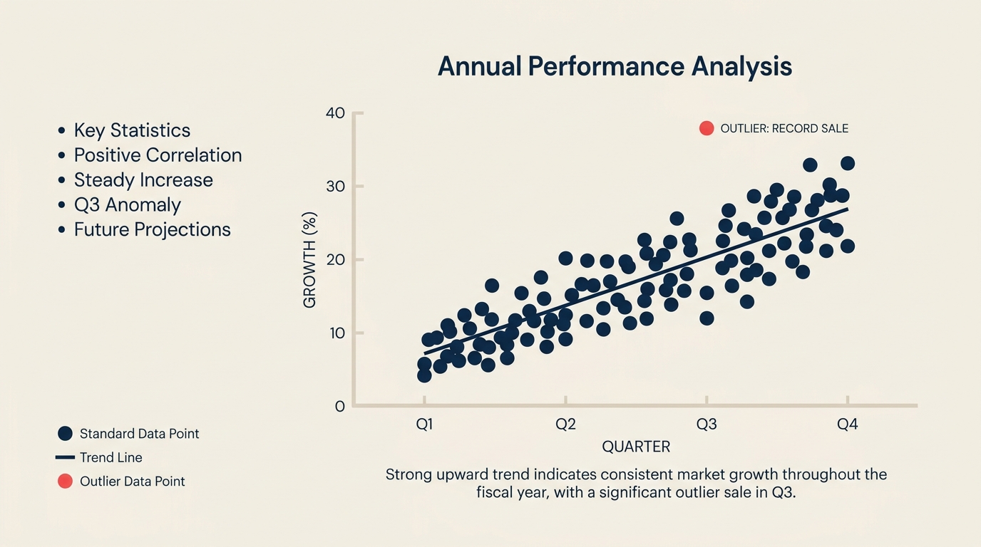
A scatter diagram (also called a scatter plot or X-Y graph) is a graph that plots paired numeric values on a horizontal X axis and a vertical Y axis to reveal whether two variables are related and how strongly. Each data point represents one observation. The resulting cloud of dots shows whether the two variables tend to rise and fall together, move in opposite directions, or have no apparent connection at all.
The scatter diagram is one of the 7 basic quality tools (quality control (QC) tools) attributed to quality pioneer Kaoru Ishikawa, who formalized the toolkit in the 1960s and 1970s. It sits alongside the fishbone diagram, check sheet, histogram, control chart, Pareto chart, and stratification as a foundational method for data-driven problem solving.
The key point: a scatter diagram shows correlation, not causation. It tells you that two things tend to move together. It does not tell you why.
Key Facts
- Kaoru Ishikawa formalized the 7 basic quality tools (including the scatter diagram) in his 1968 work at Kawasaki and in later publications such as Guide to Quality Control (1976, Asian Productivity Organization). The full toolkit became the global standard for quality circles and total quality management programs.
- The scatter plot as a graphical form has a long history: British astronomer John Herschel used an early version of the technique in 1833 to plot star positions, and Francis Galton used paired-data plots in the 1880s when studying heredity. Karl Pearson formalized the correlation coefficient (Pearson's r) in 1896, giving scatter diagram users a numerical measure of relationship strength alongside the visual pattern.
- A scatter diagram is most reliable when built on at least 30 paired data points. Fewer points make pattern interpretation unreliable, and spurious trends can appear by chance.
- "A scatter diagram won't tell you why two things move together, only that they do."
Why Use a Scatter Diagram
Most quality problems start with a hunch. A process engineer suspects that higher oven temperature causes more surface defects. A support manager thinks understaffing drives longer wait times. A sales leader believes more calls produce more closed deals.
Those hunches are fine starting points. But acting on them without data is expensive. The scatter diagram lets you test a suspected cause-and-effect relationship before committing resources to a fix.
It fits naturally after a fishbone diagram or five whys session. Once your team has identified a list of potential root causes, you can use a scatter diagram to check which suspected relationships actually show up in the data. That keeps your root cause analysis grounded in evidence rather than opinion.
The scatter diagram also feeds upstream into Six Sigma DMAIC projects, specifically the Analyze phase, where teams need to confirm or rule out variable relationships before designing improvements.
Types of Correlation a Scatter Diagram Shows
The pattern your dots form is the output of the analysis. Here are the six patterns you will typically encounter:
| Pattern | What the dots look like | What it means |
|---|---|---|
| Strong positive correlation | Tight cluster rising steeply from lower-left to upper-right | As X increases, Y reliably increases. Strong relationship worth investigating further. |
| Weak positive correlation | Loose upward cloud with wide scatter | X and Y tend to rise together, but other factors also influence Y. Relationship exists but is not dominant. |
| Strong negative correlation | Tight cluster falling steeply from upper-left to lower-right | As X increases, Y reliably decreases. Worth investigating whether reducing X is a viable lever. |
| Weak negative correlation | Loose downward cloud | X and Y tend to move in opposite directions, but the relationship is inconsistent. |
| No correlation | Random scatter with no directional trend | X and Y are not related, or the relationship is masked by other variables. |
| Non-linear (curved) correlation | Dots form a curve (U-shape, S-curve, or arc) | A relationship exists, but it is not linear. Standard correlation statistics may understate it. Investigate further. |
When the pattern is ambiguous, a trend line (line of best fit) drawn through the data helps clarify the direction. A correlation coefficient (Pearson's r) gives a numeric summary: values near +1 or -1 indicate strong relationships; values near 0 suggest no linear relationship.
Use Pareto analysis after identifying a strong correlation to prioritize which variable to address first when multiple relationships exist.
How to Create a Scatter Diagram
Building a scatter diagram is straightforward. The quality of interpretation depends on the quality of data collection, so each step matters.
Step 1: Choose the two variables
Identify one potential cause (X axis) and one potential effect (Y axis). Be specific. "Temperature" is vague; "oven temperature in degrees Celsius during the coating stage" is precise. The cause goes on the horizontal axis by convention, and the effect goes on the vertical axis.
Step 2: Collect paired data
For every observation, record both values at the same time or from the same unit. You need at least 30 paired data points, and 50 or more gives you much more reliable patterns. Collect data across the full range of conditions you care about, not just during normal operation. If you only measure when things are going well, you will miss the high-end or low-end behavior that drives defects.
Use a check sheet to record paired values systematically before moving to the scatter diagram.
Step 3: Set the axes
Draw or configure your X and Y axes. Set the X axis scale to cover the full range of your cause variable, with a little headroom. Do the same for Y. Label each axis with the variable name and its unit of measurement. Clear labels prevent misinterpretation later.
Step 4: Plot the points
For each paired observation, find its X value on the horizontal axis and its Y value on the vertical axis, then place a dot at the intersection. If two observations land on the exact same coordinates, use a small circle around the dot to indicate multiple points at that location.
Step 5: Interpret the pattern
Step back and look at the overall shape. Does the cloud trend upward, downward, or in no direction? Is the cluster tight or spread wide? Are there outliers pulling the pattern off-axis? Identify which of the six correlation types the pattern resembles (see the table above), and add a trend line if needed.
Do not stop here. Use the scatter diagram as evidence for deeper analysis, not as a final answer.
Scatter Diagram Examples by Function
Manufacturing: oven temperature vs. surface defect rate
A production team suspects that higher oven temperature causes more surface defects in a coated metal part. They collect 45 paired readings over two weeks, logging oven temperature (X) and defect rate as a percentage (Y) for each batch.
The scatter diagram shows a moderate positive correlation: as temperature rises above 210°C, defect rates climb noticeably. The relationship is not perfectly tight, suggesting other variables (humidity, coating thickness) also contribute. But the diagram gives the team enough confidence to test temperature control improvements in a controlled trial.
Support operations: staffing level vs. average wait time
A service operations manager plots daily staffing headcount (X) against average customer wait time in minutes (Y) for 60 days.
The diagram shows a strong negative correlation: more agents on shift consistently reduces wait time. The cluster is fairly tight, with a few outliers on high-volume event days. The team uses this to build a staffing model that ties headcount to expected volume thresholds.
Sales: outbound calls vs. deals closed
A sales team plots weekly outbound call volume per rep (X) against weekly closed deals (Y) over three months.
The diagram shows a weak positive correlation. Higher call volume tends to produce more deals, but the spread is wide. This tells the team that call volume alone is not the primary driver of deal closure. They run a follow-up analysis comparing call quality scores and deal rates, which shows a much tighter correlation.
Correlation Is Not Causation
This is the most important rule in scatter diagram interpretation, and the one most often skipped.
A strong correlation means two variables move together in a predictable pattern. It does not mean one causes the other. Both might be driven by a third variable you haven't measured. The relationship might be coincidental. Or the direction of causation might run the opposite way from what you assumed.
A classic example: ice cream sales and drowning rates both rise in summer. A scatter diagram of the two would show a strong positive correlation. But ice cream does not cause drowning. Both are driven by a third variable: hot weather that brings people to the water and also drives ice cream purchases.
In business contexts, the same trap appears constantly. A scatter diagram showing that sales training hours correlate with revenue growth doesn't prove training drives revenue. Better-funded teams might get both more training and more marketing budget. Untangle the variables before making a decision.
The next step after a strong correlation finding is usually a controlled experiment or a deeper multivariate analysis to confirm the causal direction.
Best Practices
Collect enough data. Thirty paired data points is the minimum. Fifty is better. With fewer points, random variation can produce patterns that look meaningful but aren't.
Watch for outliers. A few extreme data points can create or destroy an apparent trend. Investigate outliers before excluding them. They often reveal the most important information about process failure modes.
Stratify when needed. If your data comes from multiple shifts, machines, or product lines, plot each group with a different symbol or color. A combined scatter diagram can mask patterns that only exist within subgroups.
Follow up with deeper analysis. The scatter diagram is a screening tool, not a final verdict. When you find a strong correlation, confirm it through a controlled trial, regression analysis, or additional rounds of the five whys before committing to a fix.
Pair it with other quality tools. The scatter diagram works best as part of a broader investigation. Use it after a fishbone session to test suspected causes, and use Pareto analysis to prioritize which confirmed correlations to act on first.
Frequently Asked Questions
What is the difference between correlation and causation?
Correlation means two variables tend to move together in a predictable pattern. Causation means one variable directly produces a change in the other. A scatter diagram shows correlation. It does not establish causation. Confirming causation requires controlled experiments or additional analysis that rules out confounding variables.
Is a scatter diagram one of the 7 QC tools?
Yes. The scatter diagram (also called scatter plot or X-Y graph) is one of the seven basic quality control tools formalized by Kaoru Ishikawa. The other six are the fishbone diagram, check sheet, histogram, control chart, Pareto chart, and stratification.
How many data points do I need for a reliable scatter diagram?
Aim for at least 30 paired data points, and ideally 50 or more. With fewer than 30 points, random variation can produce misleading patterns. Collect data across the full range of operating conditions, not just typical or normal scenarios.
What does Pearson's r measure?
Pearson's r is the correlation coefficient, a number between -1 and +1 that summarizes the strength and direction of a linear relationship. A value near +1 indicates a strong positive correlation. A value near -1 indicates a strong negative correlation. A value near 0 suggests little or no linear relationship. Note that Pearson's r measures only linear relationships and will understate curved or non-linear patterns.
When should I NOT use a scatter diagram?
A scatter diagram is not the right tool when your variables are categorical rather than numeric, when you are working with fewer than 20 data points, or when you already know from prior controlled experiments that a causal link exists and you need to quantify it precisely. In those cases, regression analysis or statistical process control methods are more appropriate.
A scatter diagram gives you a fast, visual answer to the question "do these two things move together?" When the pattern is clear and the data is solid, it can save your team weeks of guesswork. But its real value is in pointing you toward the next question, not closing the investigation. Pair it with a structured root cause analysis process, and you have a combination that consistently produces better decisions than intuition alone.

Senior Operations & Growth Strategist
On this page
- What Is a Scatter Diagram?
- Why Use a Scatter Diagram
- Types of Correlation a Scatter Diagram Shows
- How to Create a Scatter Diagram
- Step 1: Choose the two variables
- Step 2: Collect paired data
- Step 3: Set the axes
- Step 4: Plot the points
- Step 5: Interpret the pattern
- Scatter Diagram Examples by Function
- Manufacturing: oven temperature vs. surface defect rate
- Support operations: staffing level vs. average wait time
- Sales: outbound calls vs. deals closed
- Correlation Is Not Causation
- Best Practices
- Frequently Asked Questions