Control Chart: How to Read and Build One (With Examples)
Turn this article into takeaways for your work.
Each assistant summarizes the article only for you and suggests best practices for your work.
A control chart is the fastest way to tell whether a process is behaving as it should or quietly heading toward a defect. It's a line graph of process data over time, with three reference lines calculated from the data itself: a center line and two control limits. Once you know how to read one, you can spot real trouble fast and stop reacting to noise.
What Is a Control Chart?
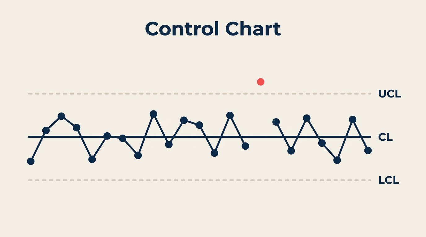
A control chart (also called a Shewhart chart) is a statistical graph that plots process measurements over time and uses calculated boundaries to distinguish normal variation from a signal that something has changed. It has three reference lines:
- Center Line (CL): the process average, calculated from historical data
- Upper Control Limit (UCL): set at three standard deviations above the center line
- Lower Control Limit (LCL): set at three standard deviations below the center line
These limits come from your own process data, not from engineering specifications or customer requirements. That distinction matters. A process can be perfectly in statistical control and still produce parts outside spec, or it can be within spec but drifting. Control charts address stability; process capability (Cpk) addresses whether that stable process also meets requirements.
Walter Shewhart invented the control chart at Bell Labs in 1924 to distinguish the two types of variation every process produces: common cause (random, inherent, predictable) and special cause (unusual, assignable, worth investigating). Control charts are now foundational to statistical process control, Six Sigma, and lean manufacturing worldwide.
Key Facts
- Organizations that adopt control charts as part of an SPC program report defect reductions of 50% or more within the first year, according to ASQ Quality Progress (2022).
- A study published in the International Journal of Quality and Reliability Management (2021) found that companies using control charts reduced their cost of poor quality by an average of 32% over three years.
- Shewhart's original choice of three-sigma limits, rather than two or four, was a pragmatic engineering decision: it balances the cost of false alarms against the cost of missing real signals, a trade-off confirmed by decades of industrial experience.
Anatomy of a Control Chart
Every control chart shares the same skeleton regardless of the chart type:
| Element | What it is | How it's calculated |
|---|---|---|
| Center Line (CL) | Process mean | Average of all subgroup statistics (e.g., X-bar) |
| Upper Control Limit (UCL) | Upper boundary | CL + 3 sigma (using chart-specific constants) |
| Lower Control Limit (LCL) | Lower boundary | CL - 3 sigma (using chart-specific constants) |
| Plotted points | Subgroup statistic over time | One point per sample/subgroup |
| Time axis (x-axis) | Sample order or clock time | Left to right, earliest first |
A few things worth knowing before you build one:
Control limits are not specification limits. UCL and LCL are calculated from process variation. Your customer's tolerance is a separate thing. Confusing the two leads to wrong decisions.
The "three-sigma" rule comes from probability: if only common cause variation is present, a point will fall outside three-sigma limits only about 0.27% of the time. Any point outside those limits is strong evidence something changed.
An LCL that calculates to a negative number (common for count data) is usually set to zero, because negative counts don't exist.
How to Read a Control Chart
Reading a control chart means looking for signals that indicate special cause variation. The most widely used set of rules comes from the Western Electric Statistical Quality Control Handbook (1956), sometimes called the Western Electric Rules or Nelson Rules. You don't need all of them in every situation; start with the first two.
| Rule | Signal | What to look for |
|---|---|---|
| Rule 1 | Point beyond control limits | Any single point above UCL or below LCL |
| Rule 2 | Run of 9 | Nine or more consecutive points on the same side of the center line |
| Rule 3 | Trend of 6 | Six consecutive points steadily increasing or decreasing |
| Rule 4 | Oscillation** | Fourteen consecutive points alternating up and down |
| Rule 5 | Two of three near limit** | Two out of three consecutive points in the outer one-third zone (beyond 2-sigma) on the same side |
| Rule 6 | Four of five near center edge** | Four of five consecutive points in the outer two-thirds zone (beyond 1-sigma) on the same side |
Rules 1 and 2 catch the most common and obvious signals. Rules 3 through 6 catch subtler patterns like drift, stratification, or systematic cycling.
When a rule triggers:
- Mark the point or run on the chart.
- Do not adjust the process automatically. Tampering with an in-control process adds variation.
- Investigate the specific time window. Ask what changed in equipment, material, operator, method, or environment.
- Find the root cause before making any adjustment. Root cause analysis and the 5 Whys are common follow-up tools.
Control Chart Types
Different data types need different chart formulas. Choosing the wrong chart gives wrong limits.
| Chart | Data type | Use when |
|---|---|---|
| X-bar & R (X-bar-R) | Continuous, subgroup n = 2-10 | Most common manufacturing setup; uses range to estimate variation |
| X-bar & S | Continuous, subgroup n > 10 | Larger subgroups; uses standard deviation instead of range for better precision |
| Individuals & Moving Range (I-MR) | Continuous, subgroup n = 1 | One measurement per time period; slow processes, destructive testing, lab results |
| p chart | Proportion defective | Tracking fraction nonconforming; subgroup size can vary |
| np chart | Count of defectives | Tracking number nonconforming; subgroup size must be constant |
| c chart | Count of defects | Defects per unit when unit size is constant (e.g., errors per invoice) |
| u chart | Defects per unit | Defects per unit when unit size varies (e.g., errors per 100 invoices of different lengths) |
A simple decision rule: if you're measuring something on a scale (length, time, temperature, weight), start with I-MR or X-bar-R depending on subgroup size. If you're counting defects or defective items, use p/np/c/u depending on whether your unit size changes.
How to Build a Control Chart
Step 1: Define what to measure
Pick one critical process output variable. Vague measures produce noisy charts. "Order entry error rate" is better than "order quality."
Step 2: Collect baseline data
Gather at least 20 to 25 subgroups of data while the process runs under normal conditions. Don't collect during a known problem period; the baseline should represent typical operation.
For an X-bar-R chart, a subgroup is usually 4 or 5 consecutive pieces from the same time period. For an I-MR chart, each observation is its own point.
Step 3: Calculate the center line
For X-bar-R:
- Calculate the average (X-bar) for each subgroup.
- Grand average (X-double-bar) = average of all subgroup averages. This is your center line.
- Average range (R-bar) = average of all subgroup ranges.
Step 4: Calculate control limits
Use tabled control chart constants (A2, D3, D4) from any SPC reference. For X-bar-R with n = 5:
- UCL(X-bar) = X-double-bar + A2 x R-bar
- LCL(X-bar) = X-double-bar - A2 x R-bar
- UCL(R) = D4 x R-bar
- LCL(R) = D3 x R-bar (= 0 for n less than 7)
Step 5: Plot the data
Draw the center line and control limits as horizontal lines. Plot each subgroup statistic as a point, connected by a line, left to right in time order.
Step 6: Interpret the chart
Check for the Western Electric Rules (Rule 1 first, then Rule 2). If the baseline data itself shows out-of-control points, identify and remove those subgroups, recalculate limits, and re-plot. Your goal is a stable baseline before you start monitoring.
Step 7: Enter real-time monitoring mode
Once control limits are established from stable baseline data, extend the lines forward and plot new subgroups as they come in. React only to signals, not to random high or low points within the limits.
Step 8: Recalculate periodically
When you make a deliberate process improvement, recalculate control limits from post-improvement data. Old limits from the old process state are no longer valid.
Control Charts vs Run Charts
Both are time-series graphs, but they serve different purposes.
| Feature | Run Chart | Control Chart |
|---|---|---|
| Control limits | None | UCL and LCL calculated from data |
| Detects special cause | Only basic run/trend patterns | Full Western Electric Rules |
| Calculation required | None | Mean, standard deviation, constants |
| Best use | Early exploration, fast visual check | Ongoing process monitoring, SPC |
| Risk | Misses subtle signals | Slightly more setup time |
A run chart is a good starting point when you just want to see if there's an obvious trend or shift. Once you're committed to managing a process, switch to a control chart. It's more work upfront but far more reliable for detecting real changes.
Both are related to the histogram quality tool, which shows the same data as a frequency distribution rather than over time. Histograms tell you the shape of the distribution; control charts tell you whether that shape is stable over time.
For exploring relationships between two variables that might explain control chart signals, the scatter diagram is a natural companion tool.
Frequently Asked Questions
What is the difference between a control limit and a specification limit?
Control limits come from the data and describe what the process actually does. Specification limits come from the customer or design and describe what the process must do. A process can be in statistical control (within control limits) but still produce nonconforming product (outside spec). Cpk and process capability analysis bridge these two views. See process capability (Cpk) for the full explanation.
How many data points do I need before calculating control limits?
The standard guidance is 20 to 25 subgroups. Fewer than 20 gives unstable limit estimates. With 25 or more you get reliable limits that won't shift dramatically when a few more points arrive.
What should I do when a point falls outside the control limits?
First, don't adjust the process until you understand why the point occurred. Investigate: was there a measurement error, a raw material change, a different operator, or equipment wear? If you find and confirm an assignable cause, remove that subgroup before finalizing the baseline limits. If you can't find a cause, leave it in and monitor.
Can I use a control chart for non-manufacturing processes?
Yes. Control charts work for any stable, repeatable process that produces measurable output: customer service call handle times, invoice processing cycle times, daily sales order counts, software bug rates per sprint. The chart type changes based on data type (continuous vs. count), but the logic is identical.
What is the relationship between control charts and Six Sigma?
Control charts are central to the Control phase of DMAIC, the Six Sigma improvement methodology. After defining, measuring, analyzing, and improving a process, you use a control chart to hold the gains. They also appear in the Measure phase when establishing a baseline process capability. Without a control chart, there's no systematic way to confirm an improvement stuck.
Where to Go from Here
A control chart is the core tool inside a broader statistical process control system. Once your chart is running, you'll want to pair it with process capability analysis to confirm the stable process also meets customer requirements, and with DMAIC when signals point to a root cause that needs structured investigation.
The time you invest in setting up even one well-chosen control chart pays back fast. You stop firefighting random variation and start responding only to signals that actually mean something changed.

Senior Operations & Growth Strategist
On this page
- What Is a Control Chart?
- Anatomy of a Control Chart
- How to Read a Control Chart
- Control Chart Types
- How to Build a Control Chart
- Step 1: Define what to measure
- Step 2: Collect baseline data
- Step 3: Calculate the center line
- Step 4: Calculate control limits
- Step 5: Plot the data
- Step 6: Interpret the chart
- Step 7: Enter real-time monitoring mode
- Step 8: Recalculate periodically
- Control Charts vs Run Charts
- Frequently Asked Questions
- Where to Go from Here