Landing Pages & Web Forms: Converting Visitors into Leads
Turn this article into takeaways for your work.
Each assistant summarizes the article only for you and suggests best practices for your work.
You've spent money on ads, created content, and got people to click. But then what? If your landing page doesn't convert, all that effort just evaporates. The truth is, most landing pages fail because they're trying to do too much, or not doing the basics right.
Here's what actually works when it comes to turning visitors into leads. Whether you're running paid ads lead generation campaigns or building an inbound lead generation engine, your landing page is where the conversion happens.
Key Facts: Landing Page Performance
- The median landing page conversion rate across all industries is 6.6%, based on analysis of 464 million visits to 41,000+ unique landing pages. (Unbounce, 2024 Conversion Benchmark Report)
- A B2B site that loads in 1 second has a conversion rate 3x higher than a site that loads in 5 seconds. (Portent, site speed research across 100+ million page views)
- Reducing a form from 4 fields to 3 can increase conversion rate by almost 50%. (Quicksprout, via FormStory)
- Companies with 40+ landing pages generate 12x more leads than those with only 1-5 pages. (HubSpot)
- Despite driving nearly 5x more traffic than desktop, mobile landing pages convert 8% worse, making mobile optimization a significant untapped opportunity. (Unbounce, 2024 Conversion Benchmark Report)
Landing Page Fundamentals: Purpose and Psychology
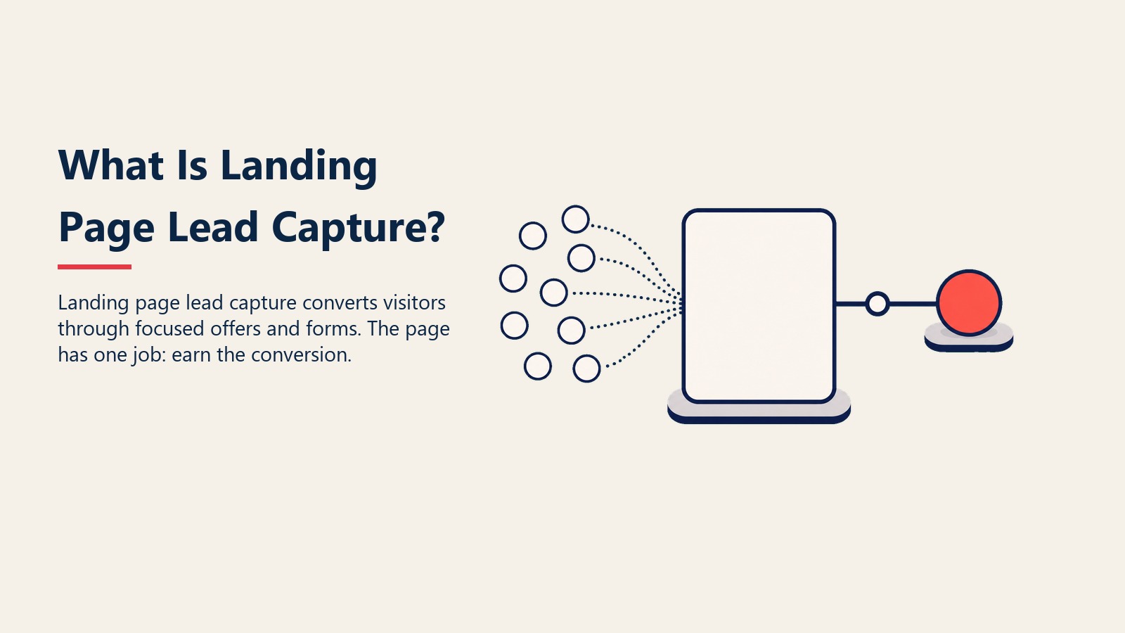
A landing page has one job: get someone to take a specific action. Not browse around. Not learn about your company history. Just one thing, usually filling out a form.
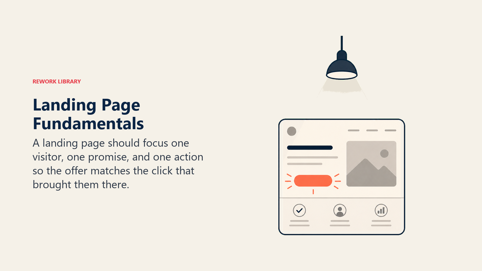
The psychology is pretty straightforward. People arrive with a question or problem. Your page needs to answer "What's in it for me?" within seconds, or they're gone. That's it. No grand theories about user behavior needed.
Think of it like this: someone clicked on an ad promising a free buyer's guide. They land on your page. If they see a generic "Contact Us" form asking for their company size, annual revenue, and phone number just to download a PDF? They'll bounce. Understanding types of leads helps you tailor your form fields to match visitor intent. But if they see "Get Your Free Buyer's Guide" with just name and email? Different story.
The page needs to match the promise that got them there. If your ad talks about increasing sales, your landing page better talk about increasing sales, not your company's 30-year history.
Key Elements That Actually Matter
Effective landing pages focus attention on the offer, proof, form, and next step instead of adding unnecessary page furniture.
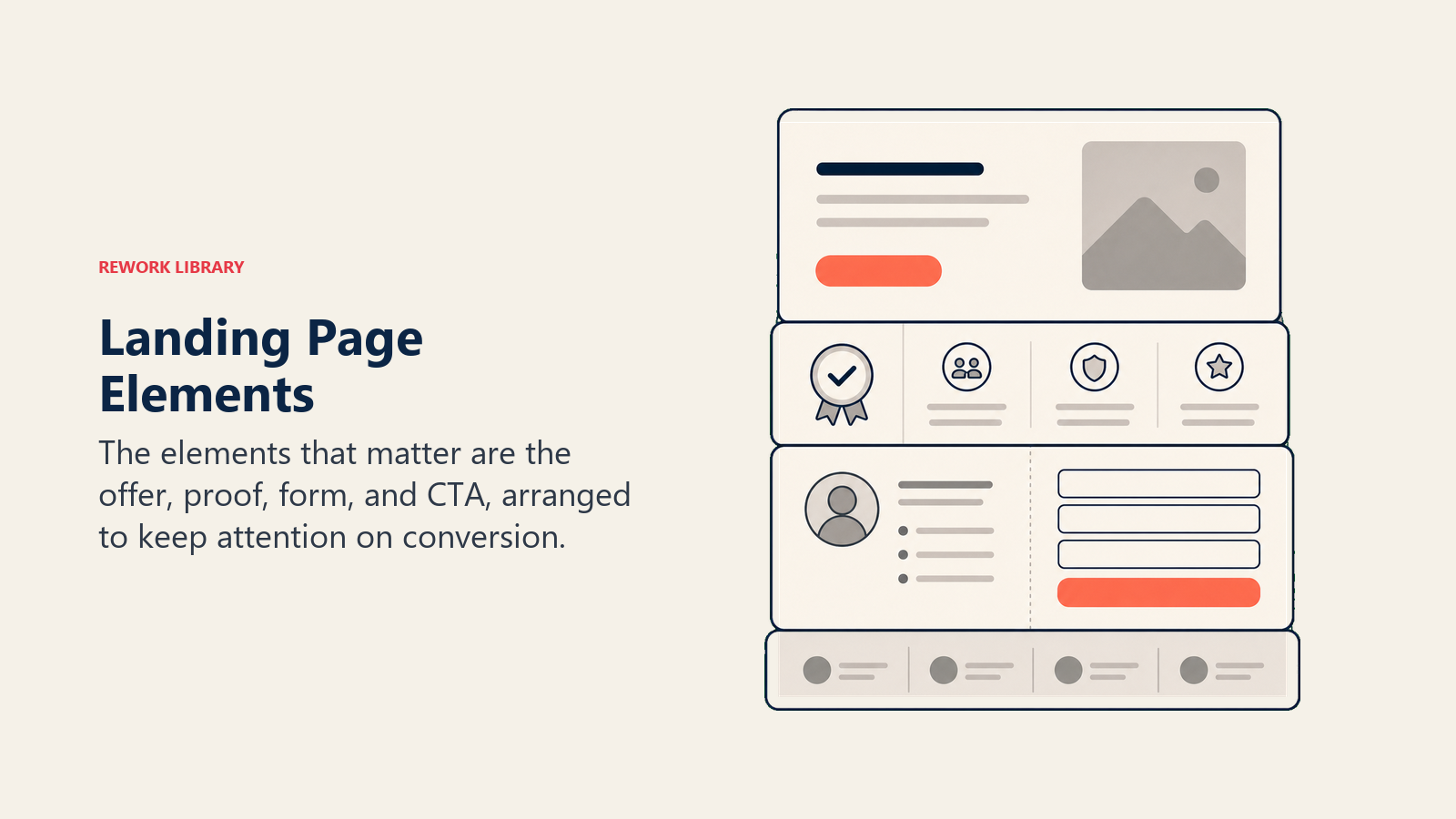
Let's break down what needs to be on the page. Not the theory. Just what works.
Headline and Value Proposition
Your headline answers one question: "Why should I care?"
Don't overthink it. If you're offering a template, say "Get the Cold Email Template That Booked 47 Meetings Last Month." Not "Unlock the Power of Email Marketing Transformation."
The value proposition goes right under the headline. It's 1-2 sentences explaining what someone gets and why it matters. That's it.
Before: "Our comprehensive solution provides robust capabilities designed to enhance your lead generation efforts across multiple channels."
After: "Get 3x more leads from your website with forms that actually convert. No coding required."
See the difference? One makes promises. The other makes sense.
Hero Image or Video
People process images way faster than text. Your hero visual should show what someone gets or how it works.
If you're offering software, show the interface. Selling a service? Show results. Promoting a download? Show what the resource looks like.
Videos can work, but only if they're short (under 90 seconds) and start with the payoff, not some slow buildup. Most people won't stick around for a 3-minute explainer video when they just want to download a checklist.
Benefits vs. Features
Nobody cares that your platform "leverages advanced algorithms" or "provides seamless integration." They care about what it does for them.
Features (don't lead with these):
- Real-time data synchronization
- Multi-channel attribution tracking
- Automated workflow capabilities
Benefits (lead with these):
- Know which leads are ready to buy, right now
- See exactly where your best leads come from
- Stop wasting time on manual follow-ups
Benefits answer "so what?" Features just list capabilities. Always lead with benefits.
Social Proof and Trust Signals
People look for reasons to trust you. Give them some.
The best social proof is specific:
- "Used by 2,400+ marketing teams" beats "Trusted by thousands"
- "Increased conversions by 34% for Acme Corp" beats "Helps companies grow"
- Customer photos with names beat anonymous testimonials
Keep it relevant too. If you're selling to HR managers, showing testimonials from CMOs doesn't help. Same industry, same role, same problems, that's what builds trust. Consider leveraging referral lead programs to generate authentic testimonials from satisfied customers.
Security badges (SSL, payment processors, industry certifications) matter more than you'd think. People won't hand over their email if your site looks sketchy. Make it obvious you're legitimate.
Call-to-Action (CTA)
Your CTA button needs two things: it should tell people exactly what happens next, and it should stand out visually.
Weak CTAs:
- Submit
- Learn More
- Click Here
- Get Started
Strong CTAs:
- Download My Free Guide
- See Pricing for My Team Size
- Get My Custom Quote
- Book a Demo for [specific use case]
Make the button big enough to spot immediately. Use a color that contrasts with the rest of the page. And repeat it, most effective landing pages have the CTA visible in at least two places (top and bottom minimum).
Form Placement and Design
Forms can go above the fold (visible without scrolling) or below it. Neither is automatically better.
Above the fold works when:
- The offer is simple and obvious (download, free trial)
- You've got brand recognition
- You're asking for minimal info (email only)
Below the fold works when:
- People need convincing (higher commitment offers)
- You're asking for more fields
- The product needs explanation
Either way, the form shouldn't look like a chore. Keep it clean, label fields clearly, and don't surprise people with hidden required fields.
Form Optimization: Getting It Right
Forms kill conversions faster than anything else. Too many fields, unclear labels, annoying validation errors, people just give up.
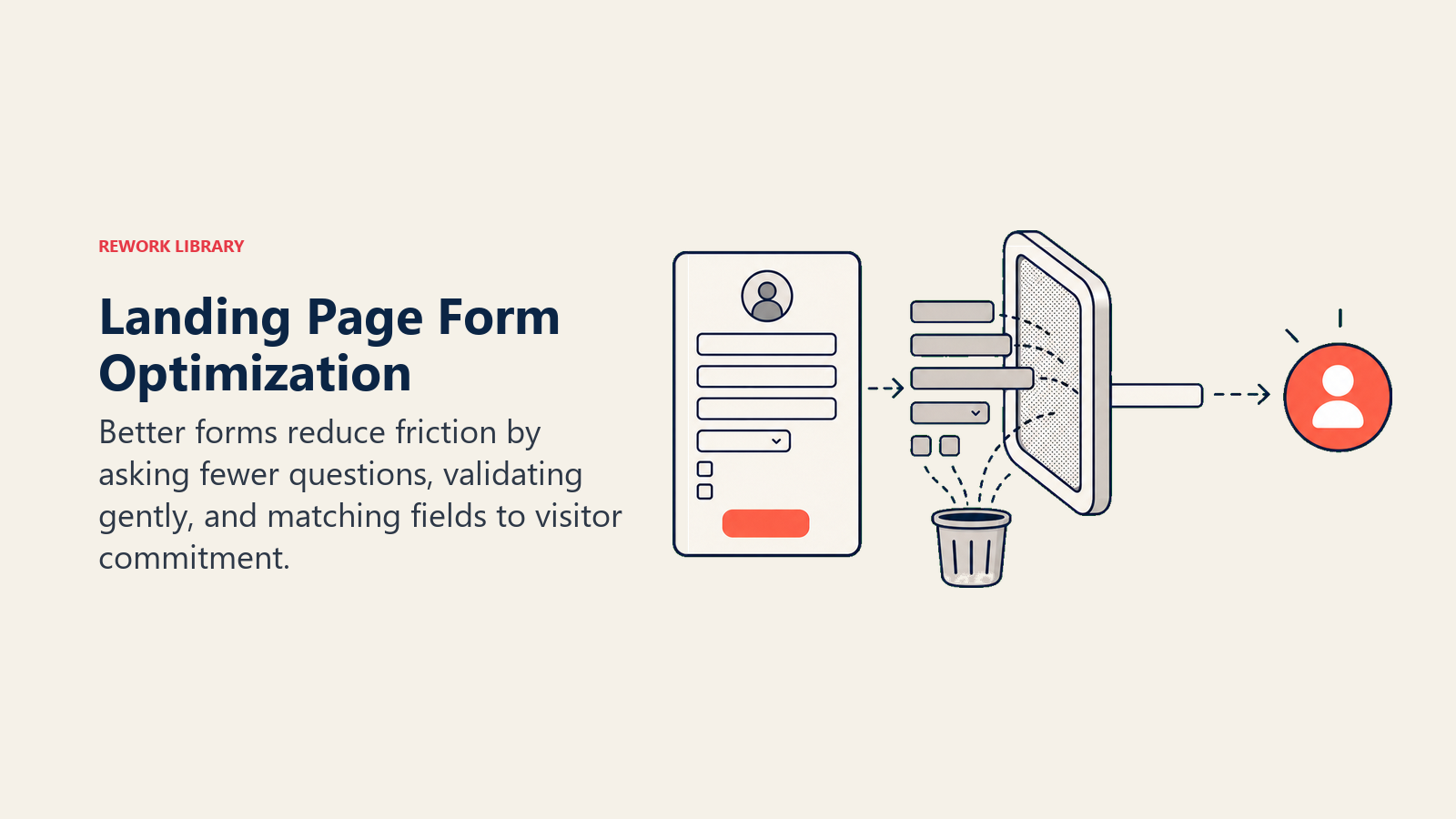
Field Count: Less Is Always More
Every field you add drops your conversion rate. That's not a maybe, it's math.
Research consistently confirms this pattern: dropping from 11 fields to 4 increased conversions by 120% in one widely cited test. Separately, Quicksprout's analysis found that reducing a form from 4 fields to 3 increases conversion rate by nearly 50%.
So why do companies still ask for everything upfront? Because they want the data. But here's the thing: you can get that data later, after someone's already a lead. Just not on the first form.
Essential fields only:
- Name (or first name only)
- That's it for top-of-funnel offers
Add one or two more for higher-commitment offers:
- Company name
- Phone (if you're calling them)
- Company size (if it determines pricing)
Everything else? Save it for later stages. You can use lead data enrichment to fill in company details automatically anyway. This approach aligns with understanding lead lifecycle stages and matching data collection to buyer readiness.
Progressive Profiling
If you've got repeat visitors, don't ask for the same info twice. Progressive profiling shows different fields based on what you already know.
First visit: Name and email Second visit: Company name and role Third visit: Team size and budget
Most marketing automation platforms handle this automatically. If you're using Rework's Webform App, this is built right in, the system remembers what it's already collected and adjusts accordingly. This technique works particularly well when combined with lead routing automation to ensure leads reach the right team members immediately.
Smart Defaults
Small details make a difference. Pre-fill country codes based on IP location. Default to the most common answer (like "Yes, I want to receive updates"). Use dropdowns for predictable answers instead of free text fields.
These tiny improvements add up. If someone can complete your form in 10 seconds instead of 30, you'll see higher completion rates. Guaranteed.
Error Handling
Nothing frustrates people more than filling out a form, hitting submit, and seeing "Error: invalid phone format" with all their info wiped out.
Do this instead:
- Validate fields as people type (show green checkmarks for correct entries)
- Keep their information if something's wrong
- Show clear error messages next to the problem field, not at the top of the page
- Don't force specific formats if you don't need to (accept "555-1234" and "5551234")
The goal is to make it impossible to fail. Guide people through it.
Mobile Optimization
Mobile drives nearly 5x more traffic than desktop on landing pages, yet desktop still converts 8% better, according to Unbounce's 2024 Conversion Benchmark Report. That gap is almost entirely fixable with better mobile form design. Your form better work on a phone.
Mobile form checklist:
- Big enough tap targets (minimum 44x44 pixels)
- No side-by-side fields (stack them vertically)
- Use mobile-friendly input types (number pad for phone numbers, email keyboard for emails)
- One-column layout
- Sticky CTA button that stays visible while scrolling
Test it yourself. Pull out your phone and try filling out your own form. If it's annoying, fix it.
Conversion Rate Optimization
You've got the basics down. Now let's make it better.
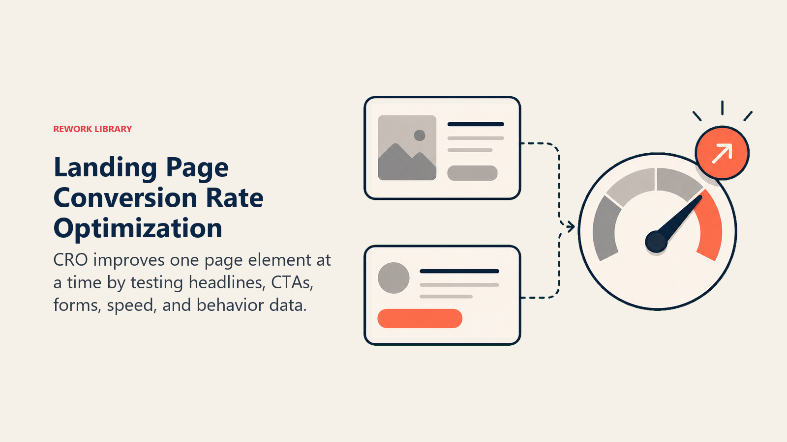
A/B Testing Strategies
Test one thing at a time. If you change your headline AND your CTA AND your form fields all at once, you won't know what worked.
High-impact elements to test:
- Headline and subheadline
- CTA button text and color
- Form length (number of fields)
- Page length (short vs. long-form)
- Social proof placement and type
Run tests until you hit statistical significance. For most B2B sites, that means at least 100 conversions per variation. Don't call a winner after 20 form fills just because variant B is up 15%. For SaaS companies, explore conversion rate optimization strategies tailored to software products.
And here's something people forget: test with your actual traffic, not some idealized version. If 70% of your visitors come from mobile, your desktop-optimized design might be killing conversions.
Heatmaps and User Behavior
Numbers tell you what's happening. Heatmaps show you why.
Look for:
- Dead zones where nobody clicks (probably need to move important elements)
- Rage clicks where people click repeatedly (usually on something that looks clickable but isn't)
- Drop-off points where people scroll to, then leave (you're losing them at that spot)
Tools like Hotjar or Microsoft Clarity (free) make this easy. You'll spot issues your analytics never show, like people trying to click on an image that's not a button, or scrolling right past your form because it blends into the background.
Load Speed Impact
If your page takes more than 3 seconds to load, you're losing leads. Portent's research across 100+ million page views found that a B2B site loading in 1 second converts at a rate 3x higher than one loading in 5 seconds, and 5x higher than one loading in 10 seconds. Separately, a 1-second delay in load time reduces conversions by approximately 7% (Aberdeen Group).
Quick fixes:
- Compress images (use WebP format when possible)
- Lazy load anything below the fold
- Minimize JavaScript that blocks rendering
- Use a CDN for faster delivery
Google's PageSpeed Insights will tell you exactly what's slowing you down. Fix the red items first.
Above-the-Fold Content
People spend 57% of their time above the fold, according to Nielsen Norman Group eye-tracking research. That first screen needs to work hard.
What should be visible without scrolling:
- Headline and value proposition
- Key benefit or unique selling point
- CTA (at least one)
- Hero image or video
What can wait:
- Detailed feature lists
- Customer logos (unless incredibly recognizable)
- Long testimonials
- Company background
The fold line varies by device, so test on different screen sizes. What's above the fold on a 27-inch monitor definitely isn't on a mobile phone.
Different Landing Page Types
Not all landing pages serve the same purpose. Here's when to use each type.
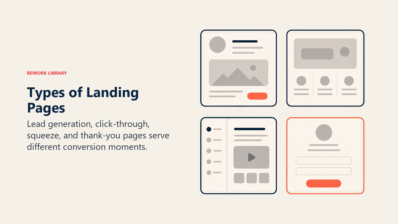
Lead Generation Pages
These are your workhorse pages. They offer something valuable (ebook, template, webinar) in exchange for contact info.
Structure:
- Problem-focused headline
- Quick explanation of what they get
- Form (short, ideally 2-3 fields)
- Benefits of the resource
- Social proof
- Privacy assurance
Best for: Top and middle-of-funnel offers, content downloads, newsletter signups. These pages work particularly well when integrated with lead nurturing programs for follow-up engagement.
Click-Through Pages
No form here. The whole page exists to warm people up before sending them to the next step (usually a checkout or detailed form).
Structure:
- Benefit-heavy headline
- Detailed explanation of value
- Visual proof (screenshots, demo video)
- Multiple CTAs leading to next page
Best for: eCommerce products, software trials, complex services. SaaS companies often use these in their demo-to-trial process to educate prospects before signup.
Squeeze Pages
Minimal design, minimal copy, maximum focus. These pages do one thing: capture an email.
Structure:
- Short headline (5-10 words)
- 1-2 sentence value prop
- Single field (email only)
- One CTA
Best for: Newsletter signups, waitlists, content upgrades. For software companies, these pages often feed into free trial optimization workflows.
Thank You Pages
People ignore these, but they're conversion opportunities too. Someone just gave you their info, they're engaged.
Structure:
- Confirm what happens next (check your email, we'll call you, etc.)
- Offer something else (related content, social follow, additional resource)
- Set expectations (when they'll hear from you)
Best for: Upselling, engagement, reducing buyer's remorse. These pages can also help set proper expectations for lead assignment SLA by telling leads exactly when they'll be contacted.
For a complete picture of how these pages fit into your broader strategy, check out lead sources overview.
Form Fields Strategy: What to Ask When
The fields you ask for should match the value you're offering and where someone is in the buying process.
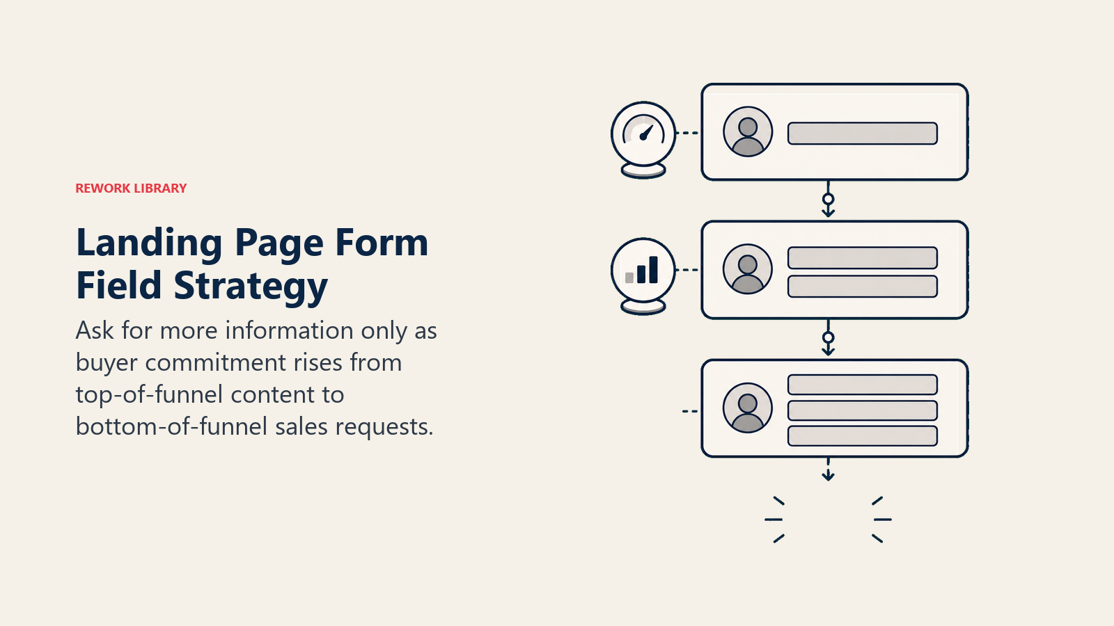
Top of Funnel (Low Commitment)
They don't know you yet. Keep it light.
Offer type: Blog subscription, downloadable template, industry report Fields to ask:
- Email (required)
- First name (optional but recommended)
That's it. Don't ask for company name, size, or role. Not yet. This minimal approach ensures you capture marketing qualified leads without creating unnecessary friction.
Middle of Funnel (Moderate Commitment)
They've engaged before or are requesting something more valuable.
Offer type: Webinar, demo video, in-depth guide Fields to ask:
- First name
- Last name
- Company name
- Job role (dropdown)
You can justify more fields here because the value is higher. But still keep it under 5 fields total. This is where understanding what is lead management becomes critical for designing your qualification process.
Bottom of Funnel (High Commitment)
They're close to buying. You need qualification info.
Offer type: Pricing quote, sales call, free trial Fields to ask:
- Full name
- Company name
- Company size (if relevant to pricing)
- Phone (if you're calling them)
- Use case or specific need (optional)
Even at this stage, don't go overboard. Eight fields maximum. Anything beyond that, save for the sales call. Use lead qualification frameworks like BANT or MEDDIC to determine which fields truly matter for your qualification process.
For more on managing these leads once they convert, see multi-channel lead capture strategies.
Benchmarks: What Good Looks Like
Benchmarks are useful only when they are interpreted by traffic source, offer type, and buyer intent.
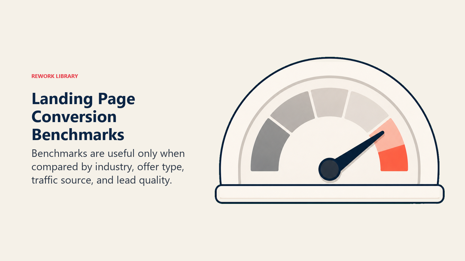
Conversion rates vary wildly by industry and offer type. Here's what to expect:
By industry (average landing page conversion rate):
- Media & Entertainment: 10-15%
- Healthcare: 7-10%
- Financial Services: 5-8%
- Education: 5-7%
- Technology/SaaS: 3-5%
- Manufacturing: 2-4%
By offer type:
- Free tool or template: 15-25%
- Webinar registration: 10-20%
- Ebook/guide download: 8-15%
- Newsletter signup: 5-10%
- Demo request: 3-8%
- Free trial: 2-5%
- Direct sales call: 1-3%
If you're below these ranges, you've got optimization work to do. If you're above them, keep doing whatever you're doing.
One more thing: conversion rate isn't everything. A 2% conversion rate on qualified enterprise leads beats a 20% conversion rate on junk leads every time. Quality matters more than quantity. Implement lead scoring systems to identify your highest-value conversions beyond just volume metrics.
To maximize lead quality from the start, explore inbound lead generation best practices.
Landing Page Conversion Checklist
Use this before launching any new landing page:
Messaging & Copy:
- Headline clearly states the benefit (not just what it is)
- Value proposition is visible in 3 seconds or less
- Benefits listed before features
- No jargon or buzzwords that confuse instead of clarify
- CTA text describes the specific action (not "Submit" or "Click Here")
Form Design:
- Field count appropriate for offer value (2-3 for top funnel, 5-6 max for bottom funnel)
- Labels clearly describe what to enter
- Required fields are marked
- Error messages are helpful, not punishing
- Mobile-friendly inputs (correct keyboard type, large tap targets)
Trust & Credibility:
- Social proof included (testimonials, customer count, ratings)
- Security/privacy assurance visible
- Professional design (no broken images, consistent fonts)
- About/contact info accessible
Technical Performance:
- Page loads in under 3 seconds
- Works on mobile (actually test it yourself)
- CTA visible above the fold on all devices
- Form submits successfully and shows confirmation
- Thank you page delivers promised resource/confirmation
Testing & Optimization:
- A/B test plan ready (what will you test first?)
- Analytics tracking installed
- Conversion goal set up in analytics
- Heatmap tool installed (optional but recommended)
- Lead distribution strategy configured to handle new conversions
What Works Right Now
Landing page "best practices" change, but a few things stay consistent:
Shorter usually wins. Unless you're selling something expensive or complex, keep the page concise. Get to the point.
Specific beats vague. "Get 47 cold email templates" performs better than "Access our template library." Numbers, deadlines, and concrete benefits convert.
Remove friction everywhere. Every extra click, field, or second of load time costs you conversions. Cut everything that isn't necessary.
Match the message. If your paid ads lead generation campaign promises one thing, your landing page better deliver on that exact promise. Mismatches kill conversions. This message consistency becomes even more critical when managing lead-to-opportunity conversion in your sales pipeline.
Test constantly. What works for someone else might not work for you. Your audience, offer, and industry all affect what converts. Test everything.
And if you're using Rework's Webform App, you've got built-in A/B testing, progressive profiling, and mobile optimization already handled. Which means less time messing with forms and more time improving your actual offer.
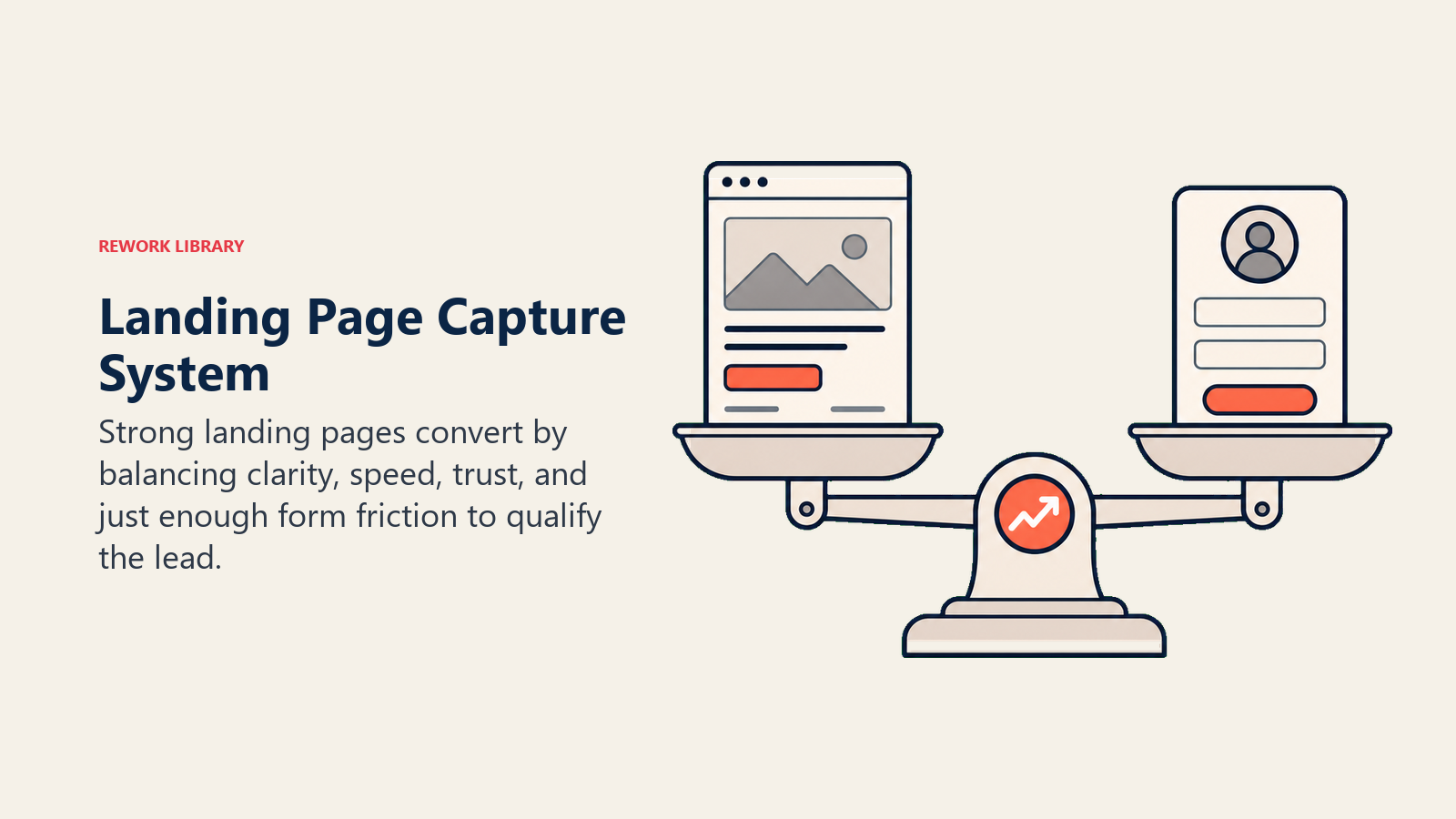
The Bottom Line
Good landing pages don't need tricks or hacks. They need clarity, speed, and the right amount of friction, just enough to qualify leads, but not so much that people give up.
Start with the basics: clear headline, obvious value, minimal form fields, fast load time. Get those right before worrying about advanced optimization tactics.
Then test. Your 5% conversion rate can probably become 7% or 8% with a few smart improvements. That's 40-60% more leads from the same traffic. Worth the effort.
And remember, the form is just the start. What you do with those leads after they convert matters just as much. Implement lead response time best practices to ensure you contact new leads within minutes, not hours. Check out lead data enrichment to see how to get more value from every contact without asking for more information upfront.
Frequently Asked Questions about Landing Pages & Web Forms
What is a good landing page conversion rate?
The median conversion rate across all industries is 6.6%, based on Unbounce's analysis of 464 million visits to 41,000+ landing pages. If you're consistently hitting 10% or above, you're in the top quartile. Rates vary significantly by offer type, webinar registration pages average 10-20%, while demo requests typically land in the 3-8% range.
How many form fields should a landing page have?
For top-of-funnel offers like content downloads, 2-3 fields is the standard, name and email at most. Research from Quicksprout shows that cutting from 4 fields to 3 can increase conversion rate by nearly 50%. Every additional field reduces your conversion rate, so only ask for information you'll actually use before the next sales touchpoint.
Does page load speed really affect lead capture?
Yes, dramatically. Portent's research across 100+ million page views found that a B2B landing page loading in 1 second converts 3x better than one loading in 5 seconds. Google's data shows that as load time goes from 1 second to 3 seconds, the probability of a mobile visitor bouncing increases by 32%. Compressing images and removing render-blocking scripts are the fastest fixes.
Why do mobile landing pages convert worse than desktop?
Mobile drives nearly 5x more traffic to landing pages but converts 8% worse than desktop, according to Unbounce's 2024 Conversion Benchmark Report. The main culprits are forms that weren't designed for touchscreens, side-by-side fields, small tap targets, and incorrect keyboard types. Mobile optimization isn't just about responsive layout; it's about rethinking the form experience entirely for a small screen.
How many landing pages should a B2B company have?
More than you probably do right now. HubSpot's research found that companies with 40 or more landing pages generate 12x more leads than those with only 1-5 pages. And companies see a 55% jump in leads when they go from 10 to 15 landing pages. Each campaign, offer, and audience segment warrants its own dedicated page rather than sending everyone to a generic homepage.
Does social proof on landing pages actually lift conversions?
Yes, specific, relevant social proof can increase conversions by up to 34%, according to data cited in multiple CRO studies. The keyword is specific: "Used by 2,400+ marketing teams" outperforms "Trusted by thousands" because it's concrete and verifiable. Testimonials from people in the same role and industry as your target visitor are the most persuasive form of social proof.
What is progressive profiling and should B2B companies use it?
Progressive profiling means showing different form fields to returning visitors based on what you already know about them, so you're never asking for the same information twice. On a first visit you capture name and email; on a second visit you ask for company name and role. This keeps individual forms short (which protects conversion rate) while building a richer lead profile over time. Most marketing automation platforms support it natively, and it's particularly effective when combined with lead data enrichment to fill gaps automatically.
Related Resources
Lead Generation Strategy:
- Lead Sources Overview - Understand all channels driving traffic to your landing pages
- Outbound Lead Generation - Complement landing pages with proactive outreach
- Event Lead Generation - Capture leads from conferences and webinars
Lead Management Operations:
- Lead Follow-Up Best Practices - Turn form fills into conversations
- Lead Status Management - Track leads through your conversion process
- Lead Data Management - Maintain clean, actionable lead records
Advanced Optimization:
- Pricing Page Optimization - For SaaS companies optimizing conversion paths
- User Activation Framework - Connect landing page conversions to product engagement
- SaaS Marketing Funnel - Build a complete acquisition and conversion system

Senior Operations & Growth Strategist
On this page
- Landing Page Fundamentals: Purpose and Psychology
- Key Elements That Actually Matter
- Headline and Value Proposition
- Hero Image or Video
- Benefits vs. Features
- Social Proof and Trust Signals
- Call-to-Action (CTA)
- Form Placement and Design
- Form Optimization: Getting It Right
- Field Count: Less Is Always More
- Progressive Profiling
- Smart Defaults
- Error Handling
- Mobile Optimization
- Conversion Rate Optimization
- A/B Testing Strategies
- Heatmaps and User Behavior
- Load Speed Impact
- Above-the-Fold Content
- Different Landing Page Types
- Lead Generation Pages
- Click-Through Pages
- Squeeze Pages
- Thank You Pages
- Form Fields Strategy: What to Ask When
- Top of Funnel (Low Commitment)
- Middle of Funnel (Moderate Commitment)
- Bottom of Funnel (High Commitment)
- Benchmarks: What Good Looks Like
- Landing Page Conversion Checklist
- What Works Right Now
- The Bottom Line
- Related Resources