Burndown Chart: 読み方と活用法
Turn this article into takeaways for your work.
Each assistant summarizes the article only for you and suggests best practices for your work.
Burndown ChartはScrumチームが毎朝確認すべき最も有益なシグナルのひとつです。一目見るだけで、Sprintが順調か、遅延しているか、あるいは誰も計画しなかったスコープが静かに膨らんでいるかがわかります。
重要なデータ
- Burndown ChartはKen Schwaberの2000年論文でScrumプロセスマネジメントとして紹介されて以来、最も活用されているScrumのアーティファクトです(Scrum Alliance、2023年)。
- 毎日Burndownを更新するチームは、週次更新のチームより17%優れたSprint目標達成率を報告しています(State of Agile Report 17版、2024年)。
- 「理想」のBurndown線は均一な日次進捗を前提としますが、実際のSprintでは**約60%のケースでJ字曲線(後半に集中した納品)**を示します(Atlassian Community調査、2023年)。
Burndown Chartとは何か
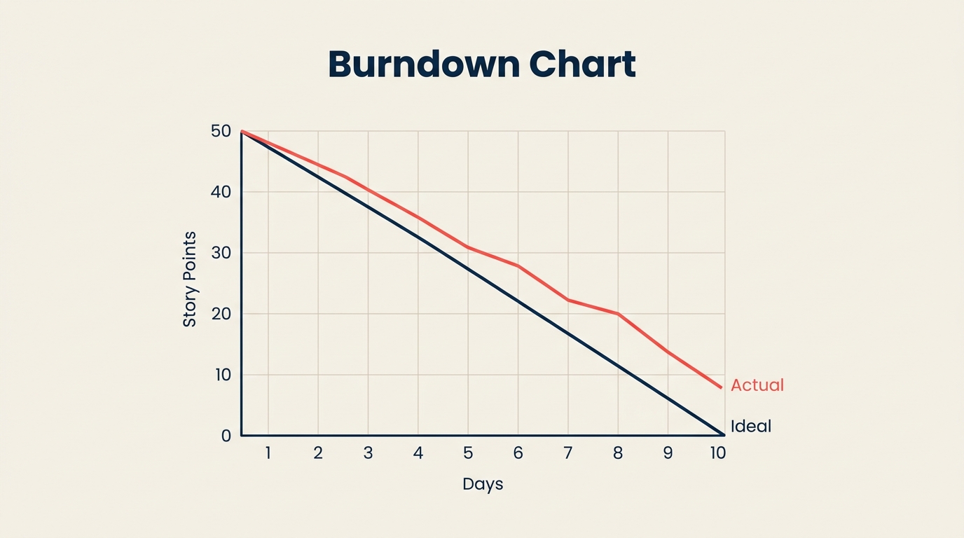
Burndown Chartは、Sprintまたはプロジェクトにおいてどれだけの作業が残っているかを、締め切りまでに0になることを目標として追跡するグラフです。横軸は時間(日、Sprint、週)、縦軸は残作業量(Story Point、時間、またはタスク数)を示します。チームが作業を完了するにつれて、線は0へと「燃え尽きて」いきます。
Burndown ChartはScrumのツールセットに属しますが、他のAgileメソドロジーを使うチームも採用しています。シンプルさが最大の魅力です。タスクごとに多くの指標を解釈する必要はありません。2本の線がすべてを物語ります。
このチャートは、タスクを日程にマッピングするGanttチャートや、タスクの依存関係に注目するPERTチャートとは異なります。Burndown Chartは個々のタスクを気にしません。残作業量はどれくらいあるか、そしてその数字は十分な速さで減っているか、という1つの問いだけを追います。
Burndown Chartの仕組み(2本の線)
すべてのBurndown Chartには2本の線があります。
理想線(参照線またはガイドライン)は、左上隅から右下隅へと直線で走ります。Sprint全体のコミットメント(例: Day 0に80 Story Point)から始まり、最終日の0で終わります。この線は毎日均一なペースで作業を消化することを前提としています。実際にそうなることは誰も期待していません。理想線は予測ではなく参照点として存在します。
実績線は、毎日記録される実際の残作業量を表します。毎日のStand-upまたは各稼働日の終わりに更新されます。この線が理想線の上にある場合、チームは遅れています。下にある場合、チームは先行しています。平坦になる(下降がない)場合、作業が完了していないか、記録されていません。上に跳ね上がる場合、新しいスコープがSprintに追加されたことを意味します。
軸の説明:
- X軸: Sprint日数(0日目または1日目から最終日まで)
- Y軸: 残作業量(Story PointまたはTimeで計測)
Y軸の開始値はSprint全体のコミットメントと同じです。Y軸の0はSprintが完了したことを意味します。
Sprint Burndown対Release Burndown
チームが使う主なバリエーションは2つあります。それぞれが異なる問いに答え、異なる対象者にサービスします。
| Sprint Burndown | Release Burndown | |
|---|---|---|
| スコープ | 1Sprint(1〜4週間) | Releaseに向けた複数のSprint |
| Y軸の単位 | Story PointまたはTimeI | Story、Feature、またはEpic |
| X軸の単位 | Sprint内の日数 | 残りSprint数 |
| 主な対象者 | 開発チーム + Scrum Master | Product Owner + ステークホルダー |
| 更新頻度 | 毎日 | 各Sprintの終わりに |
| 主な問い | このSprintを終わらせられるか? | Releaseの締め切りに間に合うか? |
| 警告シグナル | 平坦な線、上方スパイク | BacklogのGrowthに対するburn rateの遅さ |
多くのチームはSprint Burndownから始めます。Release Burndownは、信頼できるVelocityを予測できるSprint実績が十分に蓄積されてから価値を発揮します。どちらも作業分解構成図やプロジェクトライフサイクルの計画ドキュメントと並んで活用されます。
Burndown Chartの読み方(4つのパターン)
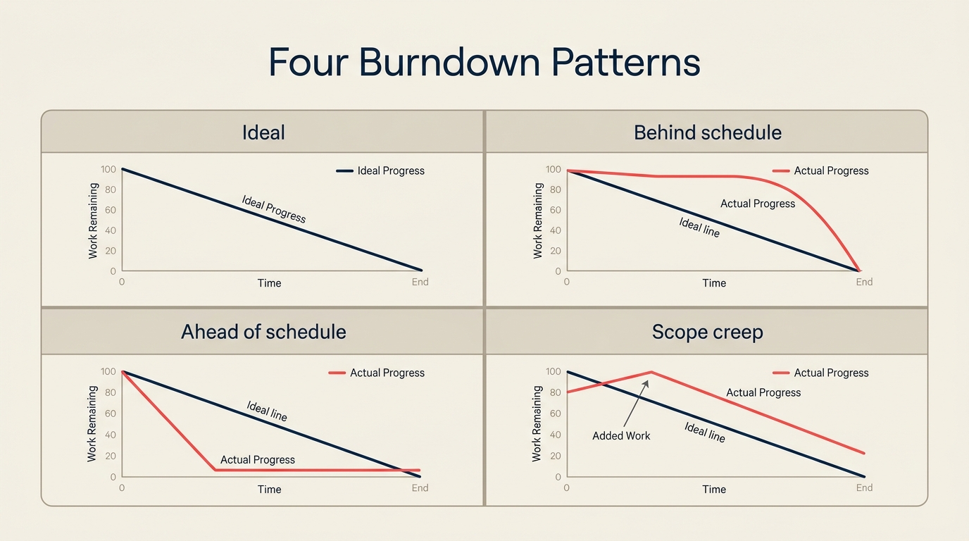
Burndown Chartを読む力は、4つのよく見られる形を認識することで身につきます。それぞれがSprintの健全性について異なるストーリーを語ります。
パターン1: 理想通りに進行中
実績線は理想線の近くを推移し、若干上下しますが大きく外れません。これは健全なSprint実行の姿です。すべてが完璧という意味ではありません。障害が速やかに解消され、チームの見積もりが妥当だったことを意味します。
パターン2: 遅れている
実績線が理想線を継続的に上回ります。2本の線の差は日を追うごとに広がります。10日間のSprintの5日目に、50%が期待されるのに20%しか消化できていない可能性があります。このパターンは毎日のStand-upで即座に対話を促します。よくある原因は、StoryがUnderestimatedだった、チームメンバーがブロックされている、またはSprintが最初からオーバーコミットだったということです。
パターン3: 先行している
実績線が理想線を下回り、そのまま推移します。チームは計画より速く消化しています。よさそうに聞こえますが、なぜかを問う価値があります。Storyがオーバーestimatedだったか(VelocityのMetricsを歪める)、チームが品質を犠牲にしているかです。見積もりが単に保守的だった場合は、チームはBacklogからStoryをPull-inしてモメンタムを維持できます。
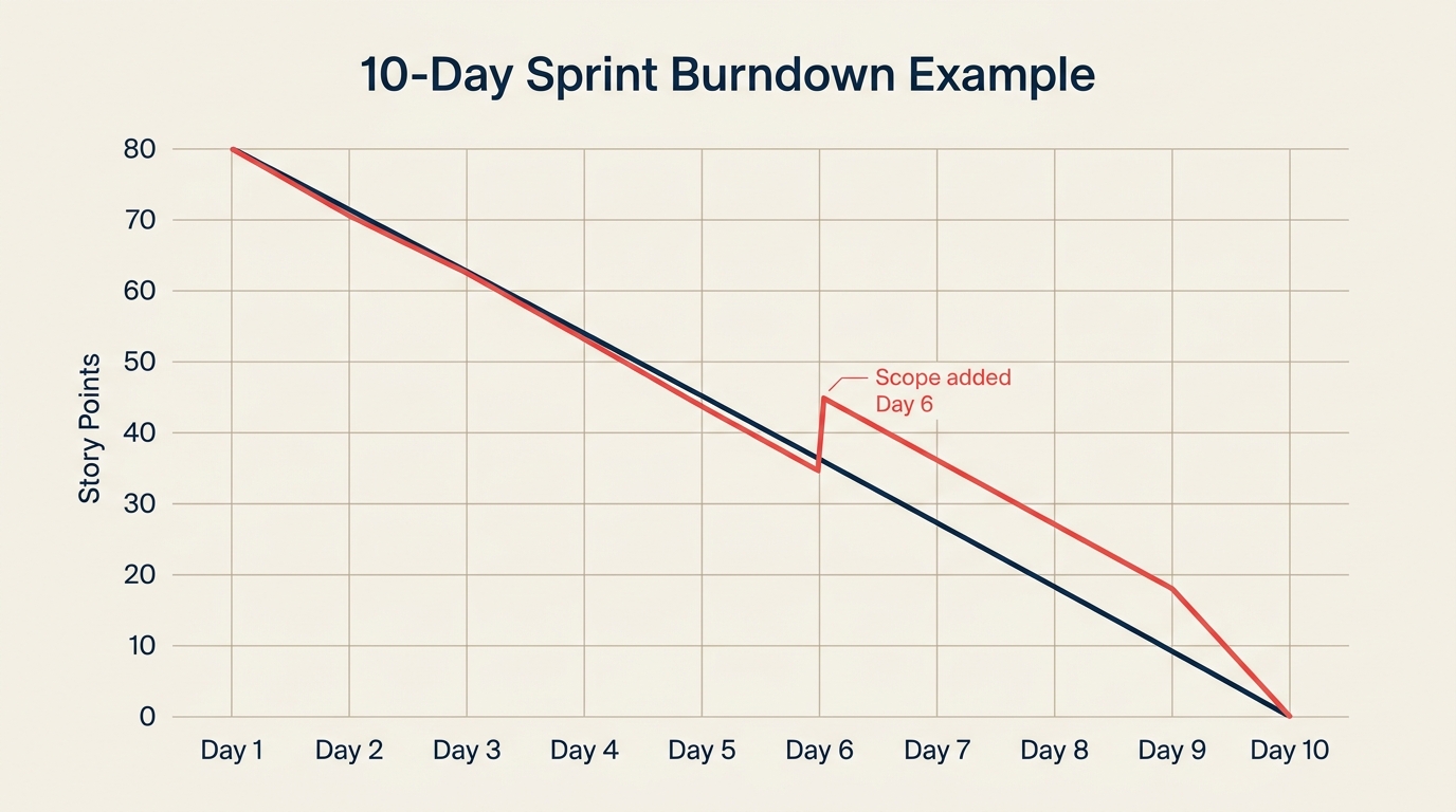
パターン4: スコープクリープ
Sprint途中で実績線が突然、下降ではなく上方に跳ね上がります。このスパイクはSprintが始まってから新しい作業が追加されたことを意味します。緊急の修正に対する小さな膨らみは許容範囲かもしれません。大きなまたは繰り返されるスパイクは、Sprint Planningの不十分さや、交渉なしにSprint途中の要求を受け入れるプレッシャーを示しています。Scrum vs Kanbanの原則と比較すると: KanbanはサイクルのMid-changeを明示的に許容しますが、ScrumはSprintの安定性を目指します。
Burndown Chartの作り方: ステップバイステップ
ステップ1: Sprintデータを収集する
チャートに触れる前に、2つの数値を集めます。Sprintにコミットした合計Story Point(または時間)と、Sprintの稼働日数。これがスタートポイントとエンドポイントを定義します。両方をSprint Planningのノートに記録しておきましょう。
ステップ2: 軸を設定する
チャートをX軸に日数(0日目から最終日)、Y軸に残作業量(0から合計コミットメント)で描くか設定します。両軸に明確なラベルを付けます。スプレッドシートで作成する場合は、Sprintが進むにつれても見えるようにヘッダー行と日付列を固定しましょう。
ステップ3: 理想線を描く
2点を結びます: (0日目、合計コミットメント)と(最終日、0)。この直線が参照線です。スプレッドシートでは、簡単なSLOPE式でこれが処理できます。JiraやAzure DevOpsでは、Sprint日程とStory Pointの合計を設定するとツールが自動的に描画します。
ステップ4: 毎日実績作業を記録する
各稼働日の終わり(またはStand-upの際)に、残Story Pointを記録します。「残」とはすべての未完了Storyのtory Pointの合計を意味します。進行中のStoryに部分点を与えないでください。Storyは完了か未完了かのどちらかです。この二値ルールはチャートを正直に保ち、偽の進捗シグナルを避けます。
ステップ5: 解釈して行動する
チャートを更新して終わりにしないでください。各日のデータポイントは対話のきっかけです。実績線が理想線を上回っていますか?チームを阻んでいるものは何ですか?あるStoryが見積もりより時間がかかっていますか?それらのStoryをさらに細分化する必要がありますか?Burndown Chartは報告だけでなく、具体的な行動を促すときに最も有益です。
チームタイプ別のBurndown Chart例
チームタイプによってBurndown Chartの使い方は若干異なります。コアのメカニズムは同じです。Sprint期間、Story Pointのスケール、更新のリズムはチームのサイズとワークフローに応じて変わります。
| チームタイプ | Sprint期間 | Y軸の単位 | 典型的なパターン | よくある課題 |
|---|---|---|---|---|
| エンジニアリング(プロダクト) | 2週間 | Story Point | バックロードな納品 | 最後の2日間でStoryが完了 |
| マーケティングキャンペーン | 1週間 | タスク数 | 平坦から急勾配 | 3日目まで承認が作業を阻む |
| デザイン | 2週間 | 時間 | 理想に近く推移 | ステークホルダーのレビューが遅れるとスコープクリープ |
| サポート / オペレーション | 1週間 | チケット数 | 理想より先行 | チケットが見積もりより速く解決 |
エンジニアリングチームは最も多くJ字曲線パターンを示します。前半でゆっくり消化し、統合やレビュー作業が収束する後半で急速に完了します。マーケティングチームは承認待ちで作業が滞るため、Sprint中盤で平坦な線を示す傾向があります。デザインチームはSprint Ceremoniesが尊重されている場合は理想に最も近く推移しますが、ステークホルダーのレビューが遅れるとスコープクリープの影響を最も受けます。
BurndownとBurnupの違い
BurndownとBurnupは近い関係にありますが、少し異なる問いに答えます。
Burndown Chartは残作業量を追跡します。線は高い値から0へと動きます。焦点は残っているものです。
Burnup Chartは完了した作業を追跡します。線は0から上へと動きます。第2の線が合計スコープを示します。2本の線の差が残作業量を示します。
Burnup Chartの主な優位性はスコープ変更の透明性です。新しいStoryが追加されると、合計スコープの線が上がり、追加された作業と当初コミットメントへの進捗の両方が誰にでも見えます。Burndown Chartではスコープ追加が上方スパイクとして現れ、一目で解釈しにくいことがあります。
多くのScrumチームは、シンプルなためBurndown Chartから始めます。スコープ変更が頻繁なチームは、「どれだけやったか?」という問いと「どれだけ追加されたか?」という問いを切り離せるため、Burnup Chartに切り替えることが多いです。Sprint Reviewの際に両者を並べて表示するチームもいます。
よくある間違いと対策
| 間違い | 対策 |
|---|---|
| 進行中のStoryを部分完了として計上する | 完了か未完了かの二値を使う。部分点なし。 |
| 毎日でなく週1回更新する | 毎日のStand-upで更新する。古いデータは問題を隠す。 |
| スコープ追加後にチャートをリセットしてスパイクを見えなくする | スパイクをそのまま表示する。それは情報であり、恥ずかしいことではない。 |
| チャートの形が悪いことでチームを責める | チャートを使って組織的な原因を探す、個人の責任追及ではなく。 |
| 理想線を下回ることを純粋に良いニュースとして扱う | Storyがオーバーestimatedだったか、品質が犠牲になっていないかを問う。 |
| Sprintがうまくいっていないときにチャートをスキップする | 状況が厳しいSprintこそ、チャートが最も重要な場面です。 |
| 異なる単位(一部のStoryには時間、他のStoryにはPointを使う)を混在させる | 1つの単位を選んでSprint全体で一貫して使う。 |
ベストプラクティス
- 毎日同じ時間にチャートを更新する。 朝のStand-upはチーム全員が更新直後にブロッカーについて話し合えるため効果的です。タイミングより一貫性の方が重要です。
- 常に理想線を見えるようにする。 実績線が乖離しても隠さないでください。その乖離こそがポイントです。
- チームが見られる場所にチャートを表示する。 共有Dashboardやチームの作業スペースのスクリーンに表示することで、余計な確認作業なくSprintの状況が常に意識に入ります。
- Y軸の合計コミットメントを調整せずにSprintにStoryを追加しない。 新しい作業がSprintに入ったら、Y軸の開始点に新しい合計を反映させましょう。そうしなければチャートは残作業量を過小評価します。
- Stand-upだけでなくRetrospectiveでもチャートを使う。 最終的なBurndownの形はRetrospectiveの豊かなきっかけになります。継続的に平坦から急勾配のパターンが見られる場合、Sprint Ceremoniesの改善が必要か、Storyが大きすぎる可能性を示しているかもしれません。
- 時系列のVelocity Chartと組み合わせる。 1回のSprintのBurndownは現在の健全性を示します。5〜6回のSprintにわたるVelocityはチームが改善しているか、停滞しているか、低下しているかを明らかにします。
- Storyの粒度を一定に保つ。 8 Story Pointを超えるStoryは均一にburnしにくいです。分割しましょう。大きなStoryはチャートに人工的な平坦さを生み、突然「完了」になります。
- Burndown Chartを個人評価に使わない。 チームレベルの進捗を反映しています。「貢献していない」個人を見つけるためにチャートを使うのはデータの誤読であり、信頼を損ないます。
よくある質問
Burndown Chartの平坦な線は何を意味しますか?
平坦な線は、少なくとも記録された内容によれば、その期間に作業が完了しなかったことを意味します。最も一般的な原因は: 作業は完了しているがStoryがトラッキングシステムでCloseされていない、チームが依存関係や不足している入力によってブロックされている、または作業がReviewで滞ってDefinition of Doneをクリアしていないことです。チームが作業をやめたと決めつける前に、まずトラッキングシステムを確認しましょう。
理想のBurndown線とは何ですか?
理想線は、0日目の合計Sprint コミットメントから最終日の0まで走る直線の対角線です。毎日均一な進捗を表します。実際のSprintがこうなることはなく、それでも問題ありません。実際の進捗が理論的な基準からどれだけ外れているかをチームが確認できるよう、参照点として存在します。
BurndownとVelocityの違いは何ですか?
Burndown Chartは1つのSprint内の残作業量を示します。Velocityはチームが複数のSprintで完了したStory Pointの数を測定し、通常は直近3〜5回の平均です。BurndownはSprint内のシグナルです。VelocityはSprint間のトレンドです。Sprint Planningにはどちらも重要で、Velocityはコミット量を、Burndownはそのコミットメントを達成しているかを示します。
Story PointとTimeのどちらを使うべきですか?
どちらでも機能します。Story Pointは個人のスキル差を抽象化し、相対的な複雑さに注目するため、プロダクトエンジニアリングチームでより一般的です。Timeは、サポートやデザインのような高度に予測可能なタスクタイプを持つチームに有効です。最重要ルールは一貫性です。チームで1つの単位を選び、プロジェクト途中で切り替えないでください。切り替えると、チャートを経時的に比較することができなくなります。
Burndown Chartはどのくらいの頻度で更新すべきですか?
毎日が標準です。毎日のStand-upまたは終業時に更新することで、問題を早期に発見するのに十分な精度を保てます。週次更新では1週間分のリスクが見えなくなります。高リスクなSprintでは1日2回更新するチームもありますが、多くの状況では毎日で十分です。
Burndown Chartは現実を素早く表面化させるから機能します。毎朝Burndownを確認するチームは、状況が悪いSprintをいつまでも隠しておくことができません。その可視性こそが有用な理由です。Scrumを使っていても、Kanbanを試みていても、クリティカルパス法で複合手法のプロジェクトを管理していても、Burndown Chartは進捗についてクリアで正直な1つの視点を提供します。今日から追跡を始めれば、チームが毎朝最初に確認するものになるでしょう。

Senior Operations & Growth Strategist
On this page
- Burndown Chartとは何か
- Burndown Chartの仕組み(2本の線)
- Sprint Burndown対Release Burndown
- Burndown Chartの読み方(4つのパターン)
- パターン1: 理想通りに進行中
- パターン2: 遅れている
- パターン3: 先行している
- パターン4: スコープクリープ
- Burndown Chartの作り方: ステップバイステップ
- ステップ1: Sprintデータを収集する
- ステップ2: 軸を設定する
- ステップ3: 理想線を描く
- ステップ4: 毎日実績作業を記録する
- ステップ5: 解釈して行動する
- チームタイプ別のBurndown Chart例
- BurndownとBurnupの違い
- よくある間違いと対策
- ベストプラクティス
- よくある質問