Bahasa Indonesia
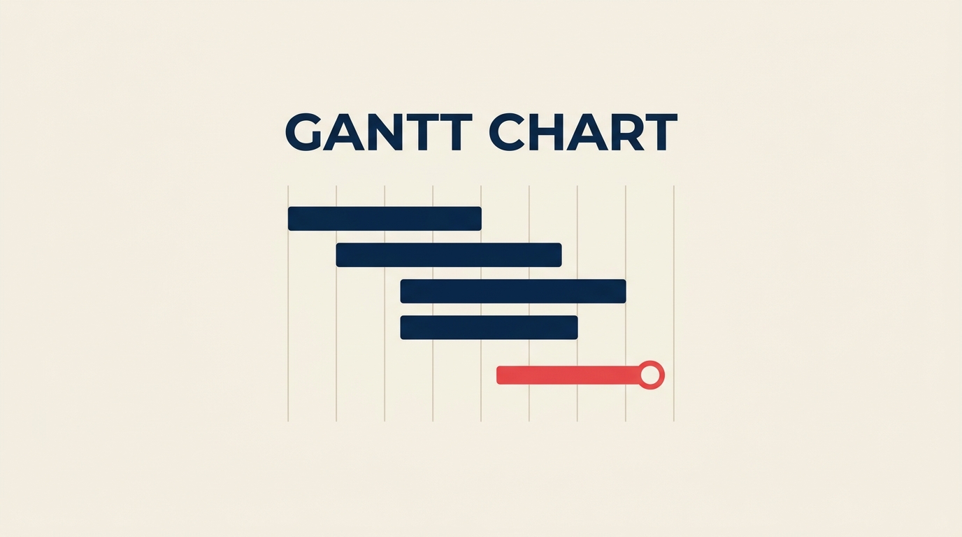
Gantt Chart: Apa Itu dan Cara Membuatnya (Beserta Contoh)
Turn this article into takeaways for your work.
Each assistant summarizes the article only for you and suggests best practices for your work.
Gantt chart adalah salah satu alat yang paling banyak digunakan dalam manajemen proyek, memberikan tim gambaran visual tentang setiap tugas, tenggat waktu, dan ketergantungan dalam satu timeline. Jika proyek Anda secara teratur meleset, melewati handoffs, atau membuat anggota tim bingung tentang apa yang akan datang, Gantt chart yang dibangun dengan baik sering kali menjadi solusi tercepat.
Apa itu Gantt chart?
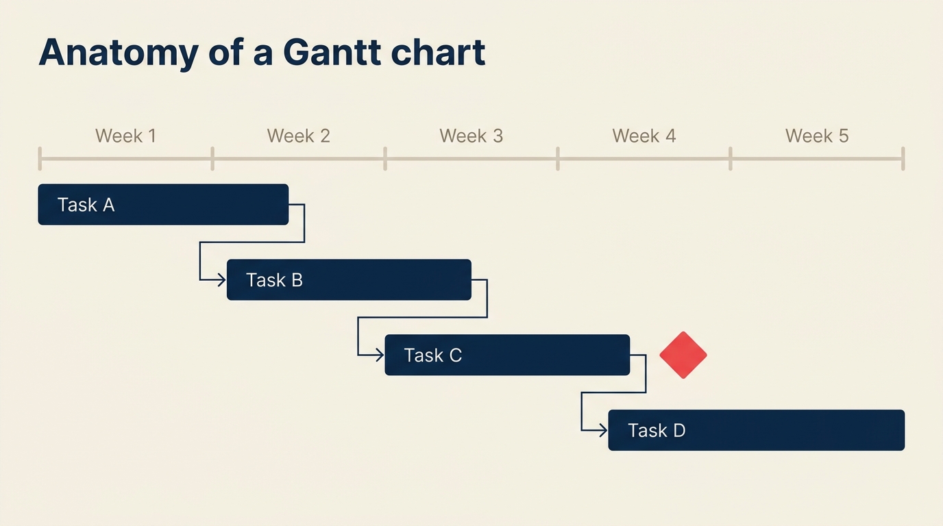
Gantt chart adalah diagram batang horizontal yang memetakan tugas-tugas proyek terhadap sumbu waktu, menunjukkan kapan setiap tugas dimulai, berapa lama berjalan, dan bagaimana tugas-tugas saling berhubungan melalui ketergantungan. Setiap batang mewakili satu tugas; panjang batang sama dengan durasi tugas; dan panah atau garis penghubung antar batang menunjukkan tugas mana yang harus selesai sebelum yang lain dapat dimulai.
Alat ini dinamai berdasarkan Henry Gantt, seorang insinyur mekanik Amerika yang mempopulerkan format ini pada 1910-an untuk penjadwalan pabrik. Yang jarang disebutkan adalah Karol Adamiecki, seorang insinyur Polandia yang secara independen mengembangkan "harmonogram" yang hampir identik pada 1896. Publikasi Gantt yang lebih luas di pasar berbahasa Inggris memberikan nama abadinya pada chart tersebut.
Saat ini, Gantt chart muncul dalam konstruksi, pengembangan perangkat lunak, marketing, layanan kesehatan, dan hampir setiap industri yang menjalankan proyek multi-langkah. Gantt chart bekerja pada skala apa pun, dari tim tiga orang yang merencanakan peluncuran website hingga kantor program yang mengkoordinasikan ratusan alur kerja.
Fakta Utama
Fakta Utama: Gantt Chart dan Visualisasi Proyek
- PMI Pulse of the Profession 2023 menemukan bahwa organisasi yang menggunakan alat visualisasi proyek formal menyelesaikan jauh lebih banyak proyek tepat waktu dan sesuai anggaran dibandingkan yang tidak. (PMI, Pulse of the Profession 2023)
- Gartner memperkirakan pasar perangkat lunak manajemen proyek global akan melampaui $9,8 miliar pada 2027, didorong terutama oleh permintaan fitur perencanaan visual. (Gartner, 2024)
- Laporan Wellingtone State of Project Management 2024 menemukan bahwa 55% organisasi masih mengandalkan spreadsheet untuk mengelola proyek, meskipun alat khusus sudah tersedia luas. (Wellingtone, 2024)
Gantt chart vs Kanban vs PERT vs diagram jaringan
| Alat | Terbaik untuk | Sumbu waktu | Menampilkan ketergantungan | Upaya untuk membangun |
|---|---|---|---|---|
| Gantt chart | Proyek terjadwal dengan tenggat waktu | Ya (tanggal kalender) | Ya (garis penghubung) | Sedang |
| Papan Kanban | Aliran berkelanjutan, antrean dukungan | Tidak | Tidak | Rendah |
| PERT chart | Estimasi awal dalam kondisi ketidakpastian | Tidak (urutan saja) | Ya (panah) | Tinggi |
| Diagram jaringan (CPM) | Menemukan jalur kritis dalam pembangunan kompleks | Tidak | Ya | Tinggi |
Kapan Gantt chart unggul. Pilih Gantt chart ketika Anda memiliki tanggal mulai yang pasti, tenggat waktu yang tetap, dan tugas-tugas yang harus terjadi dalam urutan tertentu. Peluncuran produk perangkat lunak, pembangunan konstruksi, dan kampanye marketing semuanya cocok dengan pola ini. Sumbu waktu membuat tim tetap terpaku pada kalender daripada hanya urutan alur kerja.
Kapan Kanban lebih unggul. Jika pekerjaan datang secara tak terduga atau Backlog tidak pernah benar-benar berakhir, papan Kanban mengalahkan Gantt chart karena berfokus pada throughput, bukan jadwal. Meja bantuan dan tim customer success biasanya mendapat lebih banyak manfaat dari Kanban daripada Gantt chart.
Kapan PERT atau CPM lebih unggul. Untuk proyek yang padat riset di mana Anda benar-benar tidak tahu berapa lama tugas akan berlangsung, estimasi tiga titik PERT (optimis, paling mungkin, pesimis) memberikan timeline yang lebih jujur. Diagram jaringan berpasangan dengan baik dengan PERT ketika Anda perlu mengungkap jalur kritis sebelum berkomitmen pada jadwal.
Manfaat menggunakan Gantt chart
- Visibilitas bersama di seluruh tim. Semua orang mulai dari sponsor hingga analis junior dapat melihat timeline yang sama sekilas. Tidak perlu membaca rencana proyek 40 halaman untuk memahami apa yang terjadi minggu ini.
- Manajemen ketergantungan. Garis penghubung memperlihatkan dengan jelas bahwa Sprint desain tidak dapat dimulai sampai fase discovery selesai. Ini mencegah situasi umum di mana tim hilir menunggu sementara tim hulu bahkan tidak tahu bahwa mereka memblokir siapa pun.
- Peringatan dini tentang keterlambatan. Ketika batang tugas bergeser ke kanan, setiap batang hilir ikut bergeser bersamanya. Gantt chart membuat efek domino dari keterlambatan terlihat segera, bukan setelah tenggat waktu terlewati.
- Pelacakan Milestone. Titik pengiriman kritis, seperti persetujuan klien atau pengajuan regulasi, muncul sebagai penanda yang berbeda pada timeline. Pemangku kepentingan dapat melihat dalam hitungan detik apakah proyek berada di jalur untuk hal yang paling penting.
- Visibilitas beban sumber daya. Sebagian besar alat Gantt modern memungkinkan Anda menugaskan pemilik untuk setiap batang. Melihat ke bawah kolom nama memberi tahu Anda secara instan apakah satu orang dijadwalkan untuk enam tugas paralel sementara yang lain tidak memiliki apa pun.
- Perbandingan baseline. Setelah Anda mengunci rencana asli, setiap perubahan di masa depan ditampilkan sebagai varians terhadap baseline. Jejak audit itu sangat berharga untuk retrospective proyek dan sengketa penagihan klien.
Keterbatasan dan kesalahan umum
- Gantt chart cepat usang. Chart yang tidak diperbarui setidaknya mingguan menjadi menyesatkan. Tim yang memperlakukannya sebagai dokumen statis, dibuat sekali kemudian ditinggalkan, tidak mendapat manfaat apa pun dan hanya mendapat kepercayaan diri yang salah.
- Presisi palsu dengan horizon waktu yang panjang. Gantt chart 12 bulan dengan tugas yang dijadwalkan per hari hampir selalu salah pada minggu keenam. Penjadwalan terperinci bekerja untuk jangka pendek (empat hingga delapan minggu ke depan); gunakan Milestone dan fase untuk setelah itu.
- Tidak menampilkan "mengapa" di balik keputusan. Gantt chart mencatat apa dan kapan, tetapi tidak mengapa sebuah tugas ada, seperti apa "selesai" itu, atau asumsi yang tertanam dalam estimasi. Pasangkan dengan dokumen ruang lingkup dan prosedur operasional standar.
- Kerumitan berlebihan membunuh adopsi. Chart dengan 200 tugas dan tiga tingkat pengelompokan tidak bisa dibaca di layar laptop. Jika orang berhenti melihatnya, itu berhenti bekerja. Pertahankan chart pada tingkat ringkasan dan tautkan ke daftar tugas terperinci di tempat lain.
- Mengabaikan jalur kritis. Manajer sering berfokus pada batang terpanjang daripada jalur dengan float nol. Melewatkan tugas tiga hari tanpa float menggagalkan tenggat waktu sama pastinya dengan melewatkan tugas tiga minggu.
Cara membangun Gantt chart dalam 6 langkah
Langkah 1: Daftar tugas-tugas Anda
Mulailah dengan struktur rincian kerja. Tuliskan setiap hasil kerja, kemudian urai masing-masing menjadi tugas-tugas yang diperlukan untuk menghasilkannya. Pertahankan tugas pada tingkat di mana satu orang memilikinya dan dapat diselesaikan dalam satu hingga sepuluh hari kerja. Tugas yang berlangsung berbulan-bulan sebenarnya adalah fase; tugas yang membutuhkan waktu berjam-jam termasuk dalam daftar periksa, bukan chart.
Langkah 2: Estimasi durasi tugas
Untuk setiap tugas, estimasi durasi hari kerja. Gunakan data historis dari proyek serupa yang lalu jika memungkinkan. Jika Anda mengestimasi tanpa referensi, dapatkan masukan dari orang yang mengerjakan pekerjaan tersebut daripada orang yang mengelolanya. Bangun kontingensi ke dalam jadwal pada tingkat fase, bukan dengan menambahkan padding pada setiap tugas individual.
Langkah 3: Identifikasi ketergantungan
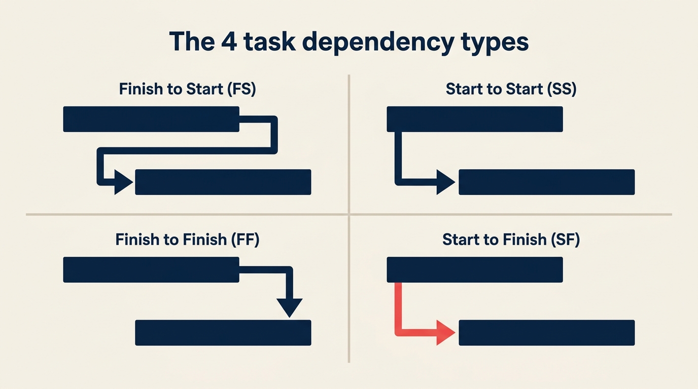
Petakan hubungan finish-to-start, start-to-start, finish-to-finish, dan start-to-finish antar tugas.
- Finish-to-start (FS): Tugas B tidak bisa dimulai sampai Tugas A selesai. Jenis yang paling umum.
- Start-to-start (SS): Tugas B bisa dimulai setelah Tugas A dimulai (sering digunakan untuk peningkatan paralel).
- Finish-to-finish (FF): Tugas B tidak bisa selesai sampai Tugas A selesai (tinjauan kualitas selesai bersamaan dengan pengujian, misalnya).
- Start-to-finish (SF): Tugas B tidak bisa selesai sampai Tugas A dimulai. Jarang, kebanyakan digunakan dalam serah terima giliran kerja.
Dokumentasikan ketergantungan Anda sebelum menyentuh alat chart. Jauh lebih cepat untuk menghubungkannya ketika Anda sudah mengetahui hubungannya daripada mencari tahu di dalam perangkat lunak.
Langkah 4: Tambahkan sumber daya dan pemilik
Tugaskan seseorang (atau peran) untuk setiap tugas. Periksa jadwal yang dihasilkan untuk konflik sumber daya: jika orang yang sama muncul di tiga batang yang bersamaan, ada sesuatu yang perlu digeser. Langkah ini adalah tempat di mana banyak rencana proyek pertama kali bersentuhan dengan realita.
Langkah 5: Plot timeline dan Milestone
Tempatkan setiap batang tugas pada sumbu waktu menggunakan tanggal mulai, durasi, dan ketergantungannya. Tambahkan penanda Milestone pada gerbang pengiriman kunci: persetujuan desain, tinjauan pemangku kepentingan, go-live, pengajuan regulasi, apa pun yang paling penting bagi proyek. Milestone memiliki durasi nol; itu adalah titik dalam waktu, bukan rentang.
Pada tahap ini, periksa jalur kritis. Urutan tugas dengan float nol menentukan tanggal penyelesaian paling awal yang mungkin. Setiap penundaan pada jalur tersebut menunda seluruh proyek, tanpa pengecualian.
Langkah 6: Tinjau, baseline, dan perbarui
Tunjukkan chart kepada seluruh tim sebelum menyebutnya final. Orang sering menemukan tugas yang hilang, durasi yang tidak realistis, atau kesalahan ketergantungan yang dilewatkan PM. Setelah semua orang setuju, kunci baseline. Potret yang dibekukan itu menjadi titik referensi untuk setiap percakapan status di masa depan.
Kemudian perbarui chart pada jadwal yang teratur, setidaknya mingguan pada proyek yang bergerak cepat, dua mingguan pada yang lebih lambat. Menandai kemajuan aktual terhadap yang direncanakan adalah yang mengubah Gantt chart dari artefak perencanaan menjadi alat manajemen yang hidup.
Contoh Gantt chart berdasarkan kasus penggunaan
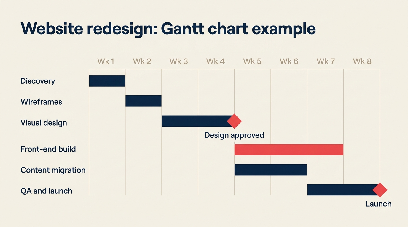
Redesain website
| Tugas | Pemilik | Mulai | Selesai | Ketergantungan | % Selesai |
|---|---|---|---|---|---|
| Discovery dan wawancara pemangku kepentingan | UX Lead | Mg 1 | Mg 1 | Tidak ada | 100% |
| Wireframes dan arsitektur informasi | UX Lead | Mg 2 | Mg 3 | Discovery | 100% |
| Desain visual dan penerapan merek | Designer | Mg 3 | Mg 4 | Wireframes (FS) | 60% |
| Pengembangan front-end | Dev Lead | Mg 4 | Mg 6 | Desain visual (FS) | 0% |
| Migrasi konten | Content Mgr | Mg 5 | Mg 7 | Front-end (SS) | 0% |
| Pengujian QA dan perbaikan bug | QA Engineer | Mg 7 | Mg 7 | Front-end, Konten | 0% |
| Peluncuran | PM | Mg 8 | Mg 8 | Persetujuan QA | 0% |
Peluncuran kampanye marketing
| Tugas | Pemilik | Mulai | Selesai | Ketergantungan | % Selesai |
|---|---|---|---|---|---|
| Brief kampanye dan riset audiens | Marketing Dir | Mg 1 | Mg 1 | Tidak ada | 100% |
| Konsep kreatif | Creative Lead | Mg 2 | Mg 2 | Brief (FS) | 80% |
| Produksi copy dan aset | Copywriter + Designer | Mg 3 | Mg 4 | Persetujuan konsep | 0% |
| Pengaturan paid media (iklan, penargetan) | Media Buyer | Mg 4 | Mg 5 | Aset siap (FS) | 0% |
| Pembangunan landing page | Developer | Mg 4 | Mg 5 | Copy + aset (SS) | 0% |
| Tinjauan internal dan persetujuan hukum | Legal | Mg 5 | Mg 5 | Semua aset (FF) | 0% |
| Go-live kampanye | Marketing Dir | Mg 6 | Mg 6 | Persetujuan hukum | 0% |
Pembangunan konstruksi interior
| Tugas | Pemilik | Mulai | Selesai | Ketergantungan | % Selesai |
|---|---|---|---|---|---|
| Survei lokasi dan izin | Manajer Proyek | Mg 1 | Mg 2 | Tidak ada | 100% |
| Pembongkaran dan pembersihan | Mandor Lapangan | Mg 3 | Mg 4 | Izin (FS) | 40% |
| Instalasi listrik dan plumbing kasar | Kontraktor MEP | Mg 4 | Mg 6 | Pembongkaran (FS) | 0% |
| Drywall dan plafon | Kontraktor Utama | Mg 6 | Mg 7 | Instalasi kasar (FS) | 0% |
| Finishing (cat, lantai, perlengkapan) | Sub KU | Mg 7 | Mg 9 | Drywall (FS) | 0% |
| Inspeksi dan pengecekan akhir | Manajer Proyek | Mg 9 | Mg 10 | Finishing (FF) | 0% |
| Serah terima | Manajer Proyek | Mg 10 | Mg 10 | Inspeksi lulus | 0% |
Praktik terbaik untuk Gantt chart
- Pertahankan chart tingkat atas pada tingkat ringkasan. Tampilkan fase dan hasil kerja utama pada tampilan utama; biarkan orang menelusuri tugas detail hanya saat mereka membutuhkannya. Chart yang muat di satu layar digunakan; yang memerlukan scroll horizontal diabaikan.
- Perbarui sebelum rapat status mingguan, bukan selama. Tidak ada yang membunuh energi tinjauan proyek lebih cepat daripada menghabiskan 20 menit pertama memperbarui chart secara real-time. Perbarui dulu, diskusi kemudian.
- Jangan pernah menyembunyikan kabar buruk di chart. Jika sebuah tugas bergeser, pindahkan. Chart harus mencerminkan realita, bukan aspirasi. Jadwal yang terlihat hijau sementara proyek sebenarnya merah lebih buruk daripada tidak ada chart sama sekali.
- Bangun lag time untuk ketergantungan eksternal. Ketika jadwal Anda bergantung pada vendor, persetujuan klien, atau izin pemerintah, tambahkan buffer. Input tersebut hampir tidak pernah tiba pada hari yang diminta.
- Pasangkan chart dengan RACI matrix. Gantt chart menunjukkan kapan tugas terjadi; RACI matrix menunjukkan siapa yang bertanggung jawab, akuntabel, dikonsultasikan, dan diinformasikan untuk masing-masing tugas. Bersama-sama, keduanya menghilangkan sebagian besar momen "Saya tidak tahu itu tanggung jawab saya."
- Gunakan kerangka metodologi waterfall untuk proyek dengan ruang lingkup tetap. Gantt chart adalah pendamping alami untuk pengiriman waterfall. Jika Anda di lingkungan agile, gunakan perencanaan rolling-wave: rincikan dua Sprint berikutnya sepenuhnya, sketsa tiga bulan berikutnya hanya sebagai Milestone.
- Warnai secara strategis, bukan dekoratif. Gunakan satu warna untuk tugas yang sesuai jadwal, satu untuk tugas berisiko, dan satu untuk jalur kritis. Lebih dari tiga warna menciptakan kebisingan visual dan orang berhenti membaca legenda.
- Tinjau chart di setiap gerbang fase proyek. Jangan menunggu laporan bulanan untuk mendeteksi penyimpangan. Perbandingan cepat antara yang direncanakan dan aktual di setiap Milestone menjaga kejutan tetap kecil dan dapat dikelola. Mengintegrasikan ini ke dalam ritme manajemen proses bisnis Anda membuatnya berkelanjutan.
Pertanyaan yang sering diajukan
Q: Apa perbedaan antara Gantt chart dan jadwal proyek?
A: Jadwal proyek adalah kumpulan lengkap tanggal, durasi, dan urutan untuk sebuah proyek. Gantt chart adalah satu format visual untuk menampilkan jadwal tersebut. Pikirkan jadwal sebagai datanya dan Gantt chart sebagai salah satu cara untuk membacanya. Anda juga bisa menampilkan jadwal yang sama sebagai tabel tanggal atau diagram jaringan; format Gantt kebetulan paling intuitif untuk sebagian besar tim.
Q: Siapa yang menemukan Gantt chart?
A: Chart ini dinamai setelah Henry Gantt, yang menerbitkan versinya pada 1910-an untuk penjadwalan industri. Namun Karol Adamiecki, seorang insinyur Polandia, menciptakan alat perencanaan visual yang hampir identik yang disebut harmonogram pada 1896, kira-kira 15 tahun lebih awal. Karena Adamiecki menerbitkan terutama dalam bahasa Polandia dan Rusia, karyanya menjangkau audiens yang jauh lebih kecil, dan nama Gantt melekat pada format tersebut.
Q: Apakah Gantt chart masih digunakan dalam proyek agile?
A: Ya, tetapi dengan modifikasi. Tim Scrum murni jarang menggunakan Gantt chart pada tingkat Sprint karena Sprint bersifat mandiri dan didorong oleh Backlog. Namun perencanaan tingkat program, roadmap rilis, dan pelacakan ketergantungan lintas tim semua mendapat manfaat dari timeline bergaya Gantt. Banyak lingkungan agile menggunakan Gantt chart "rolling-wave": terperinci untuk Sprint atau dua berikutnya, hanya Milestone setelah itu. Kuncinya adalah tidak mengunci tugas-tugas masa depan secara terperinci sebelum Anda memiliki cukup informasi untuk merencanakannya dengan baik. Membangun kompetensi manajemen proyek sering berarti mengetahui alat mana yang cocok untuk situasi mana.
Q: Alat apa yang dapat saya gunakan untuk membangun Gantt chart?
A: Alat khusus yang paling banyak digunakan mencakup Microsoft Project, Smartsheet, Asana (tampilan timeline), Monday.com, TeamGantt, dan ProjectLibre (open source). Untuk kebutuhan ringan, Excel dan Google Sheets dapat menghasilkan Gantt chart yang memadai dengan conditional formatting. Alat yang tepat tergantung pada ukuran tim Anda, kompleksitas struktur ketergantungan, dan apakah Anda membutuhkan perataan sumber daya atau tampilan tingkat portofolio.
Q: Seberapa terperinci Gantt chart saya seharusnya?
A: Aturan umum adalah menjaga tugas antara satu dan sepuluh hari kerja. Tugas yang lebih pendek dari sehari termasuk dalam daftar periksa atau Stand-up harian; tugas yang lebih dari dua minggu harus dipecah menjadi unit yang lebih kecil karena Anda tidak bisa secara akurat melacak kemajuan pada sesuatu yang tidak akan selesai selama sebulan. Untuk proyek yang berlangsung enam bulan atau lebih, gunakan chart dua tingkat: fase dan Milestone pada tingkat atas, detail tingkat tugas hanya untuk pekerjaan yang dimulai dalam empat hingga enam minggu ke depan.
Gantt chart telah bertahan lebih dari satu abad evolusi manajemen proyek karena memecahkan masalah nyata: tim perlu melihat di mana mereka berada relatif terhadap posisi yang mereka rencanakan. Gantt chart yang terawat dengan baik tidak akan menyelamatkan proyek dengan tenggat waktu yang tidak mungkin atau ruang lingkup yang tidak jelas. Namun untuk tim yang memiliki tujuan yang jelas dan rencana yang realistis, ini adalah salah satu alat paling efektif untuk menjaga semua orang selaras dari kickoff hingga penutupan.

Senior Operations & Growth Strategist
On this page
- Apa itu Gantt chart?
- Fakta Utama
- Gantt chart vs Kanban vs PERT vs diagram jaringan
- Manfaat menggunakan Gantt chart
- Keterbatasan dan kesalahan umum
- Cara membangun Gantt chart dalam 6 langkah
- Langkah 1: Daftar tugas-tugas Anda
- Langkah 2: Estimasi durasi tugas
- Langkah 3: Identifikasi ketergantungan
- Langkah 4: Tambahkan sumber daya dan pemilik
- Langkah 5: Plot timeline dan Milestone
- Langkah 6: Tinjau, baseline, dan perbarui
- Contoh Gantt chart berdasarkan kasus penggunaan
- Redesain website
- Peluncuran kampanye marketing
- Pembangunan konstruksi interior
- Praktik terbaik untuk Gantt chart
- Pertanyaan yang sering diajukan
- Q: Apa perbedaan antara Gantt chart dan jadwal proyek?
- Q: Siapa yang menemukan Gantt chart?
- Q: Apakah Gantt chart masih digunakan dalam proyek agile?
- Q: Alat apa yang dapat saya gunakan untuk membangun Gantt chart?
- Q: Seberapa terperinci Gantt chart saya seharusnya?