Strategic Group Mapping: How to Analyze Your Rivals (With Examples)
Turn this article into takeaways for your work.
Each assistant summarizes the article only for you and suggests best practices for your work.
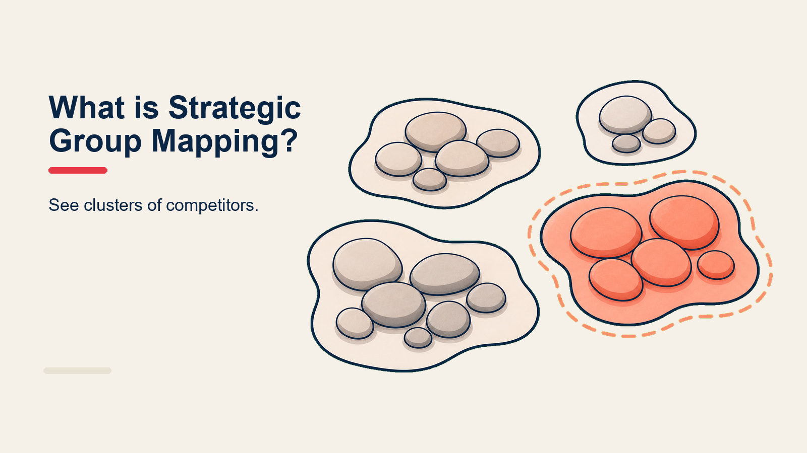
Strategic group mapping is a competitive analysis technique that plots your industry's rivals onto a two-axis chart, grouping firms that follow similar strategies so you can see who you truly compete with and where open space exists. Most companies have a rough sense of who their competitors are, but without a map, that picture stays blurry. Group mapping makes it sharp.
What Is Strategic Group Mapping?
Strategic group mapping is a framework for visualizing the competitive structure of an industry by clustering firms into strategic groups: sets of companies that pursue similar strategies across key dimensions such as price, product breadth, distribution channel, or geographic scope.
The concept originated in Michael Hunt's 1972 Harvard doctoral dissertation on the home appliances industry and was later popularized by Michael Porter in his 1980 book Competitive Strategy, published by Free Press. Porter argued that firms within the same strategic group face similar competitive pressures from each other and similar threats from outside forces, making the group the right unit of analysis for rivalry, not the industry as a whole.
Key Facts
- The concept of strategic groups was first introduced by Michael Hunt in his 1972 Harvard doctoral dissertation studying the U.S. home appliance industry. (Hunt, 1972, Harvard University)
- Michael Porter formally defined and popularized the framework in Competitive Strategy (Free Press, 1980), establishing it as a cornerstone of industry analysis.
- Research published in the Strategic Management Journal has consistently found that profitability differences between strategic groups within an industry can be as significant as differences between industries themselves. (McGee & Thomas, 1986, Strategic Management Journal)
How to Create a Strategic Group Map
Building a useful map takes about an hour of structured thinking. Rush it and you end up with a chart that confirms what you already knew.
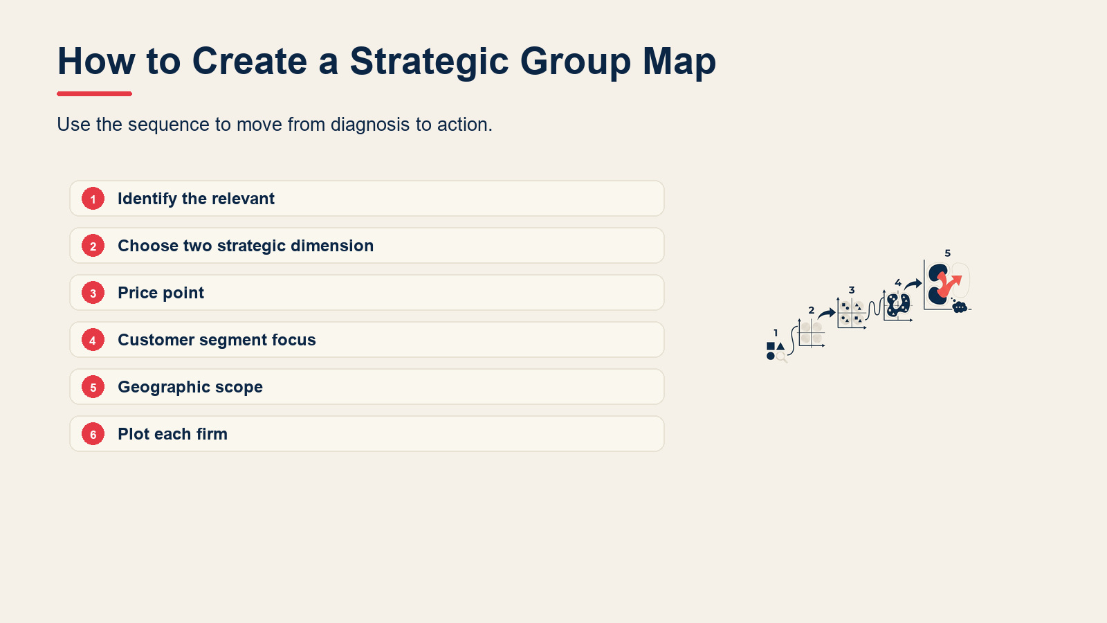
Step 1: Identify the relevant competitors
Start with every firm you genuinely consider a competitor, then expand to include firms that serve the same underlying customer need even if their offering looks different. For a B2B project management software company, that list might include enterprise vendors, niche vertical tools, spreadsheet-based workarounds, and general-purpose collaboration platforms.
Aim for 8 to 20 firms. Fewer than 8 and you probably missed someone important. More than 20 and the map becomes unreadable.
Step 2: Choose two strategic dimensions
This is where most teams go wrong. The two axes need to meet two tests. First, they must genuinely vary across the firms in your list. Second, they must NOT be highly correlated with each other, because if firms that score high on Axis A automatically score high on Axis B, you have only one real dimension dressed up as two.
Good axis pairs for B2B software:
- Price point (low to high) vs. Product breadth (narrow/point-solution to broad/suite)
- Customer segment focus (SMB to enterprise) vs. Deployment model (cloud-only to on-premise)
- Geographic scope (local to global) vs. Feature depth (generalist to specialist)
Avoid axes like "quality vs. price" for most industries because quality and price tend to move together, leaving you with a diagonal line instead of clusters.
Step 3: Plot each firm
Place each competitor at the coordinates that best describe its current strategy, not where it aspires to be. Use the firm's publicly visible actions: pricing pages, product tiers, case studies, and job postings often reveal more than press releases.
If a firm genuinely straddles two positions, place it where its primary revenue sits.
Step 4: Draw circles sized by market share or revenue
Once all firms are plotted, draw a circle around each one. Size the circle proportionally to the firm's approximate market share or revenue. This adds a third data dimension without adding a third axis. A small circle deep in your quadrant is a different competitive threat than a large one.
Where multiple firms cluster closely together, draw a larger boundary around the cluster to mark it as a strategic group.
Step 5: Analyze the map
Now you read it. Look for three things:
- Direct rivals: firms in your own cluster are your closest competitors and the ones most likely to respond to your price moves or product launches.
- Mobility barriers: structural factors (capital requirements, brand equity, switching costs, regulatory licenses) that make it hard for firms in other clusters to move into yours. High barriers mean the clusters are stable; low barriers mean a rival can cross into your space faster than you might expect.
- White space: areas on the map with no occupants. White space can signal an untapped opportunity, or it can signal that everyone has already tried that combination and found it unviable. The map tells you where white space exists; your market research tells you which interpretation is correct.
For a deeper read on the structural forces shaping each cluster's profitability, pair this map with a Porter's Five Forces analysis.
Strategic Groups vs Market Segments
Teams often conflate these two. They answer different questions.
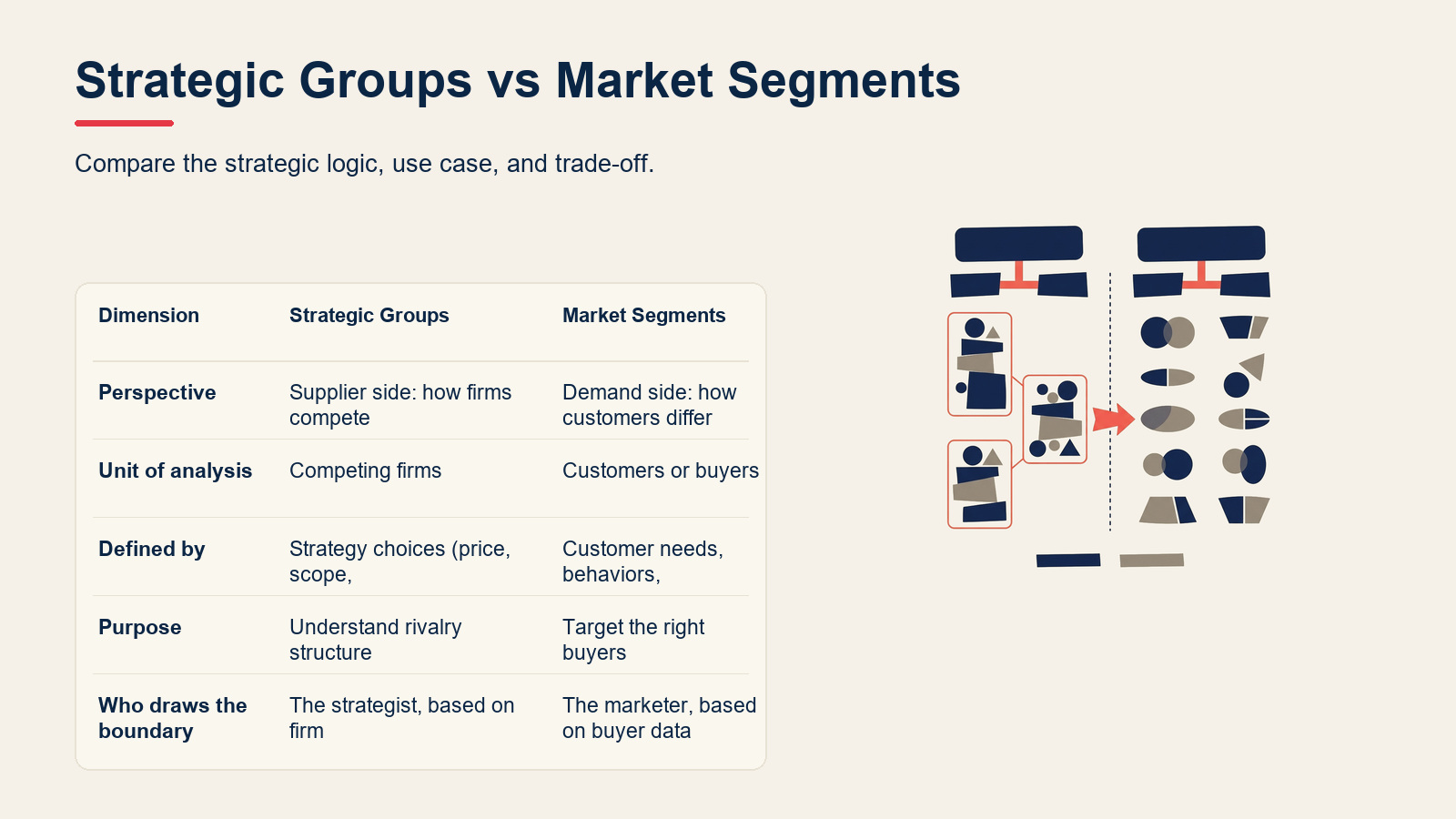
| Dimension | Strategic Groups | Market Segments |
|---|---|---|
| Perspective | Supplier side: how firms compete | Demand side: how customers differ |
| Unit of analysis | Competing firms | Customers or buyers |
| Defined by | Strategy choices (price, scope, channel) | Customer needs, behaviors, demographics |
| Purpose | Understand rivalry structure | Target the right buyers |
| Who draws the boundary | The strategist, based on firm behavior | The marketer, based on buyer data |
| Example | Full-service vs. low-cost airlines | Business vs. leisure travelers |
A firm can belong to one strategic group while choosing to serve multiple market segments. And a market segment can be contested by firms from multiple strategic groups. The two tools complement each other rather than overlap.
Benefits of Strategic Group Mapping
Pinpoints your real rivals. An industry might have 40 companies in it, but you only truly compete head-to-head with the 5 or 6 that occupy your cluster. Strategic group mapping lets you focus your competitive intelligence budget on the firms that actually threaten your next deal, not every player in the broader category.
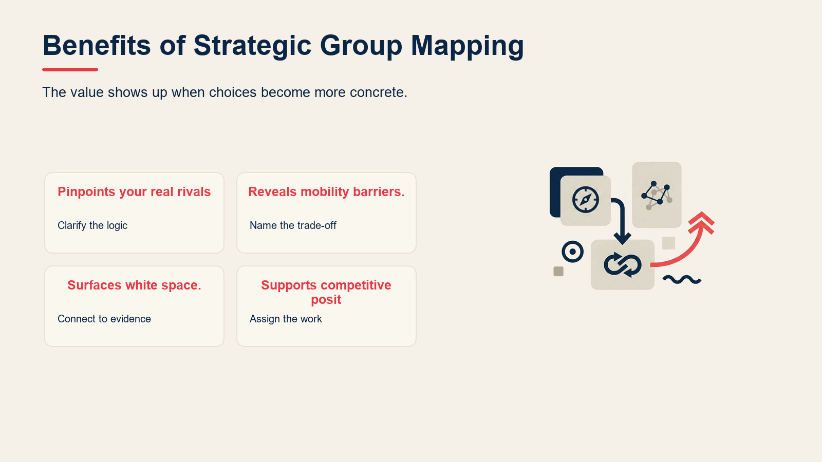
Reveals mobility barriers. Understanding what it would take for a rival in another cluster to enter yours, or for you to enter theirs, is essential for long-range planning. If the barrier is mostly capital, a well-funded new entrant changes the calculus quickly. If the barrier is regulatory certification or a decade of brand trust, the timeline is very different.
Surfaces white space. Blank areas on the map are invitations to ask why they're blank. Some represent genuine untapped opportunities: the combination of attributes that no one has yet assembled for customers who want it. Others represent strategic dead zones that incumbents already tested and abandoned. Either way, the question is worth asking deliberately rather than discovering by accident.
Supports competitive positioning decisions. When you know where every rival sits, you can make a sharper call about where to position your own firm. This pairs naturally with Porter's Generic Strategies to translate the map's spatial logic into a strategic direction (cost leadership, differentiation, or focus).
Common Mistakes
Choosing correlated axes. If your axes are "price" and "perceived quality," almost every firm will fall on a diagonal from bottom-left to top-right. The chart tells you nothing you didn't already know. Choose dimensions that are genuinely independent.
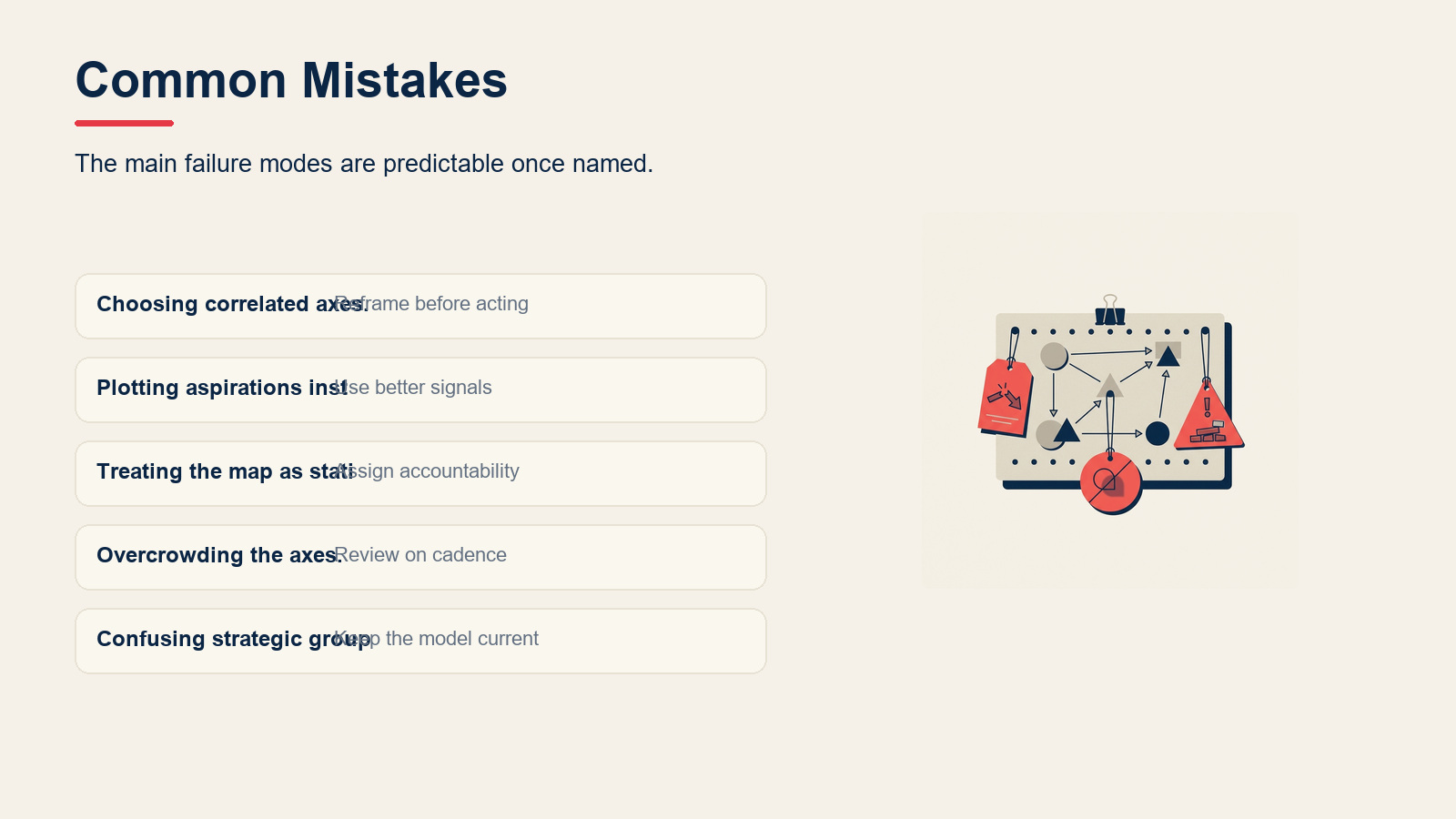
Plotting aspirations instead of current reality. Strategy documents and investor decks describe where a firm wants to go. The map should show where it actually is today, based on observable behavior. Otherwise you end up competing with a phantom version of your rival instead of the one that's taking your deals.
Treating the map as static. Markets evolve. A map drawn in 2020 may look very different by 2025 as new entrants arrive, incumbents pivot, and customer expectations shift. Build a habit of refreshing the map annually or after any major industry event.
Overcrowding the axes. Adding three or four dimensions by splitting axes into sub-categories turns a clean visualization into a jigsaw puzzle. If you need more dimensions, consider building separate maps for different axis pairs and reading them together.
Confusing strategic groups with competitive tiers. Not every cluster is "premium vs. budget." Sometimes firms are grouped by channel (direct sales vs. partner-led) or by geography (domestic vs. global), with no implied hierarchy between groups.
Strategic Group Map Examples
Automotive industry
The global auto industry has several distinct strategic groups, each protected by different mobility barriers.
| Strategic Group | Example Firms | Key Dimensions |
|---|---|---|
| Mass-market full-range | Toyota, GM, Volkswagen | Broad model range, global distribution, mid-price |
| Luxury full-range | Mercedes-Benz, BMW, Lexus | Premium price, broad model range, global distribution |
| Luxury performance specialist | Ferrari, Porsche (sports line) | Ultra-premium price, narrow model range, exclusivity |
| Budget high-volume | Dacia, Mitsubishi (entry models) | Low price, limited features, selective markets |
| Electric-first disruptor | Tesla, BYD | Technology-led, EV-only or EV-primary, direct sales |
Tesla's early map position was genuinely blank: high price, narrow model range, direct-to-consumer sales, EV-only. The established groups had left that corner of the map empty because legacy manufacturers were not set up to serve it. That white space became a $800-billion company.
Airline industry
Airlines organize into well-documented strategic groups:
| Strategic Group | Example Firms | Key Dimensions |
|---|---|---|
| Full-service legacy | Delta, Lufthansa, Singapore Airlines | Hub-and-spoke, high price, broad routes, full amenities |
| Low-cost carrier | Southwest, Ryanair, AirAsia | Point-to-point, low price, narrow service, high seat density |
| Regional feeder | SkyWest, Mesa Air | Short-haul, codeshare-dependent, thin margins |
| Ultra-premium / private | NetJets, VistaJet | Charter or fractional, very high price, bespoke service |
Ryanair's move from a regional carrier into a full-scale low-cost carrier in the 1990s is a textbook case of cross-group migration. The mobility barriers (fleet investment, route authority, operational systems) were high but not insurmountable, and the white space in European short-haul was large enough to justify the crossing.
Best Practices
Start with the customer's substitution decision. Include any firm the customer might choose instead of you, even if it looks different. That keeps the competitor list grounded in reality rather than narrow industry definitions.
Run the map with cross-functional input. Sales sees real competitive displacement. Product knows feature gaps. Finance knows margin pressure. A map built only by strategy teams often misses ground-level signals.
Document your axis choices. Write down why you picked these two dimensions and what data supports each firm's placement. When you refresh the map next year, that documentation tells you whether the logic still holds or whether you need new axes.
Use the map to sharpen your competitive advantage narrative. Once you know your cluster and your white space, you have a factual basis for explaining why your firm's position is sustainable rather than just asserting it.
Pair it with a SWOT analysis for internal grounding. The group map shows external positioning; a SWOT surfaces whether your internal capabilities can actually support the position you want to occupy.
Consider a perceptual map alongside it. Strategic group maps use observable strategy data (price, scope, channel). Perceptual maps use customer perception data. The two often diverge in instructive ways.
Frequently Asked Questions
How many axes should a strategic group map use?
Two. That's the practical ceiling for a readable two-dimensional chart. If you feel the need for a third dimension, the standard workaround is to encode it in circle size (usually market share or revenue) while keeping the two true axes for the spatial placement. Some analysts build two separate maps with different axis pairs and read them side-by-side. Adding a literal third spatial axis makes the chart very hard to read in a presentation context.
How is a strategic group map different from a perceptual map?
They look similar but measure different things. A strategic group map is built from objective, observable data about what firms actually do: their price points, their product range, their distribution channels. A perceptual map is built from customer survey data about how buyers perceive firms on attributes like quality or prestige. The two maps often disagree, and that gap between strategy and perception is itself strategically important.
What are mobility barriers?
Mobility barriers are the structural factors that make it costly or slow for a firm to move from one strategic group to another. They function like Porter's generic barriers to entry but apply to movement between groups within an industry rather than entry into the industry as a whole. Common mobility barriers include capital requirements (you need a large fleet to be a full-service airline), regulatory licenses, established brand equity, proprietary technology, and long-term distribution contracts.
How often should you update your strategic group map?
At minimum, once a year during your annual strategy review. But you should also update it reactively whenever a significant competitive event occurs: a well-funded new entrant, a major acquisition, a competitor pivoting its pricing model, or a technology shift that changes what's possible. Markets rarely stay stable for three or four years at a stretch.
Can a single firm belong to more than one strategic group?
Technically no, though some large diversified firms operate business units that sit in different groups. General Motors, for example, runs mass-market brands (Chevrolet) and a luxury brand (Cadillac) that would plot in different groups. When a conglomerate like that appears on your map, decide whether to plot each brand separately or plot the parent at its primary revenue center. Consistency matters more than the specific choice, as long as you document it.
Strategic group mapping won't tell you what to do next, but it makes the competitive landscape legible. Once you can see where your real rivals cluster, where the mobility barriers run, and where the white space sits, you're making strategic choices with your eyes open instead of guessing on instinct. For the next layer of analysis, check how competitive positioning translates that map into a concrete market stance, or use a value chain analysis to test whether your internal activities can actually support the position you want to own.
Related Reading

Senior Operations & Growth Strategist
On this page
- What Is Strategic Group Mapping?
- How to Create a Strategic Group Map
- Step 1: Identify the relevant competitors
- Step 2: Choose two strategic dimensions
- Step 3: Plot each firm
- Step 4: Draw circles sized by market share or revenue
- Step 5: Analyze the map
- Strategic Groups vs Market Segments
- Benefits of Strategic Group Mapping
- Common Mistakes
- Strategic Group Map Examples
- Automotive industry
- Airline industry
- Best Practices
- Frequently Asked Questions
- How many axes should a strategic group map use?
- How is a strategic group map different from a perceptual map?
- What are mobility barriers?
- How often should you update your strategic group map?
- Can a single firm belong to more than one strategic group?
- Related Reading