Leadership
Understanding Pareto chart: The rule of prioritization

If you're a business manager, you've probably heard, "20% of your customers generate 80% of your revenue." At first glance, this might sound like an arbitrary statement without much basis, but it stems from a famous principle widely applied worldwide—the 80/20 rule.
Every problem needs to be identified and addressed thoroughly, but it’s crucial to prioritize the most important factors to save time and resources. The 80/20 principle, combined with a Pareto chart, allows individuals and businesses to swiftly tackle 80% of their issues by identifying 20% of core problems.
Let's take a closer look below for a more comprehensive understanding.
Understanding the Pareto chart
What is a Pareto chart?
A Pareto chart, or an 80/20 chart, is a statistical tool commonly used to analyze and assess the significance of different causes contributing to a particular problem or outcome.
It is based on the Pareto Principle, also known as the 80/20 rule, which suggests that approximately 80% of results come from 20% of causes.
A Pareto chart is typically displayed as a bar graph, showing the frequency or impact of each cause, arranged in descending order from left to right. This visual representation allows for quickly identifying the most critical factors that need attention to resolve an issue.
The Pareto chart is a simple yet powerful business analysis, research, and strategic planning tool.
The origin of Pareto chart
The concept behind the Pareto chart originated in 1897 when Vilfredo Pareto, an Italian economist, created a formula to describe his observation that 80% of Italy’s wealth was owned by 20% of the population.
Later, in 1954, Pareto expanded this law and named it the Pareto Principle, or the 80/20 rule. This is considered an implicit rule (not a mandatory law), suggesting that about 80% of the results are caused by 20% of the causes. For instance:
- 20% of workers produce 80% of results
- 20% of customers contribute to 80% of revenue
- 20% of defects cause 80% of problems
- 20% of features create 80% of user demand
It's important to note that the exact figures may vary slightly. The key takeaway from the Pareto Principle is that most things in life (effort, reward, output) are not evenly distributed—some contribute much more than others.
Components of a Pareto chart
A Pareto chart comprises six distinct elements that work together to create a detailed data table, helping managers identify the main factors contributing to a result or problem:

X-axis
The X-axis on a Pareto chart displays various categories of factors under examination. These could be any aspect relevant to the issue, such as the sources of website traffic, types of product defects, causes of customer complaints, or reasons for project delays.
Y-axis
The Y-axis of the Pareto chart displays the values for the quantity or frequency of the analyzed factors, providing a visual representation of how often each factor occurs or the magnitude of its impact.
Vertical bars
These bars represent the value corresponding to each factor listed on the X-axis and are typically arranged in descending order.
Cumulative line
The cumulative line on a Pareto chart is a crucial element that distinguishes it from a standard bar chart. This line represents the cumulative percentage of the total impact or frequency of the factors listed on the X-axis, allowing viewers to see how much of the overall problem is contributed by a combination of factors.
Here’s how it works: as you move from left to right along the X-axis, the cumulative line adds up the percentage contribution of each factor. It starts at 0% on the leftmost factor and gradually rises as you move right, eventually reaching 100% when all factors are accounted for.
Secondary axis (if applicable)
A secondary axis on the right side of the chart displays the cumulative percentage value of the factors relative to the total. To determine the cumulative percentage of any factor on the X-axis, reference the factor along the cumulative line and then across to the secondary axis.
Other elements
A Pareto chart may include additional components, such as:
- Baseline: A reference line at the bottom to measure the height of the vertical bars.
- Titles: Similar to other charts, Pareto charts have titles that describe the data being presented and measured.
- Legend: Some Pareto charts display data from multiple sources or periods, requiring legends to differentiate the values and data sources.
Benefits and limitations of Pareto chart
The Pareto chart is an invaluable tool for businesses. It helps managers identify the 20% of key factors in a problem and focus on them rather than spreading resources thin across the remaining 80% of less critical factors.
By concentrating on the most impactful causes, businesses can optimize their resource allocation, leading to more efficient problem-solving and faster resolution of core issues.
Benefits of Pareto chart
In general, the core benefit of the Pareto chart is its ability to quickly identify the 20% of root causes that generate 80% of the results, enabling targeted problem-solving.
Let's go a little more detail into how this benefit applies to individuals and businesses.
For individuals: Effective time management
With the 80/20 rule, the Pareto Principle benefits personal time management.
20% of your effort will quickly take up 80% of your time, meaning that no matter how much sleep you skip or coffee you drink, you will only complete some of your work.
If you want to maximize your time, try tackling 20% of the most critical tasks that could yield 80% of your day’s results. Don’t get distracted by the remaining tasks, which may produce minimal results.
Even within a work process, focus more on the most critical stage—the foundation allowing you to complete the entire process quickly and effectively.
Consider preparing for a presentation. Instead of spending hours perfecting slides or worrying about design elements, it is more critical to focus on thoroughly understanding the content and key messages you need to convey. Once the core content is solid, fine-tuning the slides or aesthetics becomes much easier and quicker, ensuring the entire process is completed effectively.
For businesses: Productivity management
The Pareto Principle strongly supports business decision-making by providing a model for identifying the 20% of tasks or needs that will lead to 80% of your business goals.
Consider these examples:
- Customers: You understand that 20% of your key customers contribute 80% of your company’s revenue. This insight allows you to strategize, offering differentiated incentives to this top 20% rather than applying the same policies to all customers.
- Products: Twenty percent of your business’s products or services should be considered core, deserving the most labor and time investment. Instead of launching a broad range of similar products, concentrate on a select few core products, with the rest as supplementary.
- Features: Within a single product, 20% of the most essential features account for 80% of its value. Your production, marketing, and sales teams can focus on promoting these critical features to customers.
- Business locations: This ratio should also be applied to businesses with multiple locations; if a few locations significantly outperform others, focus resources there.
- Investors: When seeking investment for your business, remember that approximately 20% of investors hold 80% of your funding. Rather than spreading your efforts too thin, prioritize building solid relationships with these critical investors.
- Customer service: Adhering to the 80/20 model means that 80% of customer complaints and business losses stem from 20% of specific defects. Addressing these critical defects will significantly benefit the business.
- Employee performance: From another perspective, 20% of top employees contribute 80% to the company’s overall results. Recognizing and rewarding their achievements is an effective way to motivate them.
Case study: Applying the Pareto chart in analyzing causes of oil spills
The Pareto chart has been used in many large-scale national research projects. One of the most successful case studies is the analysis of 209 oil spills across the United States, identifying the primary causes of these spills.
The state of Washington conducted a study to determine the causes of oil spills nationwide. They gathered information on 209 different oil spill incidents, focusing on the causes of the incidents and the responsibility of the involved parties.
The study identified 29 causes, with the top six being:
- Inattention/Distraction (38 cases)
- Procedural errors (31 cases)
- Decision-making errors (26 cases)
- Mechanical failures (23 cases)
- Structural failures (20 cases)
- Unknown causes (11 cases)
These top six causes, accounting for just over 20% of identified causes, led to 149 incidents, equivalent to 71% of the oil spills. After this analysis, Washington focused on addressing these top six causes, significantly reducing oil spills.
Limitations of Pareto chart
- No solutions provided: The chart optimizes the identification of root causes but does not provide solutions to the problem.
- Lagging data: It only focuses on historical data.
- Limited to observable data: The chart can only display qualitative data that can be observed, and it cannot represent detailed quantitative data.
It is also important to note that the Pareto Principle does not suggest focusing only on 80% of the most critical tasks. It may be true that 80% of the bridge is built in the first 20% of the span, but you still need the remaining finishing touches to make the bridge functional.
The 80/20 rule is a guideline derived from observation, not a natural law.
Takeaway: If you are seeking the best, you must give your 100% effort. But if you're trying to get good bang for your buck, you focus on the 20% of activities that generate the most results.
Steps to create a Pareto chart
Step 1: Identify the problem
The first step in creating a Pareto chart is identifying the problem that needs solving. This problem will become the chart’s title and the basis for determining the contributing causes in the next step.
For example, if your company’s software has been receiving negative feedback for various reasons, the problem could be “Reasons for customer complaints,” with data to be gathered such as support service, loading speed, missing features, etc.
Step 2: Collect and analyze data
Once the core focus of the chart has been identified, all relevant data related to the issue must be collected from various sources. This is where strong skills in data collection and market research come into play, ensuring the information gathered is both accurate and comprehensive.
For example, if you are analyzing the issue of "Transportation costs for road freight operations" within a company, the categories you would need to investigate and collect data for might include rising fuel costs, instances of vehicles running without full loads, repair and maintenance costs, traffic conditions, loading/unloading times, and more.
Step 3: Draw the Pareto chart
First, determine the value and frequency of each problem, then rank them in descending order.
After sorting and categorizing the data, you can create a bar chart by marking the points on the X and Y axes, then drawing vertical bars at corresponding positions on the X-axis, with heights matching their values on the Y-axis.
Finally, calculate the cumulative percentage for each factor:
Cumulative percentage = [Cumulative total on Y-axis / Total value] x 100%
Step 4: Analyze the chart
The chart shows that the taller bars correspond to the part of the cumulative curve that rises the fastest, indicating the most frequent or significant issues that need immediate attention.
On the other hand, shorter bars correspond to less critical issues that occur less frequently.
How to create a Pareto chart in Excel (With illustrations)
Let’s analyze a real-world scenario to apply a Pareto chart in Excel.
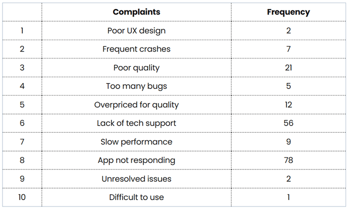
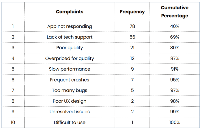
For example, after analyzing data related to “Reasons for customer complaints,” the software company summarized the results as follows:
To create a simple Pareto chart in Excel, follow these steps:
- Input the data table into an Excel sheet and reorganize the data in descending order.
- To calculate the cumulative percentage, add another column to your data table and input the formula: ‘=SUM($B$2:B2)/SUM($B$2:$B$11)’
- Copy this formula down the column and format it as a percentage. The result will be shown as the table below.
- Next, select Table
- On the Insert tab, choose Charts group, then Recommended Charts
- On the All Charts tab, select Histogram from the left menu and choose Pareto
- Click OK to start.
 How to draw Pareto chart in Excel
After entering the necessary data, Excel will generate a basic Pareto chart as below.
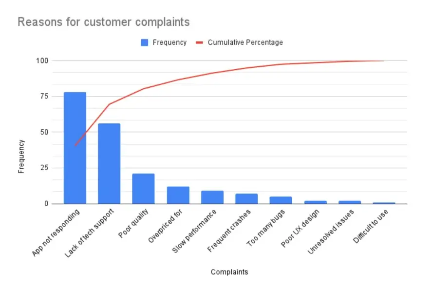
After adjusting and organizing the values, you’ll have a complete Pareto chart showing that the top two reasons for customer complaints—“App not responding” and “Lack of tech support” —account for roughly 70% of customers’ complaints.
Start with the critical few
In business, progress is rarely linear; the effort you put in only sometimes guarantees a corresponding output. Simply working harder or investing more resources doesn’t necessarily yield proportional results.
Instead, the 80/20 rule offers a powerful approach to optimize efforts and achieve significant outcomes. By focusing on the 20% of activities, clients, or issues that drive 80% of the results, you can build a more strategic and efficient approach to managing your business.
Start with the most critical 20%, and the remaining 80% will follow!
Frequently Asked Questions about Pareto Chart

Tara Minh
Operation Enthusiast
On this page
- Understanding the Pareto chart
- What is a Pareto chart?
- The origin of Pareto chart
- Components of a Pareto chart
- Benefits and limitations of Pareto chart
- Benefits of Pareto chart
- Limitations of Pareto chart
- Steps to create a Pareto chart
- Step 1: Identify the problem
- Step 2: Collect and analyze data
- Step 3: Draw the Pareto chart
- Step 4: Analyze the chart
- How to create a Pareto chart in Excel (With illustrations)
- Start with the critical few